4. Forminator
This guide explains how to use our Forminator form builder plugin to create interactive forms, polls, and quizzes. You can then embed your forms, polls or quizzes anywhere on your site using a shortcode, or click a button in your post editor and select the one(s) to add on your posts & pages.
Once Forminator is installed and activated, refer to this guide for help configuring and managing the plugin. Use the Index on the left to quickly locate usage guidance on specific features.
If you haven’t installed Forminator yet, then visit the Forminator Pro page where you can explore the plugin’s many features.
Upon activation or when certain features are configured, this plugin may add cookies to the user’s browser, store personal information in your database, or integrate with 3rd-party applications. You may need to disclose this information to your site visitors. For details, see Our Plugins in our privacy policy documentation.
Every WPMU DEV hosted site comes fully loaded with Pro versions of the following plugins automatically installed for you: Smush, Hummingbird, Defender, SmartCrawl, and Forminator. Not hosting with us yet? Check out our Hosting page to see if we might be a good fit for your projects.
If you are just starting out with Forminator, you may want to familiarize yourself with all of its features. Read our blog on how to Get the Most Out of Using Forminator for a quick run-through of how to take advantage of everything that Forminator has to offer.
Forminator just got more quizzical with new pagination for quizzes, image support for Checkbox and Radio fields, and bulk editing and CSV upload options for Radio, Checkbox, and Select fields. Check out our blog post on Forminator’s new advanced features for a complete overview.
4.1 Dashboard
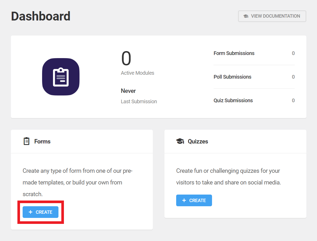
Copy chapter anchor to clipboardThe Dashboard consists of the Overview and Quick Access panels. Admins, particularly those managing multiple sites, can use the Dashboard to quickly assess the status of active forms, polls or quizzes, and to create new ones.
Click View Documentation to access the Forminator documentation.
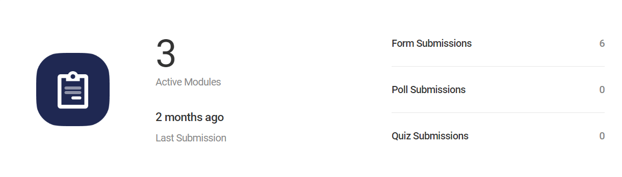
Overview
The Overview panel provides a snapshot of the site’s active forms and submissions:
- Active Modules – Shows how many of Forminator’s modules are active, currently.
- Last Submission – The date and time that the last form, poll, or quiz was submitted.
- Submissions – The total number of submissions for each form type.
Quick Access
The Quick Access panels are, naturally, the quickest way to analyze and modify any Forminator form. They are designed to make key data and the editing screens readily available.
Each panel includes a publication status indicator (published forms are indicated with a blue dot) and links to each form’s unique stats and editing screens. Click Create within any Quick Access Panel to begin creating a new form, quiz, or poll.
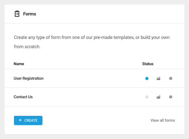
4.2 Forms
Copy chapter anchor to clipboardThe Forms tab is where forms are created and managed. It consists of an Overview panel and a list of all the forms that exist on a site, both draft and unpublished.
This section explains the basics of building forms and configuring fields. For detailed guidance regarding a specific field type, see the Forminator Fields walkthrough section below.
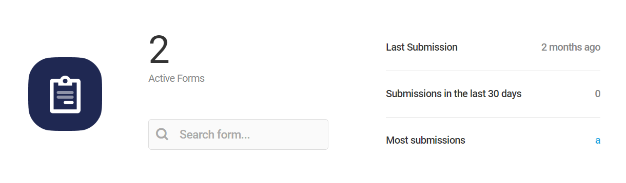
Overview Panel
The Forms tab Overview Panel displays the number of active forms, the date/time of the last submission, the number of submissions of this form type during the past 30 days, and the name of the form with the most submissions. Use the search bar to search for a specific form.
As always, the View Documentation button is there if you need to access Forminator’s usage documentation, and the Import button if you have a Forminator form from another site you wish to add to this site. Click the Import/Export tab in the index of this guide for more detailed Import/Export guidance.
Bulk Actions
Just beneath the Overview panel, you’ll see a Bulk Options section where you can apply any available option to multiple forms. Just select the forms you want to apply the action to, select the action from the dropdown, and click Apply.
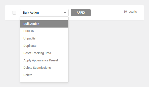
The bulk actions available include:
- Publish – This will publish selected draft forms.
- Unpublish – This will revert published forms to draft status.
- Duplicate – Click to copy forms, along with all their settings and PDFs, if any. The duplicate forms will appear at the top of the list.
- Reset Tracking Data – Click this to reset the user views and conversions data for forms, which only affects form data. User information collected for marketing purposes will not be affected.
- Apply Appearance Preset – Apply any preset style from Appearance Presets to selected forms.
- Delete Submissions – Deletes all submissions for selected forms
- Delete – Click to delete selected forms forever.
Form List
Several tasks can be accomplished from the Forms tab dashboard using the features available in the form list. Note these same features are accessible for every form on the main Forminator Forms page as well.
The information and features available for each listed form include:
- Title – The name of the form.
- Draft/Published – The form’s current status. Draft Forms are not available to the public until they have been published and inserted into a page or post using shortcode.
- Last Submission – The last day or time a published form was submitted.
- Views – How many visitors have viewed the a specific form .
- Submissions – The number of times users have completed and submitted a specific form.
- Conversion – The percentage of users who submitted a form relative to the total number who viewed it.
- View Full Report – Click this button to navigate to the form’s report page.
- Edit – Click Edit to access the form editor for the selected form. You can also open the form editor by clicking the Edit form link on the front-end when you are logged in as an admin.
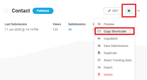
- Admin features (Gear icon) – Clicking the gear icon opens a drop-down menu that contains the following admin features:
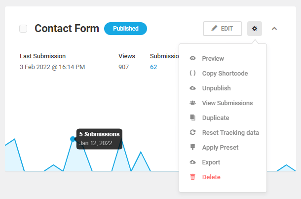
- Preview – Click to see a Preview of the form in a popup window.
- Copy Shortcode – Copy the shortcode, then paste it into any page or post where you want the form to appear.
- Publish/Unpublish – This will publish draft forms, or conversely, revert published forms to draft status.
- View Submissions – View the submission data for the respective form.
- Duplicate – Click to copy an entire form along with all its settings and PDFs, if any. The duplicate form will appear at the top of the list.
- Reset Tracking Data – Click this to reset the user views and conversions data for a form, which only affects form data. User information collected for marketing purposes will not be affected.
- Apply Preset – Apply any preset style from Appearance Presets to the form.
- Export – Click the link and Forminator will display the form in code that can then be copied and pasted into the Forminator import tool on any site.
- Delete – Click to delete a form forever.
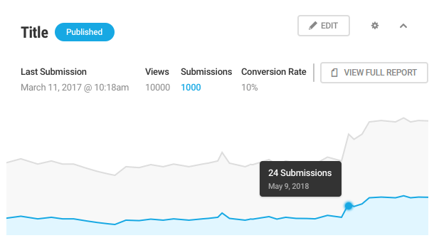
Form Stats
Click anywhere in the row of any form to access that form’s performance data, including an interactive line graph illustrating activity involving the form during the past 30 days. The stats panel also displays:
- Last submission – The last day or time a published form was submitted.
- Views – How many visitors have viewed the a specific form.
- Submissions – The number of times users have completed and submitted a specific form.
- Conversion – The percentage of users who submitted a form relative to the total number who viewed it.
4.2.1 Creating a Form
Link to chapter 2With dozens of available field types and an ever-expanding list of integrated third-party apps, there is almost no limit to the type of forms you can create with Forminator.
If you’re looking to jump right into creating more advanced forms, read our Create an Easy Payment Form with Forminator post.
Looking to build up your email lists? Check out How to Easily Capture Email Addresses for Lead Generation Using Forminator.
Regardless of the type of form you are creating, however, the fundamental process is the same:
- Build a form
- Configure the fields
- Configure form appearance and behavior
- Connect third-party apps (optional)
- Test the form
- Publish
Getting Started
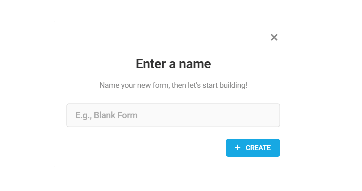
From the Dashboard, click + Create within the Forms pane, or navigate via the Admin menu: Forminator Pro > Forms and click + Create .
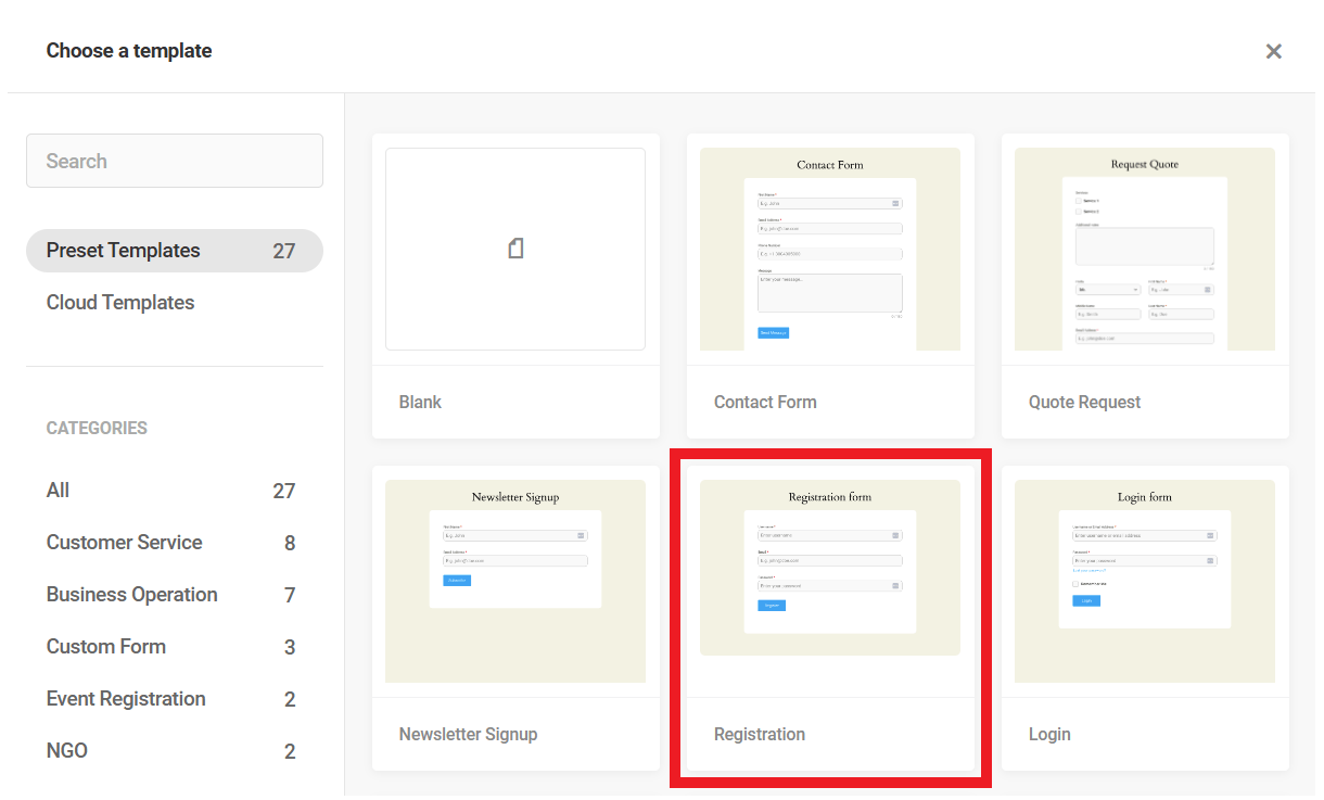
A popup will open where you can select a form template or choose to begin from scratch by selecting Blank.
Templates
The first step in creating a new form is to select the template you want to use. You can choose to start from scratch with a blank template, or select from among the available WPMU DEV Preset Templates. If you have created your own custom Cloud Templates from existing forms, they will be available for selection here as well. See the Templates chapter below for more information.

Each template includes fields commonly associated with that form type, including some specialized fields not available elsewhere in Forminator, such as a password field. These fields are pre-configured, some with complex conditional formatting, to effectively collect and manage user-submitted data.
Templates can be customized by adding or removing fields like any other form.
For some valuable tips on creating professional contact forms using Forminator, read our Creating the Perfect Contact Form blog.
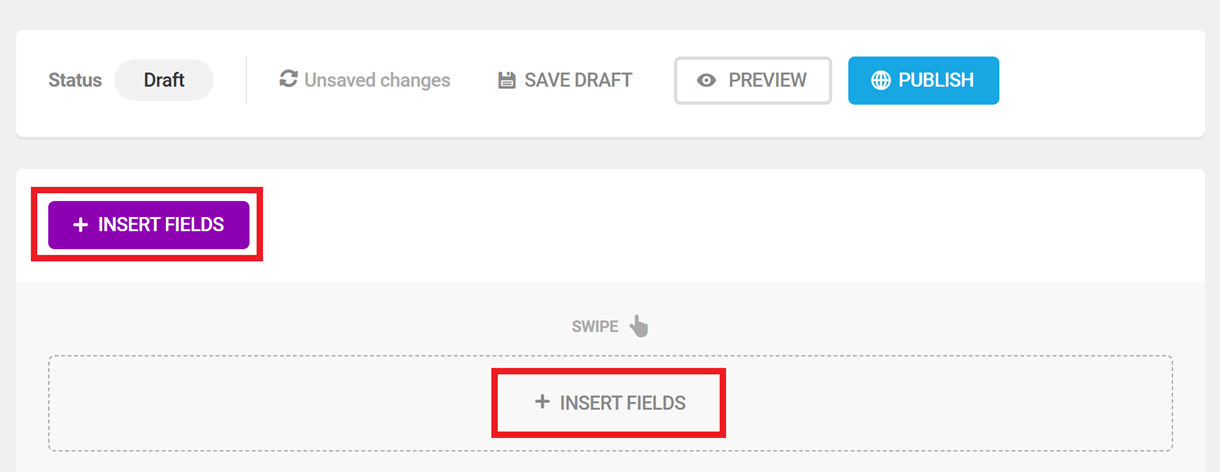
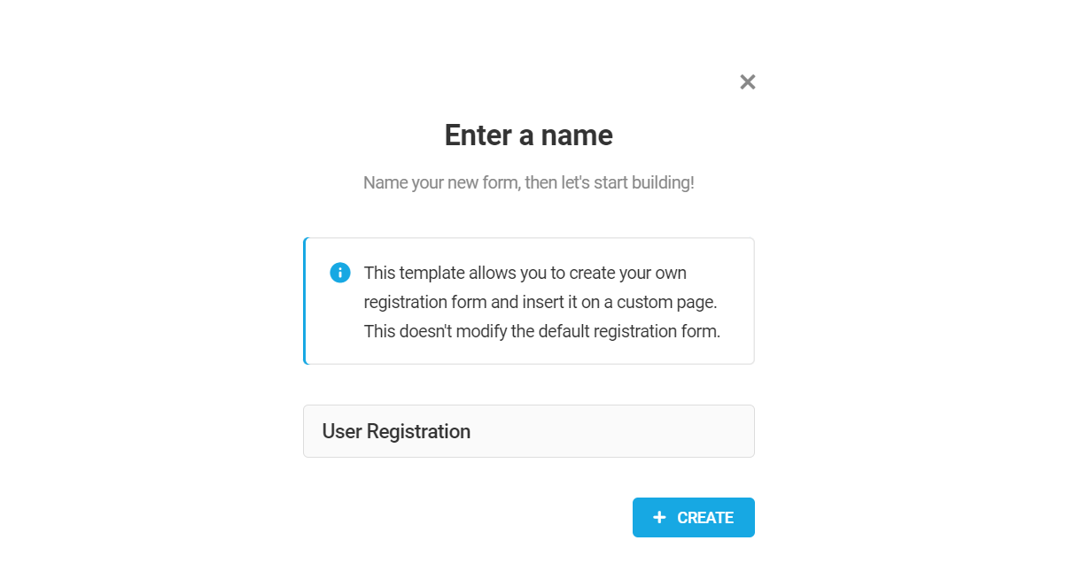
A popup will appear in which you can give your form a name. Each form must have a name, but changing that name later is easy. When you’ve entered a name, click Create.
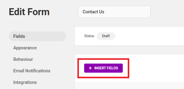
Forminator will create the form and open it in the Edit Form screen. You’ll see that your new form canvas is ready for you to start adding fields, and already has the Submit button. Click + Insert Fields to start building your form, and review the following chapters for guidance on configuring fields and other options.
Also, just a note that you can access your form settings from inside the editor by clicking on the gear icon next to the form title. To create a new form, click the plus icon.
Publishing a form
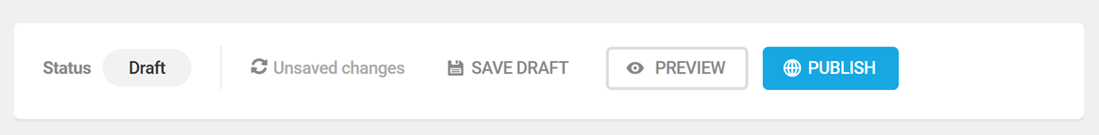
When you create or edit your form, you’ll have the option to save your progress as a Draft or Publish your form.
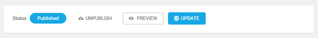
Once your form is published, you’ll be able to Unpublish or Update after making changes.
4.2.2 Appearance (Forms)
Link to chapter 2The Appearance options control a form’s overall design, its colors, and the look of its container.
Appearance Presets
You can style the appearance of any form using the options as detailed below, or apply one of your custom Appearance Presets. To apply a preset, simply click the Apply Preset button at the top-right.
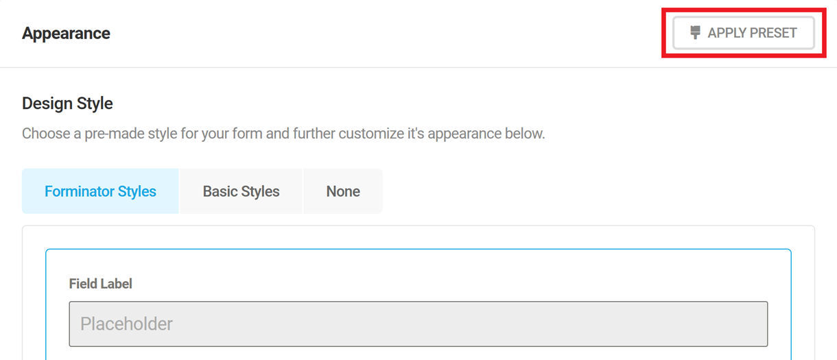
That will pop open a modal window where you’ll be prompted to select the preset you want from the dropdown. Then click Apply Preset to populate all the design elements on this screen with your preset styles.
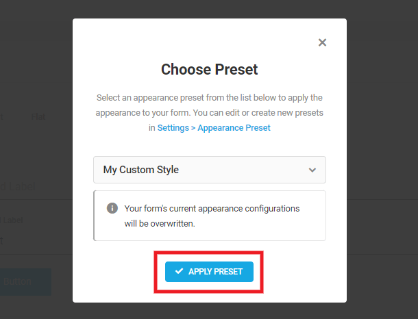
You can use your preset style as-is in your form or further customize the style if needed for a specific form.
Note that any changes you make here will not affect the preset style itself or any other forms using that preset; they will only affect the specific form you’re working on. To edit the preset style itself, go to Settings > Appearance Presets.
Design Style
Select the style option you want to use for your form.
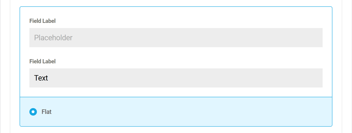
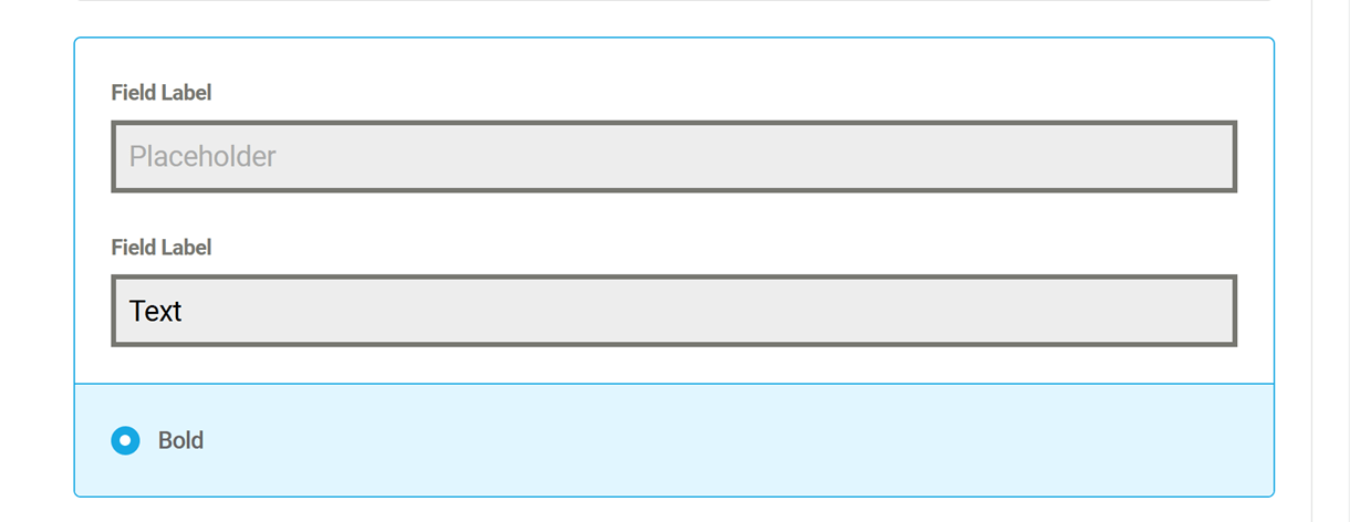
Forminator Styles
Selecting this option will use one of our pre-made themes as a starting point for further customization.
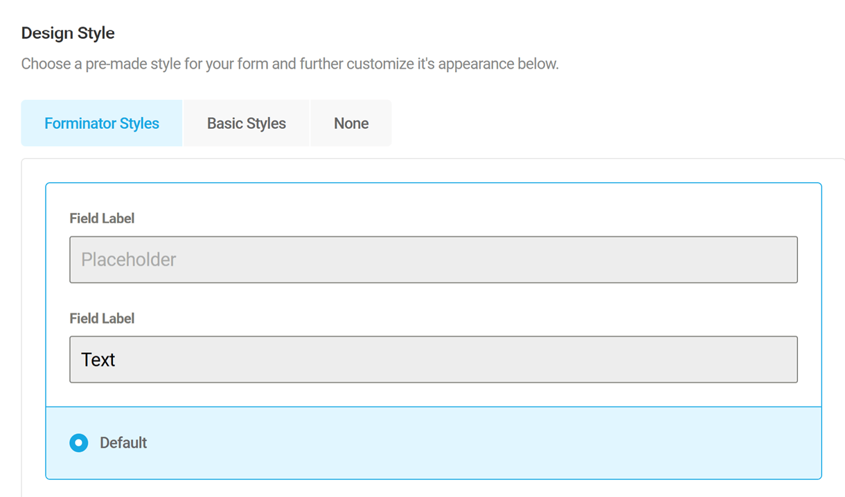
Basic Styles
Selecting this option will inherit styles from your WordPress theme. However, you can always overwrite those styles using the settings below.
None
If you select None, you will not be able to change colors, fonts, or the form container from the Appearance tab. You will need to make customizations in your theme’s CSS files.
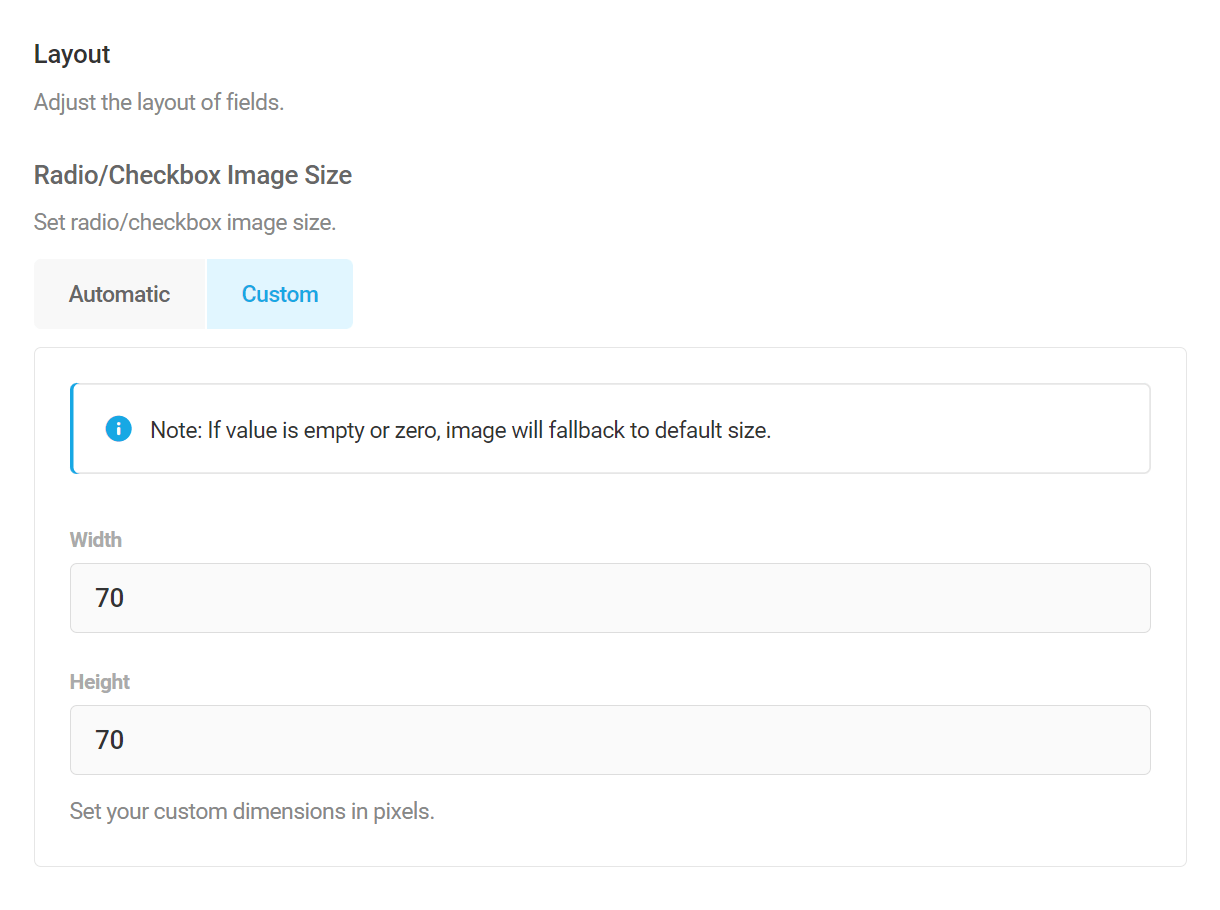
Layout
Radio/Checkbox Image Size
If you are using images in your Radio and/or Checkbox fields, you can set a Custom size for the images, or leave them at the default Automatic setting (70x70px).
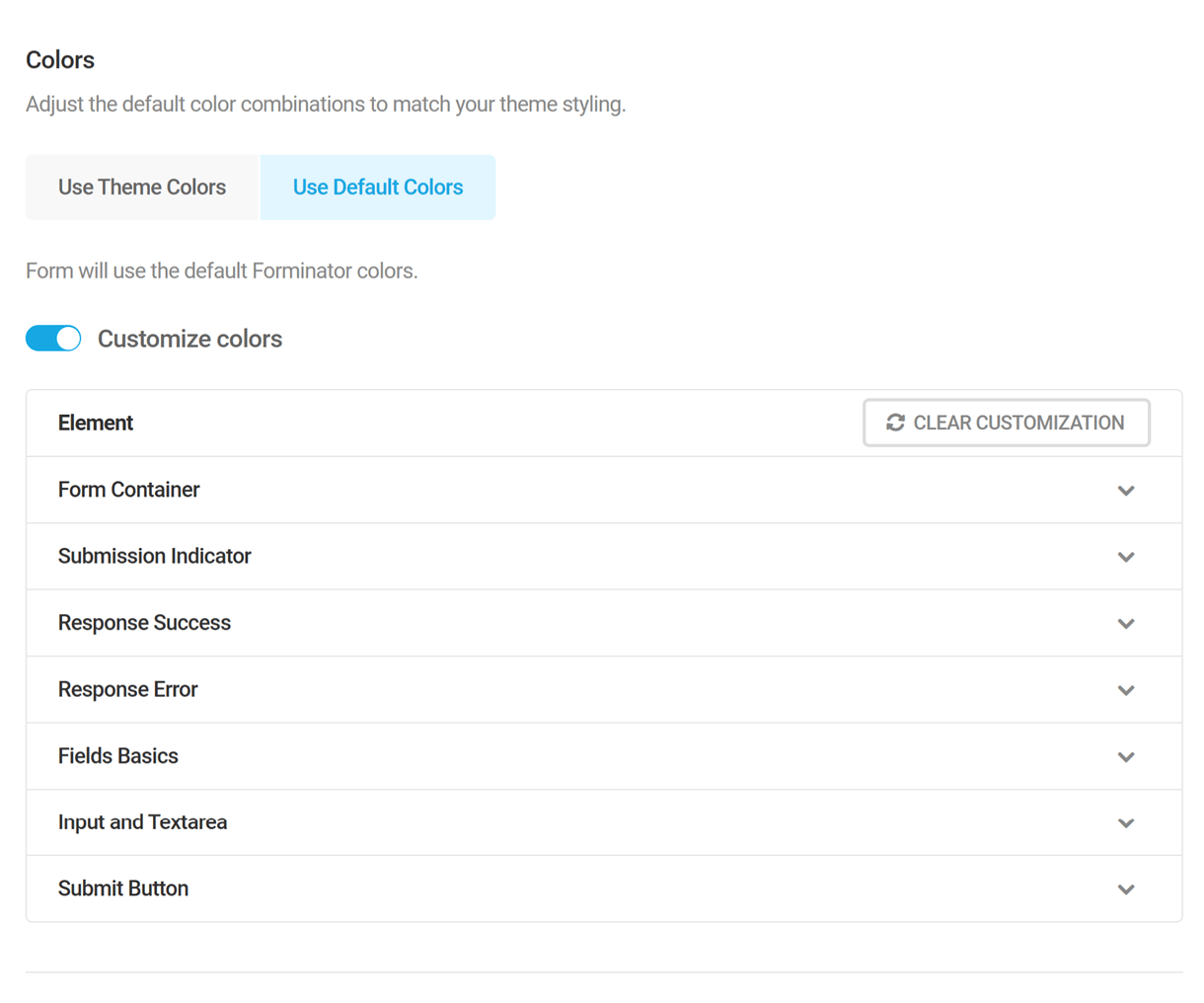
Colors
Use Theme Colors
This will inherit colors from your WordPress theme. However, you can customize the color of specific elements using the options below.
Use Default Colors
The form will use the default Forminator colors.
Customize Colors
Enable this option to customize the background and text colors of a variety of elements in your form. Simply expand the element you want to change the color and make your changes.
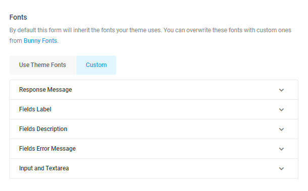
Fonts
Setup your desired fonts, font size and font weight, for the labels, section titles, pagination steps and all the other different elements in your form.
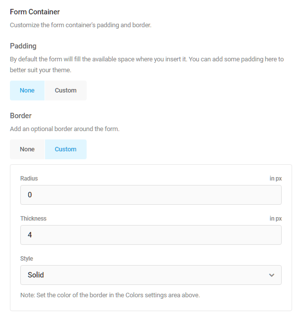
Form Container
Further customize the appearance of the form main container by adding padding, a border and the spacing between form fields.
Lets you specify a Compact, Comfortable, or Custom separation between fields. You can also disable the spacing if needed.

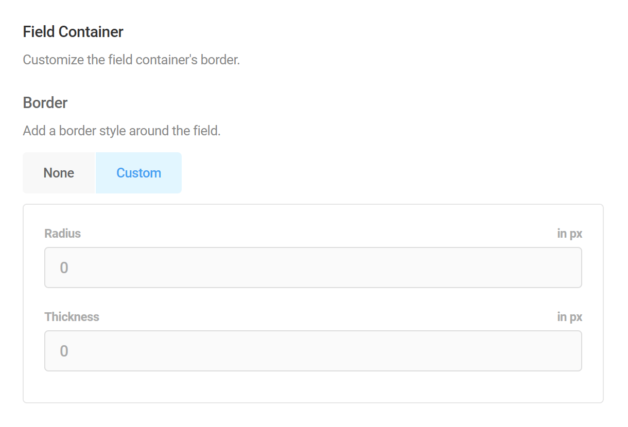
Field Container
Adjust the appearance of field containers in your form by customizing their border thickness and corner radius.
Custom CSS
Enable the Custom CSS option if you’d like to customize the appearance of your form beyond what is available with the built-in options above.
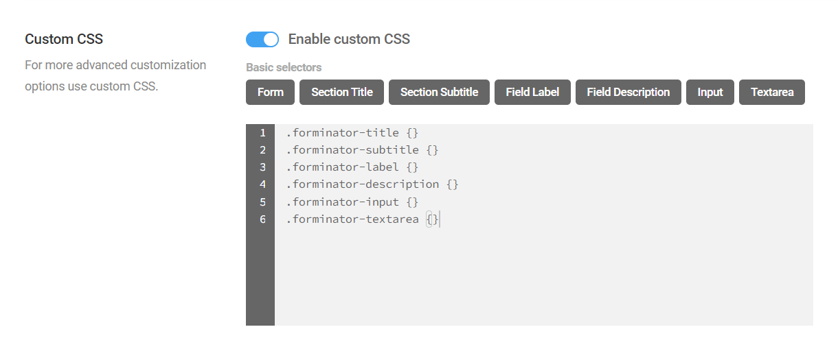
You’ll notice that there are some buttons that enable you to automatically add basic CSS selectors, simply by clicking the corresponding button. You can also manually enter the CSS you need to target any elements.
- Form (main container) – {}
- Section Title – .forminator-title {}
- Section Subtitle – .forminator-subtitle {}
- Field Label – .forminator-label {}
- Field Description – .forminator-description {}
- Input – .forminator-input {}
- Textarea – .forminator-textarea {}
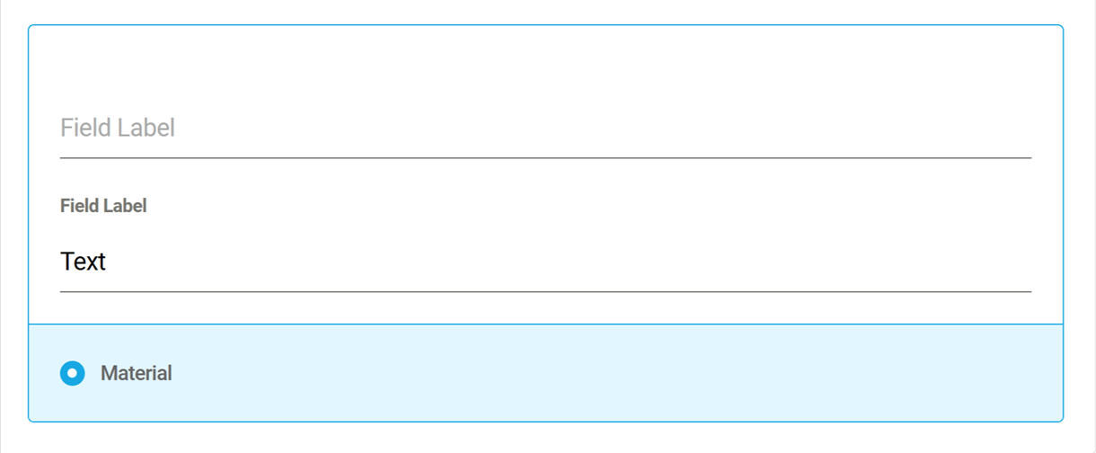
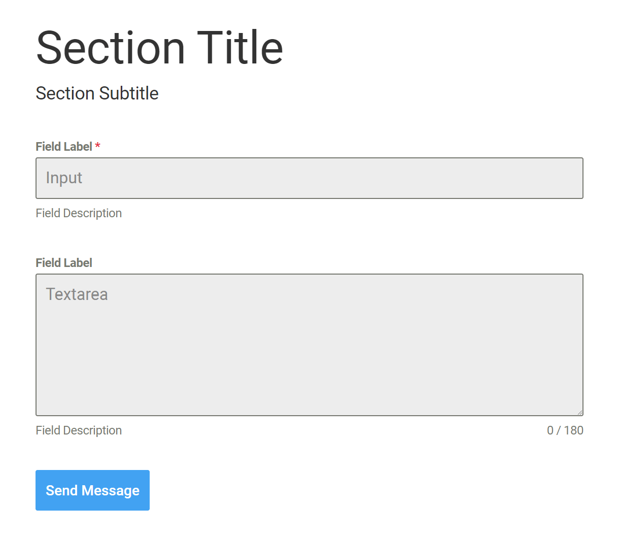
The image below illustrates which elements of the form would be affected by the basic selectors.
Regardless of whether you use the basic selector buttons or enter your custom CSS manually, it’s important to know that the plugin will ensure selector specificity in your published form by automatically prepending classes to identify the form itself and the Design Style selected above.
For example, if you click the button to add the Field Label selector and add a color, this is what would appear in the Custom CSS box:
.forminator-label {color: #f00;}
However, below is what the CSS that is output on the frontend of your site for your published form would look like. In this example, the ID of our form is 7171 and the chosen design style is Default.
.forminator-ui.forminator-custom-form-7171.forminator-design--default .forminator-label {

color: #f00 !important;

}
Be sure to keep this in mind when adding very specific selectors so you don’t create any conflicts and wind up debugging broken CSS.
4.2.3 Behavior (Forms)
Link to chapter 2The Behavior options control what happens when a user submits a form.
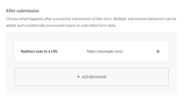
Submission Behavior
After Submission
Here, you can configure what should happen after a successful submission of your form.
You can set only one submission behavior if that’s all you need. For example, redirect all users to a thank-you page.
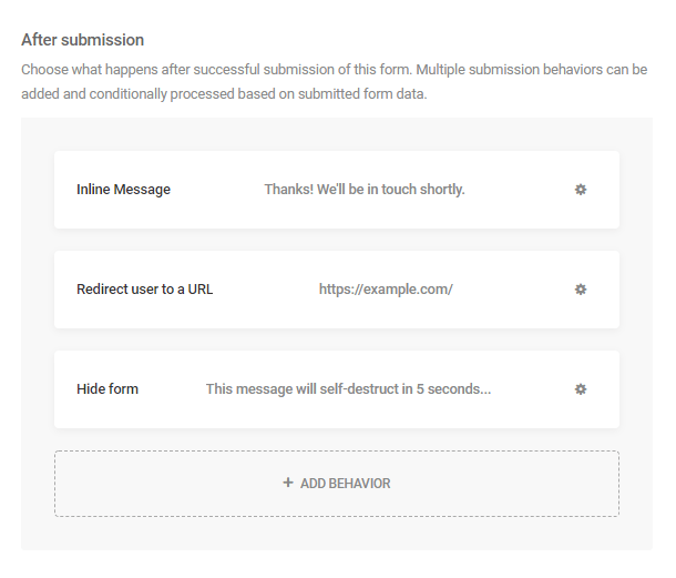
Or you can set up several different behaviors which can each be processed conditionally based on submitted form data.
For example, display a thank-you message above the form if a user had selected certain options in your form, redirect other users to different pages if they had selected different options, or hide the form & display a message to users who selected yet other options.
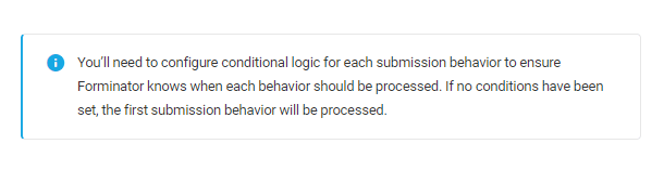
When setting up multiple submission behaviors, you’ll need to configure the conditional logic for each one. If you don’t, only the first submission behavior will be processed. You’ll see a notice appear in this section if you forget to set up your conditions:
To add a new submission behavior, click the + Add Behavior button.
To configure or edit an existing submission behavior, simply click on it to pop open a modal window with the configuration options.
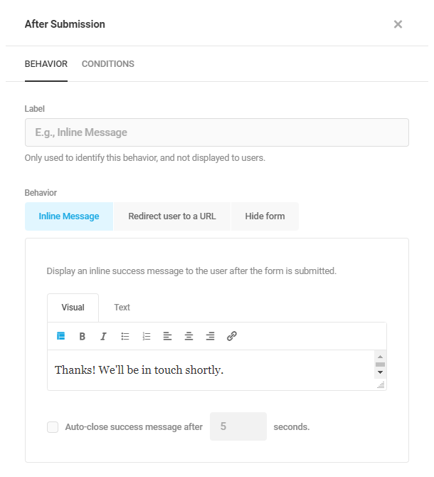
After Submission – Behavior
Under the Behavior tab, you can select from the following types of behavior:
- Inline Message – Display a custom message that appears above the form after submission.
- Redirect user to a URL – Redirect the user to any URL after submission.
- Hide form – Hide the form and display a custom message after submission.
Inline Message or Hide form
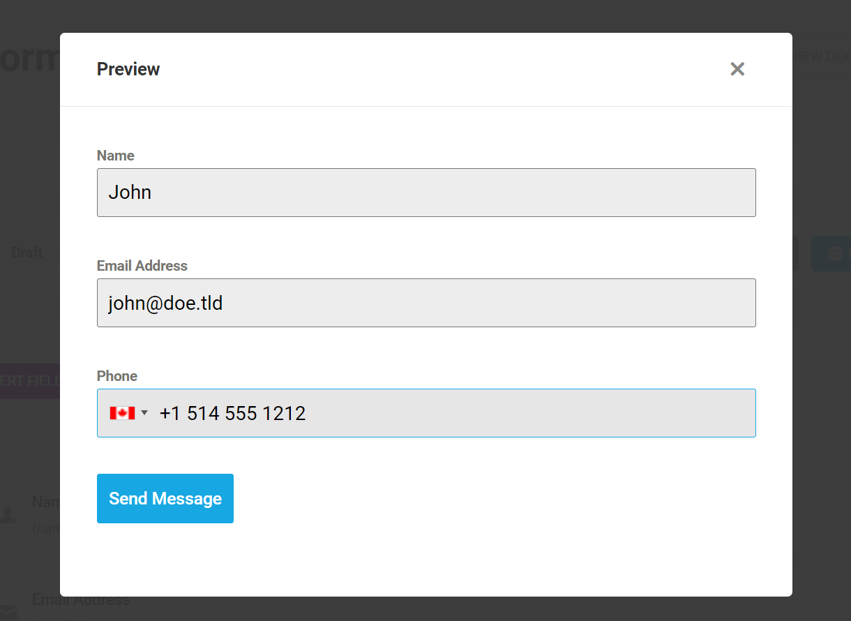
If you select either Inline Message or Hide form, submitted form data can be included in the custom message by clicking the Add form data button and selecting from the list of merge tags.
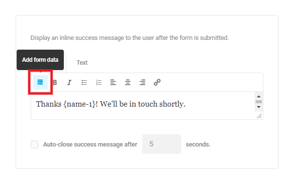
For example, you could personalize the message by including the merge tag corresponding to a Name field in your form, and display something like this:
Thanks John! We’ll be in touch shortly.
See Form Data below for more information about merge tags.
IMPORTANT
If you have created a user registration form, and have a custom login slug set by some other plugin (the Mask Login feature in Defender for example), you’ll want to manually adjust the login link that may appear in your After Submission messages so it points to your custom slug.
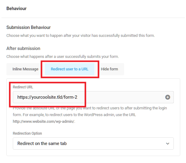
Redirect user to a URL
You can redirect a user to another page on your site or on a different site altogether.
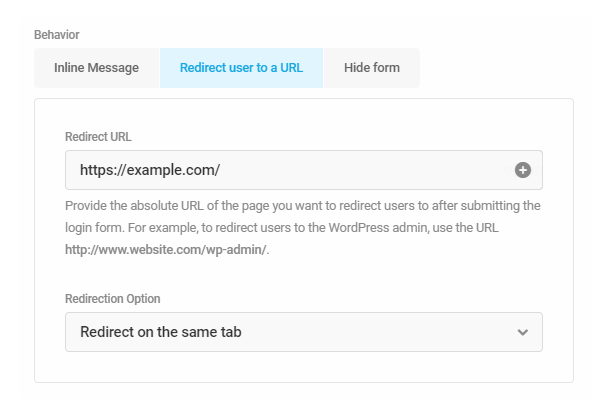
Enter the Redirect URL of the page you want users to land on after submission, and select from the available Redirection Options:
- Redirect on the same tab
- Redirect on new tab and show thank you message on form page
- Redirect on new tab and hide form on the form page
Dynamic redirects after submission
The [+] icon at the far right of the Redirect URL field enables you to use form data in your URL via merge tags. This can be very useful if you need to redirect users to different pages depending on a selected option in your form, and this can work in conjunction with the conditional logic you set up in the next step.
For example, let’s say you have a select field in a quote request form where users specify the product category they’re most interested in. You could set a different URL as the value in each option in your select field.
If you then add that selected merge tag to the Redirect URL field here, your users can be redirected to those specific product category pages on your site after they submit your form.
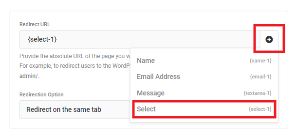
Dynamically redirecting like this also works just fine when pre-populating form field values. This means that you can redirect to different URLs based on user input, and pre-populate new forms at those URLs with data from the form they just submitted.
To follow along on the previous example, users who submitted the quote request form could be redirected to the page of the product category they’re most interested in, with their name & email address (or any other data from the form) already entered in a newsletter optin like “Want our best [category] deals delivered weekly to your inbox? Just click Yes!”
After Submission – Conditions
Under the Conditions tab, you can configure the specific conditions under which your submission behavior should be triggered.
You’ll first want to select whether All conditions should be met, or Any of them. Then click + Add Conditions to add one or more conditions for this submission behavior.
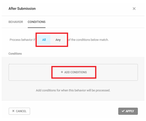
If you select All, then all conditions you set here must be satisfied for this behavior to trigger.
If you select Any, then any condition you set here will trigger this behavior. Be careful to not set duplicate conditions in multiple behaviors that are set to Any though. If you do, only the first behavior where the specific Any condition is met will be processed.
The conditions for form submissions work just like conditions for your form fields. Select the form Field that should be checked, what Condition should be satisfied, and what the field Value should be for the condition to be processed.
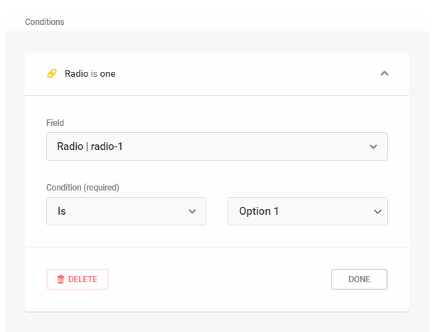
In the above example, we’ve set the condition to check whether the Value of the radio-1 field is Option 1. If it is, this condition will be processed and the submission behavior will be triggered.
Click the + Add Condition button to add as many conditions as you need for your submission behavior.
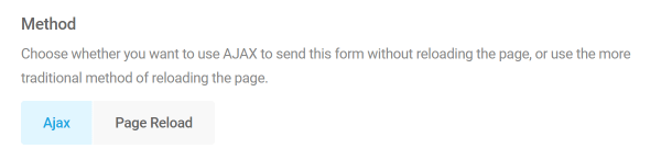
Method
Save your server resources by using AJAX for form submission. Send only one request instead of many that are needed to load the full page.
If you want to track form submissions in Google Tag Manager when using either submission method, refer to the form data not sent to GTM section.
Validation
Lets you choose your validation method.
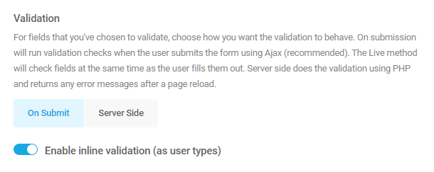
- Server only – When you click the Submit button, a request is sent to the server and validation is returned from the server via AJAX or via PHP validation on refresh. This is good if you know you have a lot of users that use outdated browsers (like IE5/IE6) or are navigating you to your form from mobile browsers that don’t support inline validation.
- On form submit – Validation happens when you click the Submit button, but the data never gets sent to the server if is it isn’t valid (this uses Javascript validation) – this should work with most browsers
- Enable inline validation – Validation happens as user types using Javascript and this might be the best option for modern browsers
Autofill
In case you need some of the fields auto-populated, you can set that up here. The autofill works on the Text, the Name, and the Email field.
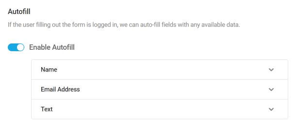
You can also make the auto-populated data editable or not.
Security
This section contains several options to help you protect your form.
Enable Honeypot Protection
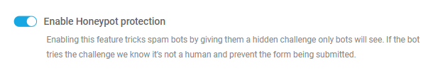
Enabling this option will trick and trap spam bots into revealing themselves by giving them a challenge that human users cannot see.
When the form is displayed in the browser it creates a hidden input. A hidden input must match the desired condition and if the condition doesn’t match, a success message such as “Form entry saved” will be sent to the bot, but the form will not be actually submitted.
Also, because the honeypot input is hidden and generated only when the form is displayed in the browser – bots will also tend to miss that and will send a request without the hidden input (which will make them fail the honeypot test).
Enable Akismet Spam Protection
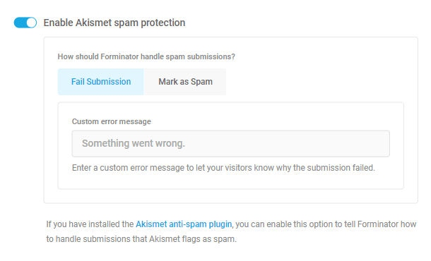
If you are using the Akismet plugin on your site, you can enable this option, and select to either fail any submissions that Akismet detects as spam, or simply mark them as spam.
Selecting the Fail Submissions option would display a customizable message to the user, and Mark as Spam would log them in your database but they would not appear in your Submissions list.
Enable Logged-In Submission Only
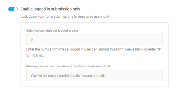
Enable this option if you want to restrict form submissions to logged-in users only.
Optionally Limit the number of times a logged-in user can submit the form, and the Message that should be displayed when a user has reached the number of allowed submissions.
Note that this option is not available here for Registration forms. For those forms, a similar option can be found in Additional Settings under the User Registration tab.
Learn more about preventing form and comment spamming on our blog.
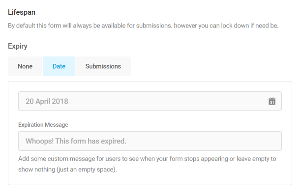
Lifespan
Configures the lifespan of your form. You can choose for it not to expire, to expire on a certain date or after a certain amount of submits.
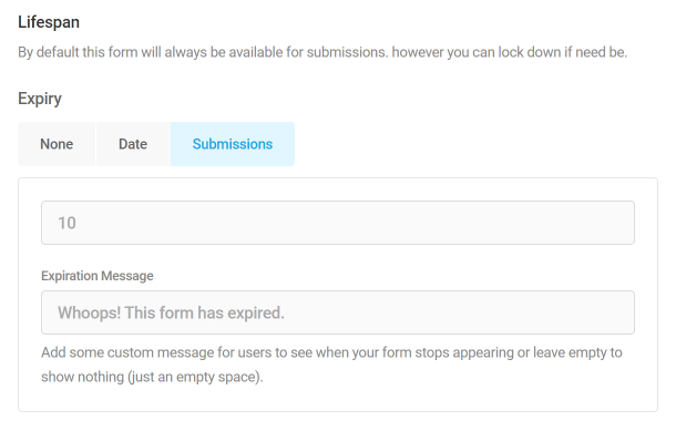
Take note that once the form expires it will not be visible on the front-end (but will be still available in the back-end).
Rendering
This lets you choose how to render your form to accommodate cache plugins that may cause issues.
Use Ajax will do just that in order to avoid any cache issues that may arise because of plugins that have Page Cache ability.
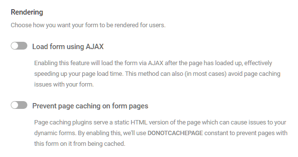
Enable Use DONOTCACHEPAGE Constant to utilize the constant in cache plugins like Hummingbird to skip page cache on the pages that contain your Forminator form.
Save and Continue
Enabling this option allows the users to save a partially completed form as a draft. Then, they can come back later to complete and submit it. This feature comes in handy when you have a long form.
On the Configuration tab, you can customize the following options:
- Draft retention period – Set the number of days a form’s draft will be stored on your server before it is deleted.
- Save form link text – Customize the save form link text.
- Resume message – Customize the Resume message text. This message is displayed after the user clicks the save form as a draft link.
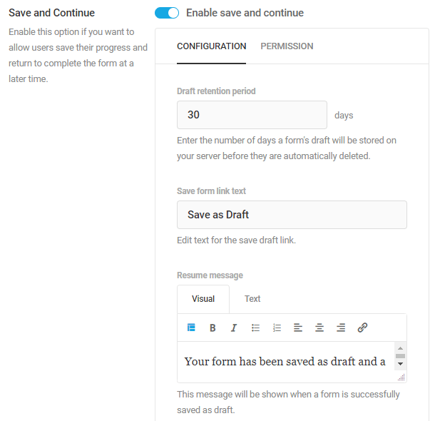
You can also enable the Allow send draft link to email option, which allows the user to send the form draft link to the email they choose. For this option, you can customize the Email input label, placeholder text, and send link button label.
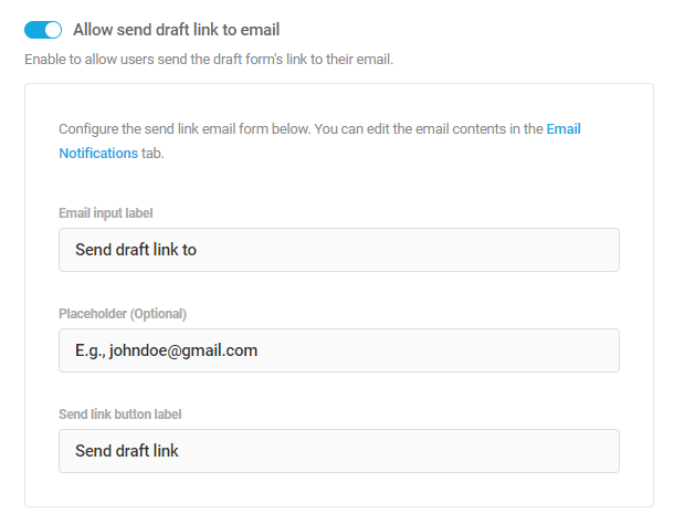
Please note that the Upload, Paypal, Stripe, Signature, Password, Consent and Captcha fields won’t be saved in the form draft.
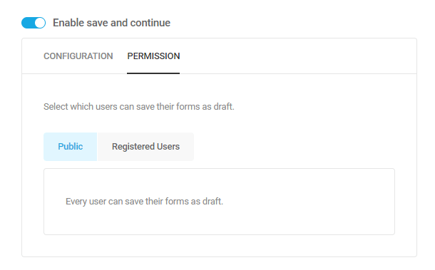
On the Permission tab, you can set the save form as a draft option available to all your site visitors by choosing Public or limit it to logged-in users only by selecting the Registered Users option.
4.2.4 PDF (Forms)
Link to chapter 2The PDF option allows you to generate an unlimited number of PDFs with your forms and form submissions, and also share the PDFs. This feature requires the PDF Generator Addon to be installed.
The Store Submissions in Database option must be enabled in the form settings for this feature to function properly. If submissions are not stored in the database, there will be no data available for the PDF generation and the form submit action will fail. This will be improved in a future update.
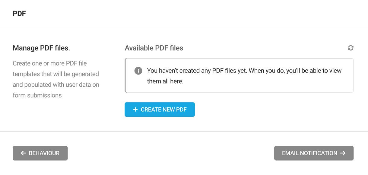
Here you can view and manage all the generated PDFs. To generate a new PDF, Click Create New PDF.
A popup will appear in which you can give the name for your PDF. Each PDF file must have a name, but changing that name later is easy. When you’ve entered a name, click Create.
From the next modal that opens up, you can select a template for your PDF.
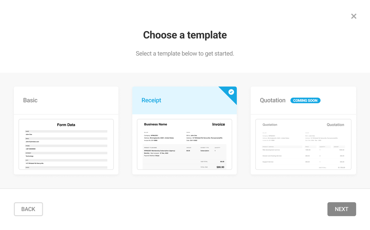
Each template has specific form fields and pre-defined layout configurations. Selecting a template will apply the chosen configuration to your PDF.
Now, click Continue.
Basic Template
If you have chosen the Basic template, in the following modal, you can choose if you want to pre-load the existing form fields in the PDF or start with a blank PDF file.
Click Create.
Receipt Template
If you have chosen the Receipt template, the Payee and Payer Details modal will open up. Note that to use the receipt template, your form must have either PayPal or Stripe payment fields.
Expand the Payee details and enter the details of the person/entity to which the amount will be paid. You can add text, list, or link and can apply bold and italics formatting. You can also insert fields from your form or any available dynamic data (by clicking on the Insert Dynamic Data button) or just type the information.
Similarly, in the Payer details field, enter the details of the person/entity that pays the amount.
In the Payment note field, add any additional instructions you need to display on the receipt.
Click Create.
Edit PDF
The PDF templates can be customized by adding or removing fields like any other form.
Click the Pencil icon in any generated PDF to edit it, the Preview icon to get a preview of the PDF, and the Trash icon to delete it. By Clicking the Pencil icon, you will be taken to the Edit PDF page.
Note: You can generate multiple PDF files for the same form.
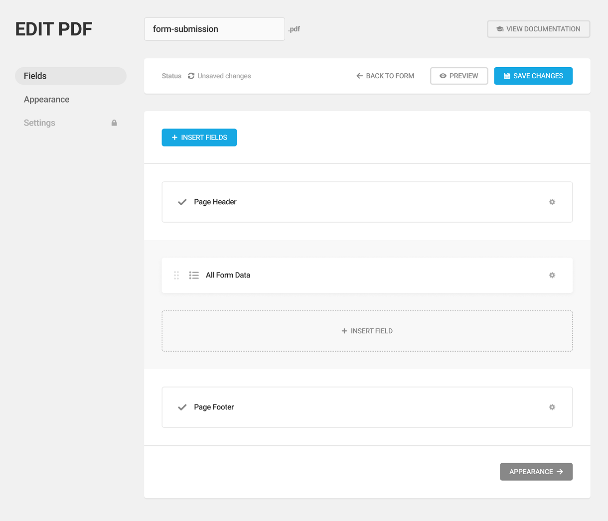
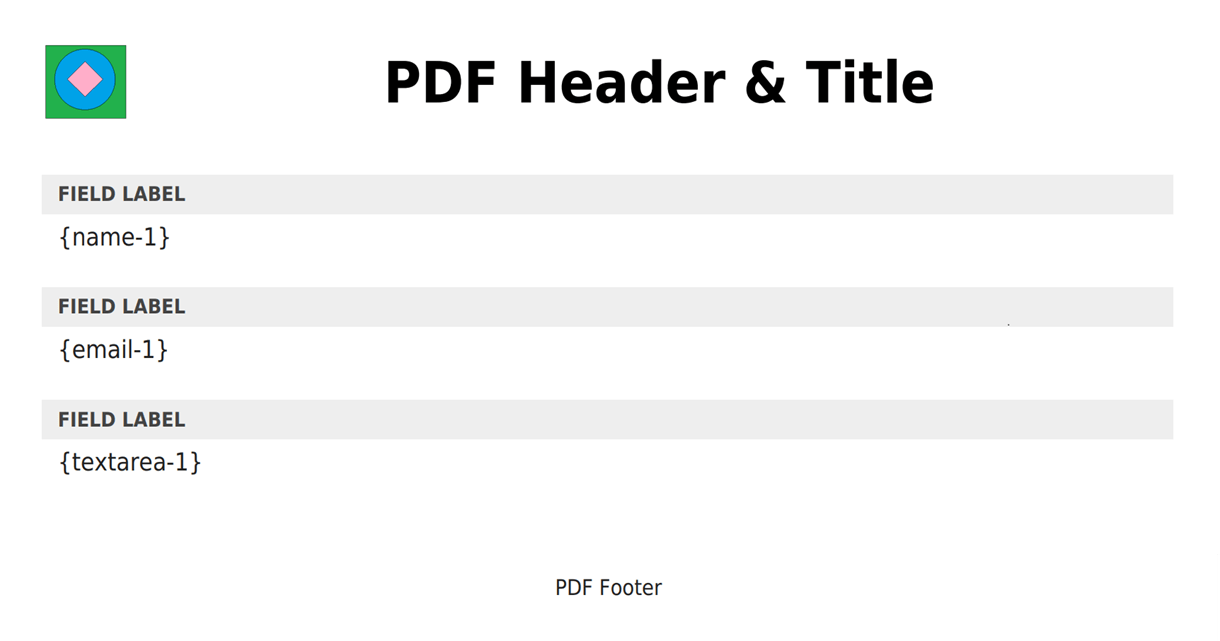
Page Header
The Page Header and Page Footer elements are static and cannot be moved. Click the gear icon to the right of the header/footer element to edit the field settings and style.
Clicking the Gear will pop up the Edit Field modal.
Under the Settings tab, you can enable or disable the PDF title and logo.
To insert a text for the logo, select the text option and type the desired logo text in the Logo Text field, or click the plus icon and select any of the available macros.
To add an image for the logo, select the image option. Select if you want to use the existing site logo for the PDF, upload a custom logo image, or add the image URL.
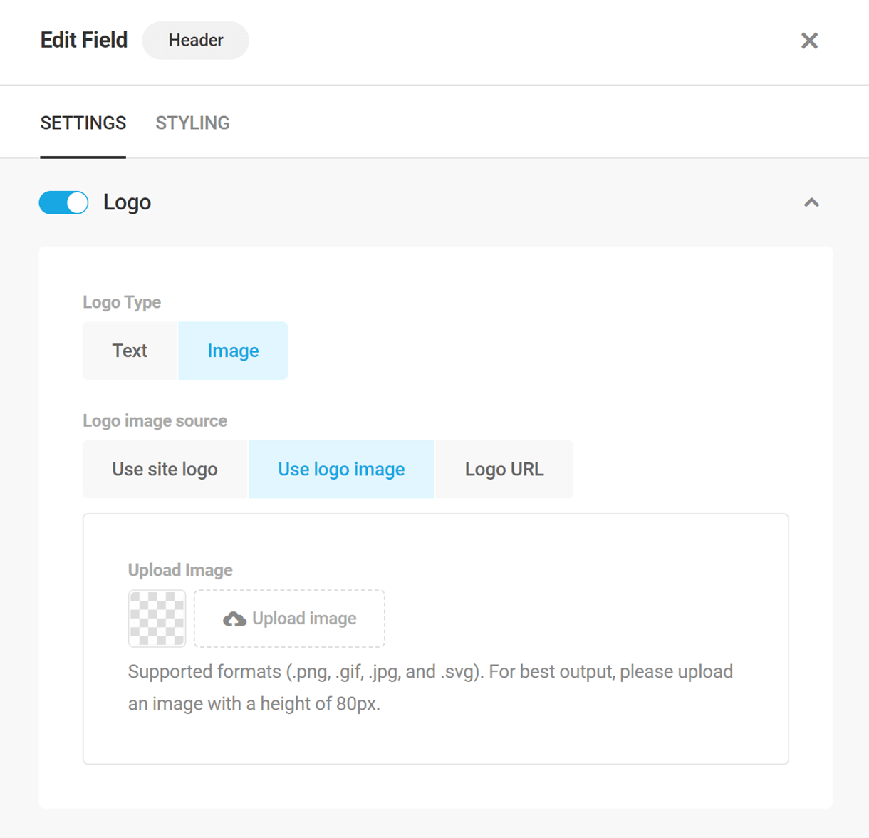
To add a title text for the PDF, expand the Title option. Enter the desired title text in the Text field or insert any of the available macros (by clicking on the Insert Dynamic macro button). Select the alignment option for the title.

You can set the Additional CSS Classes in the Styling tab of the header settings.
Specify a class in the field, so you can add custom CSS (use a space to separate multiple classes). Adding CSS classes will help you differentiate one field from another and also helps you add specific style changes to the fields individually.
Note that the custom class is applied to the main container element of the field. So if you wish to style only certain elements inside the field container, you would need to specify those elements in your custom CSS.
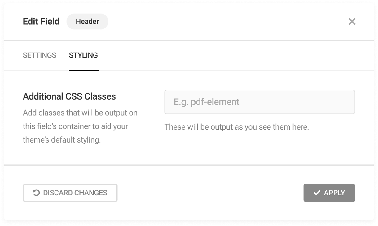
Not a CSS expert but still would like to accomplish something like this? Contact support and our experts will always be right by your side.
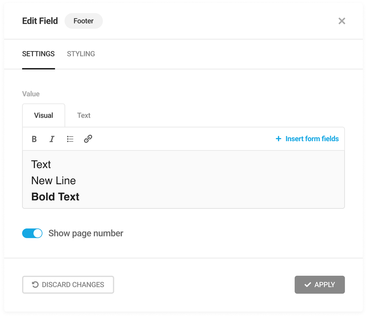
Page Footer
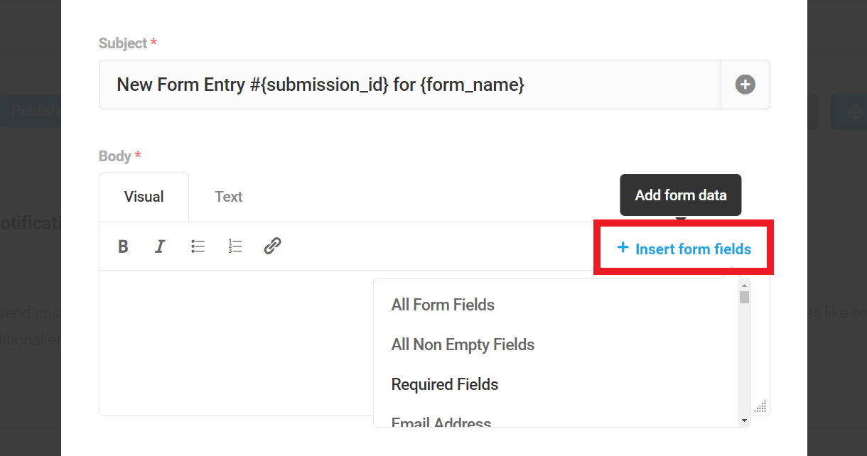
In the footer, you can add any text, list, or link and can apply bold and italics formatting. To insert any field(s) from the form, click the Insert form fields link.
Enable show page number to display the page number at the footer of the PDF
Insert Fields
You can insert certain new fields between the form header and footer. Click the Insert field to insert the following fields: Rich text, All form data, and Page break.
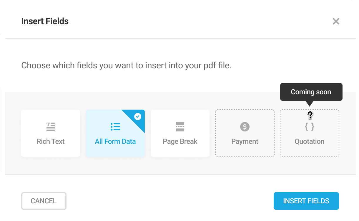
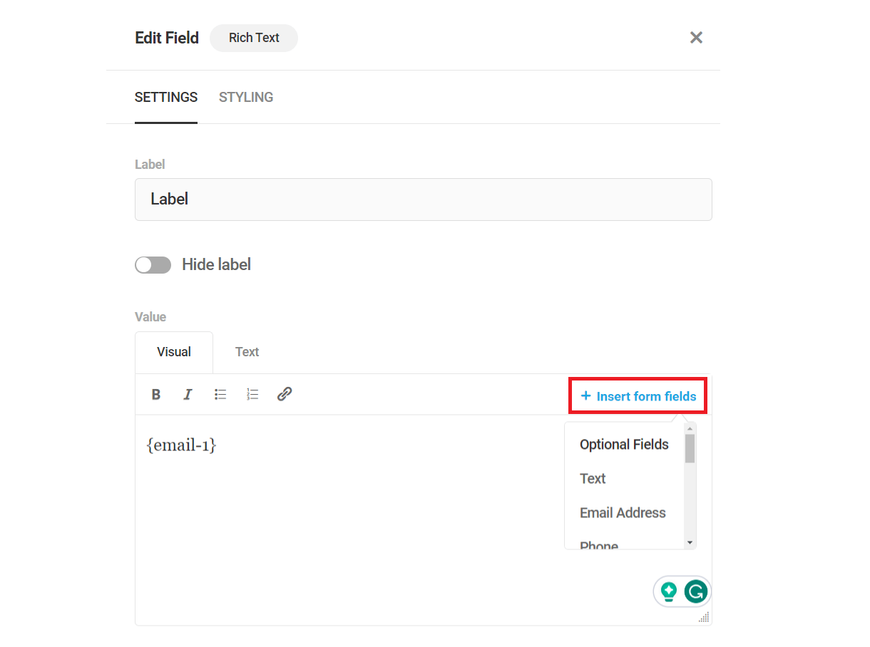
Rich Text
This field inserts a rich text editor into the PDF. Just like the footer text, you can add any text, an unordered list, or a link and can apply the bold and italics formatting.
To insert any field(s) from the form, click the Insert form fields link and select the form field(s) you want to insert in the PDF.
Label – Specify the field label. Toggle the hide label switch on to hide the field label.
All Form Data
Inserting this field will include all the fields currently present in the form in the PDF.
Show/Hide Input – Select if you need to show or hide the input labels of the form fields.
Form field exclusion – Here you can specify the form fields that you don’t want to display in the PDF. Click the Insert form fields link and select the form fields you want to exclude or you can also type in the input field.
Note: Any changes made to form fields after creating PDF template(s) will not get reflected in the existing PDF template(s) if the “All form data” field is not present. You need to either create a new PDF template or insert the “All form data” field to an existing template after updating form fields to view the changes in the PDF(s).
Page Break
Insert this to add a page break in the PDF and make it look more organized and visually structured.
Appearance
With the appearance options, you can configure the look and the layout of the PDFs.
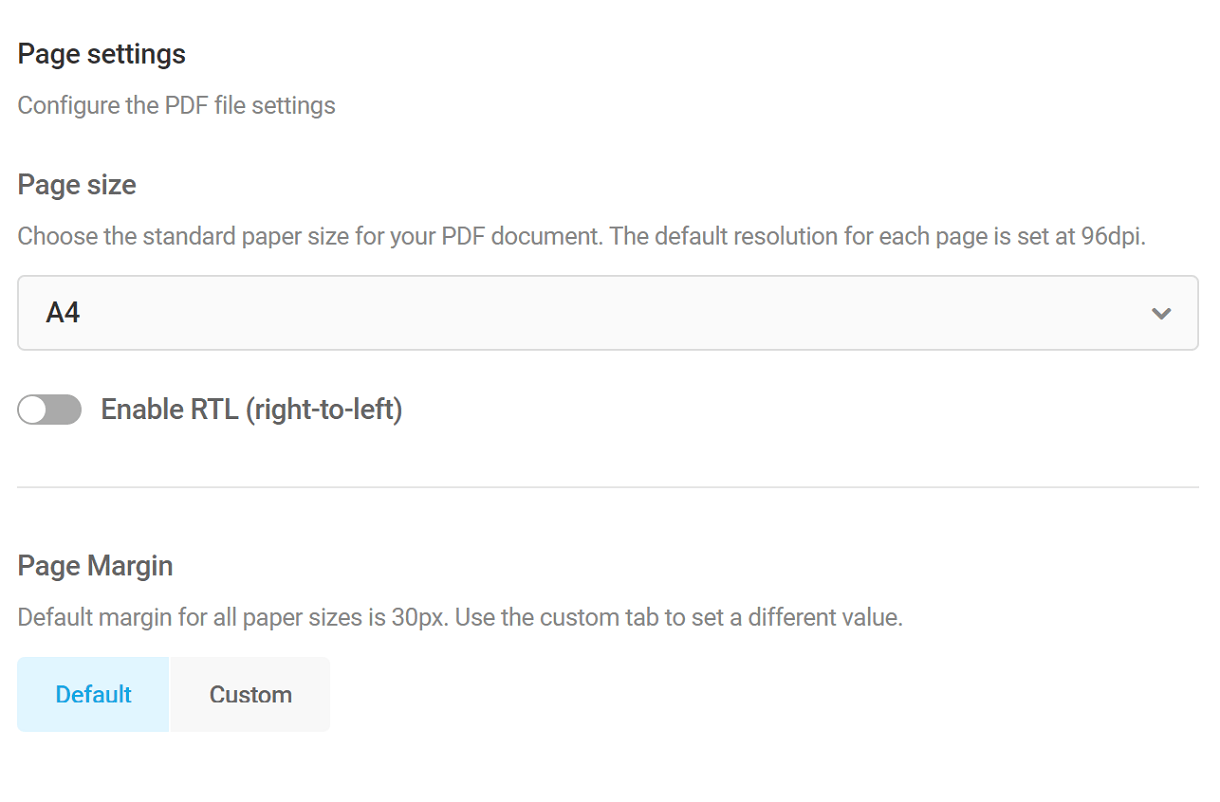
Page Settings
Page Size – Set the page size of the PDFs using the drop-down. The recommended default is A4
Enable RTL – If the RTL option is enabled, the direction of the text in the PDF will be from Right to Left.
Page Margin – The default page margin is set to 30px. You can set it to a different value under the custom tab.
Custom CSS
Enable the Custom CSS option if you’d like to customize the appearance of your PDF beyond what is available with the built-in options above.
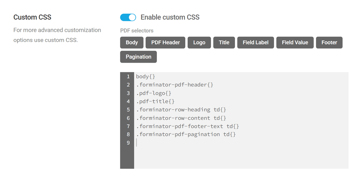
The PDF Generator add-on uses the mPDF library to generate PDF files. While this library supports most CSS properties & values, there are some limitations. See the Supported CSS chapter in the mPDF library documentation for more information.
You’ll notice that there are some buttons here that enable you to automatically add basic CSS selectors, simply by clicking the corresponding button. You can also manually enter the CSS you need to target any elements.
- Body – body{}
- PDF Header – .forminator-pdf-header{}
- Logo – .pdf-logo{}
- Title – .pdf-title{}
- Field Label – .forminator-row-heading td{}
- Field Value – .forminator-row-content td{}
- Footer – .forminator-pdf-footer-text td{}
- Pagination – .forminator-pdf-pagination td{}
The image below illustrates which elements would be affected by the basic selectors.
If your website is in a language other than English and the PDF generator produces unreadable text, you will need to upload the appropriate font files to Forminator.
1. Go to https://github.com/mpdf/mpdf/tree/v8.2.4/ttfonts.
2. Download the font files corresponding to the language translation.
3. Upload the font files.
The file upload path depends on the option selected in Forminator > Settings> File Upload Storage. The default path is [SITE_URL]/wp-content/uploads/forminator/ttfonts.
If you’ve chosen the custom option, the path will be the specified custom directory: [SITE_URL]/wp-content/uploads/[SPECIFIED_CUSTOM_DIRECTORY]/ttfonts.
Publishing a form
When you create or edit a PDF, you’ll have the option to save your progress as a Draft. Once the PDF is created, you’ll be able to Unpublish or Update it after making changes.
Download PDF on form submission
For forms with PDF template(s), if submissions are made, then you will get the option to download the PDFs of the submission on the Submissions page. If there is more than one PDF template available for a single form, you can either download the form submission PDF of each template separately or the PDFs of all the templates as a single zip file.

Note: There are no restrictions on the number of PDFs you can download.
4.2.5 Email Notifications (Forms)
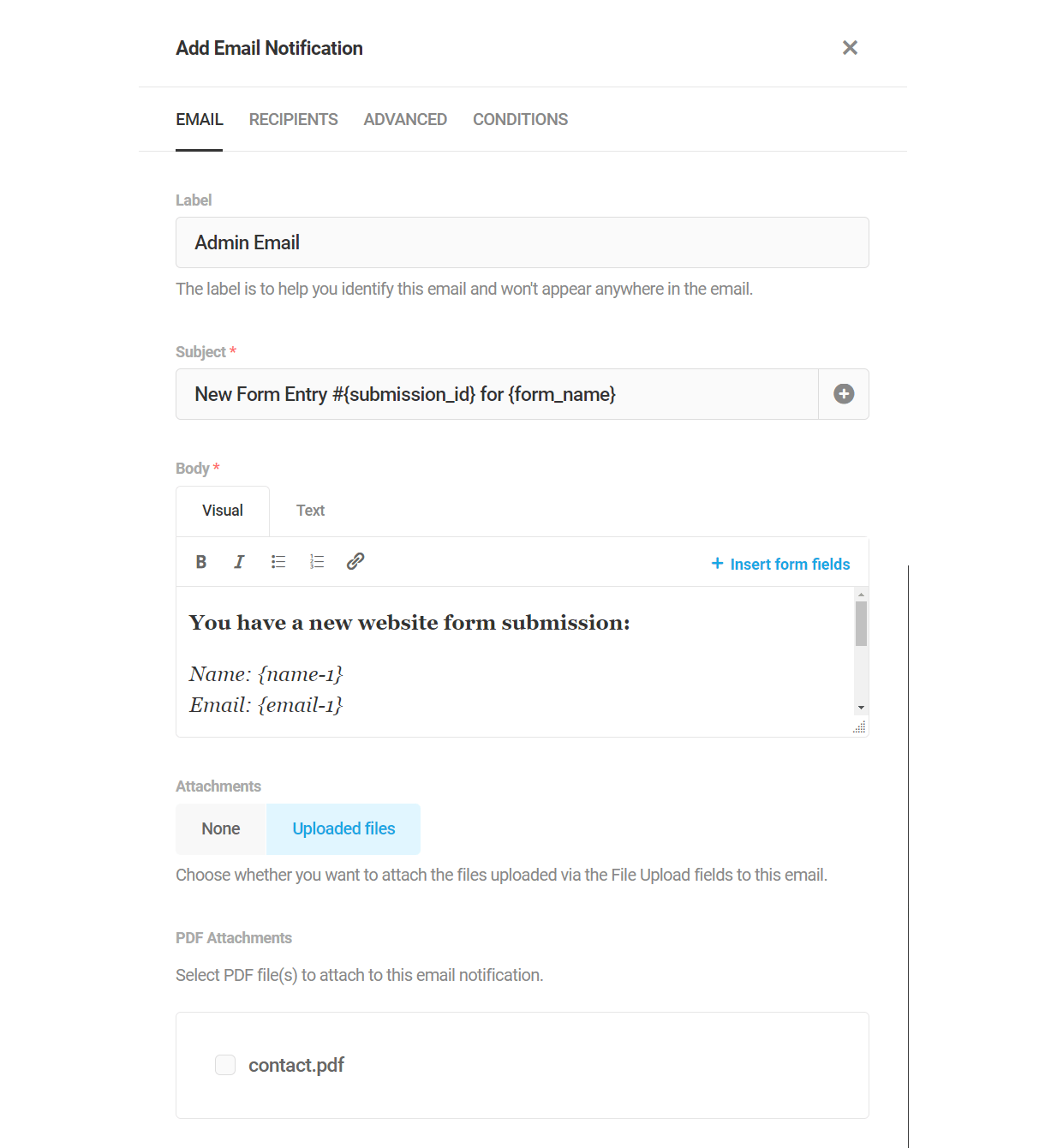
Link to chapter 2Email notifications can be configured in the form’s Email Notification tab, enabling custom emails to be sent to admins or users upon form submission, with emails routed based on form data. By default, an Admin Email notification is added when a form is created, though it can be edited or deleted as desired.
To add an email notification, click Add Email Notification.

Form Data
Form data can be included in your notification email subject and body, as well as in various other text fields, through the use of merge tags.
Merge tags can be inserted for any required or optional fields in the form in addition to the following pieces of form data:
- Form Name – Use the {form_name} merge tag
- All Form Fields – {all_fields}
- All Non Empty Fields – {all_non_empty_fields}
- Submission ID – {submission_id}
- User IP Address – {user_ip}
- Date (mm/dd/yyyy) – {date_mdy}
- Date (dd/mm/yyyy) – {date_dmy}
- Submission Date (mm/dd/yyyy) – {submission_date_mdy}
- Submission Date (dd/mm/yyyy) – {submission_date_dmy}
- Submission Time (hh:mm:ss am/pm, timezone) – {submission_time}
- Embed Post/Page ID – {embed_id}
- Embed Post/Page Title – {embed_title}
- Embed URL – {embed_url}
- HTTP User Agent – {user_agent}
- HTTP Refer URL – {refer_url}
- User ID – {user_id}
- User Display Name – {user_name}
- User Email – {user_email}
- User Login – {user_login}
- Custom Value – {custom_value}
- Query Parameter – {query} – Please ignore this tag as it serves no purpose for emails and will be removed from these options shortly.
- Mode – {payment_mode} Mode of payment when Stripe is used
- Status – {payment_status} Status of the payment when Stripe is used
- Transaction ID – {transaction_id} ID of the Stripe payment transaction done
- Subscription ID – {subscription_id} ID of the Stripe subscription done
- Site Title – {site_title} The site title as set in wp-admin > Settings > General.
- Site URL – {site_url} The URL of the site homepage.
Where supported, click any [+] icon or +Insert form fields link to select and insert available merge tags. Alternatively, you can type out the merge tag directly.
For example, the following subject line includes the merge tags {submission_id} and {form_name}, representing the ID of the form submission and the name of your form respectively:
New Form Entry #{submission_id} for {form_name}
Accordingly, an email notification sent upon form submission would read as “New Form Entry #12 for My Form”.
Similarly, let’s say you’re using Name and/or Address fields set to Multiple in your form. You could use the specific fields you need to really personalize email notifications to your users. For example, a subject line could include the user’s first name only, with a welcome to users from their country in the message body.
Welcome {name-1-first-name}!
It's always nice to see people from {address-1-country}.
You can also use standard HTML tags in the email body when editing in Text mode. However, just like when editing regular WordPress posts, some tags may be stripped out if you switch to Visual mode.
If you would like email notifications to include all submitted form data, use the {all_fields} merge tag. To include only non-empty form fields, use the {all_non_empty_fields} merge tag.
Email Tab
- Label – The label you set here only appears internally and does not show up anywhere in the email itself.
- Subject – The subject line is what appears in email clients like Gmail as the email subject, so that’s what your users see in their inbox before they open the email.
- Body – The body is where you compose the email message itself.
- Attachments – If your form includes one or more File Upload fields, you can choose to include the uploaded files as attachments in the email.
- PDF Attachments – If your form has one or more PDF templates, you can choose to include them as attachments in the email.
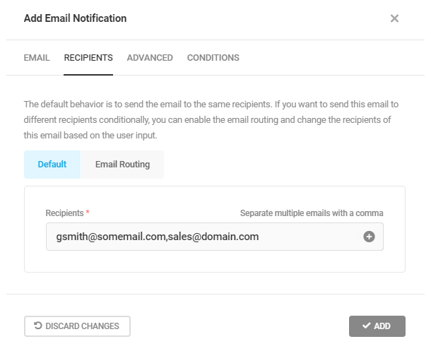
Recipients Tab
Default
The default behavior is to send the notification for every form submission to the same recipients. You can add as many recipients as you like, separating each address with a comma. Simply enter the recipients’ email addresses in the Recipients field and click the Add button to save.
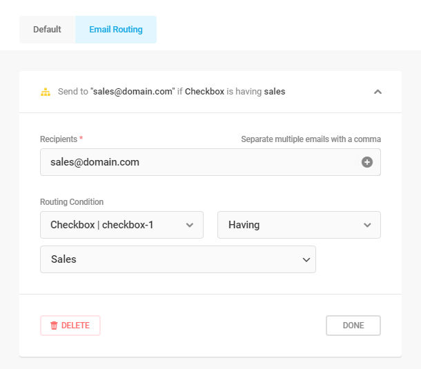
Email Routing
Email routing enables you to send notifications to different recipients conditionally based on user input in your form. For each recipient, set up conditions just like you would do for conditional display of form fields. You can set up as many recipients as you need with different conditions for each.
The image below shows an example of a condition set to send the email to [email protected] if the the user has selected the Sales option for a field called checkbox-1 in the form.
Advanced Tab
The options under this tab enable you to customize the from name, from email and reply-to email, as well as any CC or BCC addresses you wish to send to.
You can either manually enter the needed info in each field, or click the [+] sign to the right of each one to reveal shortcuts that, when clicked, automatically insert the corresponding merge tag in the field.

The options here cannot override the From Name or From Email if you have SMTP set up for your domain emails (using our Branda plugin or other plugin/method), or if your host has preconfigured these settings.
Conditions Tab
In addition to conditionally routing emails to different addresses, you can even set up rules to send emails only if certain conditions are met. Again, this is set up exactly the same way as the conditional display of form fields.
The image below shows an example of a condition set to send an email only if the user has selected the I would like a reply option for a field called checkbox-2 in the form.
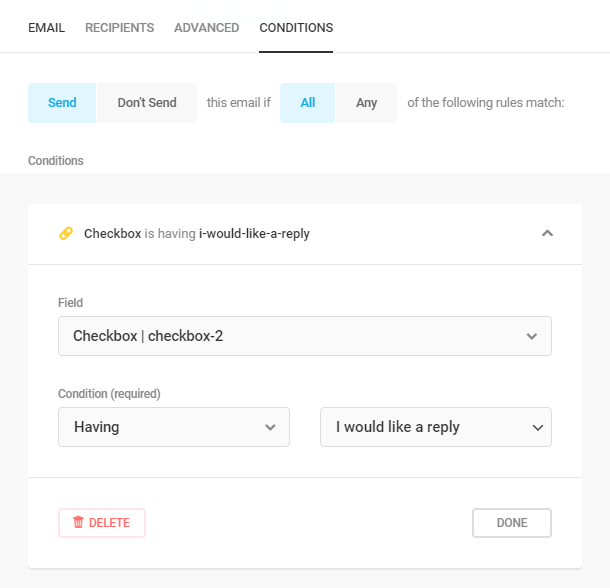
Using the Conditions here and the Email Routing option under the Recipients tab can be a powerful combination, enabling you to trigger emails and send them to different departments in your organization all based on user input.
4.2.6 Integrations (Forms)
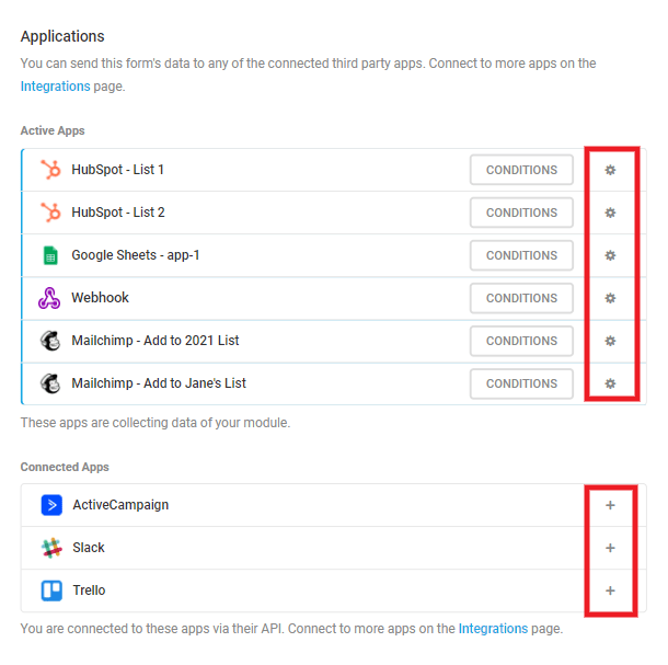
Link to chapter 2Connect your third-party app accounts and send data to your favorite apps. Our integrations module makes this easy and you’ll be up and running in no time.
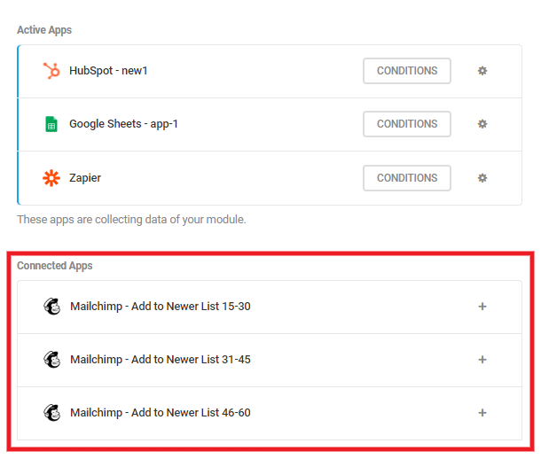
You can connect as many apps as you need, and as many instances of each app, to any form. You can also send your form data to different lists of the same app, or assign different groups/tags in the same list, depending on user input in your form (see Sending Data Conditionally and the full MailChimp example below).
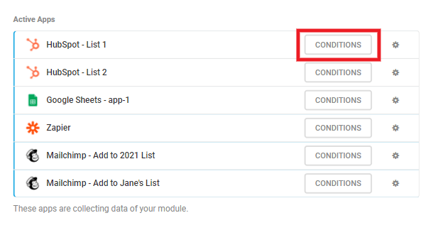
Once you have configured the app accounts you want, they will appear in the Connected Apps section under the Integrations tab of every form. Connect any app to that specific form by clicking the [+] icon in its row.
They will then appear in the Active Apps section where you can click the gear icon if you need to adjust that app’s settings afterwards.
To see how to configure these integrations follow the links here:
Sending Data Conditionally
As noted above, you can have as many instances of each app as you want connected to a form, and you can send data conditionally to any connected app depending on user input in the form.
The conditional logic feature here works similarly to when setting up Visibility Conditions for a form field.
Once you have your app connected, click the Conditions button in that app’s row.
That will pop open a modal window where you’ll first want to select whether you want to Send data or Don’t Send data when your conditions are met. Then select whether All or Any of your conditions should be met.
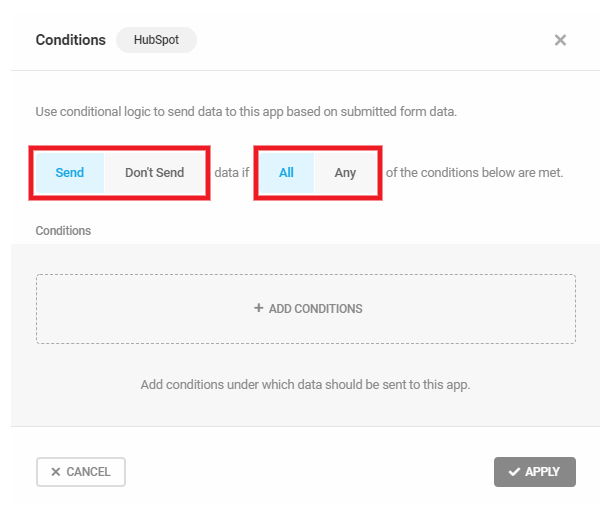
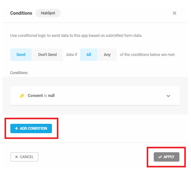
Next, click the + Add Conditions button to define under which conditions you want the Send/Don’t Send action to be triggered.

You can select any available field from your form to use as a condition. For each field you want to use, you’ll set the Condition and the Value or Option it should contain for that condition to be applied.
For example, let’s say you want to send data to your connected Hubspot list only if the user selects Canada in a Country field in your form. You’d select your Country field here, set Is as the Condition, and select Canada as the option.
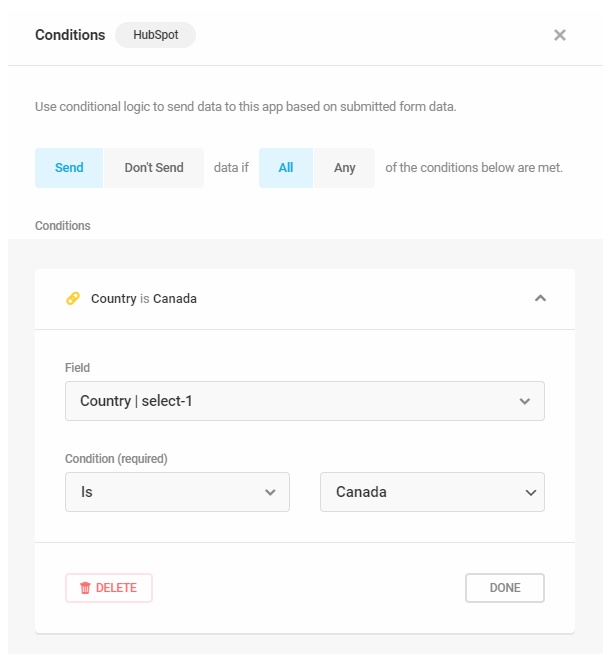
Click the + Add Condition button for any additional conditions you want to add. Once you’re done, click the Apply button.
Sending Data Conditionally – MailChimp Example
This walkthrough will help you configure your MailChimp integration to add contacts to different groups and/or add different tags depending on user input in your form.
If you’ve never set up MailChimp integration in Forminator, you’ll want to first review that chapter below. You can use this example as a guide for setting up a similar configuration with any other integration.
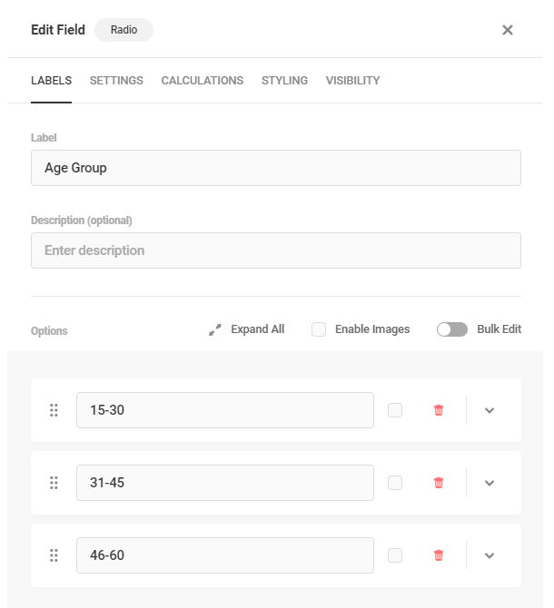
In this example, we’ll use a simple form where the user selects which of 3 age groups they belong to.
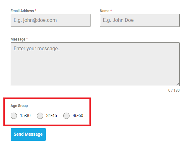
Then depending on their selection, they get added to the corresponding age group in the MailChimp audience, with a similar tag added as well.
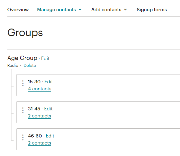
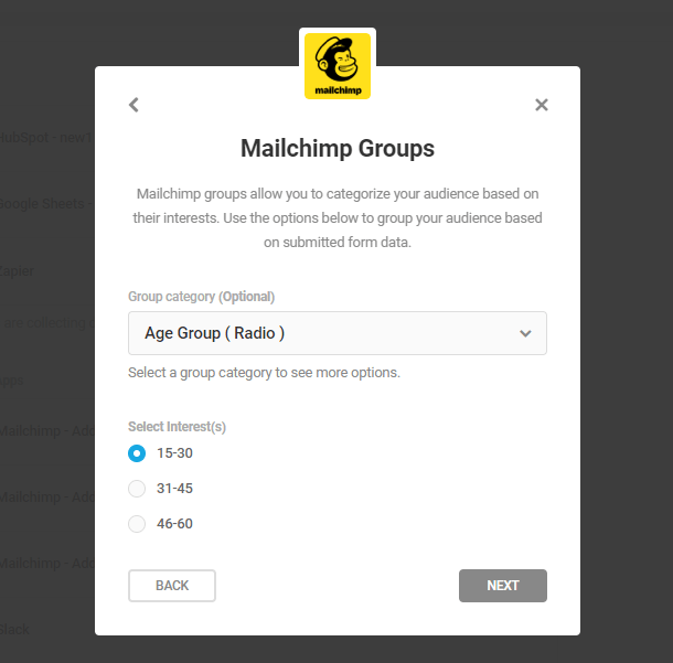
You’ll first want to ensure that you have created a group in your MailChimp account with the 3 age groups being used in your Forminator form. In this example, we set up a radio group, but you can use any type that suits your project. You can omit this step if you only need tags as below.
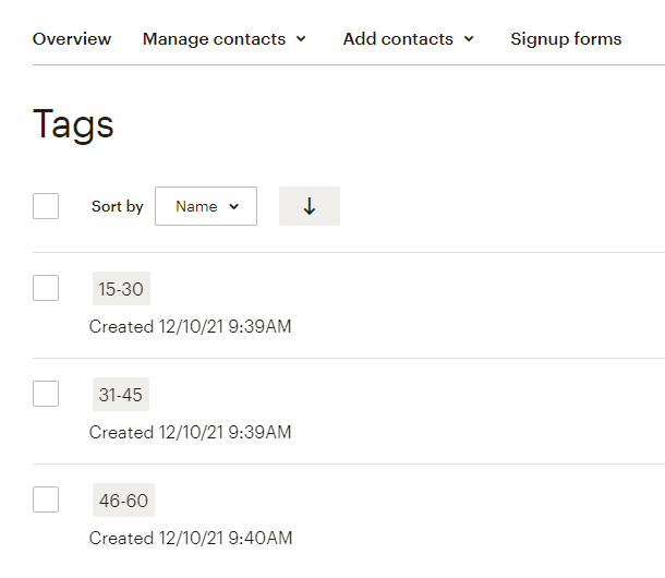
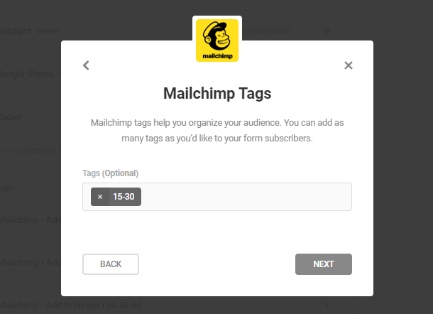
You’ll then set up some tags as well in your MailChimp audience. You can of course omit this step if you only need groups as above.
Next, back in your site admin, add a radio field to your Forminator form with the desired options. You can of course use checkboxes or a select field for this if you prefer.
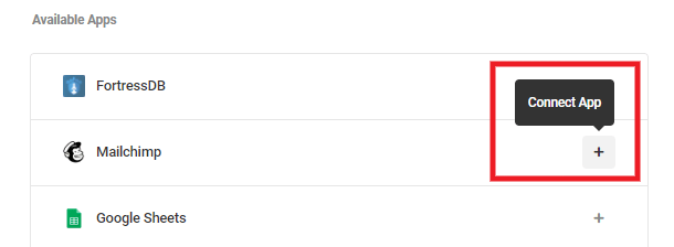
Now that you have the groups and/or tags set up in your MailChimp audience and the radio, checkboxes or select field added to your form, head on over to Forminator > Integrations. You’ll want to set up 3 MailChimp integrations and give each one a different name so you can recognize them later.
To get that done, click the + icon next to MailChimp in the Available Apps section.
In the modal window that pops open, add your MailChimp API Key and give your integration an easy-to-recognize name as its Identifier, and click Save.
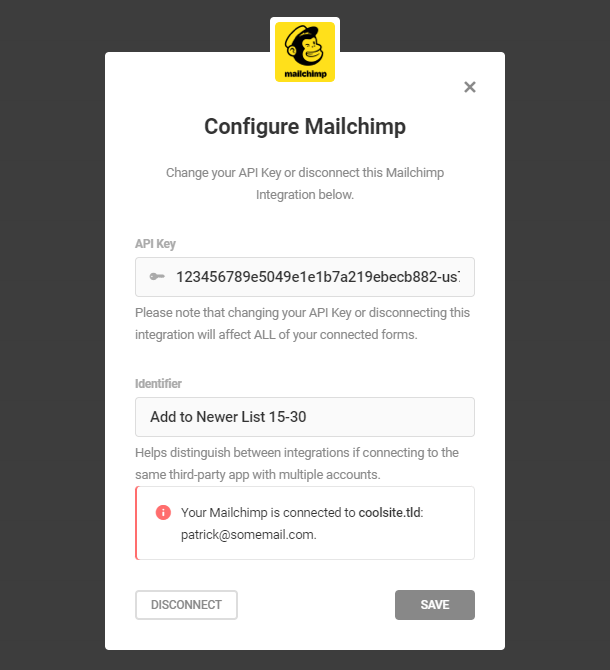
Repeat that 2 more times so you have 3 MailChimp integrations set up, each with a unique Identifier.
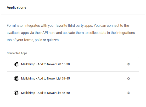
Now head on over to the Integrations tab of the form where you added the Age Group radio field, and you’ll see the 3 MailChimp integrations you just set up in the Connected Apps section there.
Click the + icon next to the first one. In the modal window that pops open, select the Audience you added the groups & tags to. Then in the next steps, select the tag(s) and/or group(s) you want to add to the contact when a user submits your form.
In this example setup, we want to add the contact to the age group they select in our form, and also add the tag corresponding to that same age group, so we’d select both.
In the final step, you’ll map your form fields to your MailChimp fields as usual.
Then repeat the previous steps to connect the other 2, ensuring you select the appropriate age group and/or tag in each one. You’ll then see all 3 of your MailChimp apps now in the Active Apps section.
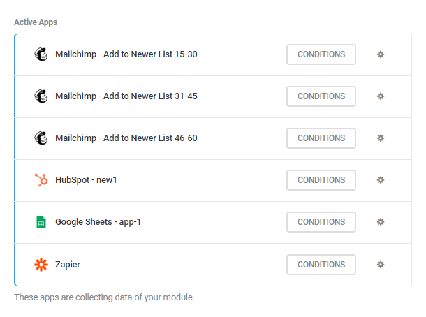
The final step is to set up the conditions so each one only sends data according to the age group the user selects in the form.
Click the Conditions button next to the first MailChimp active app. Then, following the directions in Sending Data Conditionally above, select the value of the radio field in your form that corresponds to the group and/or tag you want to add the contact to in your MailChimp list.
In our example, we want to add to the 15-30 age group if a user selects the 15-30 option in the form. So the condition we’d add to the 1st app is to Send if the Age Group is 15-30. Click the Apply button to save that condition.
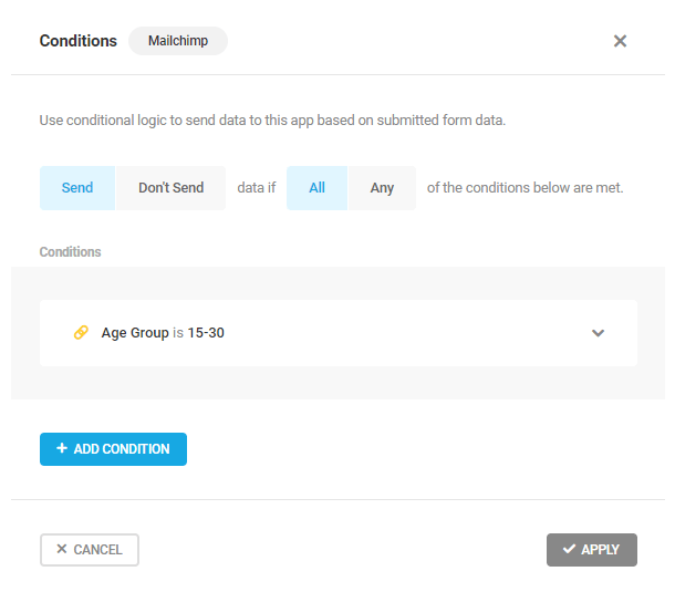
Repeat that for each of the other 2 MailChimp apps, ensuring you select the radio option in each one that corresponds to the age group and/or tag you want to add the contact to.
You’ll then see a yellow icon appear next to each active MailChimp app. Hover your mouse over that icon to reveal a tooltip that indicates the condition(s) you set for that app.

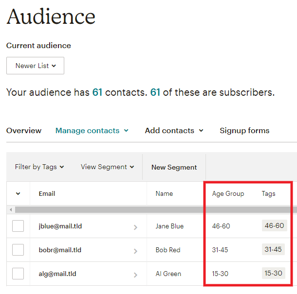
Now when a user selects an age group in your form, they’ll be added to the selected Age Group in your MailChimp Audience, with the corresponding tag added as well.
You can use that in your MailChimp account to create segments and send different newsletters to the different age groups, or any other automation that you see fit.
4.2.7 Settings (Forms)
Link to chapter 2Settings allows you to customize how the data for your form is stored.
Data Storage
In cases where you don’t want to store the forms data on your server, you can choose to Disable store submissions in my database.

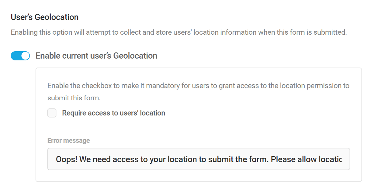
Geolocation
If you want to collect the location information of the users who submit the form(s) on your site, you can enable the geolocation feature.
Enable the “Require access to users’ location” checkbox if you want the users to mandatorily provide access to their location before submitting a form.
In the “Error message” field enter the custom error message that should be displayed if the user’s location access is not enabled.
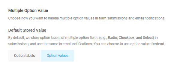
Multiple Option Value
By default, we use the labels of multiple option fields (Radio, Checkbox, and Select) in form submissions and in email notifications.
If you prefer to use the option values instead, click the Option Values button here.
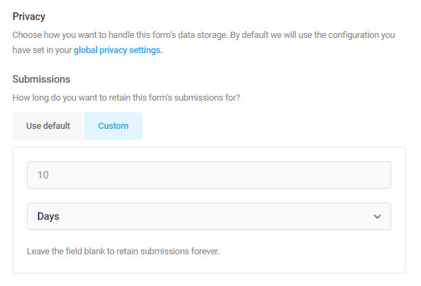
Privacy
Submissions
Forms collect a lot of sensitive information. In the privacy section, you have the option of auto deleting form submissions once they reach a certain age.
You can set the number of days, weeks, months or years. Once a form entry reaches the date you specify, it will be deleted.
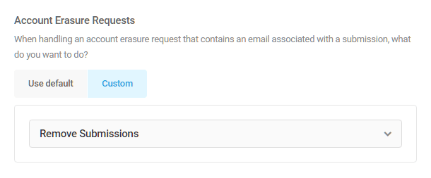
Account Erasure Requests
Here you can choose what will happen to the submission of a user you are deleting from your site (by using Tools/Erase personal data) if the submission contains an email address associated with that user.
- Retain submissions – will leave all submissions of that user intact.
- Remove submissions – will remove all submission from the user you deleted from your site.
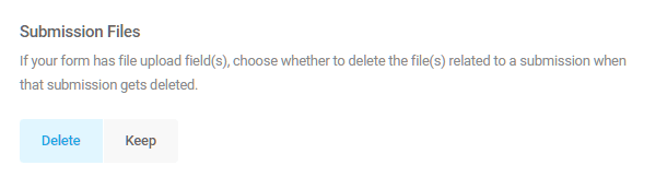
Submission Files
Choose whether to keep or delete any files related to a submission when the submission gets deleted.
4.2.8 Form Preview
Link to chapter 2One of the most useful Forminator features in the admin is the live preview.
Not only can you see the form fields, including how your conditional rules are operating, but you can also view the changes you make to your forms appearance.
If you make changes to your form’s design style, colors, fonts, form container, etc. you can use the preview mode to see the outcome.
For example, here we see a live preview of the difference between two built-in layout styles.
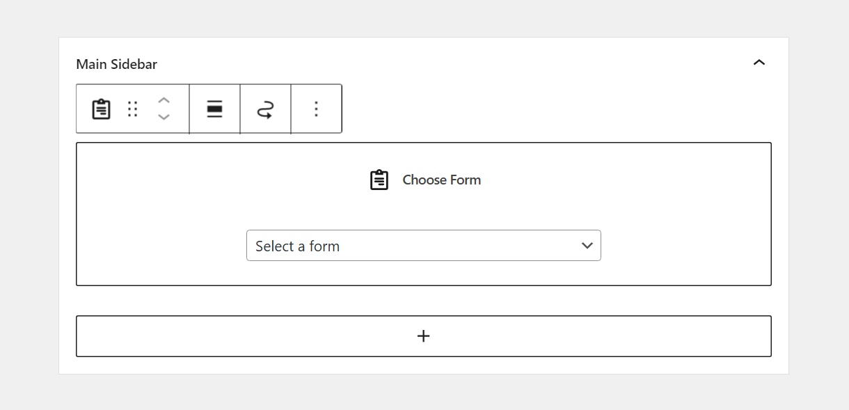
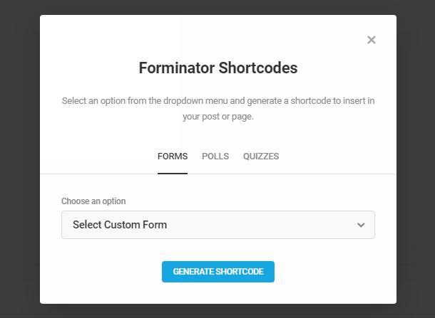
4.2.9 Embedding Forms
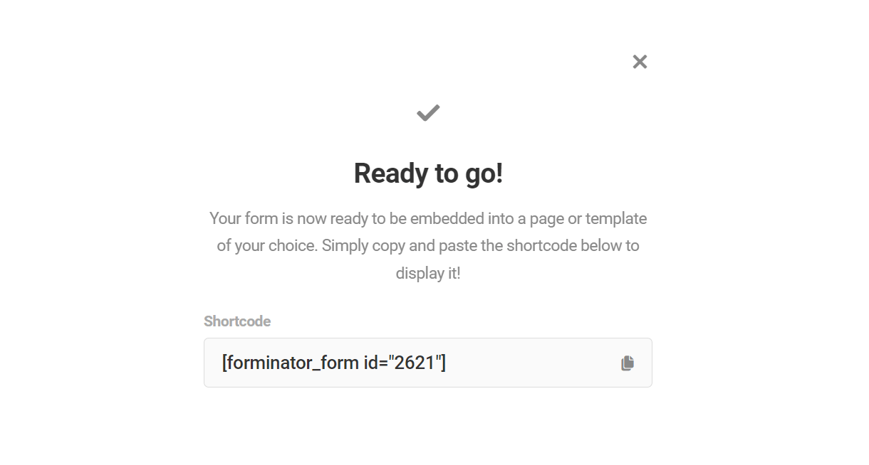
Link to chapter 2Each form comes with a shortcode which you can use to embed your form anywhere on your site where shortcodes can be used: pages, posts, widgets, etc.
Any time you click the Publish button for a form in the form editor, a modal will pop open to show you the shortcode for that form.
To get the shortcode for any form after having published it, go to the Forminator Forms page. Find the form you’d like to use and select the gear icon to open the settings dropdown for the form.
Select Copy Shortcode, which will automatically add the shortcode to your clipboard so you can paste it anywhere.
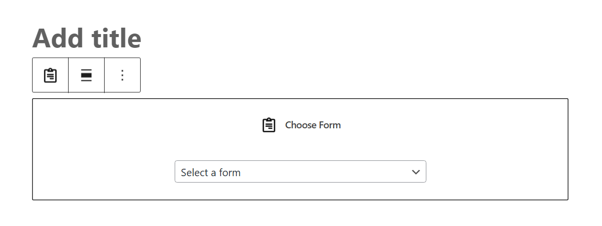
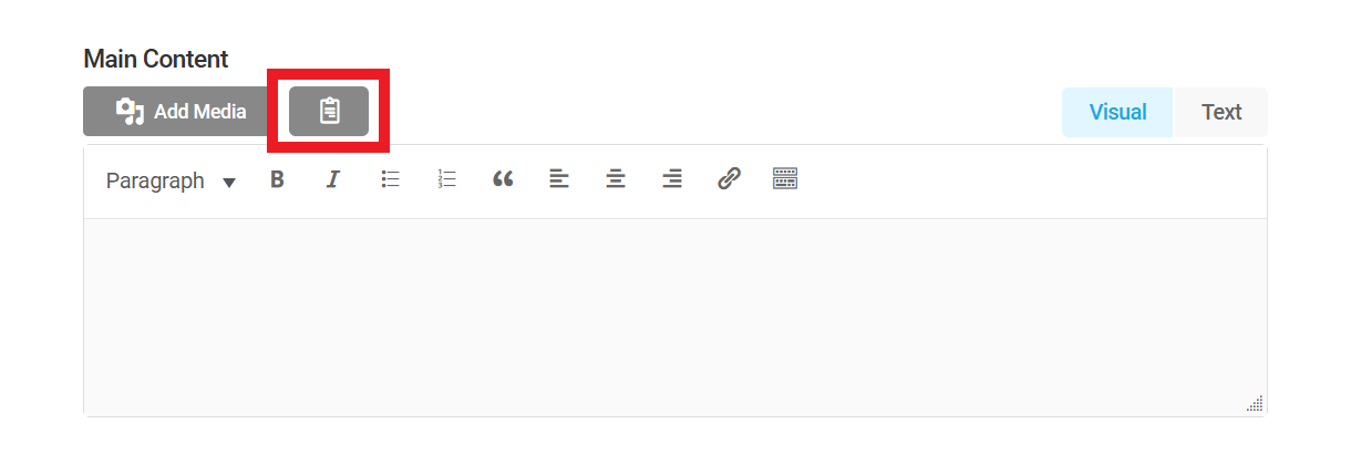
You can also add a form to your post while in the WordPress editor. Click the [+] icon to add a new block, and find the Form block.
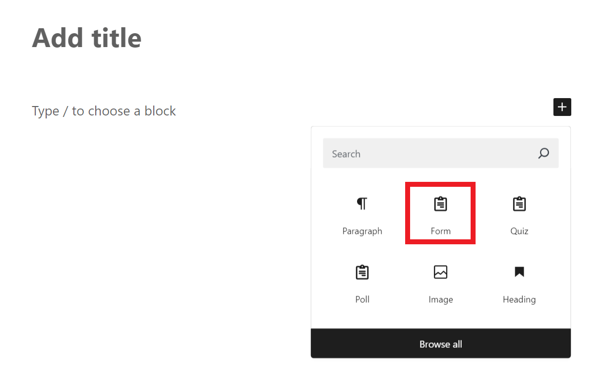
Once the block is added, select the form you want to embed in the post.
In case you want to present your form in a Widget, navigate to Appearance > Widgets. Choose the widget area you want to add your form into, click the [+] icon to add a new block, and find the Form block.
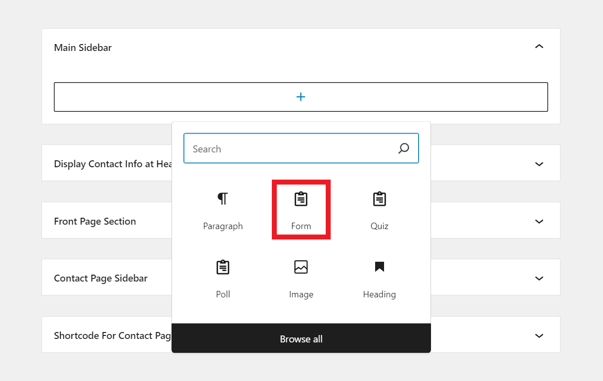
Once the block is added, select the form you want to embed in the widget area.
Once the form is embedded on the front-end, you’ll see a handy Edit link there when logged in as administrator. Clicking that link will redirect you to the edit screen for that specific form.
How to display a form in Hustle
If you’re using WPMU DEV’s Hustle plugin to create marketing embed modules, slide-ins and pop-ups, you can add Forminator forms to the main content area.
You’ll first want to create your Forminator form, then select the embed, slide-in or pop-up module in Hustle where you want to add the form.
In the main content area of your Hustle module, click the Form icon (same as the one in the Classic editor for any post or page).
From there, you’ll be able to choose a form, poll or quiz to add to your Hustle embed box.
4.2.10 Registration and Login Forms
Link to chapter 2Registration and Login forms are two special form types, so we’ve developed a template for each with key field behaviors built-in. See the video below for a walk-through of using Forminator to create a Registration and Login Page, featuring these two special form types.
This section covers only those fields which are unique to the Registration and Login templates:
- Password field – A specially-designed field that, depending on its configuration, allows/requires users to create a password-protected account with the site.
- User Registration tab – A unique tab only available in the Registration Form template containing the options that govern user account creation.
Forminator’s Registration and Login forms are designed to allow you to place those forms anywhere on a site, and do not automatically replace the default WordPress screens. If you wish to customize the default screens, consider using our Branda plugin.
Registration Template
Click the Create button, and when prompted, select the Registration template and click Continue.
To prevent abuse by unauthorized users, only those with administrator or superadmin role can create or edit registration forms made with Forminator.
Name the form and click Create.
Password Field
The password field is unique to this template. To customize the password field, click the gear icon to expand the drop-down menu and click Edit Field.
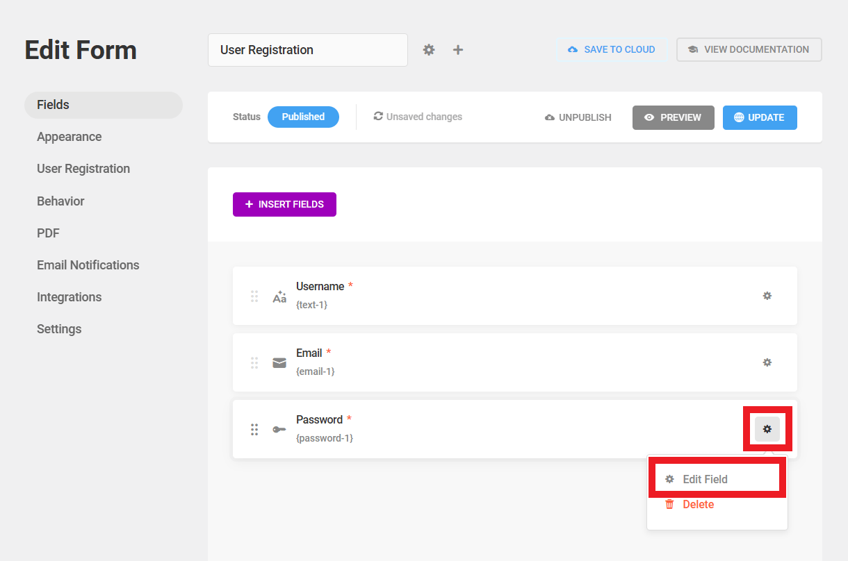
Click the Settings tab.
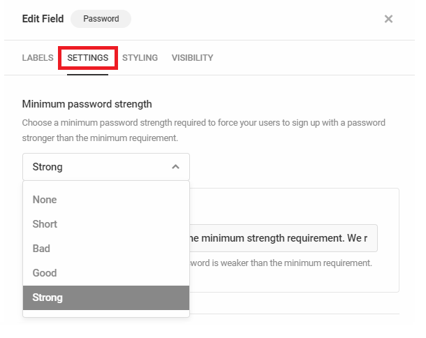
Minimum password strength
This setting controls the minimum password strength required for the registration form to be accepted.
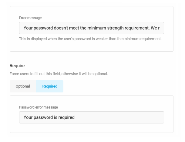
Custom error messages
Use the fields provided to create custom error messages when users submit inadequate passwords or fail to enter a password at all.
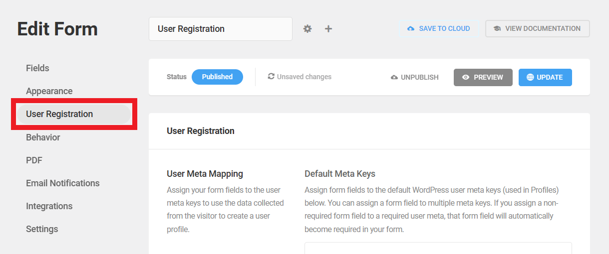
User Registration Tab
Click the User Registration tab to see the following configuration options:
- User Meta Mapping – Map default WordPress user meta keys to specific fields in your form.
- User Account Activation – Options governing how accounts are created and how users are notified.
- Additional Settings – There options determine login page behavior following account creation.
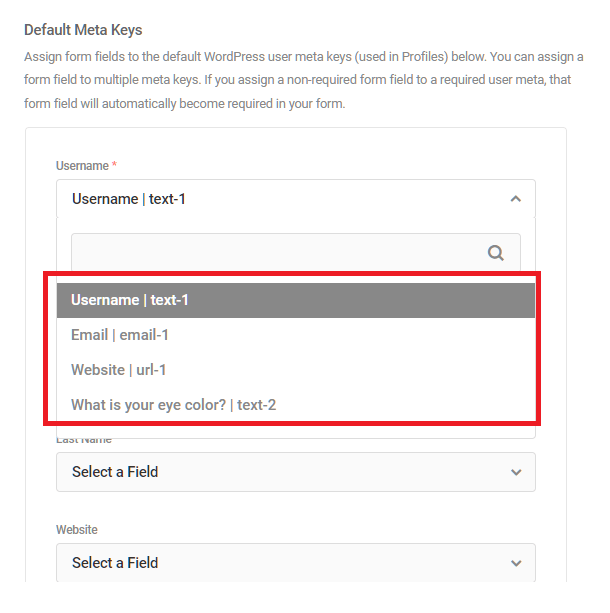
User Meta Mapping
The WordPress usermeta table was created to allow sites to expand the stored data associated with its registered users. Mapping meta keys to form fields allows admins to customize what user data is collected and how the data is stored by WordPress.
Default Meta Keys
Forminator makes the following default user meta keys available:
- Username
- First Name
- Last Name
- Website
- Password
- Role
Click any field to access a drop-down menu showing the fields from the current form and their respective meta keys. Selecting a field will cause Forminator to create a table entry for that information. Any field with that meta key will store the data to the indicated table.
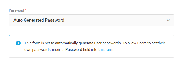
Note that the Password setting here has an option to assign an Auto Generated Password to users who sign up through your form. If you select that option, you’d want to delete the Password field from your form if you still have one in there, as it would serve no purpose and would likely confuse your users. A notice will appear to remind you of this if you select that option.

If there is no Password field in your form, or if you have already removed it, a notice will appear here to remind you to add one if you want your users to be able to set their own passwords.
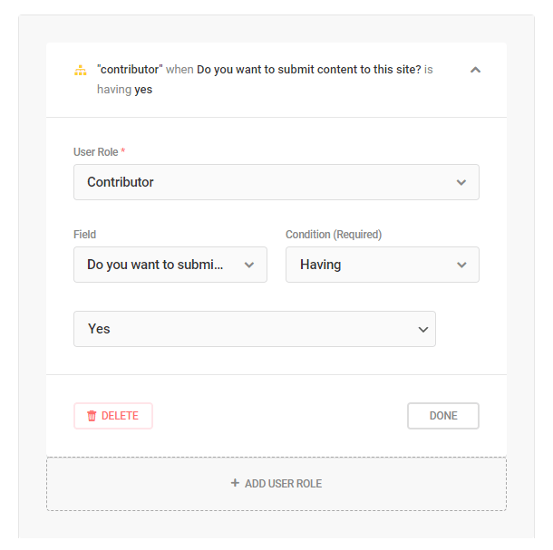
User Role
You can choose to assign the same user role to all users, or conditionally assign roles based on user input in your registration form.

- Fixed Role to All – Select this option to assign the same role to all users who signup.
- Assign Role Conditionally – Choose this option if you want to assign a user role based on user input.
As an example, let’s say you have a checkbox field in your registration form with Yes/No answers to a question like this: Will you be submitting content to this site?
You could set this up to assign the Subscriber role to users who select No as their answer to that question, and assign the Contributor role to users who select Yes.
To assign another role based on a different condition, click the Add User Role button at the bottom.
Custom User Meta
To create custom user meta keys, first enable the feature by clicking the Add Custom User Meta toggle. Next, click the Add Custom User Meta field.

Enabling the Show files in media library option in the upload field settings is necessary when you add a custom user meta key and assign it to a file upload field to upload user images
Site Registration (Multisite only)
If Forminator is network-active in a multisite network, you will see an additional option in the User Registration settings when editing a Registration form in the main site of the network: Site Registration.
Enable this option if you wish to allow your users to create a site in your network using your registration form.
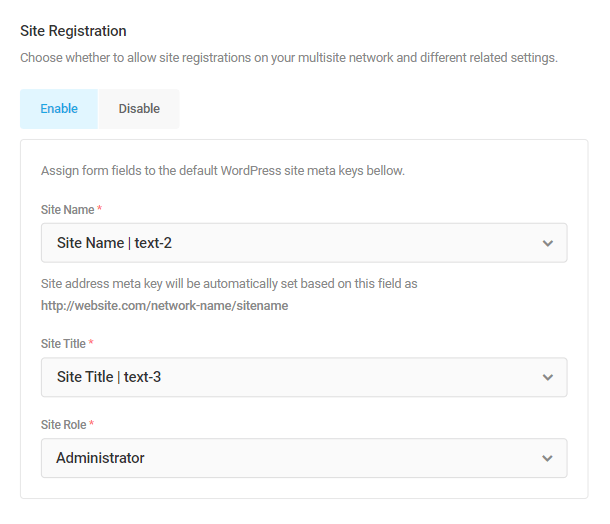
The following form fields are required if you enable this, so you’ll want to ensure you have added input fields in your form for these first so you can map them.
- Site Name – This is to be mapped to the field your users will use to enter their site address, which will be automatically appended to your network address.
- Site Title – Map this one to the field in your form used for the site title or tagline.
- Site Role – Select the role to assign to the user on their new site in your network.
User Account Activation
By default, user accounts are activated as soon as a properly completed form is submitted. However other options are available.
- Default – Account is activated as soon as form is submitted.
- Email Activation – Requires users to respond to a link in an email to activate their account.
- Manual Approval – Suspend account activation until a site admin approves its creation.

Note that if you have enabled the option to assign an Auto Generated Password to users who sign up through your form, you’ll want to keep the Activation Email setting to Default so the needed notification emails can be sent to the user.
Additional Settings
Enable the toggle to log new users in as soon as the account is activated.
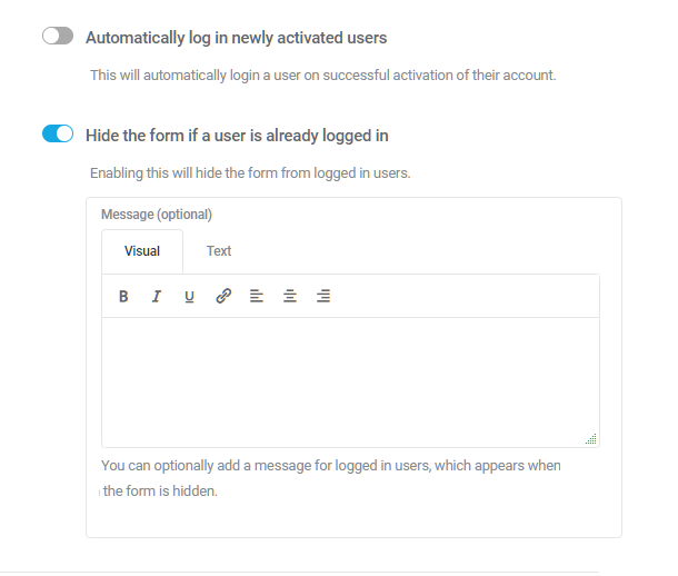
Registered users don’t need to see the registration form again, so hide the form from them by enabling that feature.
If you wish, use the message editor to display a message to registered users instead of the displaying the form.
4.2.11 Saving Forms as Cloud Templates
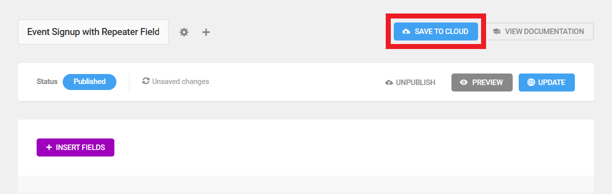
Link to chapter 2Any Forminator form can be saved as a custom cloud template that you can use on any site that you have connected to your Hub.
To save a form as a cloud template, click the Save to Cloud button at the top of the Edit Form screen.
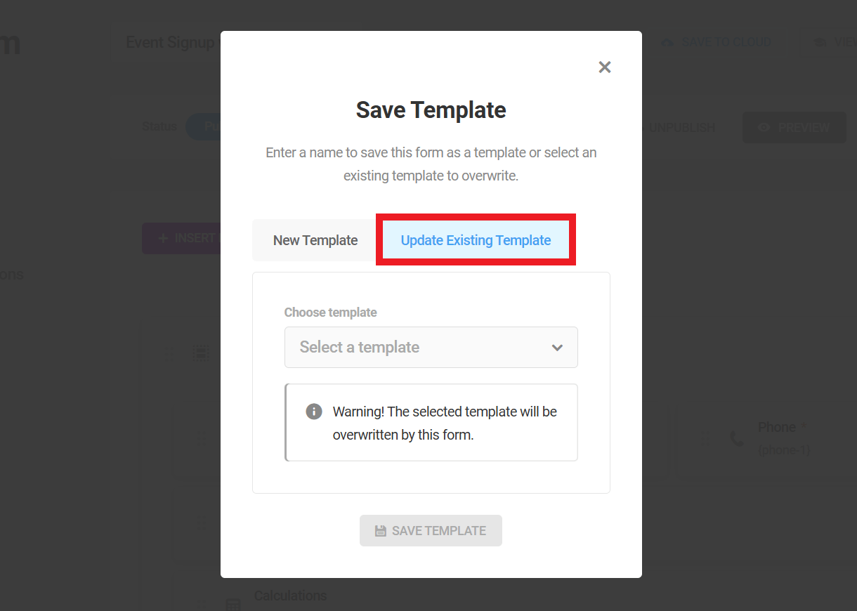
That will pop open the Save Template modal where you can choose to create a new template or overwrite an existing one.
New Template
If you wish to create a brand new template, select New Template, enter the Name you want for your new template and click Save Template.
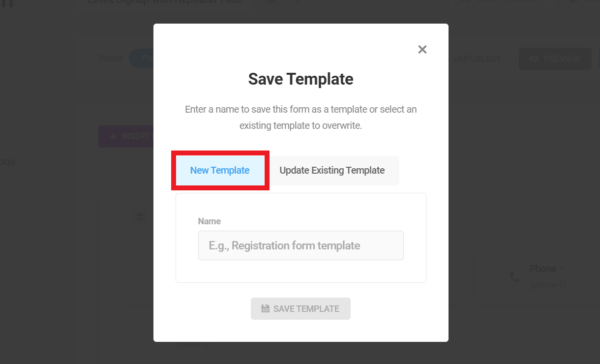
Update Existing Template
If you wish to overwrite an existing template, select Update Existing Template, then Choose the template you wish to overwrite from the dropdown menu and click Save Template.
This will only apply to new forms created with the template after it’s updated. Existing forms created from the template before the update will not be affected.
Note that you can have a maximum of 100 cloud templates from all sites combined.
4.2.12 Pre-Populate Form Field Values
Link to chapter 2Forminator makes it easy to pre-populate fields in one form with values from another form’s fields.
To do that, you’ll need to select the Redirect user to a URL option for the Submission Behavior under the Behavior tab for your first form, and enter the URL to the page containing the 2nd form whose fields you want to pre-populate.
Then, you’ll need to add query parameters to the URL.
For example, to pre-populate a field in the 2nd form with an email address, add a question mark (?) to the end of the URL to indicate a query. Then, add the query parameter key to identify the pre-populated data, followed by an equals sign (=). This key can be any string of text, but use something relevant and recognizable, such as email:
https://yourcoolsite.tld/form-2?email=
Next, click the [+] icon to select and insert available merge tags, representing the pre-populated data. For example, to insert the date from the email address field in your form, select Email Address.
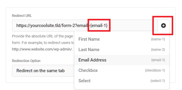
See Form Data above for more information about inserted form data using merge fields.
If you need more than one parameter in your URL to populate more than one field, just add an ampersand – & – then add the next query parameter key and value. For example, here’s a URL with 2 key/value pairs that can be used in the 2nd form:
https://yourcoolsite.tld/form-2?email={email-1}&check={checkbox-1}
To use the values you have now defined in the redirect URL, go to your 2nd form and open the settings for the field you want to pre-populate.
Under the Settings tab for your field, scroll down to the Pre-populate section, and enter the query parameter key you set for the field in the 1st form. In our example above, we simply used the word email as the key, so that’s what we would enter here.
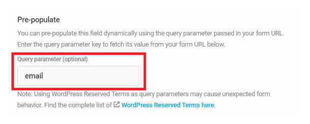
Please note that certain terms are reserved by WordPress and it is not recommended to use them as query parameters in this feature as that may cause unexpected form behavior. See the full list of reserved terms here.
Now when your users submit the 1st form, the value will be pre-populated in the field in the 2nd form.
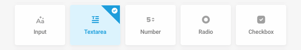
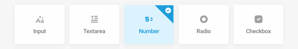
4.3 Forminator Fields
Copy chapter anchor to clipboardThere are more than two dozen fields available in Forminator, each with a unique purpose. Many of the fields share configuration options, but some options are unique to a single field type. Those features are covered in the sections below.
Inserting Fields
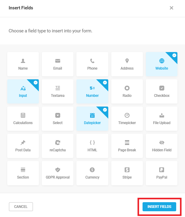
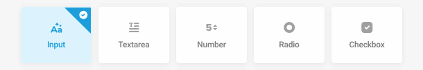
To add a new field, click the Insert Fields button.
A modal will pop open where you will be able to choose from a variety of different fields. You can select and insert multiple fields at the same time, if you wish. When ready, push the Insert Fields button.
Arranging Fields
Once inserted, fields can be dragged and dropped into place to establish the form’s basic layout.
By default, new fields will occupy one row. To organize your fields into columns, simply drag and drop a field into the same row as another field. You can add up to four fields to a single row.
Editing, duplicating and deleting fields
Fields and all their settings can be edited, duplicated or deleted by clicking on the gear icon next to a field and selecting the corresponding option from the dropdown.
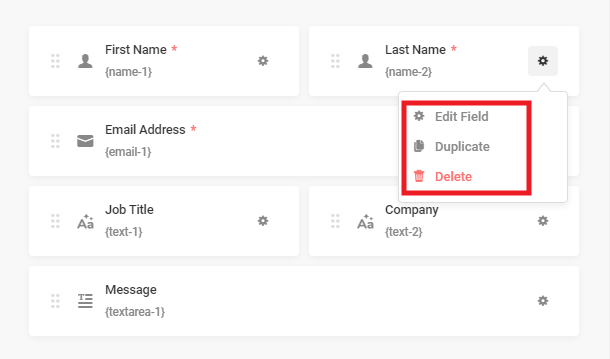
Duplicated fields are added to the end of the current form and you can drag them to where you need them.
Optional vs. Required fields
When adding a new field, or editing an existing one, you can specify whether or not the field is Required in the Settings tab. When you select Required, an additional field will open so you can enter an error message that the user will see if they leave the field blank or incomplete.
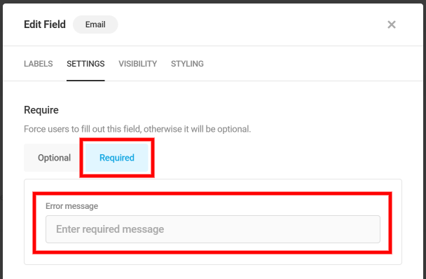
Each required field will have a * in the form to visually denote to your user that the field must be answered).
Additional CSS Classes
You can set the Additional CSS Classes in the Styling tab in the field settings.
Here you can add a class to the field so you can add Custom CSS (to add multiple classes, use a space to separate). This will help you, for example, separate one field from the others by adding some padding to it or add color to the text of a certain field.
Note that the custom class is applied to the main container element of the field. So if you wish to style only certain elements inside the field container, you would need to specify those elements in your custom CSS.
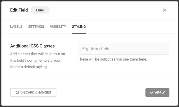
Not a CSS expert but still would like to accomplish something like this? Contact support and our experts will always be right by your side.
Visibility (Conditional Logic)
Visibility is a feature that lets you easily show or hide form fields based on how someone responds to other fields on the form. This will streamline your form, make it “appear” short (so you can display other fields when a condition is met for example) or create a customized form experience.
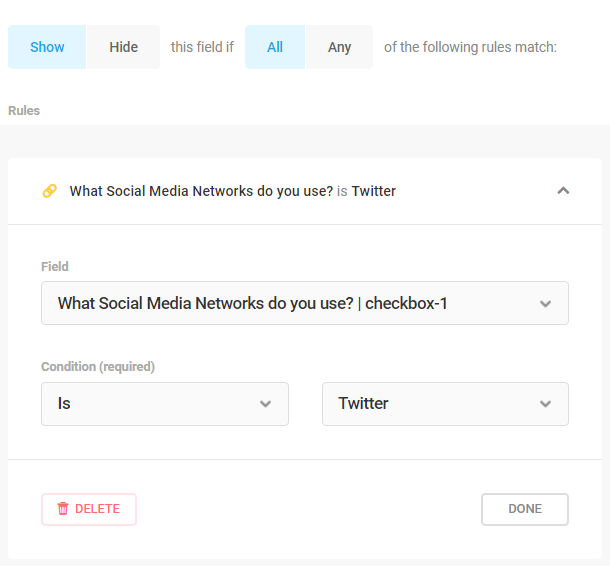
To add conditional logic rules, go to the Visibility tab and click on the Add Rule section.
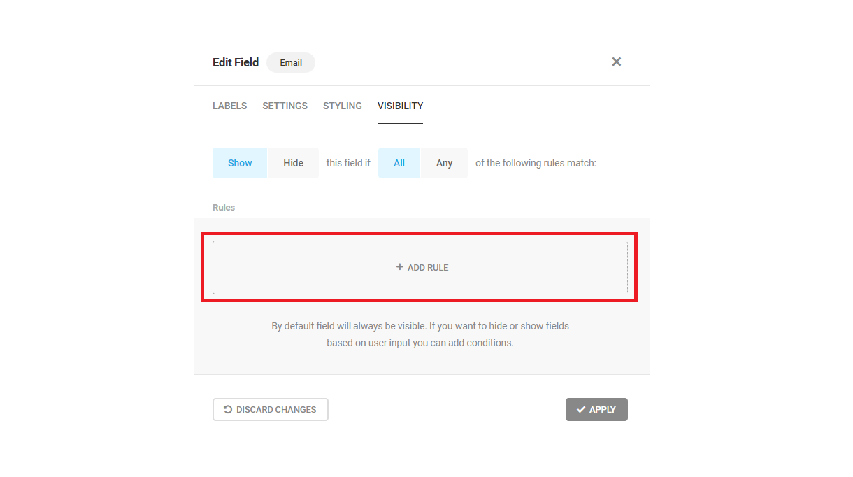
In the popup, choose whether or not you want the rule or rules to hide or show a field. If you have multiple rules you will need to specify if all conditions must be met or just one.
When you open a rule, you need to choose which field the condition will be using. Also, select the condition and the value of the field.
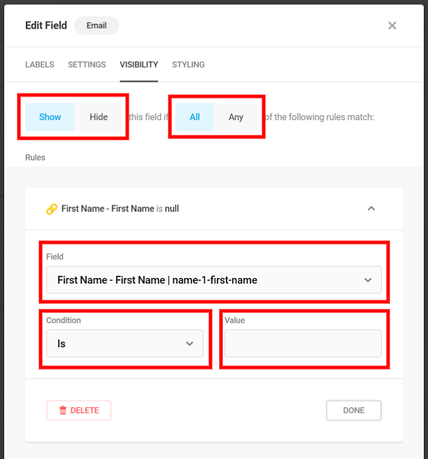
Let’s make a quick and easy example here, with a Show function.
In this form, you want to create fields for someone to be able to enter links to their social media profiles. Instead of showing a bunch of fields for every social network, you’re going to create a checkbox with a list of social media profiles first, so if someone selects a field from the list, a field will appear so they can enter a link to their profile.
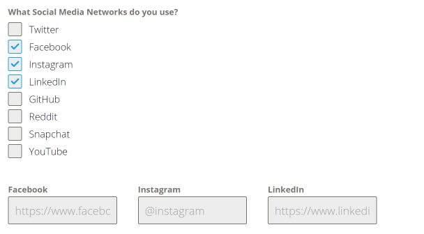
To do this, I’m going to create a field for each social network and only show it if someone checks it off on my checkbox list.
After you create a field for a social network, go to the Visibility tab
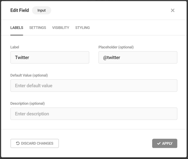
We will show this Twitter field if someone selects the Twitter checkbox.
For the field, you will select What Social Media Networks do you use? Since that is the field that the condition takes into consideration. For condition we will choose Is and choose Twitter from the value dropdown.
Do this for the other social network fields, but instead of Twitter, enter the value that corresponds to the field.
Customizing the submit button
Below the form fields and the insert fields section, you can customize the behavior and label of the submit button for your form.
Submit Button Labels
Button text: button message allows you to change the text of your submit button.
Error message: custom message when the form is not properly filled? Just enable the feature and enter your custom text here.
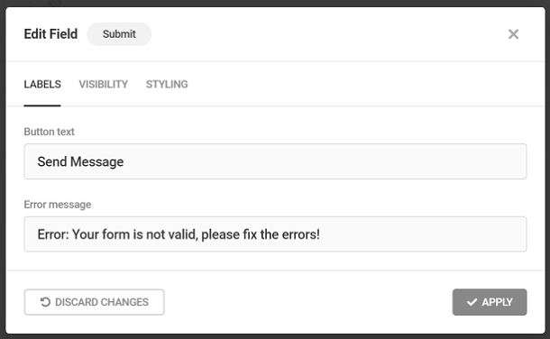
Just like with fields, you can use Visibility to set conditional logic rules that will show or hide your submit button based on certain conditions.
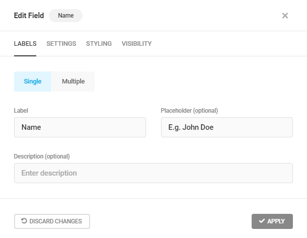
4.3.1 Name Field
Link to chapter 3Adds a name field to your form.
Name Labels
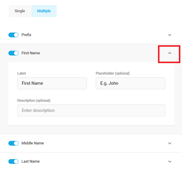
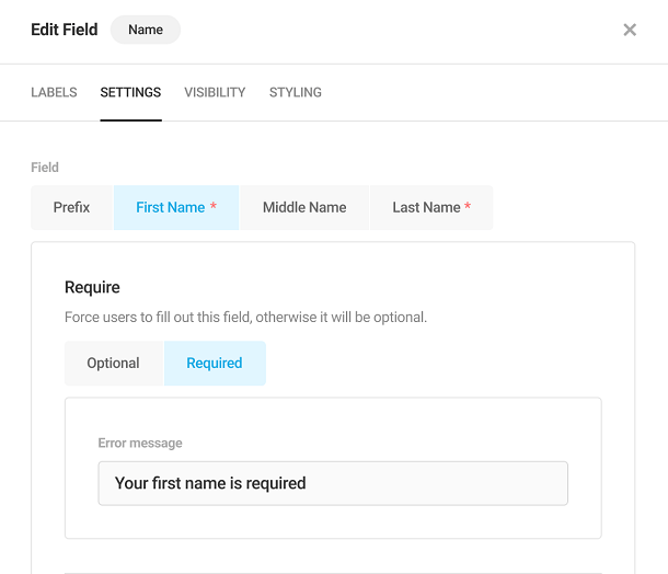
In the Labels tab, you have two options, single and multiple. Single will create one field for a name, while multiple will split the name into prefix, first name, middle name and last name.
Select single to change the field Label, enter Placeholder text or add a custom Description for a single Name field.
Select Multiple to open additional options so you can add Prefix, First Name, Middle Name or Last Name to your Name field.
Open a field to change the Field Label, put Placeholder text or add a custom Description for the name fields you’ve activated.
Name Settings
Selecting the Multiple Option under the Labels Tab will allow you to set the First Name, Middle Name and Last Name name fields to Required or Optional under the Settings Tab.
Select Required to force users to fill out the name field or Optional to make the field skippable.
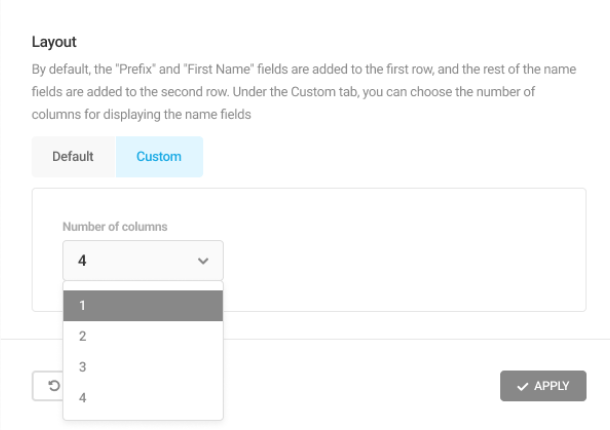
Layout
By default, the Prefix and First Name fields are displayed in the top row, and the rest of the name fields (Middle Name and Last Name) are displayed in the very next row.
This behavior can be altered by changing the Number of columns under the Custom tab of the Layout option. The name fields will get arranged next to each other to a maximum of 4 columns.
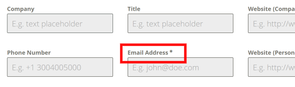
4.3.2 Email Field
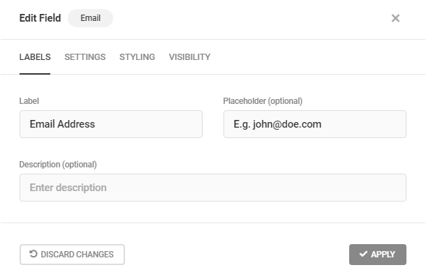
Link to chapter 3Adds an email field to your form.
Email Labels
In the Labels tab, you can change the Field Label, put Placeholder text or add a custom Description.
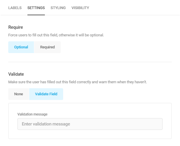
Email Settings
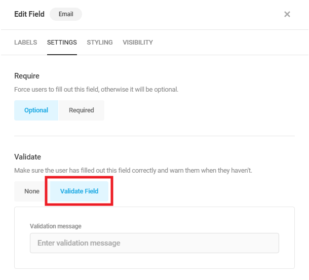
Validate Field: Each time a user enters an email address, this field will check if it has a valid format. Enabling this will let you enter your custom validation message that will appear if the email is invalid.
4.3.3 Phone Field
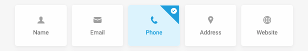
Link to chapter 3Adds a phone field to your form.
Phone Labels
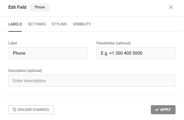
In the Labels tab, you can change the Field Label, put Placeholder text or add a custom Description.
Phone Settings
When a user enters a phone number, this field will check if it has a valid format. You can choose a National, International format or you can limit the number of characters. Enabling this will let you enter your custom validation message that will appear if the phone number is invalid.
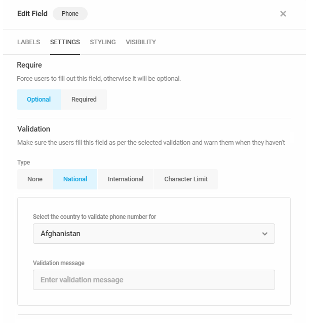
You can verify your selected phone number format when previewing your form.
4.3.4 Address Field
Link to chapter 3Adds an address field to your form.
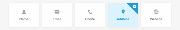
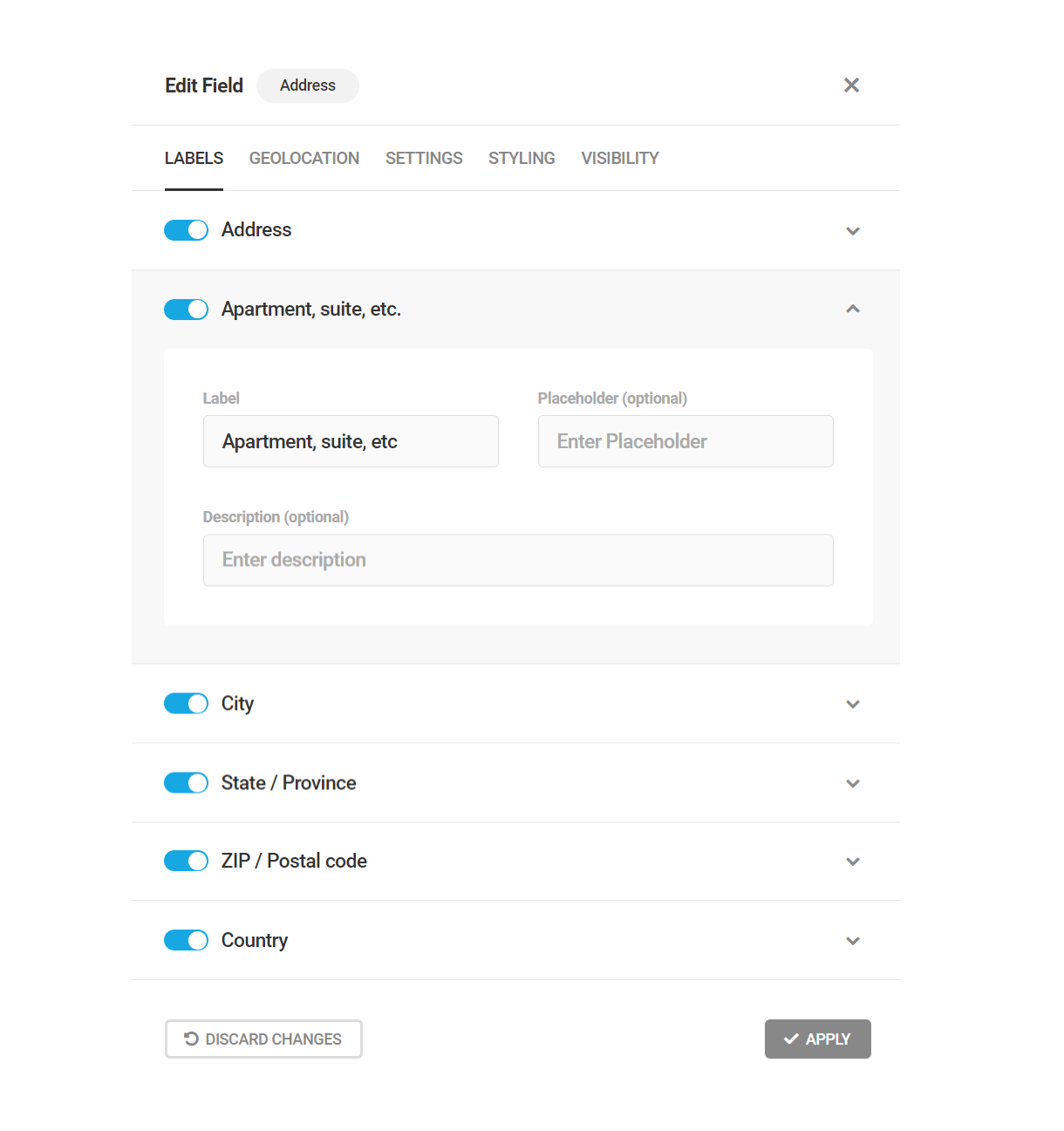
Labels
Under the Labels tab, you can activate the different address subfields that you want to use.
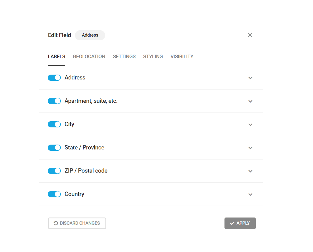
To change the Field Label, add Placeholder text or a custom Description, open the subfield.
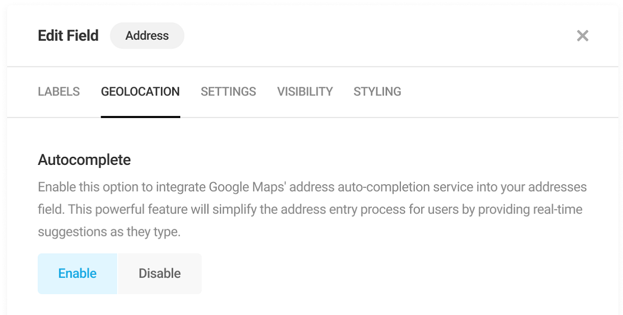
Geolocation
Under the Geolocation tab, you can configure the options to provide auto-suggestions and display maps in your address field.
Autocomplete
You can enable this option if you want to provide real-time address auto-suggestions to the users in the form address field as they type.
Display address on map
Enabling this option will display Google Maps next to your address field. The address entered/selected by the user will be displayed on the map.
Map location
Select where you want to display the map in your form (above or below the address field). By default, the map is displayed below the address field.

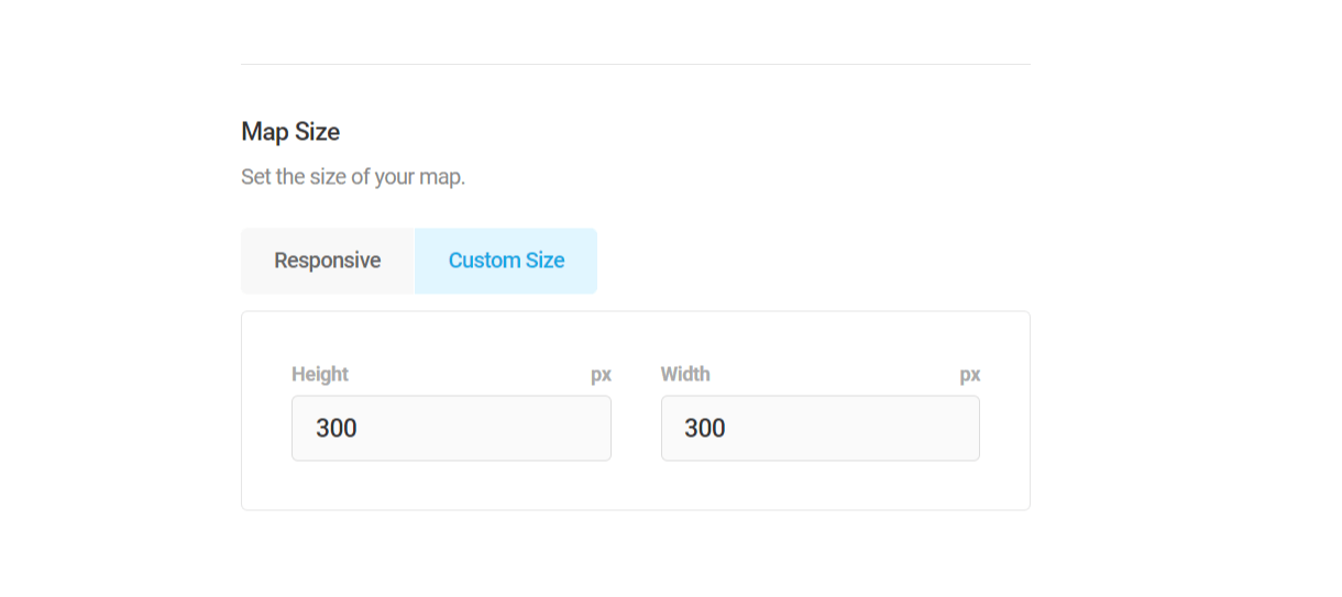
Map size
You can configure the size of the map using this option. Selecting the “Responsive” option will display the map responsively according to the device type in which the form is displayed. Select the “Custom size” option if you want to assign a specific width and height to the map.
Default map location
By default, the map is at the 0-degree latitude and longitude location. You can customize this default location by selecting the “Custom location” and entering the coordinates of the location.
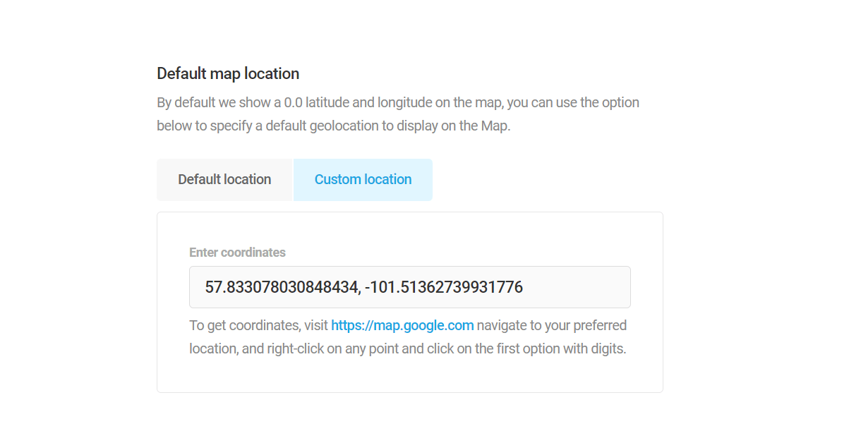
Note: You need to enter your Google Maps API key in the Geolocation settings to use the Geolocation feature.
4.3.5 Website Field
Link to chapter 3Adds a website field to your form.

Website Labels
In the Labels tab, you can change the Field Label, put Placeholder text, add a Default Value or add a custom Description.
Website Settings
Validate Field: Each time a user enters a website URL, this field will check if it has a valid format. Enabling this will let you enter your custom validation message that will appear if the website format is invalid.
4.3.6 Input Field (Text input)
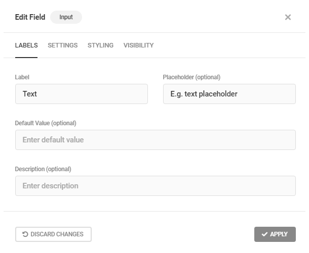
Link to chapter 3Adds a single line text input field to your form.
Input Labels
In the Labels tab, you can change the Field Label, put Placeholder text, add a Default Value or add a custom Description.
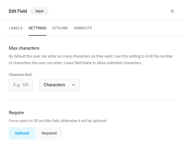
Input Settings
Max characters: You can limit the number of characters allowed in this field.
4.3.7 Text Area Field
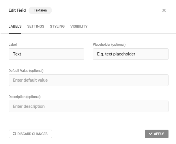
Link to chapter 3Adds a textarea field to your form.
Textarea Labels
In the Labels tab, you can change the Field Label, put Placeholder text, add a Default Value or add a custom Description.
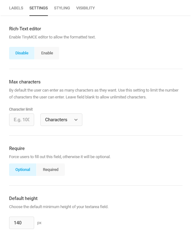
Textarea Settings
Enable the Rich-Text editor option if you want your textarea field to be a WYSIWYG editor. You can also set the Max characters and Default Height for the textarea field.
4.3.8 Number Field
Link to chapter 3Adds a number field to your form.
Number Labels
In the Labels tab, you can change the Field Label, put Placeholder text, add a Default Value or add a custom Description.

Number Settings
The Settings tab allows you to adjust various aspects of the Number field functionality, including value limits and formatting.
To force users to fill out the Number field, select Required. Otherwise, the field will be optional.
To restrict the minimum and/or maximum values that a user can choose, enter a minimum and/or maximum value in the respective fields, and optionally set custom error messages for values beyond these bounds. Leave the fields blank to allow the user to choose any number, including a negative value.
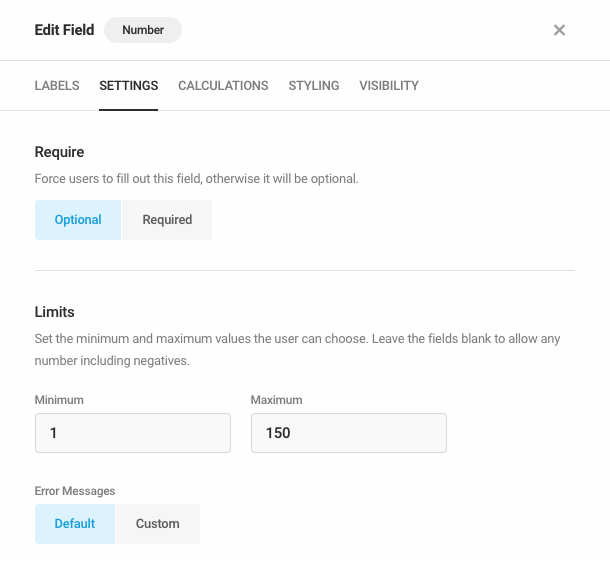
Choose your preferred decimal separator from the Separators drop-down menu. To round the field’s value automatically, choose the maximum number of decimal places from the Round To drop-down menu.
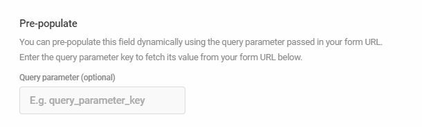
Lastly, to pre-populate the field dynamically using a query parameter passed in your form URL, enter a query parameter key in the Query parameter field.

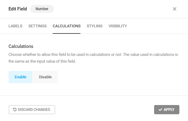
Number Calculations
You can choose whether or not to allow this field to be used to create formulae within Calculations fields in your form. Select Enable to allow the field to be used in calculations.
If enabled, the value used in calculations would be the value input by the user.
4.3.9 Radio Field
Link to chapter 3Adds a radio button field to your form.
Radio Labels
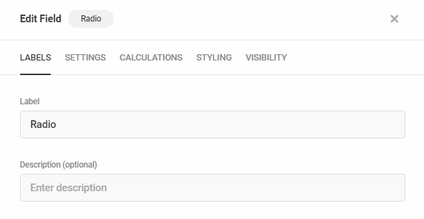
Basic Options
Under the Labels tab, you can customize the Field Label and add an optional Description.
Then, for each radio button option, you will need to input the option Label (that your users will see in the form) and its Value (this is what is stored in the database). Note that you can format the options label texts using the HTML text formatting tags. For now, the <strong> and <em> are the only supported tags.
To do that, click the caret icon at the far right of any radio option to toggle it open and reveal the additional fields and settings for that option. Or click the Expand All / Collapse All toggle to reveal all settings for all options.
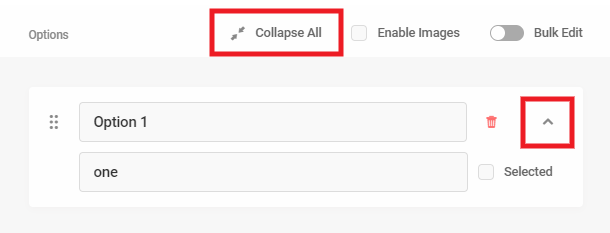
To make any option pre-selected in your form, check the Selected box. Your site visitors will of course be able to change that selection when they fill out the form.

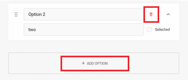
Click on the Add Option area to manually add radio button options. Click the red trash icon next to any option you would like to delete.
Using Images
If you would like to use images in your radio options, check the Enable Images box. That will add an Upload Image button to each radio option.
You can customize the layout and label visibility for image options under the Settings tab below.

Your image options could look like this example in your frontend form with radio buttons and labels showing:
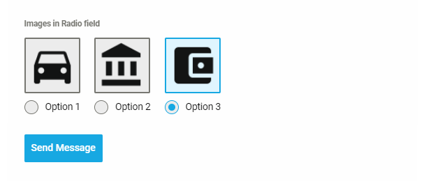
You can adjust the colors for the selected state in your form’s Appearance settings.
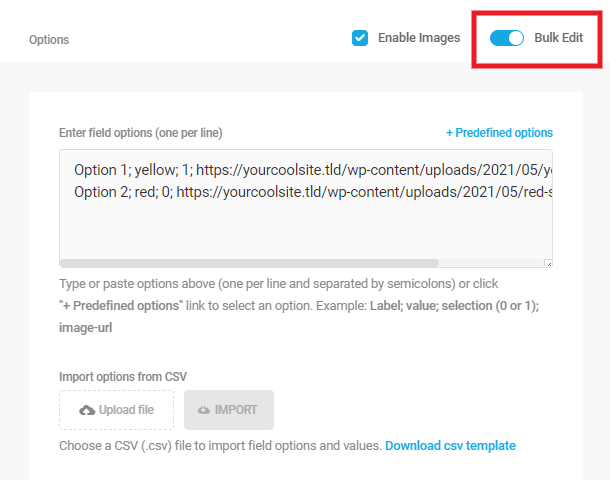
Bulk Edit
Enable the Bulk Edit feature if you have a large number of options you want to add to your radio field. There are 3 ways you can bulk add options to your radio field:
Any existing options you have already manually created will automatically populate in the Bulk Edit area. If you don’t need those, simply delete them from the Bulk Edit area.
Manually enter bulk options
If you wish to manually enter or paste your list of options in the Bulk Edit area, they must be entered one per line with each term separated by a semicolon, in this order (note that the last term on each line should not be followed by a semicolon):
- Option label;
- Option value;
- Selected; – only one option can be set as selected and should be designated with the number 1
- Image URL – if no image, leave that part blank
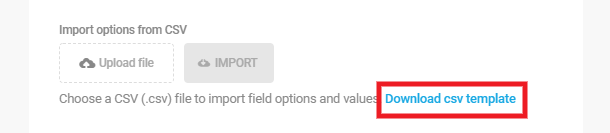
Upload bulk options from CSV file
You can also upload your list of options from a csv file. Click the Download csv template link to download an example csv file that you can edit and add your own options.
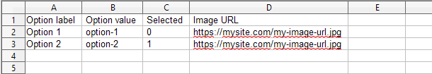
The example file would look like the image below. Edit that template file to add your list of radio options in the needed format. Save your file with any name you like.
Then click the Upload File button and select your saved csv file. Once your file is uploaded, click the Import button to add all your options to the Bulk Edit area.

Note that uploading options with a CSV file will replace any existing options. If you have existing options already, a notice like below will appear before you import your CSV file.

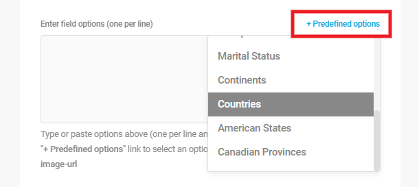
Use predefined options
Click the Predefined options link to pop open a dropdown where you can select from among the available options:
- Age
- Gender
- Educational Attainment
- Employment Status
- Occupation
- Marital Status
- Continents
- Countries
- American States
- Canadian Provinces
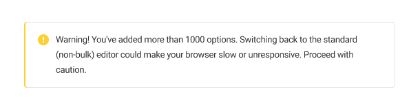
If you have added more than 1000 options using the Bulk Edit feature, then toggle that off to switch back to the standard editor, it will take quite some time for the screen to render and your browser may become slow or unresponsive. A notice will appear to remind you of this:
Radio Settings
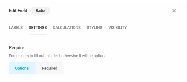
Require
Select Required to force users to complete this field or Optional to allow users to skip this field if they wish.
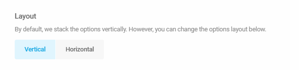
Layout
Select to display your radio options in a Vertical or Horizontal layout.
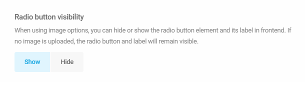
Radio button visibility
If you are using images in your radio options, you can select here to either Show or Hide the radio buttons and labels. If no image is uploaded for any option, the radio button and label will show by default.
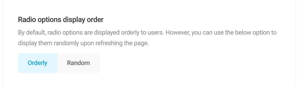
Radio options display order
The radio button options by default are shown in a specific order to the users. Select Random to display the options in a random order every time the page is refreshed.
Pre-populate
This option enables you to dynamically pre-populate this field with a value passed in your form’s URL. See the Pre-Populate Form Field Values chapter above for details.
Radio Calculations
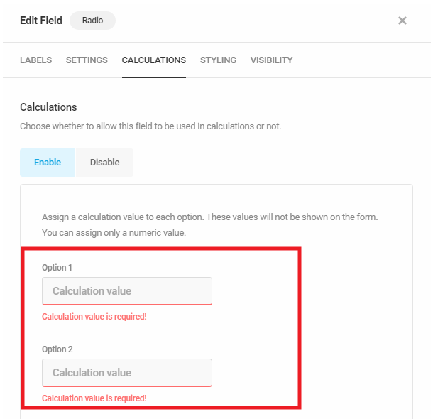
You can choose whether or not to allow this field to be used to create formulae within Calculations fields in your form. Select Enable to allow the field to be used in calculations.
If you choose to Enable calculations for a Radio field, you must assign a numeric value to each option. Enter the necessary value in the Calculation Value field.
4.3.10 Checkbox Field
Link to chapter 3Adds a checkbox field to your form.
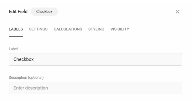
Checkbox Labels
Basic Options
Under the Labels tab, you can customize the field Label and add an optional Description.
Then, for each checkbox option, you will need to input the option Label (that your users will see in the form) and its Value (this is what is stored in the database). Note that you can format the options label texts using the HTML text formatting tags. For now, the <strong> and <em> are the only supported tags.
To do that, click the caret icon at the far right of any checkbox option to toggle it open and reveal the additional fields and settings for that option. Or click the Expand All / Collapse All toggle to reveal all settings for all options.
To make any option pre-selected in your form, check the Selected box. Your site visitors will of course be able to change that selection when they fill out the form.
Click on the Add Option area to manually add checkbox options. Click the red trash icon next to any option you would like to delete.
Using Images
If you would like to use images in your checkbox options, check the Enable Images box. That will add an Upload Image button to each checkbox option.
You can customize the layout and label visibility for image options under the Settings tab below.
Your image options could look like this example in your frontend form with checkboxes and labels showing:

You can adjust the colors for the selected state in your form’s Appearance settings.
Bulk Edit
Enable the Bulk Edit feature if you have a large number of options you want to add to your checkbox field. There are 3 ways you can bulk add options to your checkbox field:
Any existing options you have already manually created will automatically populate in the Bulk Edit area. If you don’t need those, simply delete them from the Bulk Edit area.
Manually enter bulk options
If you wish to manually enter or paste your list of options in the Bulk Edit area, they must be entered one per line with each term separated by a semicolon, in this order (note that the last term on each line should not be followed by a semicolon):
- Option label;
- Option value;
- Selected; – only one option can be set as selected and should be designated with the number 1
- Image URL – if no image, leave that part blank
Upload bulk options from CSV file
You can also upload your list of options from a csv file. Click the Download csv template link to download an example csv file that you can edit and add your own options
The example file would look like the image below. Edit that template file to add your list of checkbox options in the needed format. Save your file with any name you like.
Then click the Upload File button and select your saved csv file. Once your file is uploaded, click the Import button to add all your options to the Bulk Edit area.
Note that uploading options with a CSV file will replace any existing options. If you have existing options already, a notice like below will appear before you import your CSV file.
Use predefined options
Click the Predefined options link to pop open a dropdown where you can select from among the available options:
- Age
- Gender
- Educational Attainment
- Employment Status
- Occupation
- Marital Status
- Continents
- Countries
- American States
- Canadian Provinces
If you have added more than 1000 options using the Bulk Edit feature, then toggle that off to switch back to the standard editor, it will take quite some time for the screen to render and your browser may become slow or unresponsive. A notice will appear to remind you of this:
Checkbox Settings
Require
Select Required to force users to complete this field or Optional to allow users to skip this field if they wish.
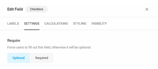
Layout
Select to display your checkbox options in a Vertical or Horizontal layout.
Checkbox visibility
If you are using images in your checkbox options, you can select here to either Show or Hide the checkboxes and labels. If no image is uploaded for any option, the checkbox and label will show by default.
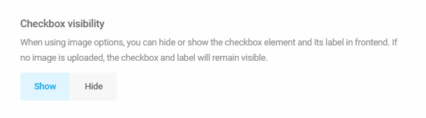
Checkbox options display order
The checkbox options by default are shown in a specific order to the users. Select Random to display the options in a random order every time the page is refreshed.
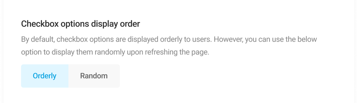
Pre-populate
This option enables you to dynamically pre-populate this field with a value passed in your form’s URL. See the Pre-Populate Form Field Values chapter above for details.
Checkbox Calculations
You can choose whether or not to allow this field to be used to create formulae within Calculations fields in your form. Select Enable to allow the field to be used in calculations.
If you choose to Enable calculations, you must assign a numeric value to each option. Enter the necessary value in the Calculation Value field. Note that if users select two or more options in the same checkbox field, the values are added together, and the sum will be the value used in subsequent calculations for the field.
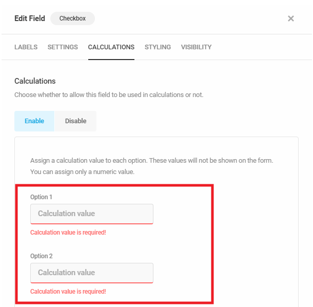
4.3.11 Calculations Field
Link to chapter 3Adds a field to your form that calculates numeric user inputs using custom mathematical formulae.
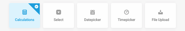
Calculations Labels
In the Labels tab, you can change the field Label, apply Placeholder text, or add a custom Description.
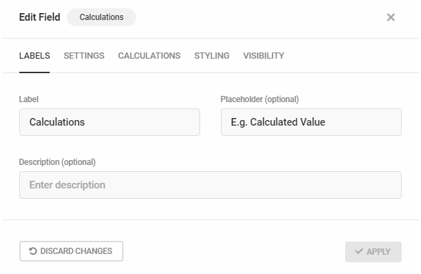
Calculations Settings
The Settings tab allows you to adjust various aspects of the Calculations field functionality, including field type and formatting.
By default, the Calculations field is read-only. To also hide the Calculations field, check the Hidden checkbox.
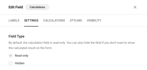
To add a prefix or suffix to values entered into the field, enter a prefix and/or suffix into the respective field(s).
Choose your preferred decimal separator from the Separators drop-down menu. To round the field’s value automatically, choose the maximum number of decimal places from the Round To drop-down menu.
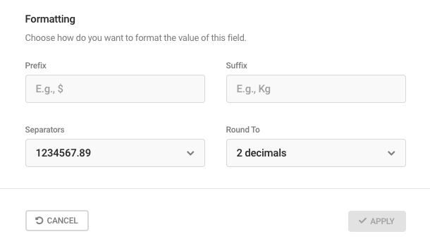
Calculations Tab
The Calculations tab is where you input the formula you want to employ for this field, using the merge tags for any fields in your form that you enabled for calculations (Number, Radio, Checkbox, Select & Currency fields can be used in calculations).
Formulae can be simple, such as fieldname1+fieldname2, or complex mathematical equations with multiple grouped fields, such as fieldname1*(fieldname2+fieldname3). Each formula is considered a single calculation, and by inserting multiple calculation fields, your form becomes a powerful mathematical tool.
A handy menu of common mathematical operand shortcuts, located at the top of the formula field, greatly simplifies the construction of your custom formulae.
Click the form icon to open a drop-down menu of the numeric value fields that have been inserted in the current form. Combine these with the mathematical operands + - * / ^ % ( ) , and the constant PI. Click the ellipsis icon to reveal additional functions that can also be used in your formulae: abs(), avg(), ceil(), floor(), min(), max(), round() See below for an explanation of each available operand and function.
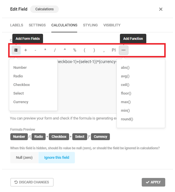
After adding your formula to the Calculation Formula field, a preview of the formula will appear so you can verify that the proper data and mathematical operation(s) will be used in making this calculation.
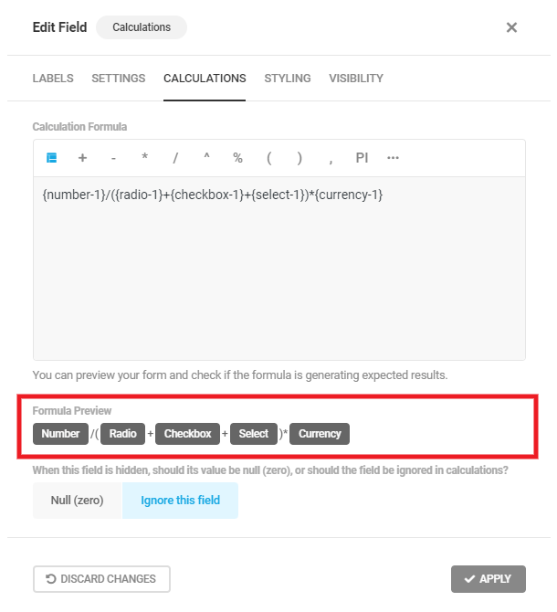
At the bottom of the tab, you’ll find an option to either set this Calculations field’s value to Null (zero) or Ignore this field if the field is hidden in the form.
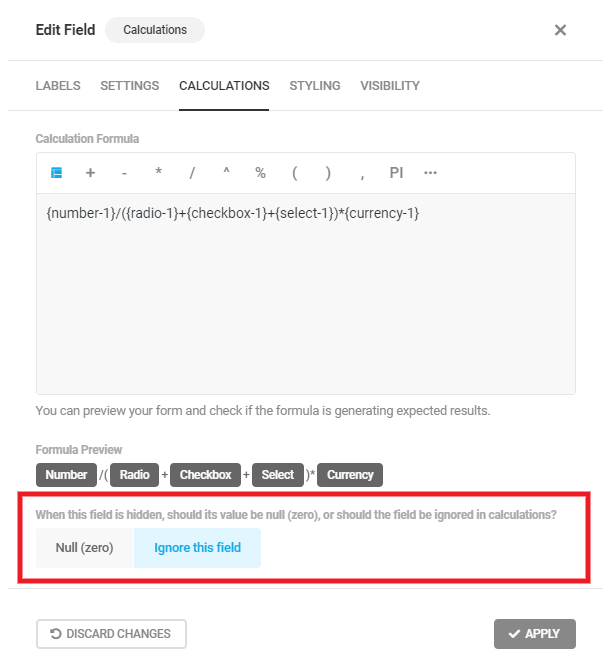
Operands and Functions
Following are the operands and functions available for your calculations:
- + – Use for addition
- – – Use for subtraction
- * – Use for multiplication
- / – Use for division
- ^ – Use for exponentiation. Ex: 3^2
- % – Use to find the Modulo Remainder of two field values. Ex: {number-1}%{number-2}
- ( ) – Use to group expressions
- , – Use to separate values in a list or when using functions below
- PI – Returns the value of π (pi)
- abs() – To use the absolute value of a form field. Ex: abs({number-1})
- avg() – To calculate the average of two or more numbers. Ex: avg({number-1},{number-2})
- ceil() – Rounds the value of a number up to the nearest whole integer
- floor() – Rounds the value of a number down to the nearest whole integer
- max() – Uses the largest of two or more field values. Ex: max({number-1},{number-2}) would return the value of {number-2} if greater than {number-1}
- min() – Uses the smallest of two or more field values. Ex: min({number-1},{number-2}) would return the value of {number-2} if less than {number-1}
- round() – Rounds the value of a number up or down to the nearest whole integer
You must add a formula to the Calculation Formula field in order to save any calculation field settings. For example, you cannot configure Labels or Styling and then save the field with the intention of adding a formula at a later time. Once you’ve added your calculation formula, use the Preview feature to check if it’s working as expected.
4.3.12 Select Field
Link to chapter 3Adds a dropdown select field to your form. You can choose from a single select dropdown or a dropdown that allows multiple selections.
Select Labels
Basic Options
In the Labels tab, you’ll want to first choose to make your Select field accept either a Single choice, or Multiple choices.
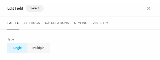
If you choose Single, you can optionally enter a custom Placeholder that displays in the field before the user makes a selection.
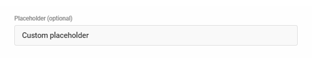
You can then customize the field Label and add an optional Description.

Then, for each selectbox option, you will need to input the option Label (that your users will see in the form) and its Value (this is what is stored in the database).
To do that, click the caret icon at the far right of any selectbox option to toggle it open and reveal the additional fields and settings for that option. Or click the Expand All / Collapse All toggle to reveal all settings for all options.
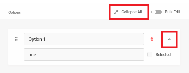
To make any option pre-selected in your form, check the Selected box. Your site visitors will of course be able to change that selection when they fill out the form. Note that if you make an option Selected here, that overrides the custom Placeholder you may have set above, and it will not appear in your selectbox
Click on the Add Option area to manually add selectbox options. Click the red trash icon next to any option you would like to delete.
Bulk Edit
Enable the Bulk Edit feature if you have a large number of options you want to add to your select field. There are 3 ways you can bulk add options to your select field:
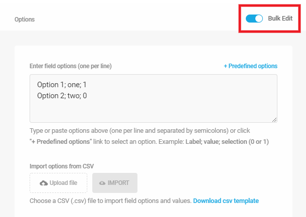
Any existing options you have already manually created will automatically populate in the Bulk Edit area. If you don’t need those, simply delete them from the Bulk Edit area.
Manually enter bulk options
If you wish to manually enter or paste your list of options in the Bulk Edit area, they must be entered one per line with each term separated by a semicolon, in this order (note that the last term on each line should not be followed by a semicolon):
- Option label;
- Option value;
- Selected – only one option can be set as selected and should be designated with the number 1
Upload bulk options from CSV file
You can also upload your list of options from a csv file. Click the Download csv template link to download an example csv file that you can edit and add your own options.
The example file would look like the image below. Edit that template file to add your list of selectbox options in the needed format. Save your file with any name you like.
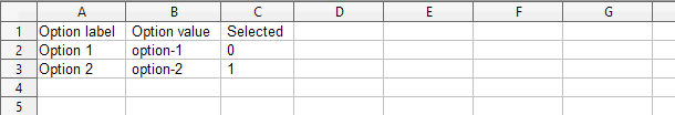
Then click the Upload File button and select your saved csv file. Once your file is uploaded, click the Import button to add all your options to the Bulk Edit area.
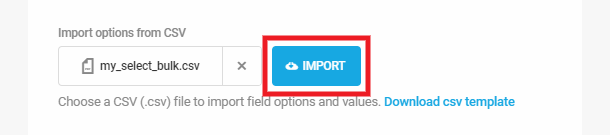
Note that uploading options with a CSV file will replace any existing options. If you have existing options already, a notice like below will appear before you import your CSV file.
Use predefined options
Click the Predefined options link to pop open a dropdown where you can select from among the available options:
- Age
- Gender
- Educational Attainment
- Employment Status
- Occupation
- Marital Status
- Continents
- Countries
- American States
- Canadian Provinces
If you have added more than 1000 options using the Bulk Edit feature, then toggle that off to switch back to the standard editor, it will take quite some time for the screen to render and your browser may become slow or unresponsive. A notice will appear to remind you of this:
Select Settings
Require
Select Required to force users to complete this field or Optional to allow users to skip this field if they wish.

Multi Select Style
If you have set your select field to Multiple in the Basic Label Options above, you can choose from either the Standard or Modern styling options.
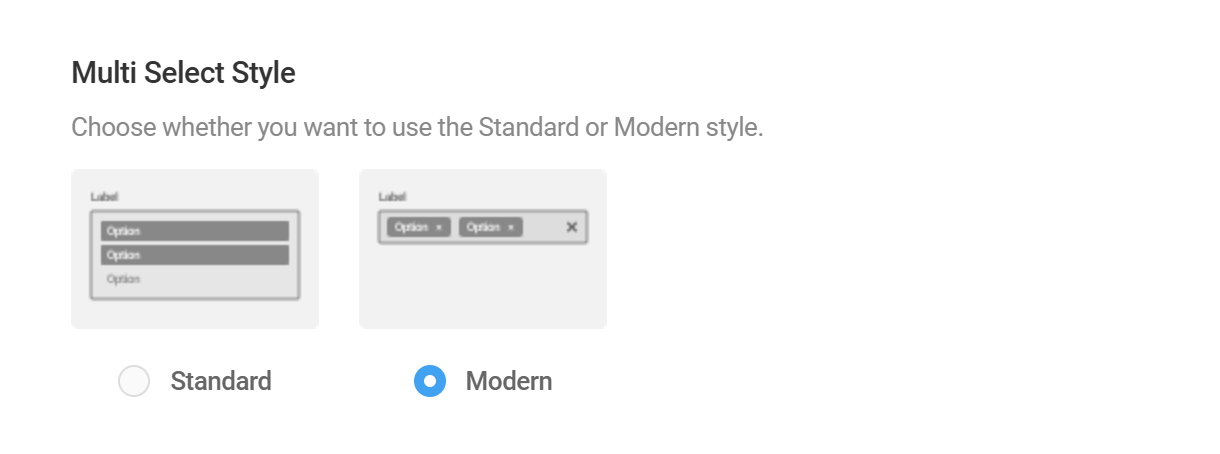
Search
If you have set your select field to Single in the Basic Label Options above, you can optionally enable this to include a search field in your selectbox dropdown. Note that if you have set a custom Placeholder as above, that placeholder will also appear in the search field.

Checkbox In Dropdown Options
If you have set your select field to Multiple in the Basic Label Options above, you can choose to Show or Hide checkboxes for each option in the select field dropdown.
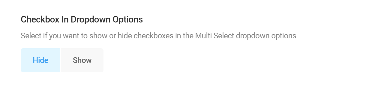
Limit Submission
This option enables you to set a limited number of times any option in your select field can be submitted by your users.
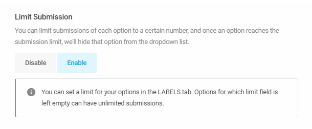
When enabled, you’ll see an additional setting appear under the Labels tab for each option you add to your select field. Once the limit you enter for any option is reached, that option will be hidden from your select field so users can’t select it.
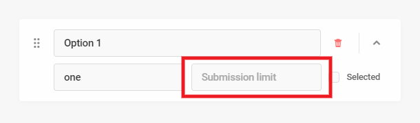
Pre-populate
This option enables you to dynamically pre-populate this field with a value passed in your form’s URL. See the Pre-Populate Form Field Values chapter above for details.
Select Calculations
You can choose whether or not to allow this field to be used to create formulae within Calculations fields in your form. Select Enable to allow the field to be used in calculations.
If you choose to Enable calculations, you must assign a numeric value to each option. Enter the necessary value in the Calculation Value field. Note that if your Select field is of the Multiple type and users select two or more options, these values are added together, and the sum will be the value used in subsequent calculations.

4.3.13 Datepicker Field
Link to chapter 3Adds a datepicker field to your form.
Datepicker Labels
In the Labels tab, you can choose between three different calendar types.
- Calendar with selectable dates
- Dropdowns for day, month and year
- Text input for day, month and year
You can change the Field Label, add Placeholder text and show a calendar icon (Calendar only), or add a custom Description.
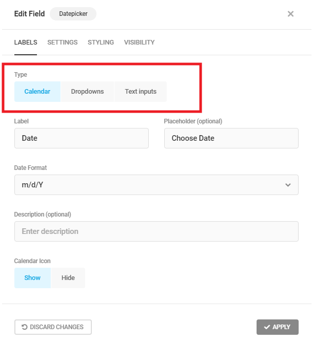
You can also select the specific output format of the dates using any of the available presets:
- Y-m-d – ex: 2020-12-31
- m-d-Y – ex: 12-31-2020
- d-m-Y – ex: 31-12-2020
- Y/m/d – ex: 2020/12/31
- m/d/Y – ex: 12/31/2020
- d/m/Y – ex: 31/12/2020
- Y.m.d – ex: 2020.12.31
- m.d.Y – ex: 12.31.2020
- d.m.Y – ex: 31.12.2020
The Dropdowns and Text Input options also allow you to customize the field Labels and Placeholders (Text Input only).
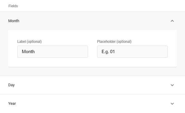
Below are examples of how each calendar type option would look in your form.
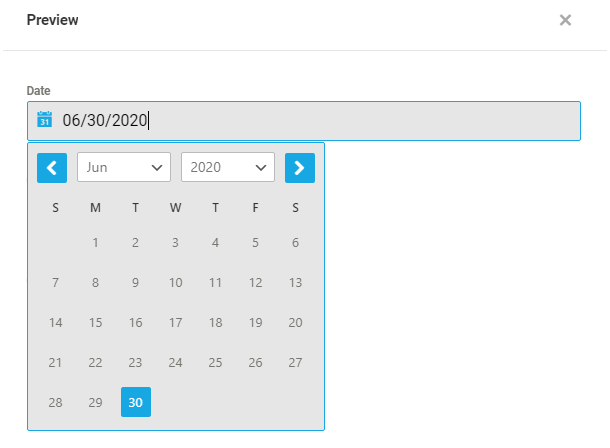
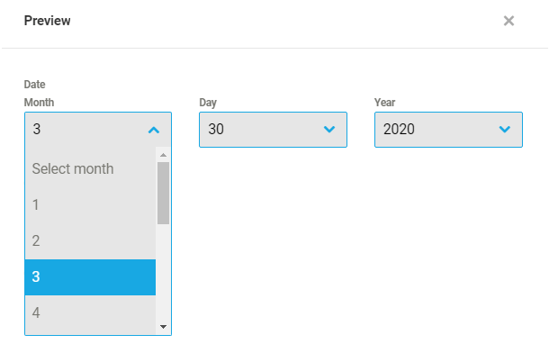
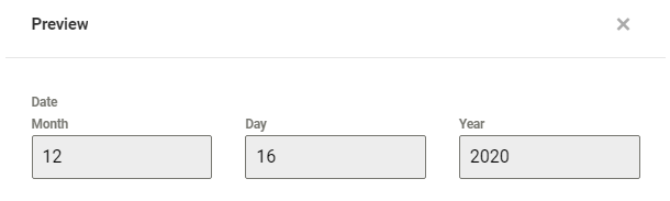
Datepicker Settings
If you select Calendar or Dropdowns as the datepicker type, you can set a default date to display in the datepicker field. Select either Today or enter a Future Date; select None if you don’t want a default date to appear in the datepicker.

Datepicker Limits
When you select the Calendar type, you can specify date ranges, specific dates, or days of the week that are available or blocked off in the datepicker field.
Start & End date
- No Limit – Select this option to have the calendar year start & end 100 years before & after the current year.
- Specific Date – Select the date you wish the datepicker to start or end at.
- Today – Select this to have today’s date be used as the datepicker start or end date. You can also offset from today’s date any number of days, months or years, forward or backward.
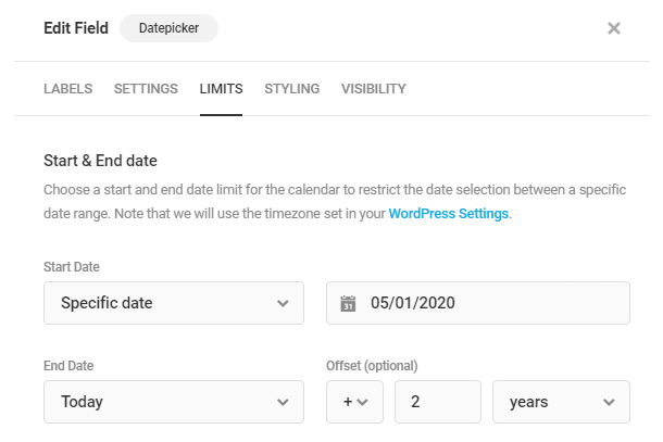
Days of the week
- All Days – When this option is selected, all weekdays are available for selection in the datepicker field.
- Selected Days – Enables you to specify which weekdays should be available for selection.
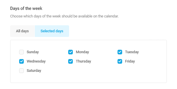
Disable Dates or Date Ranges
These options enable you to enter specific dates or whole date ranges that should not be available for selection in your datepicker calendar.
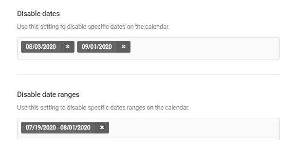
Change “Week Starts On” Day
If you’re using the Calendar option for your Datepicker field, know that the calendar will inherit the “Week Starts On” day you have set in your wp-admin under Settings > General. If you wish the calendar to start with a different day, you can change that setting there.
4.3.14 Timepicker Field
Link to chapter 3Adds a timepicker field to your form.
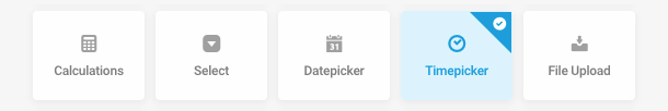
Timepicker Labels
In the Labels tab, you can choose between two different time formats.
- Dropdowns
- Number Inputs
You can also specify if you’d like to use 12 hour or 24 hour time, and customize the Field Label and Description.
Open the subfields if you wish to customize the Label and Placeholder for hours and minutes.
Timepicker Settings
Time Increments
Whether using Dropdowns or Number Inputs, you can set the hour and minute increments by which the user can select the desired time.
For example, if you set the increment for hours to “1” and the increment for minutes to “30”, the time can be selected on any hour, and the minutes will be either “0” or “30”.
Time Limits
You can set a start and end time for your timepicker so only times between those limits can be selected.
Default Time
You can set a default time to populate the field if it is left blank.
4.3.15 File Upload Field
Link to chapter 3Adds a file upload field to your form.
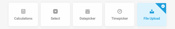
File Upload Labels
In the Labels tab, you can select whether your upload field should allow for only a single file or multiple files. You can also customize the Field Label and add a custom Description.
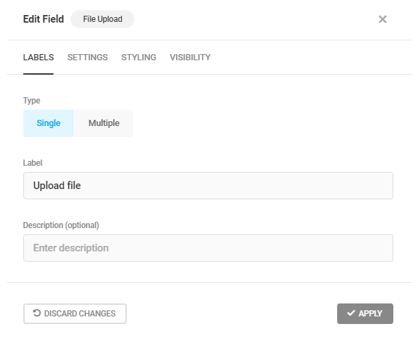
Below are previews of how the Single and Multiple file upload fields could look in your form.
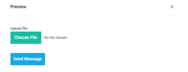
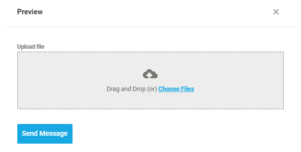
File Upload Settings
Allowed file types
By default, your users can upload any type of file allowed by WordPress, but you can restrict that to only selected file types here.
To limit the accepted file types, select the custom option and you will have access to a list of image, document, audio, video, archive, text, spreadsheet and interactive file types. Uncheck the file types you do not want to allow to be uploaded through this field.
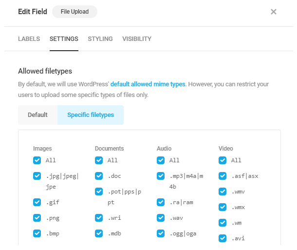
Limit number of files
If you have enabled the Multiple file upload option under the Labels tab, this option will be available so you can restrict the number of files that can be uploaded using this field. Select the Custom option and enter the desired limit.
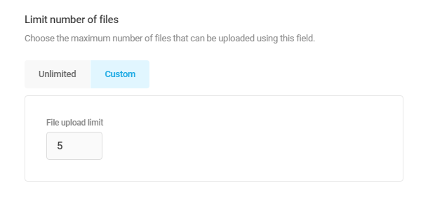
Filesize Limit
Set the maximum allowed size for any file uploaded through this field in your form. You can set this to any value lower than what is already defined as the upload_max_filesize for your site. If you need to increase that limit, you’ll need to make that change in your server settings. Need help? Follow this guide: Increase file upload size.
Note that if you have enabled the Multiple file upload option under the Labels tab, this setting will apply to each uploaded file, and you’ll see the option is named: Filesize limit per file
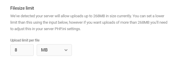
Upload method
If you have enabled the Multiple file upload option under the Labels tab, you can choose which method to use for file uploads.
- Ajax – This option will upload the files as the user selects them, and can be a good option to reduce server load if the total filesize is rather large and your server has limited resources. Note that the files will be uploaded to your server even if the user does not submit the form, so you may want to consider the option below to avoid abuse.
- On Form Submission – This option will upload all files at the same time, but only when the user submits the form.
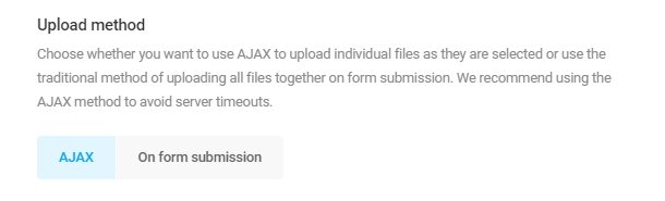
Show files in media library
Enable this option if you want files uploaded through your form to be added to your Media Library.
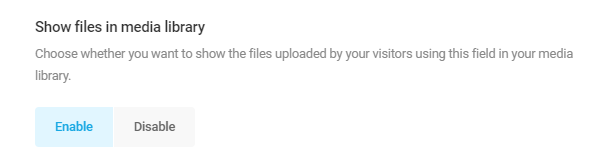
4.3.16 Post Data Field
Link to chapter 3Adds a Post Data field to your form so you can enable your users to create posts on your site from a frontend page.
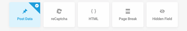
Post Data Labels
In the Labels tab, you can activate the following Post Data subfields:
- Title – Enables a field in your form that will create the post title when the form is submitted.
- Content – Enables a field in your form that creates the post content.
- Excerpt – Use this field if you want users to be able to manually enter a post excerpt.
- Featured Image – This file upload field automatically adds the uploaded image as the featured image for your post. If you are using the WPMU DEV Smush plugin and have enabled Automatic compression, images submitted here will be optimized before being added to your Media Library.
- Category – Enable your users to select the post category (you can enable an option to allow for multiple categories under the Settings tab).
- Tags – Enable your users to select a post tag (you can enable an option to allow for multiple tags under the Settings tab).
- Custom Fields – Use this option to map input from other fields in your form to custom fields in your posts.
Please note that you need to enable at least one of the Title, Content, or Excerpt subfields for post data to be submitted.
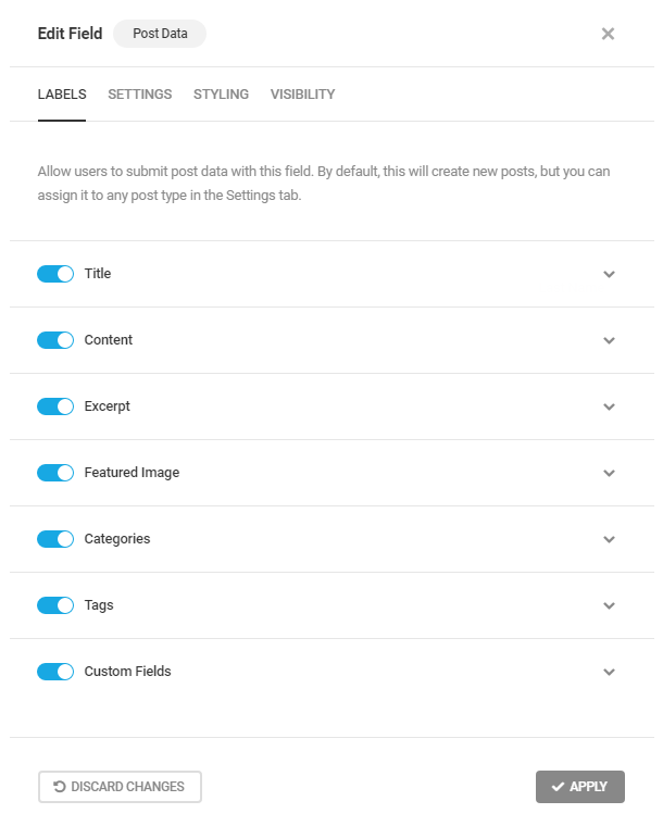
Toggle open any subfield to reveal its labeling options. For the Title, Content and Excerpt fields, you can customize the field label, placeholder and description. For the Featured Image, Categories and Tags fields, you can customize the label and description. (See below for details about the Custom Fields option.)
The image below shows the label options for the Title field; the others are similar.
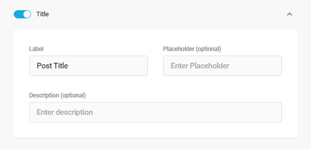
Custom Fields
The Custom Fields option enables you to map input from other fields in your form so they write to custom fields that you are using in your selected post_type.
As an example, let’s say you’re using the popular Advanced Custom Fields plugin and have created a custom Text field using that plugin named acf_text_1.
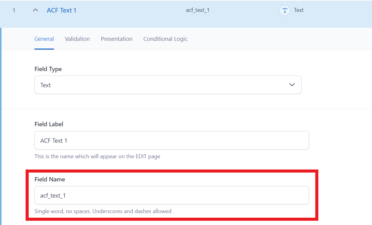
To map a text Input field in your form to that custom field, first add an Input field to your form. In our example below, that would be {text-1}.
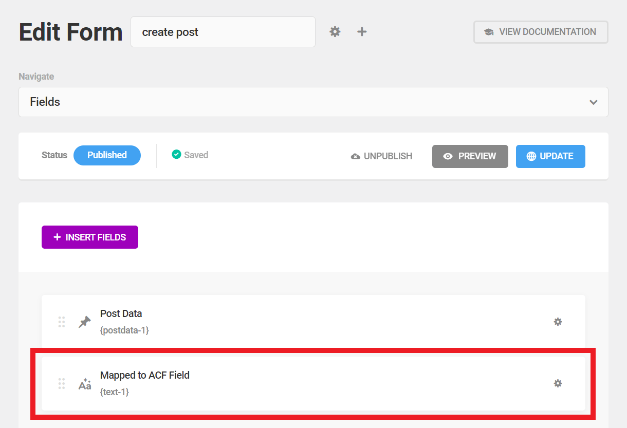
Now click on the Custom Fields option in the Post Data field in your form. Enter the Name of your ACF field as the custom field Label (in our example above, that is acf_text_1). Then select the text Input field you created that should write to it as the custom field Value (in our example above, that is {text-1}).
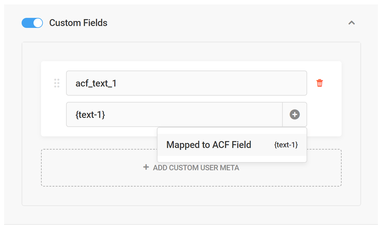
If you see a No available options message when you try to select the form field you want to map, that means that you have not yet added an input field to your form that you can map to a custom field. Simply add an input field to your form and you’ll see it appear for selection here.
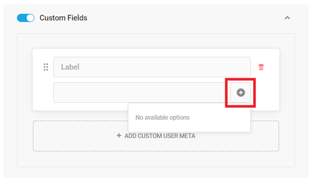
Below is an example of how your frontend post form could look with the text Input field that maps to your custom ACF field in the post.
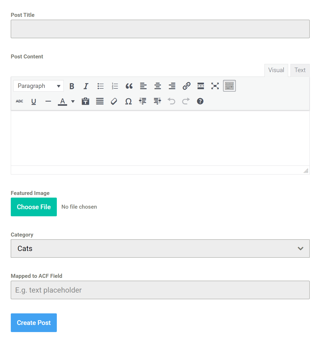
Once the form is submitted and the post created, you’ll see the ACF field data when viewing the post in the post editor.
How you output and display that custom field data in your post is entirely up to you. However, continuing on the example of using the ACF plugin, you would likely want to use their built-in functions like get_field() or the_field() to call that specific field anywhere you need it in a post template.
Post Data Settings
Post Type
By default, the Post Data field is set to create a post of the Posts post_type, but you can select any available post_type on your site so the form creates posts of that type instead.
Default Status
You can set to automatically publish the post to the selected post_type, or save the form entry as a draft or pending review.

Default Author
Choose a default author for all submissions though your post form. The default author must be a registered user on your site and his user role must be Author or higher. This user will be used as the post author if you allow for guest submissions.
You can also force the selected user to be always assigned as the post author, whether the user who submits the form is logged-in or not. If you don’t force this and a logged-in user makes a post, he will be set as the author of the post.
Taxonomies limits
Select whether only one of each taxonomy can be selected per submission, or if you wish to allow for multiple category and/or tag selections.
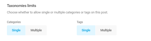
4.3.17 CAPTCHA Field
Link to chapter 3Adds a captcha field to your form.

Forminator includes support for both Google reCAPTCHA and hCaptcha. Either option will protect your website from spam and abuse while letting real people pass through with ease.
Why should you use Captchas?
Adding captchas in forms serve as a security measure that verifies the authenticity of the user interacting with the form by presenting a variety of challenges.
Implementing captchas is strongly advised as it not only helps in spam prevention but also strengthens your website’s security, verifies users, and improves the overall quality of form submissions.
Google reCAPTCHA
To add Google reCAPTCHA to your form, select reCAPTCHA as the Provider in the field settings.
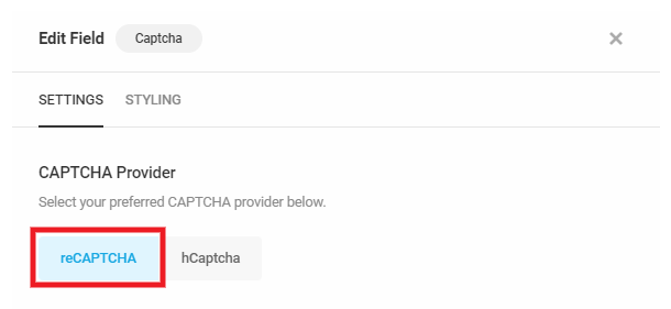
Alignment
When using the V2 Checkbox type, this option will align the captcha per your selection. When using either the V2 Invisible or V3 types, this option will align the captcha badge per your selection only if you set the Badge Position to be inlined in the form.

reCAPTCHA Type
Select the type of reCAPTCHA you wish to include in your form. If your selected type has not yet been set up on the Settings > CAPTCHA page, you’ll see this handy prompt with a link to that page so you can get that done first.
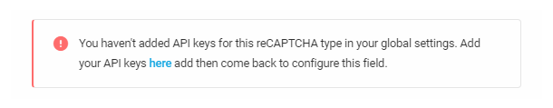
Select the v2 Checkbox option to include a familiar checkbox inline in your form. This option enables you to specify the Size and Theme for the checkbox.
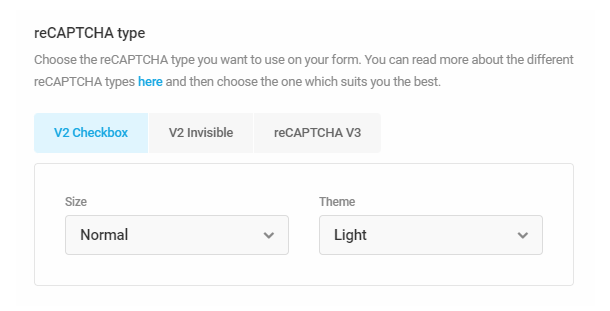
This option could look like the following example in your published form:
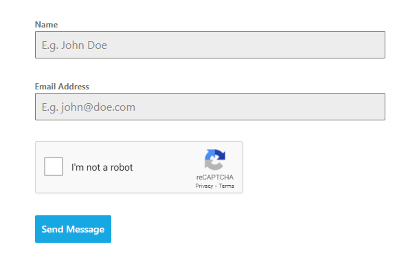
Select the v2 Invisible option to only display a reCAPTCHA badge on your form page. This option enables you to specify the Theme for the badge.
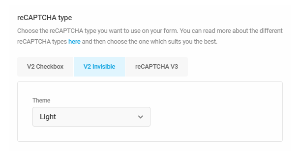
Selecting the reCAPTCHA v3 option also only displays a reCAPTCHA badge on your form page. This option enables you to specify the Score Threshold below which the verification will fail. Note that the higher you set the threshold, the more likely it is that legitimate submissions will fail.
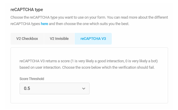
The v2 Invisible and reCAPTCHA v3 options use advanced risk analysis technology to separate humans from bots and protect your sites from spam and abuse without any need for users to click on “I’m not a robot”. Either captcha option could look like the following example in your published form page:
Language
By default, the captcha field will use the language you set in Settings > CAPTCHA, but you can change that here for any specific form if you wish.
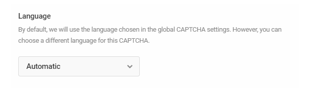
Badge Position
This option only appears if you have selected either the v2 Invisible or reCAPTCHA v3 options above. It enables you to specify where the badge should appear on your form page: bottom-left, bottom-right or inline in the form.
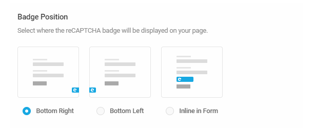
Error Message
Customize the error message that appears if the captcha verification fails.
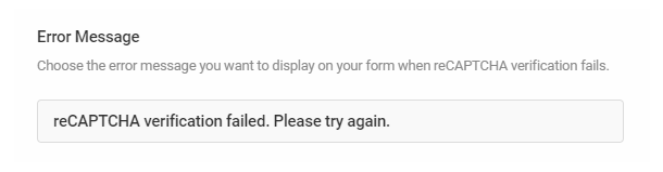
hCaptcha
hCaptcha enables you to add either a familiar inline checkbox or a message to your form, as seen in the examples below.
To add hCaptcha to your form, select hCaptcha as the Provider in the field settings.
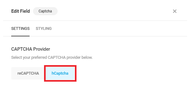
Alignment
When using the Checkbox type, this option will align the captcha per your selection. When using the Invisible type, this option will align the captcha message that displays instead.
hCaptcha Type
Select the type of hCaptcha you wish to include in your form. If you have not yet set up your hCaptchaAPI keys on the Settings > CAPTCHA page, you’ll see this handy prompt with a link to that page so you can get that done first.
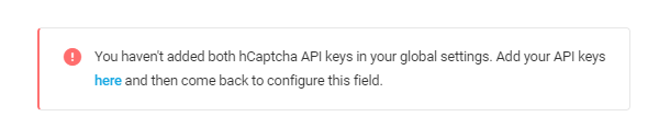
Select the Checkbox option to include a familiar checkbox inline in your form. This option enables you to specify the Size and Theme for the checkbox.
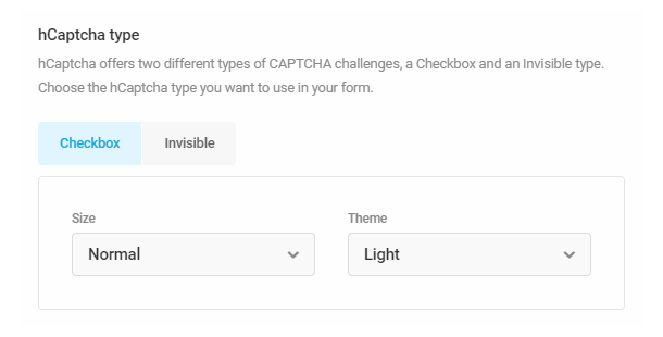
This option could look like the following example in your published form:
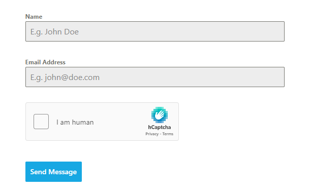
Select the Invisible option to only display a message that your form is protected. To comply with global privacy laws, the message includes links to hCaptcha’s Privacy Policy and TOS by default.
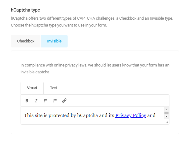
The Invisible option uses advanced risk analysis technology to separate humans from bots and protect your sites from spam and abuse without any need for users to click on “I am human”. This option could look like the following example in your published form page:
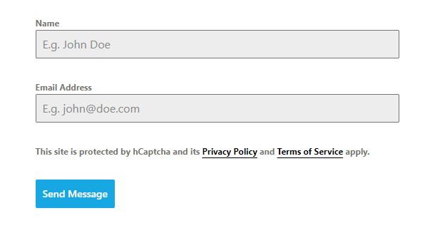
Language
By default, the captcha field will use the language you set in Settings > CAPTCHA, but you can change that here for any specific form if you wish.
Error Message
Customize the error message that appears if the captcha verification fails.
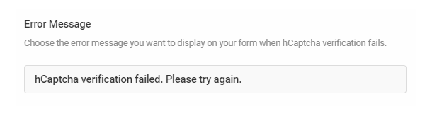
4.3.18 HTML Field
Link to chapter 3Adds a HTML field so you can insert HTML into your form. This only displays formatted HTML within the form. It is read-only by default and is not for user input.
In addition to HTML code, form data can be embedded into the HTML field through the use of merge tags. To add form data to the HTML field, click the + Insert form fields link to select and insert available merge tags. Alternatively, you can type out the merge tag directly.
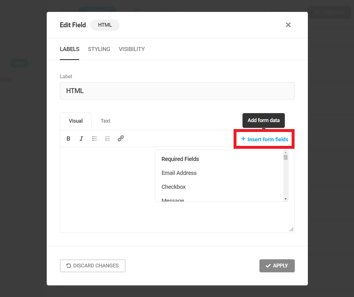
See Form Data above for more information about embedding form data using merge fields.
Note that if you want to use shortcodes in a HTML field to include custom content in your form, you’ll need to first add the following filter in a mu-plugin or in your child-theme’s functions.php file.
add_filter( 'forminator_replace_variables', 'do_shortcode' );
4.3.19 Page Break
Link to chapter 3Adds a page break to your form so you can add steps or break up long forms into sections.

Example of a paginated form on the Frontend:
Pagination Labels
The Page Break fields themselves have no settings, but can dragged & dropped anywhere in your form to break it into pages.
When you add your first Page Break field to a form, you’ll see a Pagination section appear at the top, above all other fields.
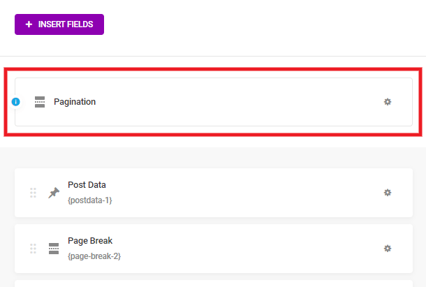
Click that section to open the Pagination settings modal. There, you’ll see a label field for that first Page Break you added, and one for the last step of your form. For each additional Page Break field you add to your form, a new page label will appear here for you to customize.
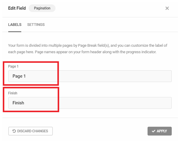
Pagination Settings
Progress Indicator
Choose to show or hide the progress indicator at the top of your form and, if shown, whether it should indicate the steps (as in our example above) or a simple progress bar.
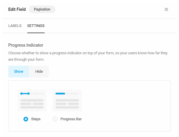
Buttons Text
For each Page Break you add, you can chose to use the default “Previous/Next” button text, or customize those labels for each one.
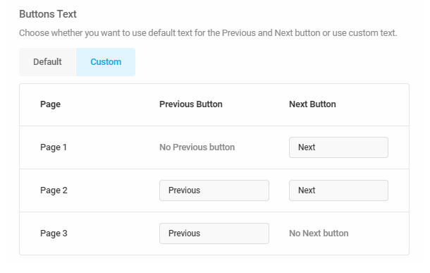
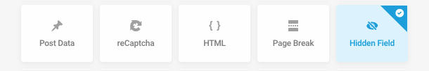
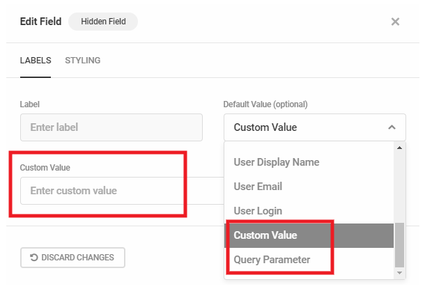
4.3.21 Section Field
Link to chapter 3Adds a section divider to your form.
Section Labels
- Section title – Adds a title to your section
- Section subtitle – Adds a subtitle to your section
Section Settings
Optionally add a solid or dotted borderline underneath your section, then specify its width and color.
4.3.22 Consent Field
Link to chapter 3Adds a Consent checkbox to your form which may be used for compliance with GDPR, for consent to receive marketing emails, and more.
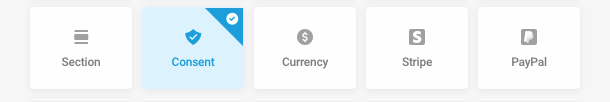
Consent Labels
Customize the field label that appears in your form and edit the text content. Default text is included with a link to your Privacy Policy page set in your site admin Settings and an empty Terms and Conditions link which you’ll want to edit to include the correct link. You can also enter any additional information you need to provide to your users.
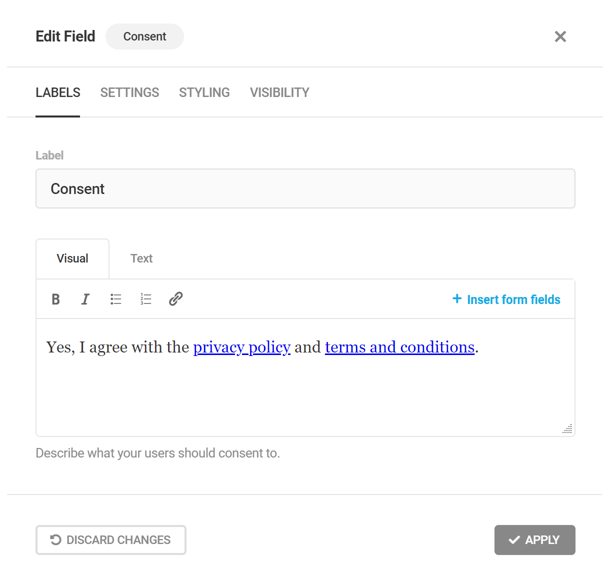
Consent Settings
The Consent checkbox is a required field by default, but can be made optional for users. You can also customize the message shown to users if they do not check the box in your form.
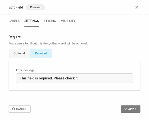
4.3.23 Currency Field
Link to chapter 3Adds a field to your form which allows user-defined monetary inputs, such as when accepting donations.
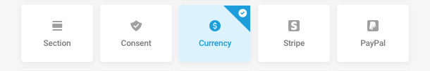
Currency Labels
In the Labels tab, you can change the field Label, put Placeholder text, add a Default Value or add a custom Description.
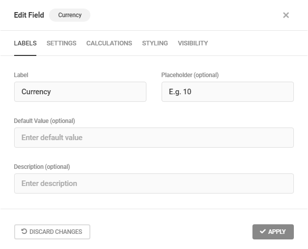
Currency Settings
The Settings tab allows you to adjust various aspects of the Currency field functionality, including value limits and formatting.
To force users to fill out the Currency field, select Required. Otherwise, the field will be optional.
It is recommended that any currencies used in a Forminator module remain consistent to avoid confusion. To set the field’s currency, select your preferred currency from the drop-down menu.
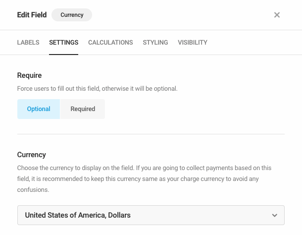
To restrict the minimum and/or maximum values that a user can enter, enter a minimum and/or maximum value in the respective fields, and optionally set custom error messages for values beyond these bounds. Leave the fields blank to allow the user to enter any number, including a negative value.
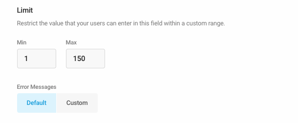
Choose your preferred decimal separator from the Separators drop-down menu. To round the field’s value automatically, choose the maximum number of decimal places from the Round To drop-down menu.
Lastly, to pre-populate the field dynamically using a query parameter passed in your form URL, enter a query parameter key in the Query parameter field.
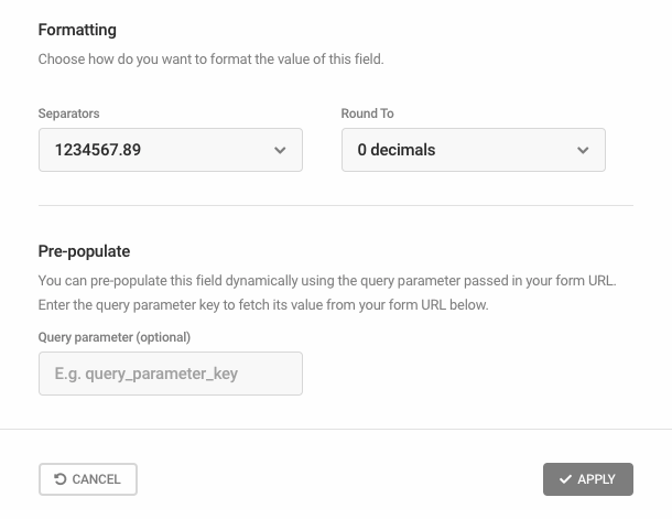
Currency Calculations
You can choose whether or not to allow this field to be used to create formulae within Calculations fields in your form. Select Enable to allow the field to be used in calculations.
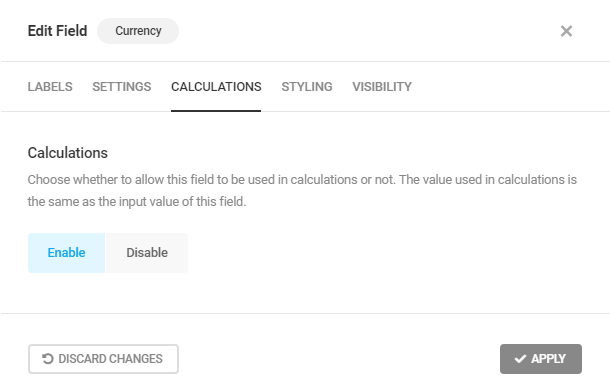
4.3.24 Stripe Field (Legacy)
Link to chapter 3This chapter details the usage of the old Simple Card Payment Element, which is being deprecated by Stripe. It is replaced by Stripe’s new Optimised Checkout Suite Payment Element, which is now the default for all new forms using a Stripe field. See the Stripe Field (New) chapter below for details about the new features and how to migrate your existing forms to the new Stripe checkout experience.
Adds a Stripe payment field to your form. If you’re interested in how this can be implemented for an order form that accepts payments, check out the video below.
Stripe and PayPal fields can be added to the same form, though we recommend using conditional logic so only one field is visible at a time. Consider a Radio (or Select) field that allows visitors to choose the payment method, then conditionally display only the visitor’s desired payment method. Or, use conditional logic to allow visitors to skip payment altogether!
A notice will appear at the top of your screen to remind you of this if you do add both payment fields to your form.
Stripe Labels
Under the Labels tab, you can customize the Stripe field Label and optional Description, as well as the preferred Language used for placeholder fields and card validation errors returned by Stripe.
You can also choose whether to show or hide the Card icon in the Stripe field, and whether to require Postal code (or ZIP code) in the Stripe field. If enabled, the postal code can be optionally prefilled from a related postal code field in your form.
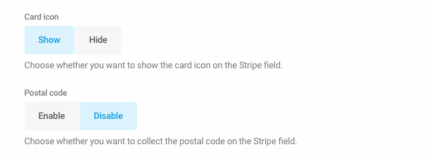
The following image shows how Card icon and Postal code options are displayed in the Stripe field, if enabled.
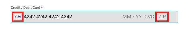
Stripe Settings
The Settings tab allows you to configure payment mode and payment method settings for the Stripe field. Note that you will need to connect a Stripe account to Forminator before customizing Stripe field payment settings.
The Stripe field can be placed in Test mode until your form is ready to process live payments, and can be toggled to Live mode to begin accepting payments. For information about testing Stripe’s payment integration, refer to Stripe’s testing documentation.
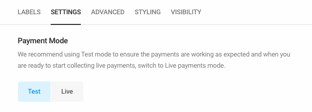
Select the Stripe field’s payment currency from the drop-down menu. We recommend using the currency most likely to be used by the majority of your customers in order to minimize currency exchange feeds.
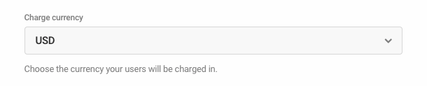
Payment Plans
The Settings tab also allows you to configure one-time and subscription payment plans to be processed by the Stripe field. Multiple payment plans can be configured for the same Stripe field, and conditionally processed based on form data.
Select an existing payment plan to configure payment plan details, or click Add Another Plan to add a new payment plan. Click the trash icon to delete an existing payment plan.
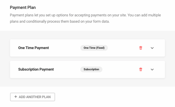
Enter the plan name to be displayed in the form submission and in the Stripe dashboard. For the payment type, select One Time to charge customers a single payment or select Subscription to change customers a recurring payment.
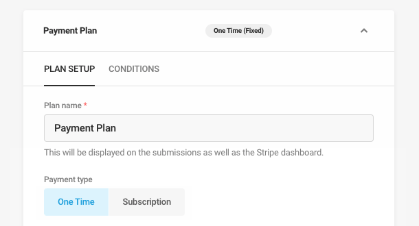
Stripe subscription payment plans are a Forminator Pro feature and require the Stripe Subscriptions add-on to be installed. See Add-ons below for installation instructions.
For One Time payments, simply select the plan payment amount:
- Fixed – Charge all customers the same amount, such as when submitting an application fee or deposit.
- Variable – Change the payment amount depending on form data. If selected, a drop-down menu will appear where you can select an existing Currency, Calculations or Number field in your form to set the plan payment amount.
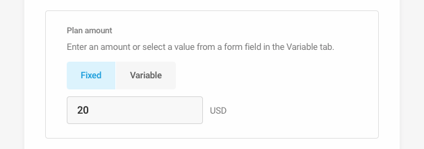
For Subscription payments, select the plan payment amount and quantity. For both settings, the available options are:
- Fixed – Charge all customers the same amount/quantity, on a recurring basis.
- Variable – Change the payment amount/quantity depending on form data. If selected, a drop-down menu will appear where you can select an existing Currency, Calculations or Number field in your form to set the plan payment amount/quantity.
Whether you set the Quantity to be Fixed or Variable, the total amount that the user will pay equals the number in the Amount field multiplied by the number in the Quantity field. For example, if the Amount is $10 and the Quantity is 3, the user will be charged $30 when submitting the form and a similar amount on the next billing cycle.

For Subscription payments, select your billing cycle and choose whether to allow a free trial period. If a trial is enabled, select a trial duration, in days.
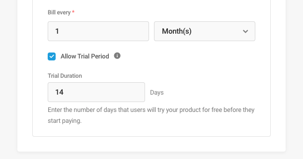
Multiple payment plans can be added to the same Stripe field and conditionally processed based on form data. First, select the Conditions tab, and then select an existing condition to configure condition details, or click Add Conditions to add a new condition.
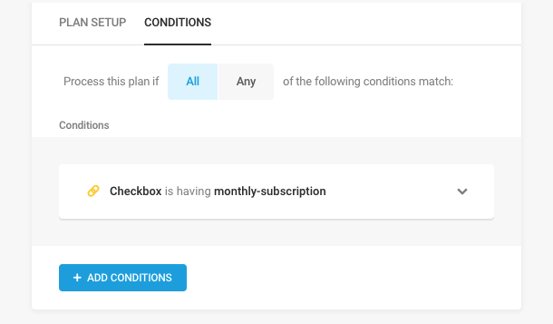
Then, configure the conditional logic that will determine when to process the selected payment plan. For additional details on conditional logic, refer to our overview of conditional logic in the introduction to the Forminator Fields chapter.
Note that if you have more than one plan configured with conditional logic, only the first plan whose conditions are met will be processed.
Once customers have submitted forms with a subscription payment plan, your subscribers and subscription payments can be managed from the Stripe Dashboard. Alternatively, you can jump to individual subscriptions in Forminator from the Submissions page by selecting a form submission and clicking Manage subscription.
At this time, subscriptions cannot be canceled directly by customers. If cancelation is requested by a customer, their subscription can be managed from the Stripe Dashboard.
Stripe Advanced
Payment Receipt
Enable the Payment Receipt feature and Stripe will email a receipt to your customers following successful purchases. This receipt comes directly from Stripe and is in addition to any custom email notifications configured in Forminator.
Click the Email address drop-down menu to reveal the email fields present in the current form and select the applicable email address.
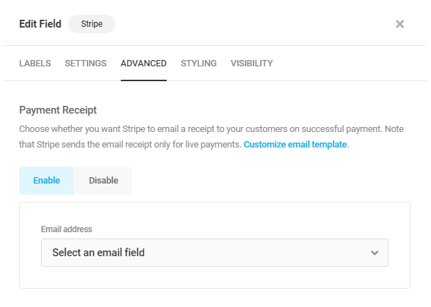
Stripe does not send receipts for purchases conducted in Test mode, only successful live payments will receive receipts.
You can customize the Stripe receipt email by clicking Customize email template, which will open the Stripe login screen. Log in to Stripe and follow their guidance on creating custom email receipts.
Payment Details
Statement Decipher
A Statement Decipher is techie phrase for the word or phrase appearing in a financial account statement that identifies where a transaction occurred. Typically, one would expect this to be the company name but you can create any custom decipher you wish as long it’s no more than 22 characters long.
Payment Description
The Payment Description will appear in the Stripe payment receipt emailed to your customers and will be part of transaction data recorded in the Stripe account that received the payment.
Card Validation
Stripe validates card information as it’s being input and this validation occurs independent of the validation of other user inputs, such as email addresses, as configured under the form’s Behavior tab.

Billing Details
Enable Billing Details to send additional information collected by a form to Stripe so the data appears with the payment information in your Stripe Dashboard. Click Enable, then select from the drop-down menus the information you want Stripe to include with the transaction record.
Meta Data
Any custom metadata associated with your form can be sent to Stripe and included in the MetaData section for each payment received. Any metadata sent to Stripe must conform to the service’s requirements: a maximum of 20 meta keys can be sent, key names must be 20 characters or less and mapped data will be truncated to 500 characters.
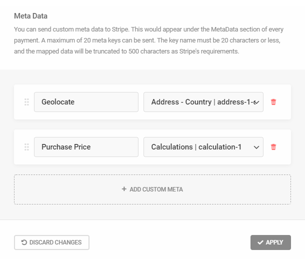
Stripe Styling Tab
The element classes on the Stripe checkout screen are associated with a specific field state, such as empty, invalid or complete. When a field’s state changes, usually because a user entered some data, a new class is applied. The Styling tab allows you to create custom classes while maintaining this relationship between classes and field state.
For example, when a user completes a given field with no errors, Stripe associates the default class StripeElement–complete with that field. You may change the class StripeElement–complete by editing the Complete field in the Styling tab, but Stripe will still associate the new class with the “complete” state, and only when a field achieves the “complete” state will styling associated with that class be applied.
Remember, modifying Stripe’s default classes is not necessary, but if you wish to do so, simply enter your custom classes into the fields provided and click Apply.
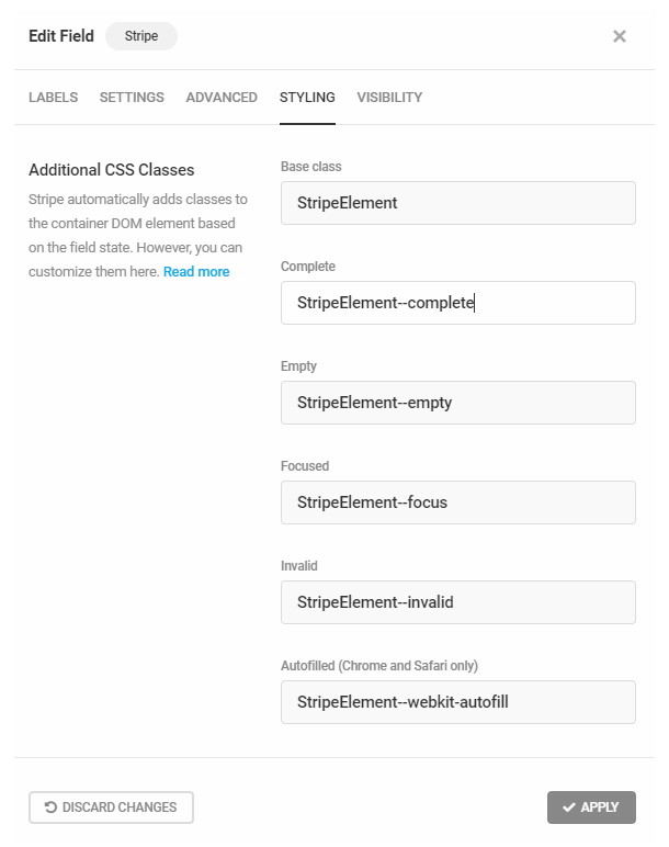
Click Read More to access the Stripe compendium of element types, objects, classes and styles.
Once you’ve defined your custom classes, or chosen to use the defaults, you can then use the classes to apply custom CSS in the editor available in the Forminator Appearance tab.
SCA Compliance
Forminator 1.9, released August 29, 2019, replaced the Stripe Checkout Modal with the SCA compliant Stripe Elements. All forms containing Stripe payment fields will be automatically updated. While we expect your forms to continue to work as intended, if you are updating the plugin from a version prior to 1.9, we recommend that you review any form containing a Stripe field to ensure there are no issues, and review the following information.
The Stripe Elements payment process is fully SCA compliant. Strong Customer Authentication (SCA) requires that online credit and debit card payments transacted in Europe use 3D Secure to authenticate payments.
Financial institutions may decline transactions that don’t follow SCA guidelines.
3D Secure, in a nutshell, dictates that verifying a card’s validity is insufficient protection from fraud and requires that customers authenticate each online purchase independently. This is typically accomplished by providing customers with a transaction-specific verification code delivered via email or SMS, similar to the example below.
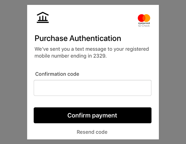
A message will appear in your WordPress Dashboard following the update which outlines why updating to SCA is critical. Click Learn More to access a window we designed to expedite the process of verifying your forms’ appearance and functionality.
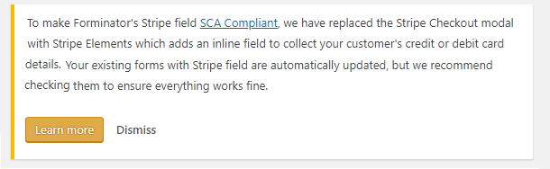
The Stripe is SCA Compliant window suggests things to look for when you are reviewing your forms.
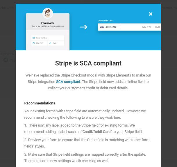
The window identifies your existing forms that contain stripe fields. Click the edit icon on the right to access that form and review the Stripe field.
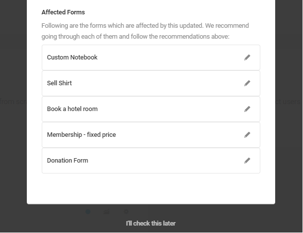
4.3.25 Stripe Field (New)
Link to chapter 3Adds a Stripe payment field to your form.
This chapter details the new Stripe Optimised Checkout Suite (OCS) Payment Element that replaces the soon-to-be-deprecated Simple Card Payment method previously used in Forminator. In the past, your users could only use Credit and Debit Cards, but with the new OCS Payment Element you can now use many different payment options including Apple and Google Pay, Amazon Pay, Klarna and many many more. See Stripe Settings below for details.
If you have existing forms using a Stripe field, we recommend migrating your field data and settings following the directions in Migration from Old Stripe Field to New Stripe Field below.
Stripe and PayPal fields can be added to the same form, though we recommend using conditional logic so only one field is visible at a time. Consider a Radio (or Select) field that allows visitors to choose the payment method, then conditionally display only the visitor’s desired payment method. Or, use conditional logic to allow visitors to skip payment altogether!
A notice will appear at the top of your screen to remind you of this if you do add both payment fields to your form.
Stripe Labels
Under the Labels tab, you can customize the Stripe field Label and optional Description, the preferred Language used for placeholder fields, and the Currency in which the users will be charged.
We recommend using the currency most likely to be used by the majority of your customers in order to minimize currency exchange fees.
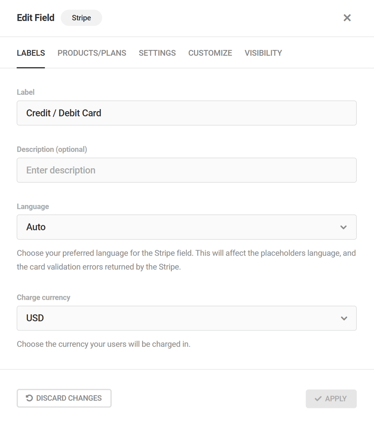
Stripe Products/Plans
The Products/Plans tab allows you to configure payment mode and payment method settings for the Stripe field. Note that you will need to connect a Stripe account to Forminator before customizing Stripe field payment settings.
Payment Mode
The Stripe field can be placed in Test mode until your form is ready to process live payments, and can be toggled to Live mode to begin accepting payments. For information about testing Stripe’s payment integration, refer to Stripe’s testing documentation
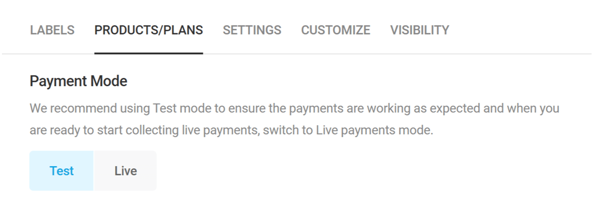
Payment Details
Under the Payment Details section, configure the type of payment plans (one-time or subscription) to be processed by the Stripe field. Multiple payment plans can be configured for the same Stripe field, and conditionally processed based on form data.
Select an existing payment plan to configure payment plan details, or click Add Another Plan to add a new payment plan. Click the trash icon to delete an existing payment plan.
Enter the plan name to be displayed in the form submission and in the Stripe dashboard. For the payment type, select One Time to charge customers a single payment or select Subscription to change customers a recurring payment.
Stripe subscription payment plans are a Forminator Pro feature and require the Stripe Subscriptions add-on to be installed. See Add-ons below for installation instructions.
For One Time payments, simply select the plan payment amount:
- Variable – Change the payment amount depending on form data. If selected, a drop-down menu will appear where you can select an existing Currency, Calculations or Number field in your form to set the plan payment amount.
Fixed – Charge all customers the same amount, such as when submitting an application fee or deposit.
For Subscription payments, select the plan payment amount and quantity. For both settings, the available options are:
- Fixed – Charge all customers the same amount/quantity, on a recurring basis.
- Variable – Change the payment amount/quantity depending on form data. If selected, a drop-down menu will appear where you can select an existing Currency, Calculations or Number field in your form to set the plan payment amount/quantity.
Whether you set the Quantity to be Fixed or Variable, the total amount that the user will pay equals the number in the Amount field multiplied by the number in the Quantity field. For example, if the Amount is $10 and the Quantity is 3, the user will be charged $30 when submitting the form and a similar amount on the next billing cycle.
For Subscription payments, select your billing cycle and choose whether to allow a free trial period. If a trial is enabled, select a trial duration, in days.
Multiple payment plans can be added to the same Stripe field and conditionally processed based on form data. First, select the Conditions tab, and then select an existing condition to configure condition details, or click Add Conditions to add a new condition.
Then, configure the conditional logic that will determine when to process the selected payment plan. For additional details on conditional logic, refer to our overview of conditional logic in the introduction to the Forminator Fields chapter.
Note that if you have more than one plan configured with conditional logic, only the first plan whose conditions are met will be processed.
Once customers have submitted forms with a subscription payment plan, your subscribers and subscription payments can be managed from the Stripe Dashboard. Alternatively, you can jump to individual subscriptions in Forminator from the Submissions page by selecting a form submission and clicking Manage subscription.
At this time, subscriptions cannot be canceled directly by customers. If cancelation is requested by a customer, their subscription can be managed from the Stripe Dashboard.
Stripe Settings
Payment Methods
Select how your customers will make payments. By default, Stripe supports Cards Only. To enable other options such as Google Pay, Link or Alipay, choose the Dynamic Payment Methods option.
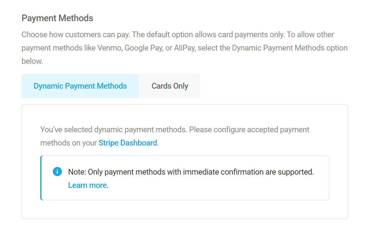
If the Dynamic Payment Methods option is enabled, you’ll need to set up the payment methods you want to accept in your Stripe Dashboard. It is quite simple to enable and disable various Payment Methods and even set conditions for when specific ones should appear for your users.
Scroll through the list of available payment methods until you find the one you want, and click on it. Be sure the method provides Immediate confirmation as those that require a delay will not work in Forminator.
To set up conditions for when the method should appear to your users, click the ellipsis icon and configure any available Custom Rules. Note that some methods like Apple Pay or Google Pay do not allow custom rules.
When you’re done, click the Turn On button to enable the payment method.
Additional Settings
Send Payment Receipt
Enable this option if you want Stripe to email the payment receipt to your customers upon successful payment. Note that an email receipt is only sent for live payments. Click the Customize email template link to be directed to your Stripe dashboard where you can do just that.
Enable Billing Details
Enable this option to send additional information collected by a form to Stripe so the data appears with the payment information in your Stripe Dashboard. Select the corresponding form fields from the drop-down menus to send the information you want to Stripe.
Meta Data
Any custom metadata associated with your form can be sent to Stripe and included in the MetaData section for each payment received.
Any metadata sent to Stripe must conform to the service’s requirements: a maximum of 20 meta keys can be sent, key names must be 20 characters or less and mapped data will be truncated to 500 characters.
Stripe Customize
Payment Element Layout
Here you can customize the layout of the Stripe payment element. You can select to either display payment methods in Tabs or as an Accordion (with or without radio buttons).
Appearance
Choose from among the available themes from the drop-down menu to customize the style and appearance of the elements. You can select either Default, Night or Flat.
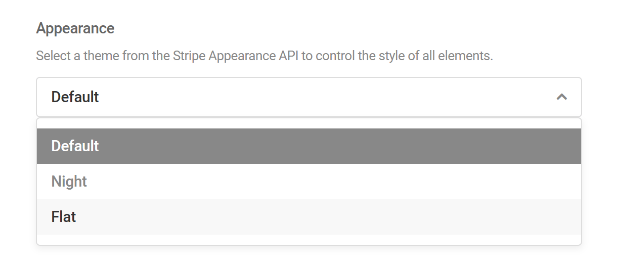
Customize Appearance
Enable this option to customize the colors, spacing, and other appearance settings.
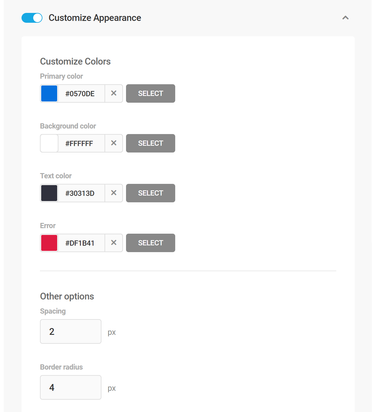
Migration from Old Stripe Field to New Stripe Field
If you are currently using the older version of the Stripe payment field in any forms, a notice will be displayed at the top of every Forminator screen prompting you to migrate them to the new Stripe field.
This notice will provide links to the 3 most recent forms with a Stripe field and, as each is migrated to the new Stripe field, it will be replaced by the next most recent until all are updated.
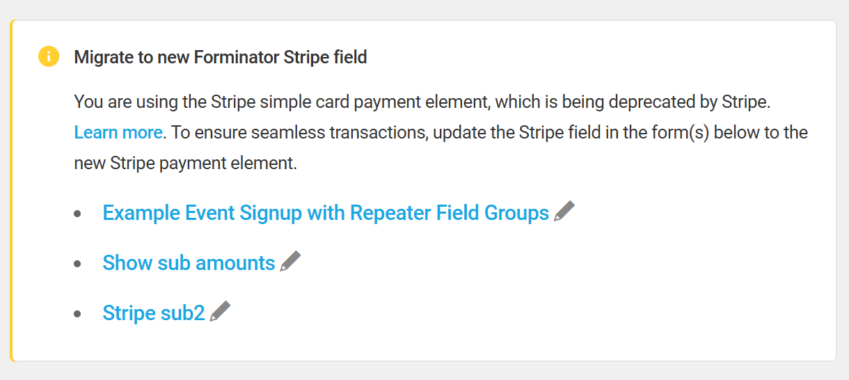
In the editor of each form still using an old Stripe field will be another warning prompting you once again to perform the migration.

Click the Migrate to New Stripe Field button on the notice displayed to start the migration from the old Stripe payment field to the new Stripe field.
A new Stripe OCS field will be added, and a Legacy tag will be applied to the existing Stripe field. Additionally, all settings from the old field will be transferred to the new one.
After successful migration, you can delete the legacy Stripe field after ensuring the new field is working without any issues.
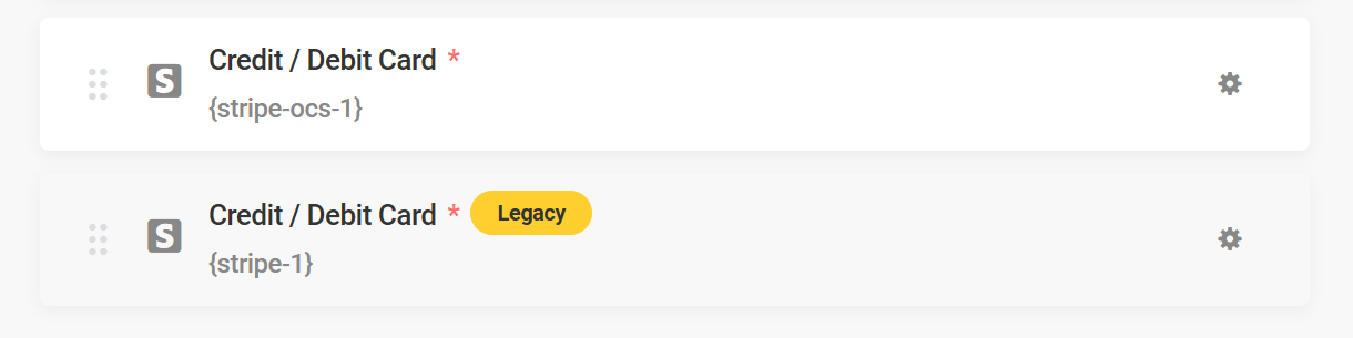
Note that Stripe will not completely disable the card element but may start charging extra fees for sites using the old Stripe Card Element along with a Secret API Key rather than a Restricted API Key. However, we will eventually deprecate the old Stripe field in Forminator.
FAQs and Known Issues
I can’t see any payment methods other than card even though I have set them to active in the Dashboard
- Make sure that the there are no Custom Rules set in your Stripe dashboard for the payment methods that you have activated causing them to not appear.
- Make sure the correct currency is set in the Stripe Labels settings based on your Stripe account.
- For example: Stripe Account Created in Australia – Currency should be Australian Dollars.
- Certain Payment Methods like Apple Pay and Google Pay require domain verification. Make sure you have your Domain set in Payment method domains on your Stripe Dashboard.
Nothing happens after using Payment Methods that redirect to payment site – (After submission, you will be redirected to securely complete next steps)
- Make sure that you dont have any Adblock Extension blocking the browser pop-up.
My submission fails immediately after using a specific payment method
- Make sure that the payment method’s confirmation that you are using is Immediate.
- We are working on better ways to exclude some of the Payment Methods that wont work with Forminator and will improve this in future versions.
- Note that some confirmations that are not immediate dont fail and will continue to process. We are working on improving this as well.
Can I still use the old Stripe Card element in new forms?
- No, new forms can only use the new Payment element.
4.3.26 PayPal Field
Link to chapter 3Adds a PayPal payment field to your form.
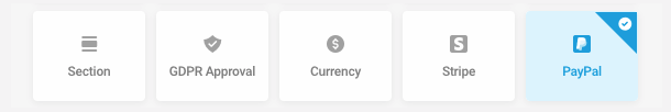
Stripe and PayPal fields can be added to the same form, though we recommend using conditional logic so only one field is visible at a time. Consider a Radio (or Select) field that allows visitors to choose the payment method, then conditionally display only the visitor’s desired payment method. Or, use conditional logic to allow visitors to skip payment altogether!
A notice will appear at the top of your screen to remind you of this if you do add both payment fields to your form.
PayPal Settings
The first time you access the PayPal field Settings screen, you will be prompted to connect a PayPal business account to Forminator if you haven’t already done so.
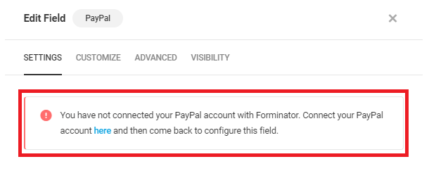
Click the here link to be redirected to the Settings > Payments screen in Forminator. There, you’ll click Connect To PayPal to access and connect your PayPal account to Forminator. See the Settings > Payments section if you need help connecting your PayPal account.
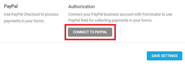
Once PayPal is successfully connected to Forminator, you can continue with the configuration of the payment field in your form.
Mode of Payment
Use Sandbox mode to test your PayPal Checkout configuration and ensure it looks and functions as you expect before publishing the form. Select Live mode when you are ready to publish your form and accept payments.
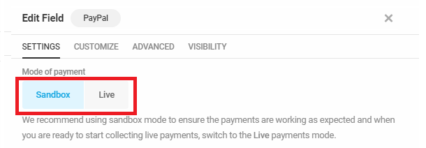
Charge Currency
Open the drop-down menu to select the currency you wish to use with this form. It is recommended that you use the currency most likely to be used by the majority of your customers in order to minimize the negative impact currency exchange fees can have on sales.
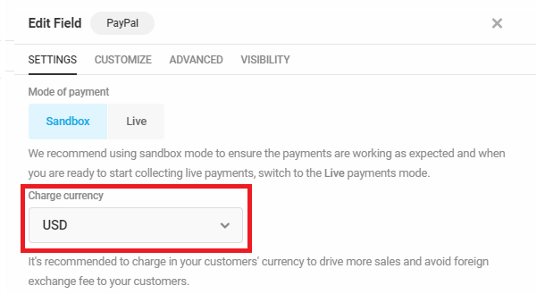
Payment Amount
- Fixed – Select this option to set a fixed payment amount if you want everyone submitting this form to pay the same amount, such as when submitting an application fee or deposit.
- Variable – Select this option to make the payment amount dependent on user inputs. A drop-down menu will appear where you can select any Currency, Calculations or Number field in your form to populate the Payment Amount field.
PayPal Advanced
Disable Funding Sources
Select the funding sources you want to eliminate from PayPal displays as payment options.
Disable Card Options
Select the cards you want to eliminate from PayPal displays as payment options.
Pre-fill Billing Details
Billing details collected by your form can be sent to PayPal. These details will appear alongside each payment in your PayPal Dashboard. Click Enable to send billing details to PayPal.
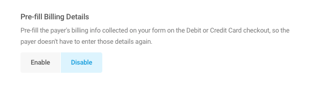
Note that if you select a Name field when enabling this option, that Name field must be set to Multiple (with both First and Last names enabled). Similarly, if you select an Address field, the Country option must be enabled in that field.
If these requirements are not met, you’ll get a very cryptic error from PayPal on your form page when you click the payment button: Error! Something went wrong when verifying the payment.

Shipping Address
If you are selling a product that doesn’t need to be shipped, you can choose to disable and hide the shipping address fields from the PayPal payment page. Click Enable to include shipping address fields on the PayPal payment page.
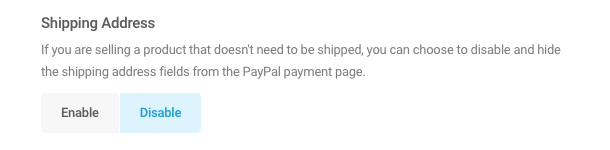
Language
PayPal automatically adapts the language that appears on its buttons to visitors’ geolocations and browser preferences. You can set a specific language for your PayPal buttons but doing so overrides the PayPal adaptive language feature. The payment buttons will display the language you choose to all visitors.
If you wish to limit your PayPal buttons to a specific language, you must enter a PayPal locale code. Visit PayPal’s Supported locale codes page to find your code, and enter the code in the field provided.
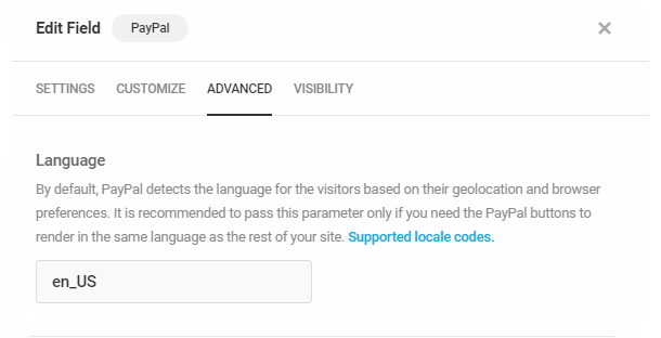
Debug Mode
PayPal debug mode can help troubleshoot issues with the PayPal payment process. However, Debug mode significantly increases script size and can cause performance issues. It is recommended that you enable Debug mode and troubleshoot PayPal issues in Sandbox mode only.
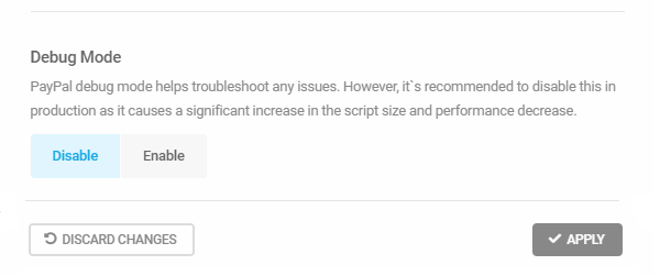
When enabled, pop open your browser console where you’ll see every PayPal process is logged during a transaction to help troubleshoot any issues you may be having.
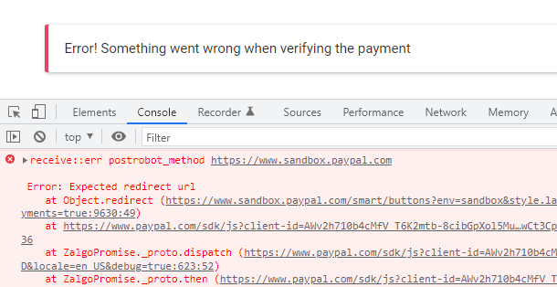
PayPal Customize
The Customize Tab allows you to modify the look of the PayPal Checkout buttons in your form.
- Label – Choose which of three PayPal labels will appear in your form’s buttons.
- Color – Choose the color of the buttons.
- Width – Chose the width of the buttons.
- Height – Chose the height of the buttons.
- Shape – Choose the shape of the buttons.
- Layout – Choose whether the PayPal and PayPal Credit buttons are stacked or appear side by side.
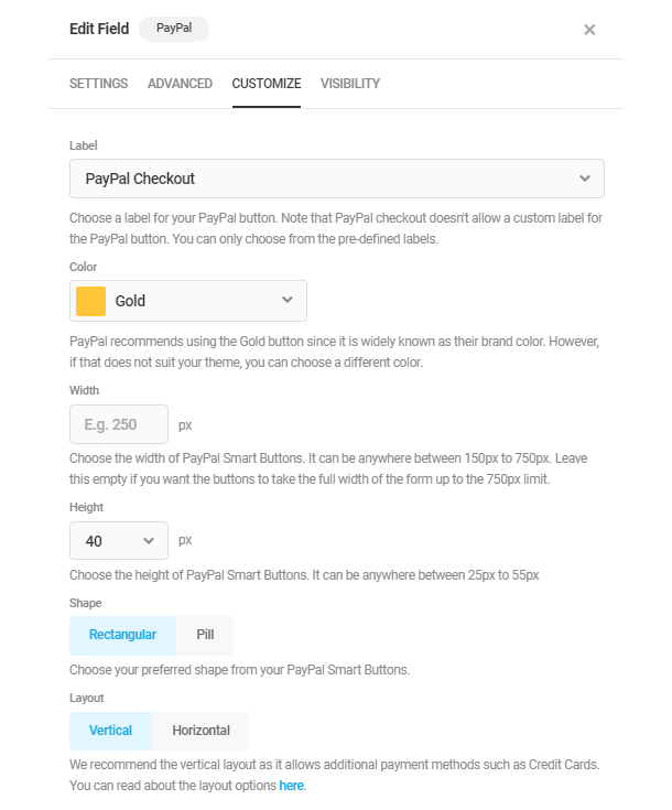
If you leave everything at their defaults, your buttons would look like this example in your form.

SCA Compliance
The PayPal payment process is fully SCA compliant. Strong Customer Authentication (SCA) requires that online credit and debit card payments transacted in Europe use 3D Secure to authenticate payments.
Financial institutions may decline transactions that don’t follow SCA guidelines.
3D Secure, in a nutshell, dictates that verifying a card’s validity is insufficient protection from fraud and requires that customers authenticate each online purchase independently. This is typically accomplished by providing customers with a transaction-specific verification code delivered via email or SMS, similar to the example below.
4.3.27 E-Signature Pro
Link to chapter 3The E-Signature field enables you to require users to add their signature when submitting your form.
The e-signature field requires the PHP GD extension to be enabled on your server. If you are not sure how to enable PHP extensions, please contact your hosting provider and ask them to enable it for you.
If you need a legally binding signature, see also the WP E-Signature integration below.

With all settings at their defaults, the E-Signature field would look like this example in your form.
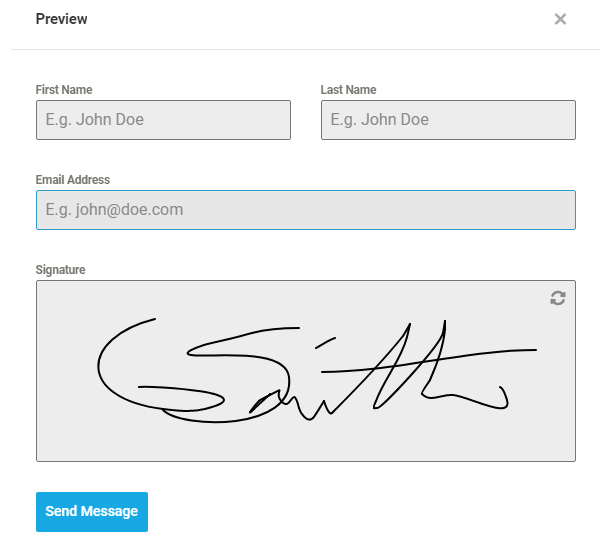
E-Signature Labels
- Label – This appears above the E-Signature field in your form.
- Placeholder – This appears in the E-Signature field before the user clicks into it to sign.
- Description – This appears beneath the E-Signature field.

E-Signature Settings
- Signature filetype – Select to save submitted e-signatures as PNG or JPG files.
- Height – Adjust the height of the e-signature field if needed.
- Stroke thickness – Adjust the line thickness of the e-signature.
- Require – Set the e-signature to required or optional.
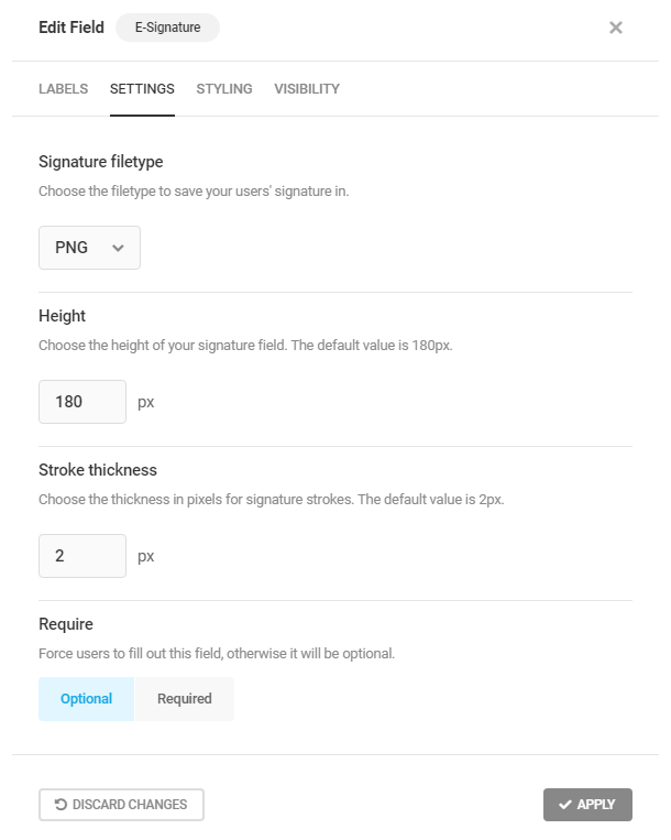
4.3.28 Field Group
Link to chapter 3This special field allows you to group any number of other fields together in your form, and to optionally enable your users to add as many additional field groups as needed when filling out your form. This can be very useful for repeatable data entry like employment history, event attendees, any kind of list, etc.

As an example, you could group Name, Email and Phone fields together when creating a form for event attendees. Your users could then either click an Add button for each additional field group they need, or they could select the number of attendees in another field to automatically add that number of field groups in the form. See Example Field Group Setup below for details about this example.
It’s not only limited to Name, Email & Phone fields; once you have added a Field Group, you can add any other fields as needed in that group. See Adding Fields to a Field Group below for details.
Field Group Labels
In the Labels tab, you can customize the Field Group Label and add a custom Description.
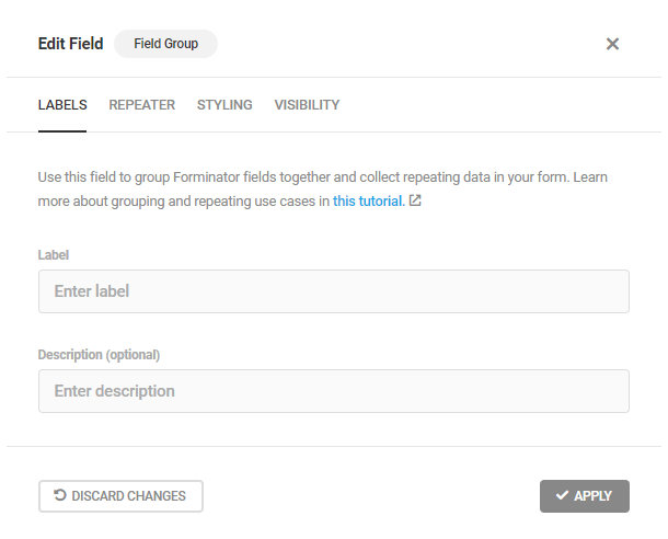
Field Group Repeater
The Repeater section is where you can configure how users can add more Field Groups to the form they’re filling out.
Note that using this feature is entirely optional. You can use Field Groups to simply group any number of fields together to provide a visual distinction between groups of related fields in your form if needed.
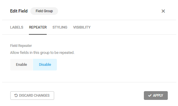
Clicking the Enable button will reveal the configuration options.
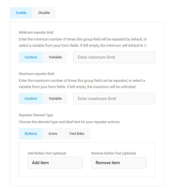
- Minimum Repeater Limit – Set the minimum number of field groups that should display in your form by default. You can either enter a Custom number, or select the Variable option to use the value from another form field. If nothing is entered here, the minimum will default to 1.
- Maximum Repeater Limit – Set the maximum number of field groups that users can add to your form. You can either enter a Custom number, or select the Variable option to use the value from another form field. If nothing is entered here, the maximum will default to unlimited.
- Repeater element type – Select to display either Buttons, Icons or Text Links for your users to add or remove field groups when filling out the form. If you select either Buttons or Text Links, you can customize the text that should display for each.
Using Variable Values for Repeated Fields
If you use the same form field as a variable for both the Minimum and Maximum Repeater Limits, a Number field for example, you will not see any Add or Remove buttons in your repeater fields. This is because whatever is entered in the Number field in the form sets the specific number of repeated field groups that would appear.
If you use a Number field as the variable for only the Minimum Repeater Limit, then Add & Remove buttons will appear unless the user selects a number that corresponds to what you have set for the Maximum Repeater Limit. In that latter case, both the minimum and maximum would be the same, and no fields could be added or removed.
If you use a Number field as the variable for only the Maximum Repeater Limit, then Add & Remove buttons will appear until the user has added the maximum number of repeated fields that they have selected in your Number field. At that point, only Remove buttons would appear.
Field Group Styling
As with all other fields, you can add Additional CSS Classes here to aid with custom styling of this field.
By default, your Field Groups will inherit the styles you have set under Appearance > Colors. Select the Remove option in Group Field Styling if you don’t want those colors applied. Note however that this would not affect the styling of the Repeater buttons if you’ve enabled that for your Field Group.
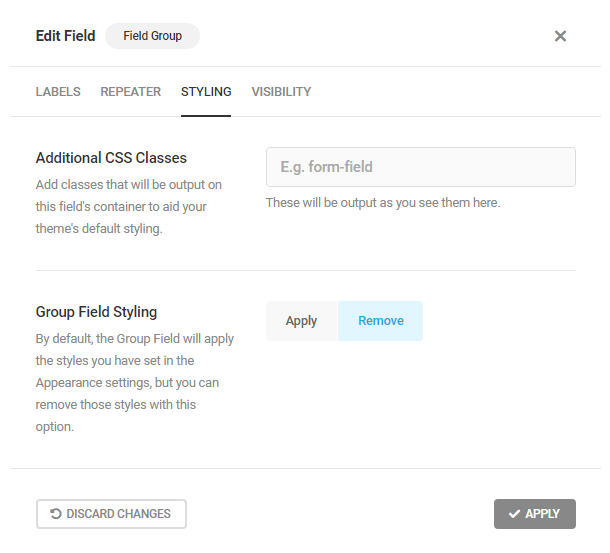
Field Group Visibility
The Visibility rules for the Field Group work the same way as other fields. See Visibility (Conditional Logic) in the Forminator Fields chapter for details.
Adding Fields to a Field Group
Once you have added the Field Group field, click the Add Fields to Group button in the Field Group to add the fields you want in that group.
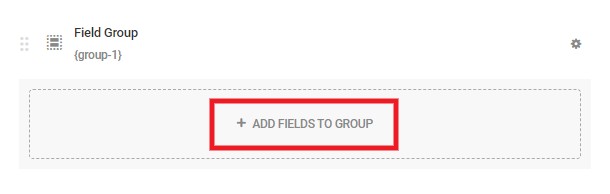
That will pop open a familiar modal window where you can select the fields you need. Note that the selection here is limited to the fields that can be added to a repeatable group. Select the ones you need and configure them as you normally do for any Forminator Fields.
All fields you add to the Field Group will be repeated as a group when the user selects to add a field group when filling out your form.
Refer to Calculations in Field Group Repeaters section to read more about how you can use calculations in Field Group Repeaters and the wildcard merge tags to create forms that can perform advanced calculations.
Example Field Group Setup
Check out the New Forminator Field Grouping and Repeater Option Is Now Available post on the blog for additional use cases.
Let’s say you want to build a form to sign up event attendees with the following criteria:
- You want your users to be able to enter their information for their own attendance.
- You want users to be able to add information for up to 4 guests.
- The user’s event ticket will cost $20, and any added guests are $10 each.
- You want to use Stripe to process the payments.
This example will show you how to use a Number field so your users can select how many guests they want to add, and the corresponding number of Field Groups will be automatically added to the form.
Using a Number field is required for this example. This numerical value, which corresponds to the number of guests added, is fetched by Calculations fields, which are then used in the Stripe field to determine the total cost to the user.
Follow these steps to get it done. Or import the form code below into your site to instantly get this example form set up and see how it works.
- First create a Field Group with Name, Email and Phone fields in it for the user who’s submitting the form.
- Set the 3 fields to Required
- Label this Field Group Your Information
- Set the Repeater option to Disable
- Add a Number field.
- Label it How many guests?
- Set the Default Value to 0
- In the field Settings, set the Minimum and Maximum values to 0 and 4 respectively.
- Enable the Calculations option for this field.
- Add a 2nd Field Group for the guest info with Name, Email and Phone fields in it.
- Set the 3 fields to Optional (to avoid any Stripe errors when submitting the form).
- Label this Field Group Your guest’s information.
- Set both the Minimum and Maximum Repeater Limits to Variable and select How Many Guests?
- Set this field’s Visibility to Show if How many guests? is Less than 5 AND How many guests? is not Null.
- Add a 1st Calculations field (these Calculations fields are used to calculate the total cost of the purchase, and appear in the Submissions and Emails).
- Label it Your ticket cost.
- Set the field to Hidden.
- Set the Calculations for this field to be simply the base cost of the user’s ticket: 20
- Add a 2nd Calculations field.
- Label it Your guest ticket cost.
- Set the field to Hidden.
- Set the Calculations for this field to {number-1}*10
- Add a 3rd Calculations field.
- Label it Your total cost.
- Set the field to Hidden.
- Set the Calculations for this field to {calculation-1}+{calculation-2}
- Add a 1st HTML field (these HTML fields are what appear to the user in the form).
- Label it Your ticket cost.
- In the content area, enter $20
- Add a 2nd HTML field.
- Label it Your guest ticket cost.
- In the content area, enter ${calculation-2}
- Add a 3rd HTML field.
- Label it Your total cost.
- In the content area, enter ${calculation-3}
- Add a Stripe field.
- In the field Settings, create a plan and Name it Event Tickets.
- Set the plan to One Time with the Plan Amount set to Variable and select Your total cost
Now when your users fill out the form, they’ll have the option of adding information for up to 4 guests for your event, the total cost will be automatically calculated, and Stripe will charge their card for the appropriate amount.
The Submissions data will include all the information about the event attendees:
And all the payment information will be included as well.
Here is the form code that you can import to your site to have the above example instantly created so you can see right away how things work.
And this little video shows the Field Group with Repeater option in action:
Calculations in Field Group Repeaters
If Calculations fields are added in a Repeater Field Group, the formula applied to the Calculations field(s) of the first group will be copied to the Calculations fields of every repeated group. The calculations are performed on the input values of the respective repeated groups.
Wildcard Merge Tags
A wildcard merge tag calculates the total of all values for a repeated field for which you enable calculations. The tag is indicated by a (All) appended at the end of the field label in the Add Form Fields dropdown.
These tags can only be used in Calculations fields outside the Field Groups to sum up the values in the repeated groups, and output their totals.
The wildcard merge tags are in the following format: “original-field-name-*”. For example, the merge tag of a Number field named ‘number-1’ is {number-1-*}, and a Calculations field named ‘calculation-1’ is {calculation-1-*}.
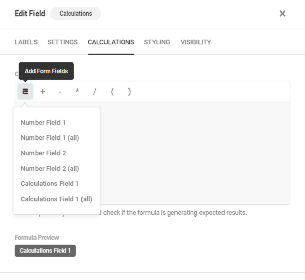
Example Number and Calculations Fields in Repeater Field Group Setup
Let’s say you want to create a form to allow people to donate, with the following criteria:
- You want users to be able to enter their information.
- You want users to be able to select the causes they wish to donate to, the number of people they wish their donation to apply to, and the total donation amount.
- You want users to be able to add information for up to 3 donations.
This example will demonstrate how you can use the wildcard merge tag to calculate the total donation made by a user.
Follow these steps to get it done. Or import the form code below into your site to instantly get this example form set up and see how it works.
- First create a Field Group with Name and Email fields in it for the user to enter their information.
- Set the both the fields to Required
- Label this Field Group Your Information
- Set the Repeater option to Disable.
- Add a 2nd Field Group for the Donation Details with a Select field, two Number fields, a Calculations field and an HTML field in it.
- Set all the fields (except Calculations & HTML) to Required.
- Label this Field Group Donation Details.
- Set the Minimum and Maximum Repeater Limits to ‘Custom’ and values to 1 and 3 respectively.
- Add a Select field.
- Label it Cause.
- Set the Type as Single.
- Add ‘Free Meal for a Child’, ‘Medical Treatment’, ‘Feed a homeless person’ as the Options and ‘one’, ‘two’ and ‘three’ as their corresponding Values. Set ‘Free Meal for a Child’ as the default select value.
- Add a Number field.
- Label it No of People
- Set the Default Value to 1
- In the field Settings, set the Minimum and Maximum values to 1 and 10 respectively.
- Enable the Calculations option for this field.
- Add another Number field.
- Label it Donation Amount
- Set the Default Value to 1
- In the field Settings, set the Minimum and Maximum values to 1 and 1000 respectively.
- Enable the Calculations option for this field.
- Add a Calculations field inside the field group (this field is used to calculate the total amount donated for each cause).
- Label it Amt Donated Calc.
- Set the Field Type to Hidden
- Set the Calculation Formula for this field to {number-1}*{number-2}
- Add a HTML field inside the field group (this HTML field is what appears to the user in the form to display the amount donated for each cause)
- Label it Amt Donated.
- In the content area, enter ${calculations-1}
- Outside the Field Group, add the 2nd Calculations field.
- Label it Total Amt Donated Calc.
- Set the Field Type to Hidden
- Set the Calculation Formula for this field to {calculation-1-*}. This formula is used to calculate the total of all the calculations fields inside the repeater Field Group.
- Add a 2nd HTML field outside the field group (this HTML field is used to display the total amount donated by a user)
- Label it Total Amt Donated.
- In the content area, enter ${calculation-1-*}
Now when your users fill out the form, they’ll have the option of donating for up to 3 causes, and the amount donated for each cause and the total amount donated for all the causes will be automatically calculated.
Here is the form code that you can import to your site to have the above example instantly created so you can see right away how things work.
Current Field Group Limitations
The Field Group feature has some limitations that you should be aware of.
- Fields – Some fields, like E-Signature, cannot be added to a Field Group. See the image in Adding Fields to a Field Group to view the fields that can be added.
- Integrations – The current version supports sending repeated fields data to Webhook and Google Sheets integrations only. So if your form is integrated with any other available apps, data will be sent to those apps from only the first fields of the group, not from the repeated one(s).
- Email Notifications and PDFs – If you use merge tags to add individual fields in email notifications or PDFs, only the data from the first fields in a field group will be included; there are no merge tags to select the repeated fields in a field group. To get all data from all repeated fields in field groups, you must use the {all_fields} merge tag.
4.3.29 Slider Field
Link to chapter 3The Slider field enables you to add a simple slider or a range slider to your form.

Slider Label
In the Labels tab, select the type of slider you want to insert
A single slider will have a fixed starting value and the ending value can be changed by dragging the slider. Whereas with the range slider, both the starting as well as the ending values can be changed.
Enter a suitable label and an optional description for the slider.
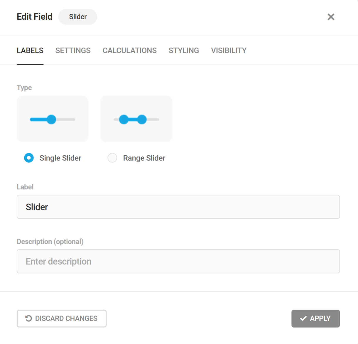
Slider Settings
Under the Settings tab, select a suitable slider width, mention its minimum and maximum value, the number of steps/values you want the slider to increment/decrement with every drag, and whether to show/hide the slider limits.

Under the advanced settings category, enter the default starting and ending (if you have chosen the range slider option) values for the slider, select the position where you want the slider value to be displayed, and enter the prefix/suffix to add to the slider value.
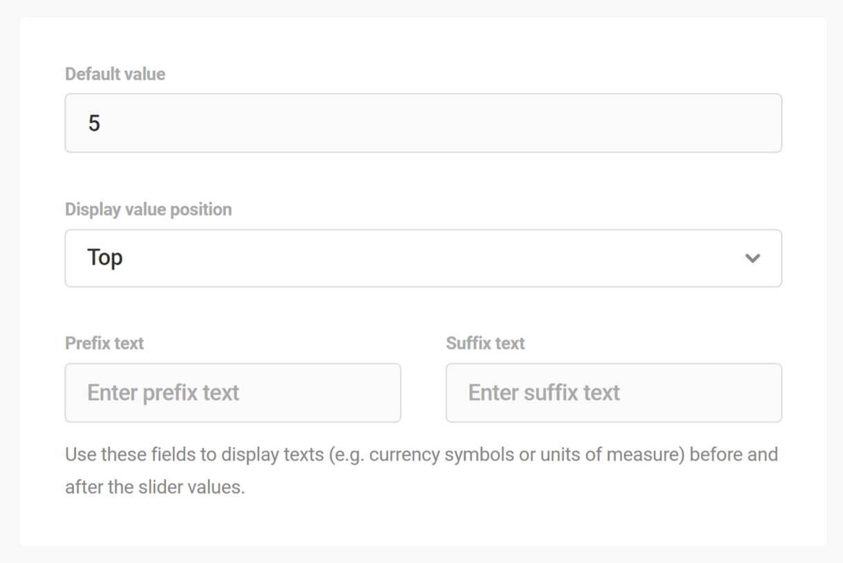
4.3.30 Rating Field
Link to chapter 3The Rating field enables you to add a rating feature to your form.

Rating Labels
Under the Labels tab, enter the label and optional description for the field.
Rating Settings
Under the Settings tab, select whether the field should be required or optional, and specify the maximum rating value (up to 50).
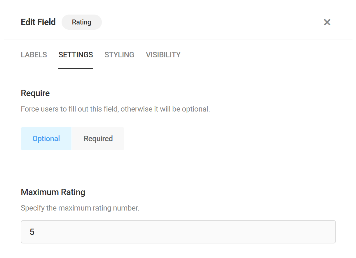
Then select the rating icon type and size. You can select from either stars, hearts, thumbs or smiley faces.
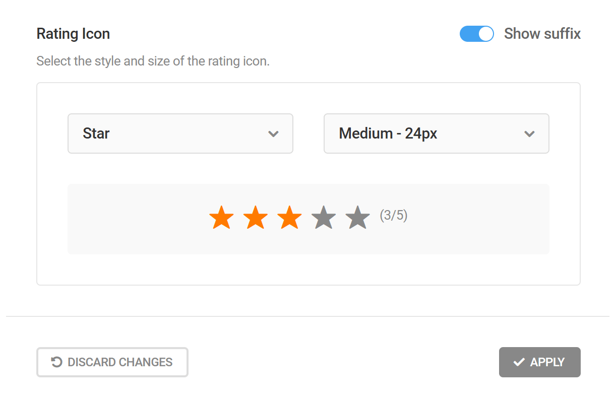
4.4 Polls
Copy chapter anchor to clipboardThe Polls tab is where polls are created and managed. It consists of an Overview panel and a list of all the polls that exist on a site, both draft and unpublished.
Overview Panel
The Polls tab Overview Panel displays the number of active polls, the date/time of the last submission, the number of poll submissions during the past 30 days, and the name of the poll with the most submissions. Use the search bar to search for a specific poll.
As always, the View Documentation button is there if you need to access Forminator’s usage documentation, and the Import button if you have a Forminator poll from another site you wish to add to this site. Click the Import/Export tab in the index of this guide for more detailed Import/Export guidance.
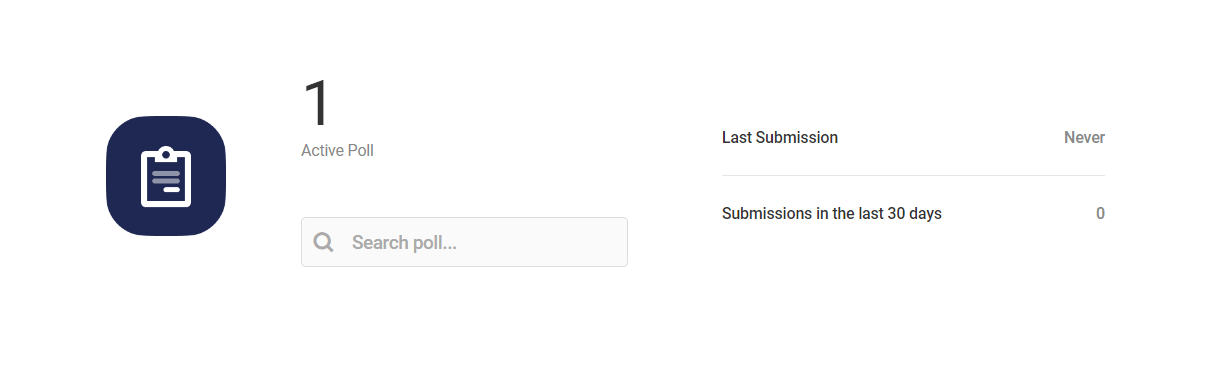
Bulk Actions
Just beneath the Overview panel, you’ll see a Bulk Options section where you can apply any available option to multiple polls. Just select the polls you want to apply the action to, select the action from the dropdown, and click Apply.
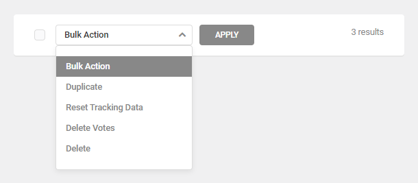
The bulk actions available include:
- Duplicate – Click to copy polls and all their settings. The duplicate polls will appear at the top of the list.
- Reset Tracking Data – Click this to reset the user views and conversions data for polls, which only affects poll data.
- Delete Votes – Deletes all votes for selected polls
- Delete – Click to delete selected polls forever.
Polls List
Several tasks can be accomplished from the Polls tab dashboard. Click anywhere in the row of any poll to access the poll’s performance data, including an interactive line graph illustrating activity involving the poll during the past 30 days.
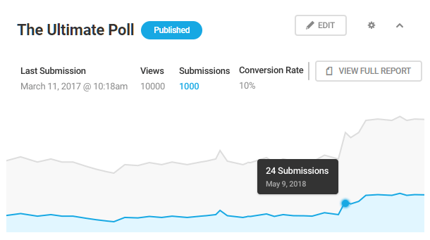
The information and features available for each listed poll include:
- Title – The name of the poll.
- Draft/Published – The poll’s current status. Draft polls are not available to the public until they have been published. Published polls are not available to the public until they have been added to a page via shortcode.
- Last submission – The last day or time a published poll was submitted.
- Views – How many visitors have viewed the a specific poll .
- Submissions – The number of times users have completed and submitted a specific poll.
- Conversion – The percentage of users who submitted a poll relative to the total number who viewed it.
- View Full Report – Click this button to navigate to the poll’s report page.
- Edit – Click Edit to access the editor for the selected poll. You can also open the poll editor by clicking the Edit poll link on the front-end when you are logged in as an admin.
Admin features (Gear icon)
Clicking the gear icon opens a drop-down menu that contains the following admin features:
- Preview – Click to see a Preview of the poll in a popup window.
- Copy Shortcode – Copy the shortcode, then paste it into any page or post where you want the poll to appear.
- Publish/Unpublish – This will publish draft polls, or conversely, revert published polls to draft status.
- View Submissions – View the submission data for the respective polls.
- Duplicate – Click to copy an entire poll and all its settings. The duplicate poll will appear at the top of the list.
- Reset Tracking Data – Click this to reset the user views and conversions data for a polls, which only affects poll data. User information collected for marketing purposes will not be affected.
- Export – Click the link and Forminator will display the poll in code that can then be copied and pasted into the Forminator import tool on any site.
- Delete – Click to delete a poll forever.

4.4.1 Creating a Poll
Link to chapter 4Navigate to Forminator > Polls and click the Create button to begin creating a poll.
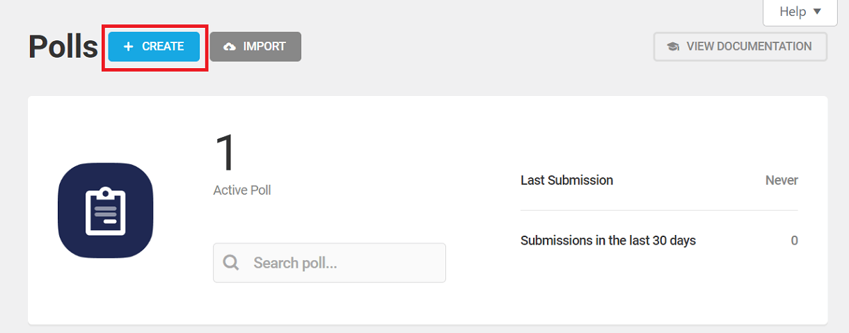
In the modal that pops open, enter the name of your new poll and click the Create button.
4.4.2 Details (Polls)
Link to chapter 4Questions
Enter the poll Question and add a Description if you wish. Each poll consists of only one question.
You can also add an image that will appear with your poll on your site, like so:
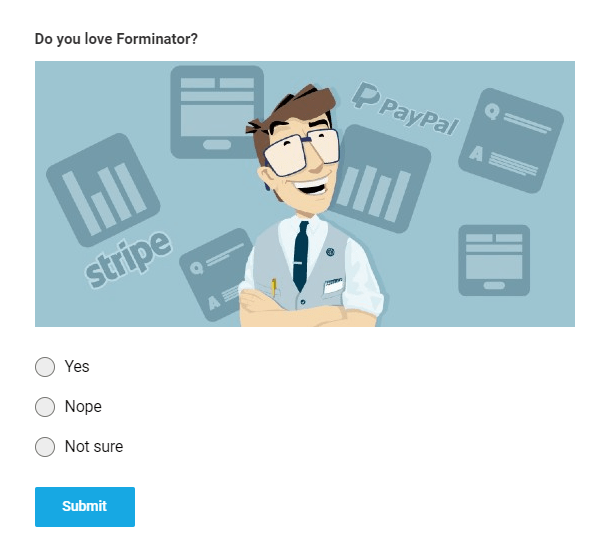
Answers
Click on the Add Answer button to add as many poll answers as you wish.
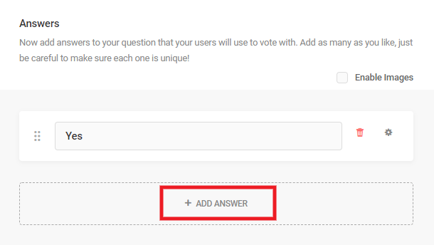
You can even add a custom input field when you want to allow your visitors to manually enter their answer. For example, you can use this field as an “Other” option. To add a custom input field, select the gear next to the answer you want to convert and select enable custom input.
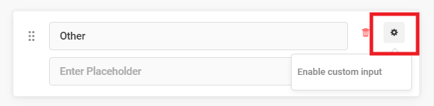
A new box will appear where you can add placeholder text. When someone selects your custom input option, a field will appear where they will be able to enter their answer. Your placeholder text will appear in this box like so:
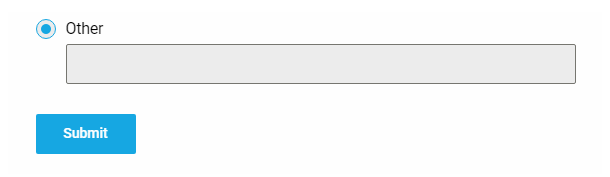
You can use images in your poll answers as well. Check the Enable Images checkbox, then click the Upload button next to any answer to add your images.
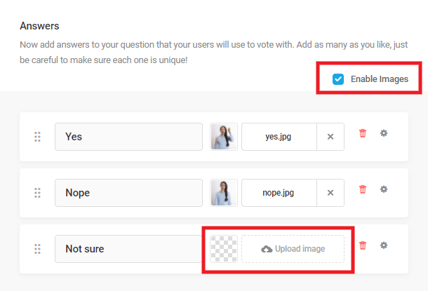
Note that for consistent image display in your poll, you’ll want to ensure your answer images are all the same aspect ratio. For example: 16:9, 4:3 or 1:1.
Below is an example of what a poll could look like with image answers set to display in 3 columns. You can adjust the layout of your answers under the Appearance tab.
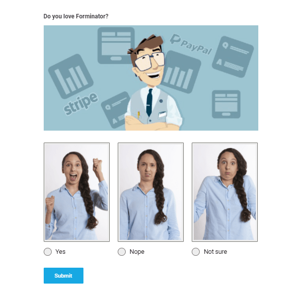
Button
Before proceeding to the appearance of your poll, you can also change the button label of your poll (the default value is Submit):
4.4.3 Appearance (Polls)
Link to chapter 4The Appearance options control a poll’s overall design, its colors and the look of its container.
Design Style
Select the base style you’d like for your poll. The available style options are Default, Flat, Bold, Material, and None.
If you select None, the poll will inherit styles from your theme’s CSS and you will not be able to change colors or the poll container from the Appearance tab. Instead, you will need to make customizations as you usually do for any other custom CSS you add to your site: under Additional CSS in the Customizer, a custom CSS plugin, a custom CSS area in your theme options, or the style.css file of your child-theme.
Colors
For colors you can use the default colors or select custom to access colors for a variety of elements in your poll. Simply open the element you want to change the color for and make your changes.
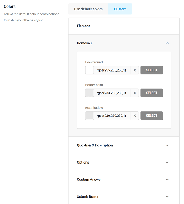
Layout
If you have enabled images for your poll answers in the Details settings, you can set your image answers to display as a List or in a Grid format.
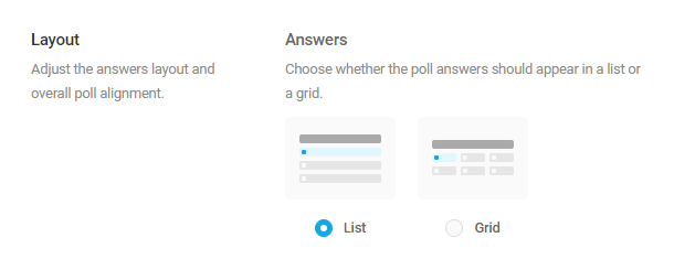
If you select a Grid layout, an additional setting will appear where you can choose the number of columns to display per row. Note that this will always default to 2 columns on mobile screens.
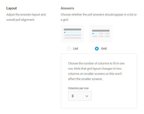
Whether you select to display answers in a list or a grid format, you can also set the Answer Type and choose to display both the radio button and image for each answer, or just the image.

Form Container
Further customize the appearance of the poll’s main container by adding padding and a border.
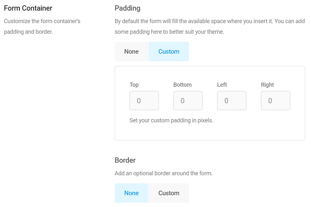
Custom CSS
Enable the Custom CSS option if you’d like to customize the appearance of your poll beyond what is available with the built-in options above.
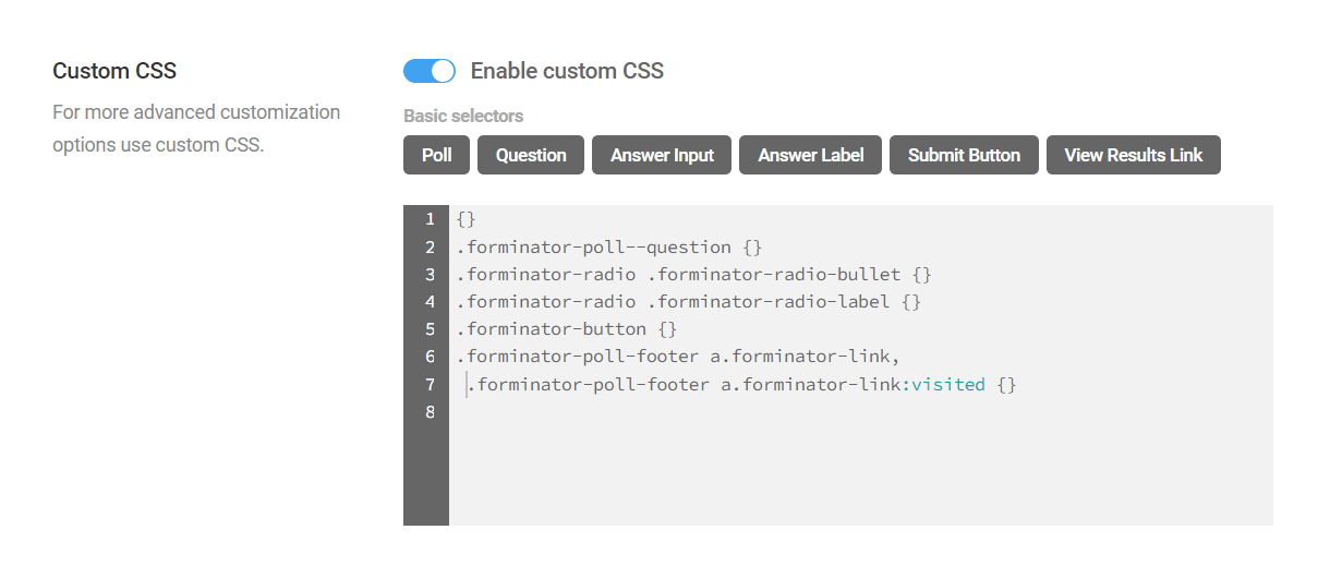
You’ll notice that there are some buttons that enable you to automatically add basic CSS selectors, simply by clicking the corresponding button. You can also manually enter the CSS you need to target any elements.
- Poll (main container) – {}
- Question – .forminator-poll–question {}
- Answer Input – .forminator-radio .forminator-radio-bullet {}
- Answer Label – .forminator-radio .forminator-radio-label {}
- Submit Button – .forminator-button {}
- View Results Link – .forminator-poll-footer a.forminator-link, .forminator-poll-footer a.forminator-link:visited {}
The image below illustrates which elements of the poll would be affected by the basic selectors.

Regardless of whether you use the basic selector buttons or enter your custom CSS manually, it’s important to know that the plugin will ensure selector specificity in your published poll by automatically prepending a class to identify the poll itself.
For example, if you click the button to add the Question selector and add a color, this is what would appear in the Custom CSS box:
.forminator-poll--question {color:#f00;}
However, below is what the CSS that is output on the frontend of your site for your published poll would look like. In this example, the ID of our poll is 10899.
.forminator-ui.forminator-poll-10899 .forminator-poll--question {

color: #f00 !important;

}
Be sure to keep this in mind when adding very specific selectors so you don’t create any conflicts and wind up debugging broken CSS.
4.4.4 Behavior (Polls)
Link to chapter 4The Behavior options control what happens when a respondent submits a poll.
Results Display
Control how poll results are displayed, or not, by selecting one of the following options:
- Link on poll – Adds View Results link to the poll which, when clicked, displays results on the same page with a Back to Poll link.
- Show after voted – Automatically displays the poll results when the user submits the poll, with a Back to Poll link as well.
- Do not show – Respondents will not see the poll results. The page will refresh or reload depending the submission method you select below.
If you chose either of the display options above, you can select whether to display results in a pie chart or a bar graph.
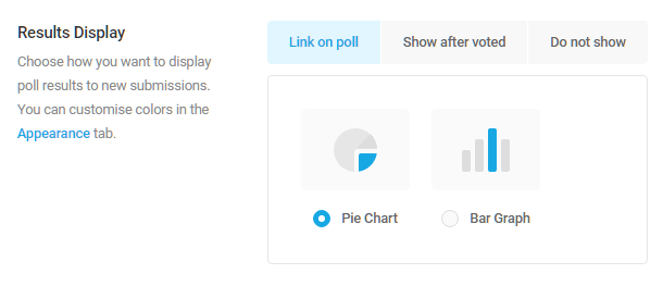
Results will display in the selected format when users submit a completed poll.
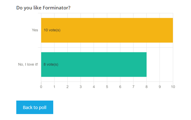
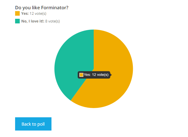
Vote Count
Choose whether or not to display the number of votes on the results page.

Submission Method
- Reload page – Select this option to reload the page upon submission of a poll if the default ajax loading is causing issues on your site.
- Ajax – This is the default submission method that does not require a page reload.
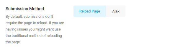
Vote Opening
Configure settings related to a poll’s voting status, including when voting should open and/or close, and the messages displayed to users when voting is closed, paused, and not yet open:
- Status – Select whether voting in the poll is open, paused, or closed.
- Open From – Select the date at which voting in the poll will open, otherwise voting will be opened immediately.
- Open Until – Select the date at which voting in the poll will close, otherwise voting will be open indefinitely.
- Custom Messages – Enter custom messages that should be displayed to users when voting is closed, paused, and not yet open.

Voting Limit
- Limits – By default, your visitors will be able to vote only once. If you want to adjust this behavior, you can let them vote unlimited times by not entering any values (this is most useful for testing purposes). You can set a limit so your visitors need to wait a certain number of minutes, hours, days, weeks, months or years before they can vote again.
- Method – Choose whether Forminator should identify users who have already submitted a poll by their IP addresses or by placing a browser cookie.
Security
This section allows you to protect your poll.
- Enable Akismet spam protection – If you are using the Akismet plugin on your site, you can enable this option, and select to either fail any submissions that Akismet detects as spam, or simply mark them as spam. Selecting the Fail Submissions option would display a customizable message to the user, and Mark as Spam would log them in your database but they would not appear in your Submissions list.
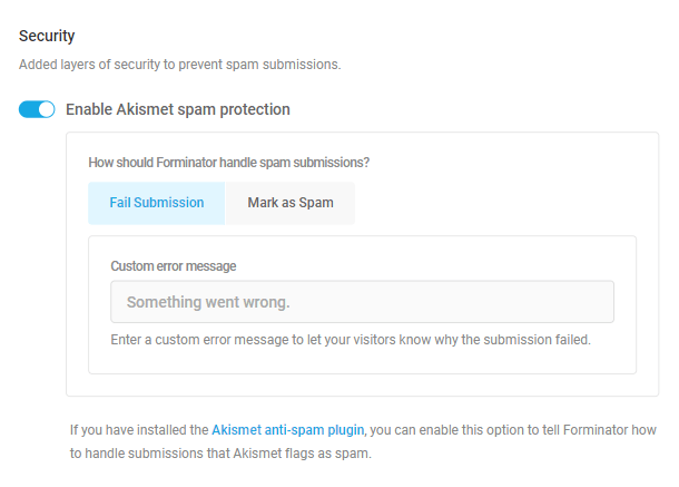
Rendering
This lets you choose how to render your poll to accomodate cache plugins that may cause issues to your dynamic polls.
- Load poll using AJAX – will do just that in order to avoid any cache issues that may arise because of plugins that have Page Cache ability.
- Prevent page caching on poll pages – Select this option to automatically add the DONOTCACHEPAGE constant to any page with this poll embedded in it. Cache plugins like WPMU DEV Hummingbird will respect that directive and not cache your poll page.
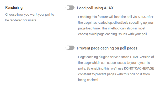
4.4.5 Notifications (Polls)
Link to chapter 4Email notifications can be configured in the poll’s Email Notification tab, enabling custom emails to be sent to admins or users upon poll submission.
To add an email notification, first toggle on Send an email to admin users.
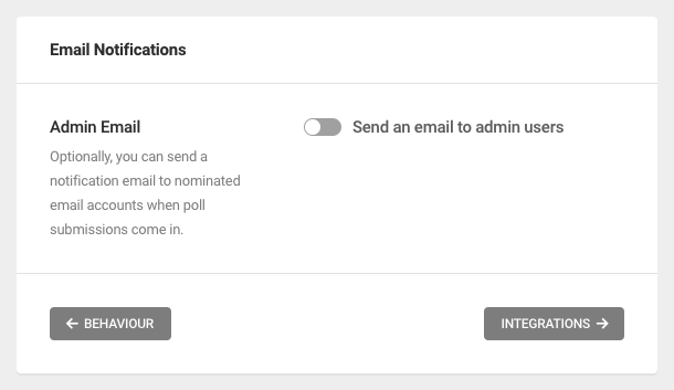
Then, configure the email fields as desired.
Poll Data
Poll data can be included in your notification email subject and body, as well as the from name, through the use of merge tags.
Merge tags can be inserted for any of the following pieces of poll data:
- Poll Name – Use the {poll_name} merge tag
- Poll Answer – {poll_answer}
- Poll Result – {poll_result}
- User IP Address – {user_ip}
- Date (mm/dd/yyyy) – {date_mdy}
- Date (dd/mm/yyyy) – {date_dmy}
- Embed Post/Page ID – {embed_id}
- Embed Post/Page Title – {embed_title}
- Embed URL – {embed_url}
- HTTP User Agent – {user_agent}
- HTTP Refer URL – {refer_url}
- User ID – {user_id}
- User Display Name – {user_name}
- User Email – {user_email}
- User Login – {user_login}
- Custom Value – {custom_value}
- Query Parameter – {query} – Please ignore this tag as it serves no purpose for emails and will be removed from these options shortly.
Where supported, click any [+] icon or +Insert form fields link to select and insert available merge tags. Alternatively, you can type out the merge tag directly.
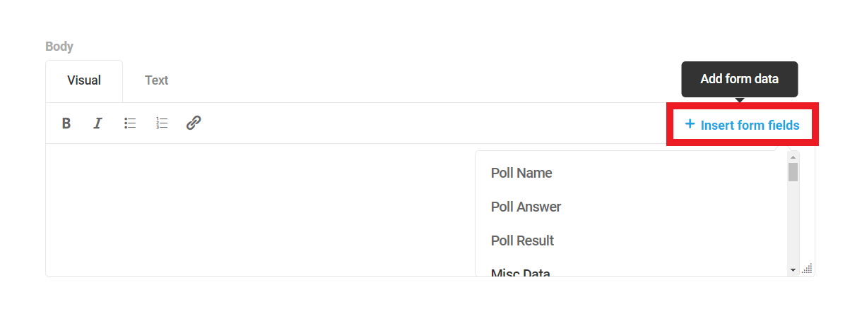
For example, the following subject line includes the merge tag {poll_name}, representing the name of your poll:
New Poll Entry for {poll_name}
Accordingly, an email notification sent upon poll submission would read as “New Poll Entry for My Poll”.
You can also use standard HTML tags in the email body when editing in Text mode. However, just like when editing regular WordPress posts, some tags may be stripped out if you switch to Visual mode.
From Name
Enter the name from which the email notification should be sent, or click the [+] icon to select and insert an available merge tag. Alternatively, you can type out the merge tag directly.
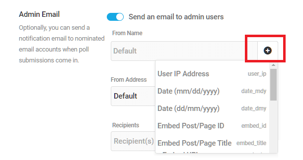
From Address
The From Address must be the default site email address or a domain email. Click the drop-down menu and begin typing the desired email address into the field. The available email addresses matching your inputs will appear for selection.
Recipients
Only admin email addresses can receive poll notifications. Add email addresses into the field provided, adding as many admin addresses as necessary.
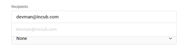
Reply To Address
Optionally add a reply-to address that can be any valid email address.
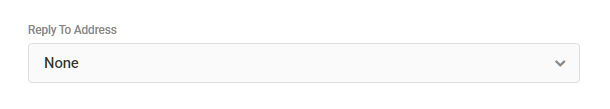
CC & BCC Addresses
Optionally add any CC and/or BCC email addresses you need to your notifications.

Subject/Body
Enter a custom subject line and a custom message into the fields provided. Use the editor to format the message just as you would any other content.
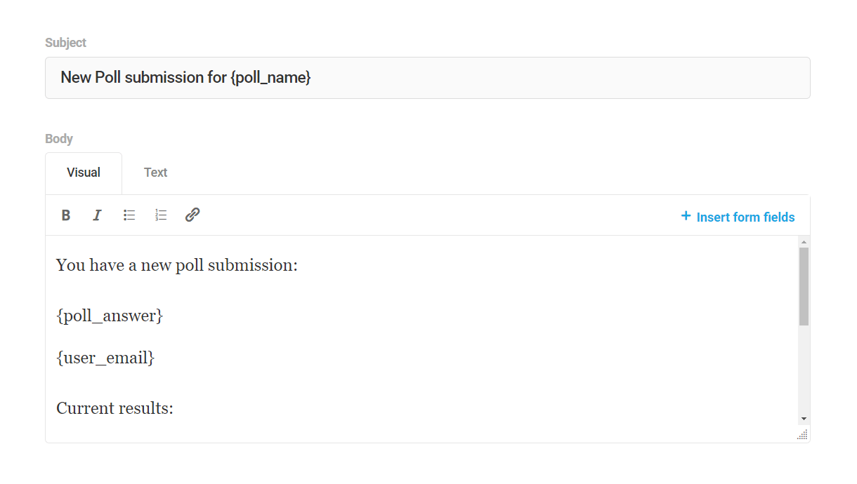
4.4.6 Integrations (Polls)
Link to chapter 4Third-party apps connected to Forminator will appear hear. Click the plus [+] icon next to any connected app to activate an app for the current poll. The app will be authorized to collect data from the poll submissions.
You can connect as many apps as you need, and as many instances of each app, to any poll.
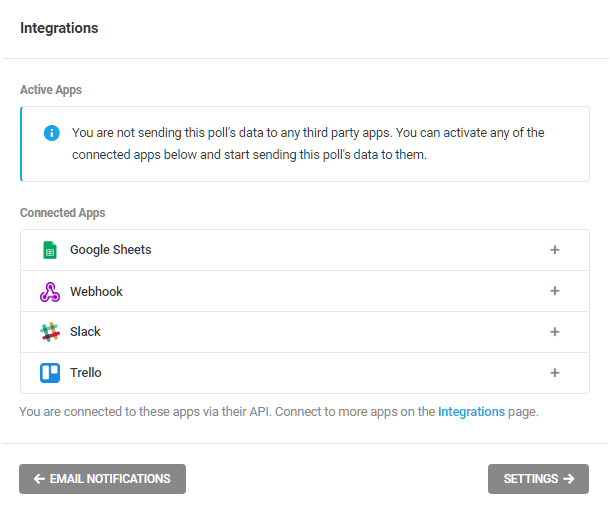
To see how to configure these integrations follow the links here:
4.4.7 Settings (Polls)
Link to chapter 4The Settings options control how Forminator stores and protects submission data.
Data Storage
Your poll submission data is stored in your site database, by default. Disable this storage with the toggle.
Be sure to configure alternate storage with a third-party integrated app before disabling local storage if you do need to keep this data somewhere.
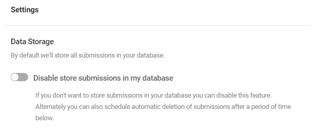
Privacy
Submissions
To save your data in your database temporarily, you can specify when you would like the data to be auto deleted.
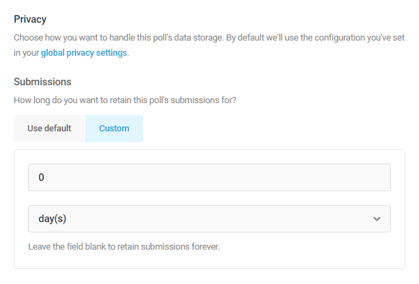
IP Retention
Each time your visitors vote, Forminator will save their IP address in your database (this is used to prevent multiple votes by one visitor and to modify vote limitations). In case you need to release this data (due to GDPR or any local law) you can change the IP retention settings here.
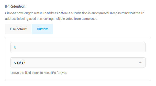
4.4.8 Poll Preview
Link to chapter 4Preview
Just like with forms, you can always preview your poll by clicking on the Preview button in the sidebar menu of any Polls screen.
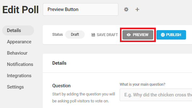
You’ll be able to see how your poll will appear on your site, including the changes you make to the appearance.

4.4.9 Embedding Polls
Link to chapter 4Each poll comes with a shortcode which you can use to embed it anywhere on your site where shortcodes can be used: pages, posts, widgets, etc.
Any time you click the Publish button for a poll in the editor, a modal will pop open to show you the shortcode for that poll.
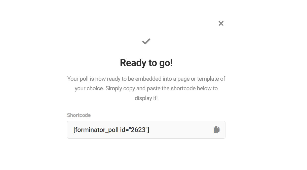
To get the shortcode for any poll after having published it, go to the Forminator Polls page. Find the poll you’d like to use and select the gear icon to open the settings dropdown for the poll.
Select Copy Shortcode, which will automatically add the shortcode to your clipboard so you can paste it anywhere.
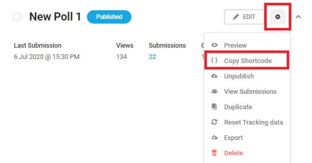
You can also add a poll to your post while in the WordPress editor. Click the [+] icon to add a new block, and find the Poll block.

Once the block is added, select the poll you want to embed in the post.
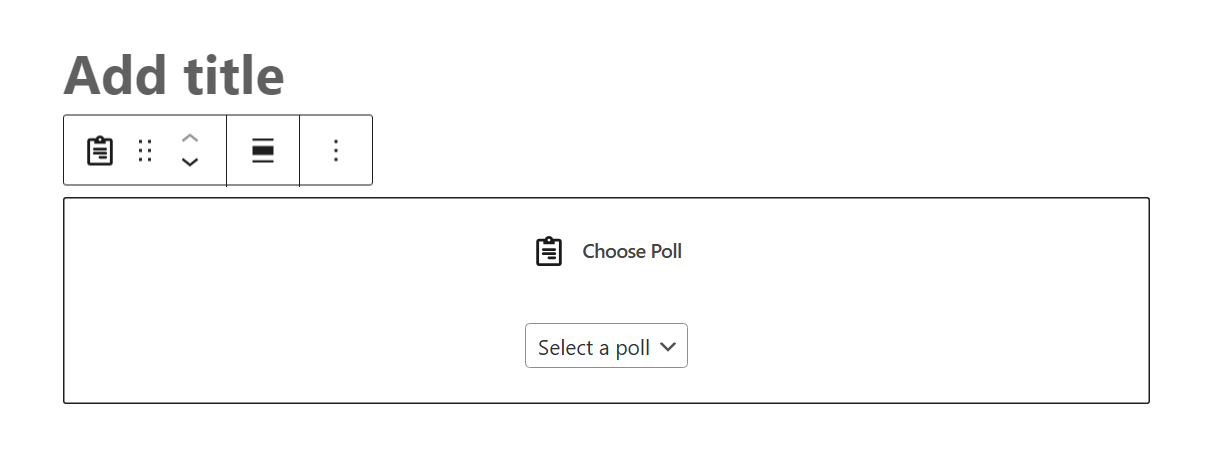
In case you want to present your poll in a Widget, navigate to Appearance > Widgets. Choose the widget area you want to add your poll into, click the [+] icon to add a new block, and find the Poll block.
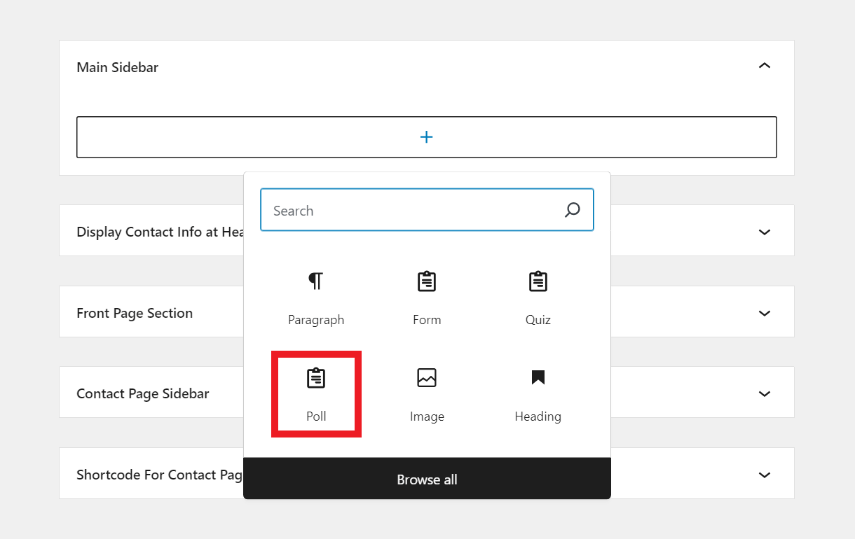
Once the block is added, select the poll you want to embed in the widget area.
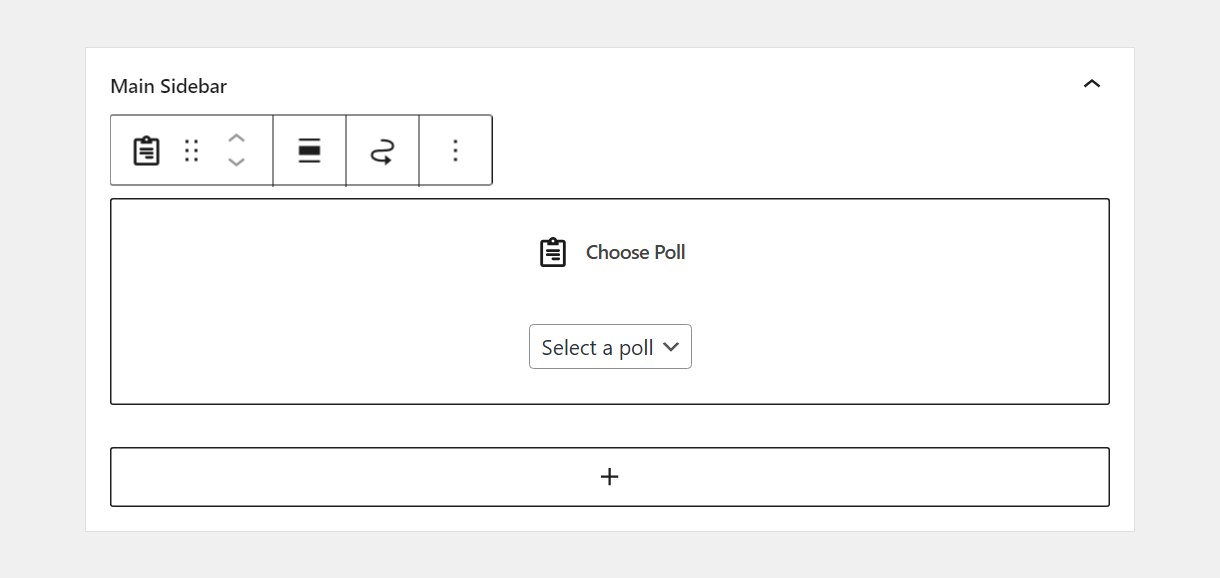
Once the poll is embedded on the front-end, you’ll see a handy Edit link there when logged in as administrator. Clicking that link will redirect you to the edit screen for that specific poll.
4.5 Quizzes
Copy chapter anchor to clipboardThe Quizzes tab is where quizzes are created and managed. It consists of an Overview panel and a list of all the quizzes that exist on a site, both draft and unpublished.
Overview Panel
The Quizzes tab Overview Panel displays the number of active quizzes, the date/time of the last submission, the number of quiz submissions during the past 30 days, and the name of the quiz with the most submissions. Use the search bar to search for a specific quiz.
As always, the View Documentation button is there if you need to access Forminator’s usage documentation, and the Import button if you have a Forminator quiz from another site you wish to add to this site. Click the Import/Export tab in the index of this guide for more detailed Import/Export guidance.
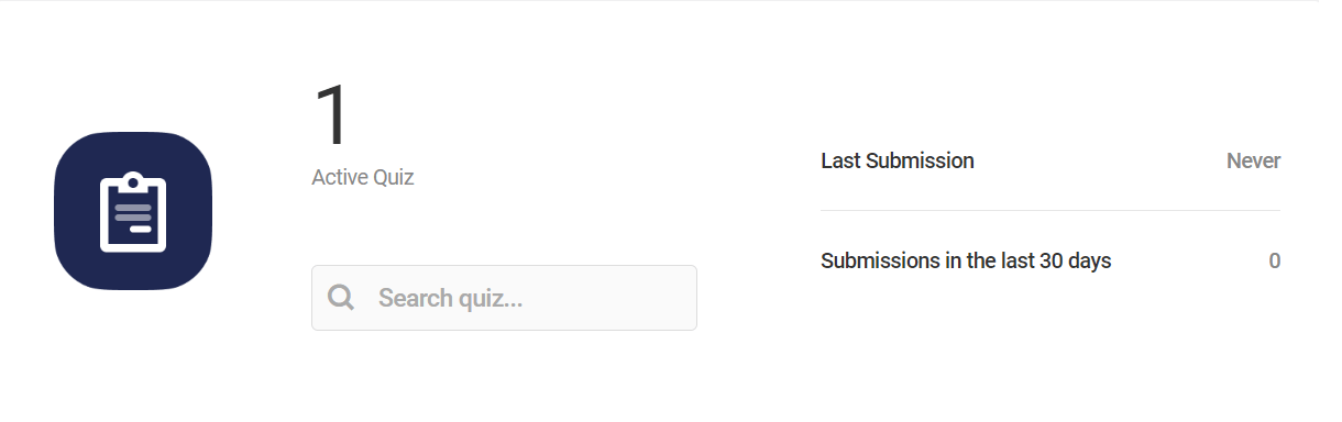
Bulk Actions
Just beneath the Overview panel, you’ll see a Bulk Options section where you can apply any available option to multiple quizzes. Just select the quizzes you want to apply the action to, select the action from the dropdown, and click Apply.
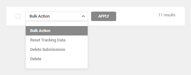
The bulk actions available include:
- Reset Tracking Data – Click this to reset the user views and conversions data for selected quizzes.
- Delete Submissions – Deletes all submissions for selected quizzes
- Delete – Click to delete selected quizzes forever.
Quizzes List
Several tasks can be accomplished from the Quizzes tab dashboard using the features found next to each quiz in the list.
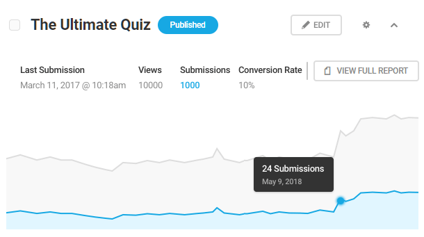
The information and features available for each listed quiz include:
- Title – The name of the quiz.
- Draft/Published – The quiz’s current status. Draft quizzes are not available to the public until they have been published. Published quizzes are not available to the public until they have been added to a page via shortcode or widget.
- Last submission – The last day or time a published quiz was submitted.
- Views – How many visitors have viewed the a specific quiz.
- Submissions – The number of times users have completed and submitted a specific quiz.
- Conversion – The percentage of users who submitted a quiz relative to the total number who viewed it.
- View Full Report – Click this button to navigate to the quiz’s report page.
- Edit – Click Edit to access the editor for the selected quiz. You can also open the quiz editor by clicking the Edit quiz link on the front-end when you are logged in as an admin.
Admin features (Gear icon)
Clicking the gear icon opens a drop-down menu that contains the following admin features.
- Preview – Click to see a Preview of the quiz in a popup window.
- Copy Shortcode – Copy the shortcode, then paste it into any page or post where you want the quiz to appear.
- Publish/Unpublish – This will publish draft quiz, or conversely, revert published quizzes to draft status.
- View Submissions – View the submission data for the respective quizzes.
- Duplicate – Click to copy an entire quiz and all its settings. The duplicate quiz will appear at the top of the list. At the moment, this action is not supported by quizzes that have the leads function enabled but sit tight, this is on its way.
- Reset Tracking Data – Click this to reset the user views and conversions data for a quizzes, which only affects quiz data. User information collected for marketing purposes will not be affected.
- Export – Click the link and Forminator will display the quiz in code that can then be copied and pasted into the Forminator import tool on any site. For now, this feature is not available for quizzes that have the leads function enabled but sit tight, this is coming soon.
- Delete – Click to delete a quiz forever.
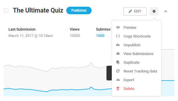
4.5.1 Creating Quizzes
Link to chapter 5Navigate to Forminator > Quizzes and click the Create button to begin creating a quiz.
The first step is to give your quiz a name. Then, you can choose one of the two general quiz types that best serves the goals for the current quiz.
- Knowledge – A quiz with as few or as many questions and answers as desired. Questions must have a correct answer, and scores/results are calculated based on the number of correct answers submitted. Also called a Graded quiz.
- Personality – An “outcome” quiz in which there are no right or wrong answers; the user’s answers are tallied up and the result is calculated based on your preset outcomes for each possible response to each question.
Select a quiz type, and click Continue.
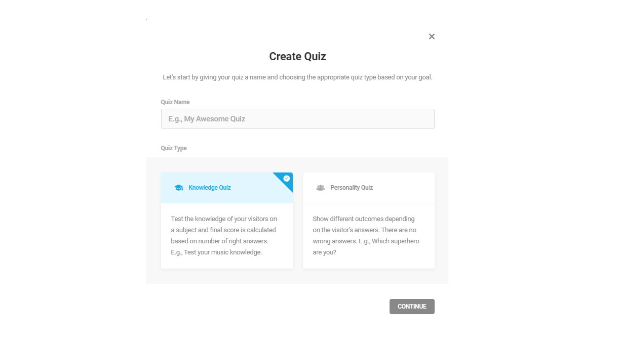
Then select whether you want your quiz to be paginated or not. If you select Paginate Quiz here, you can adjust the pagination settings under the Behavior tab.

Next, you can choose whether or not you want to collect leads on your quiz. This essentially allows you to collect participants’ data such as names or email addresses.
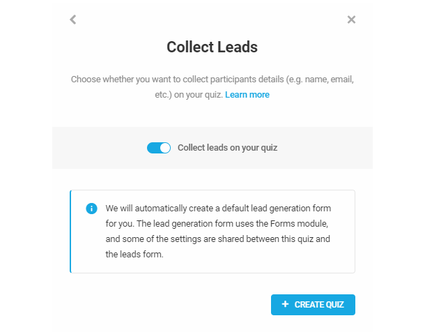
The option to collect leads in your quiz can only be enabled when creating the quiz. It cannot be enabled once the quiz has already been created.
Most of the options for the two quiz types are identical, so we’ll go through each in turn below, and highlight the differences where applicable.
4.5.2 Intro
Link to chapter 5Options in this section are identical for both quiz types.
- Title – The title that will display above the quiz. It can be left blank, if you wish.
- Feature image – Optionally add a featured image that will appear above your quiz.
- Description – Further describe your quiz and to explain to your visitors what they are about to take on.
Note that the Description field allows you to use merge tags to dynamically populate your message with any available data if needed. Just click the Add Form Data button and select the value(s) you need.
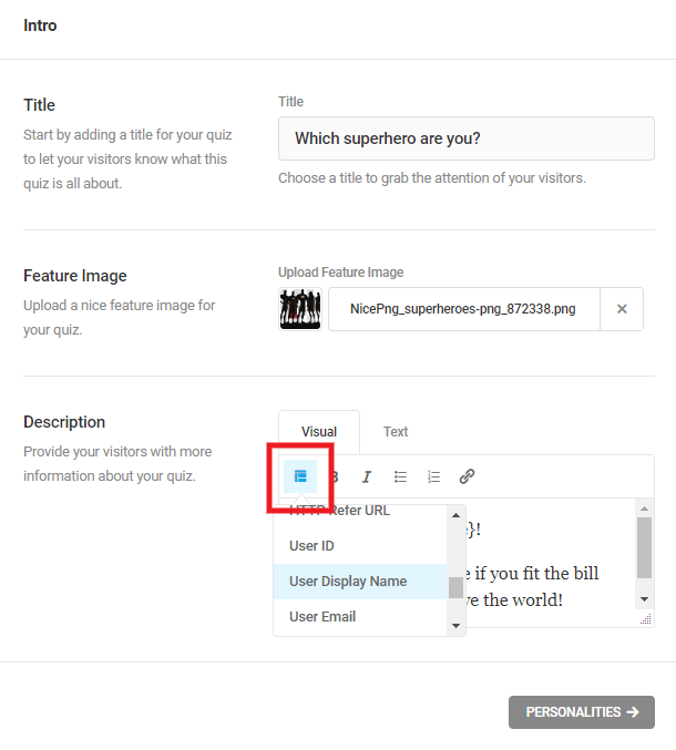
If all above options are filled in, your quiz intro could look something like the preview example below.

4.5.3 Personalities (Personality quizzes only)
Link to chapter 5If you have selected to create a Personality Quiz, you’ll see this section available where you set up the end results of your quiz. Once they’re set up, you can get to creating the questions and answers that lead up to these results.
Note that “personalities” don’t actually need to be personalities. You can use this type of quiz to build any quiz where you need the outcome to be one of your preset results, which depend on user answers. So instead of personalities, your quiz outcomes could be anything, like seasons, destinations, meal preferences, etc.
As a simple example, you could have a single question like “Which color is more you?”. Then the user could select from 3 possible answers: Red, Green or Yellow. Depending on the color selected, the outcome (the personality) could be Apple, Avocado or Banana.
Click the Add Personalities button to get started on your first desired outcome.
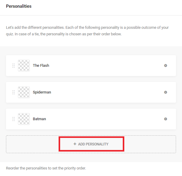
In the modal window that pops up, enter the Title for your outcome (required), and optionally include an Image and a Description.
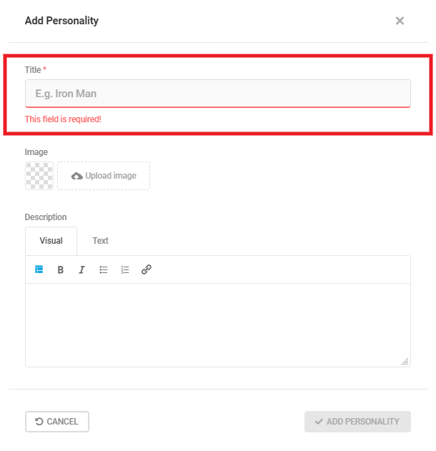
The same modal popup will appear when you want to edit an existing personality. Either click directly on the personality name itself, or click the gear icon to open a menu with the Edit option. That menu also has options to Delete or Duplicate a personality, which can be handy if you’re creating several similar ones.
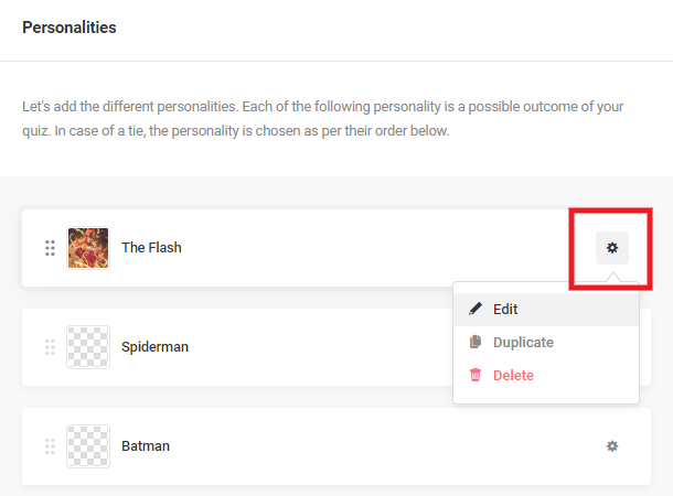
If all above options are filled in, your quiz result could look something like the preview example below.
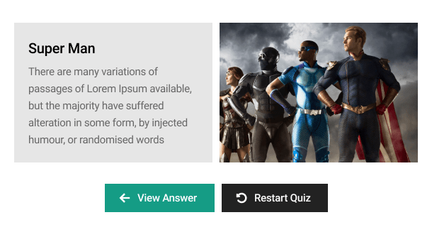
Repeat this process and add as many questions and answers as you wish to your quiz. Once all questions have been answered, the result with the highest score will be calculated and presented to the visitor.
Note that if the user’s answers create a tie between two or more personalities, whichever one of those that is higher in your list will be the end result. So be sure to order your personalities according to priority.
4.5.4 Questions
Link to chapter 5Options in this section are identical for both quiz types, with one exception: how the answer is used to calculate the quiz result.
Adding a Question
Click the Add Question button to get started with your first question.
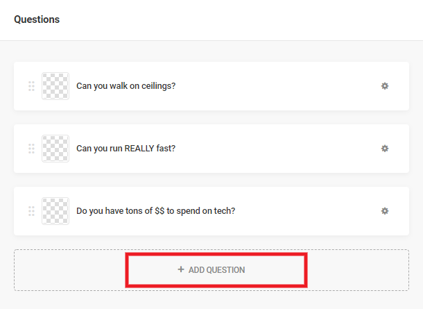
In the modal window that pops up, enter the Title for your question (required), and optionally include an Image and a Description.
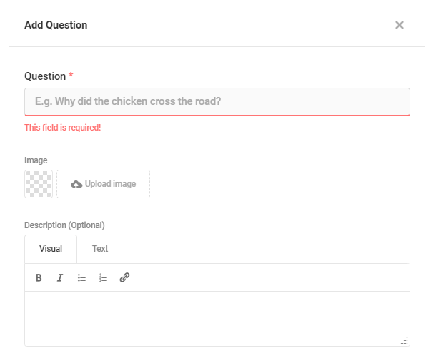
Then click the Add Answer button to add your first answer to this question.
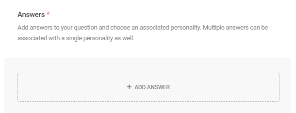
Adding an Answer
Here’s where things differ slightly in this section, depending on which type of quiz you’re creating.
Personality Quiz
If you’re building a Personality quiz, you’ll associate each answer in your question with one of the Personalities you created earlier by selecting it from the dropdown. You can select only one Personality for each answer.
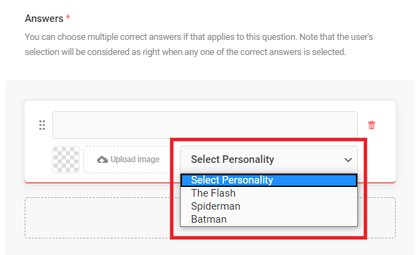
Knowledge Quiz
If you’re building a Knowledge quiz, you’ll identify the correct answer(s) for your question by checking the checkbox. There can be multiple correct answers for each question.
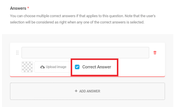
Submit Button
To edit properties of the Submit button, click on the gear icon to access the options.
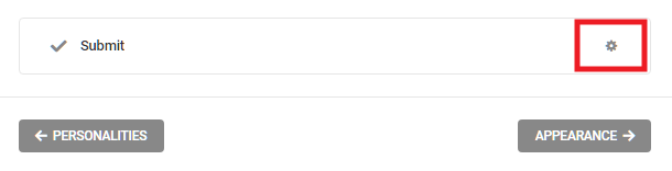
In the modal window that pops open, you can customize the submit button text, the message that displays while the quiz is submitting, and add any custom CSS classes you might want to style the element in your stylesheets.
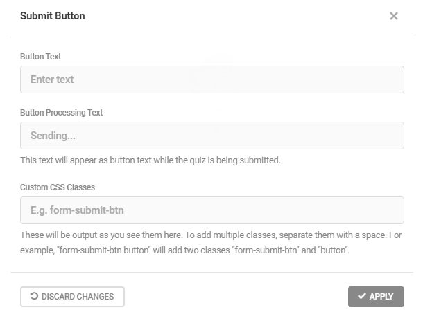
4.5.5 Leads
Link to chapter 5The Leads section allows you to configure how your embedded lead form will appear and behave in your quiz. When Leads are enabled, they allow you to collect information from users such as names and email addresses.
Forminator is a pro at creating captivating quizzes, but that’s not all that he’s capable of doing. You can also use Forminator to capture visitors’ emails and other information that you may want to collect. Check out our blog, A Forminator Quiz Is the Answer to Collecting Emails and Generating Leads, for more information.
If a lead form is embedded in a quiz, it looks a little something like this:
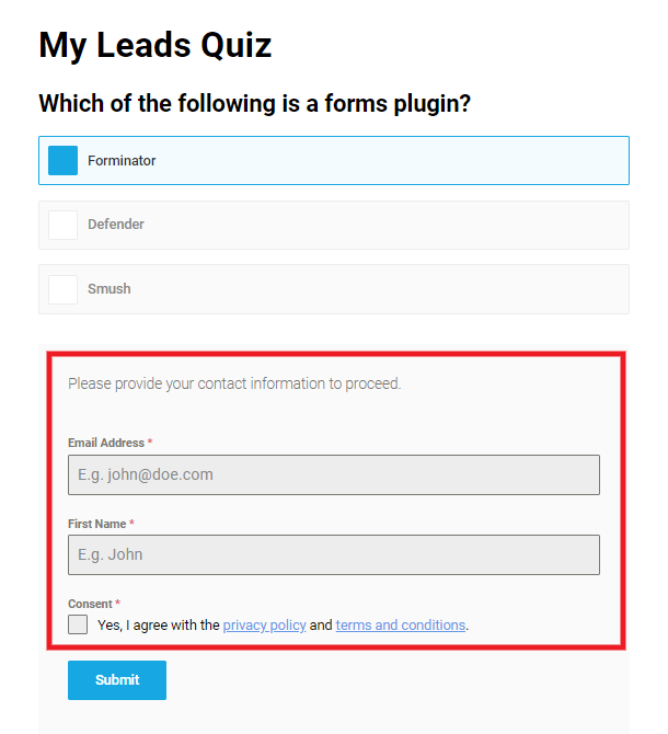
In the example above, we have chosen to include the Email Address, Name, and Consent fields and have set the lead to appear just before the quiz results.
All leads form data can be accessed in the Submissions tab for the associated quiz.
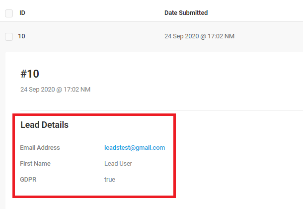
Check out the video below for more information.
Capture Leads
You can edit your lead capture by changing the following aspects that are discussed in the sections below:
- Lead generation form
- Form Placement
- Skip Form
Lead generation form
We have provided a default lead generation form for your convenience but this can easily be edited. Click on the pencil icon to jump to the Forms tab where you can customize the lead form in the same way that you would any other form generated with Forminator.
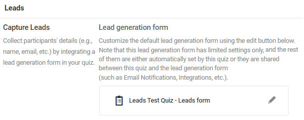
This lead form will not show up under your Forms tab like your other forms, as it is internally linked to the quiz and is not a standalone form. You will also notice that the Email Notifications and Integrations of the lead form will not be editable. This is because they are shared between the lead form and the parent quiz. The Email Notifications and Integrations can be edited for both in the configuration module for the quiz.
Form Placement
Choose whether you want the embedded lead form to appear at the beginning of your quiz or before showing the results.

Skip Form
Enable this feature if you want to give participants the option to skip your lead form. If this is enabled, you can customize the link text to better fit your quiz.
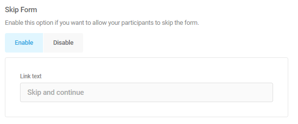
4.5.6 Appearance
Link to chapter 5Options in this section are identical for both quiz types.
Design Style
Select the base style you’d like for your quiz. The available style options are Default, Flat, Bold, Material, and None.
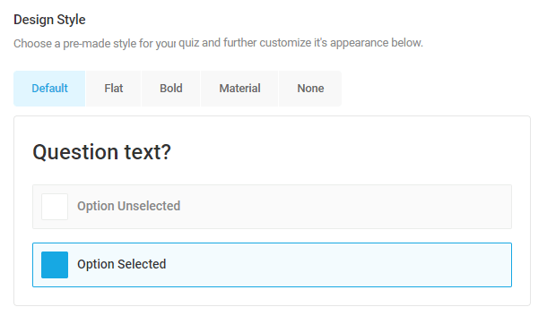
If you select None, the quiz will inherit styles from your theme’s CSS and you will not be able to change colors or the quiz container from the Appearance tab. Instead, you will need to make customizations as you usually do for any other custom CSS you add to your site: under Additional CSS in the Customizer, a custom CSS plugin, a custom CSS area in your theme options, or the style.css file of your child-theme.
Colors
By default, your quiz will inherit your theme colors, but you can completely customize every part of it by clicking on the Custom tab which will allow you to edit colors of your Quiz, Answers, Buttons, Results and Social Share icons.
Click on any element you wish to customize and enter the color hex code for the option you wish to customize, or click the Select button to use the handy color-pickers.
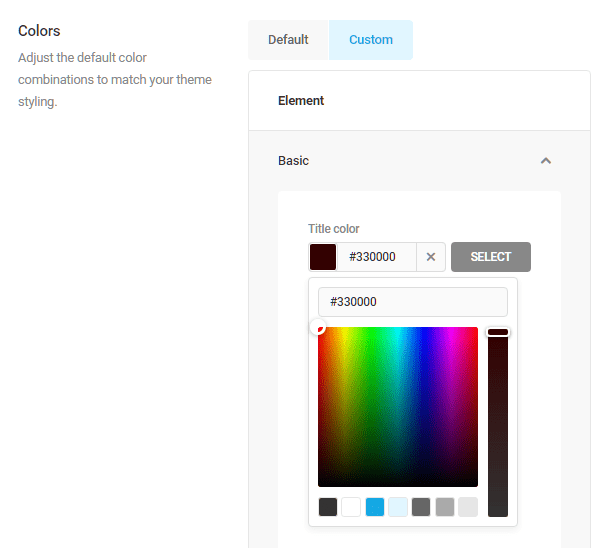
Fonts
By default, your quiz will inherit your theme fonts, but you can completely customize every part of it by clicking on the Custom tab which will allow you to edit the fonts for your Quiz, Answers, Buttons, Results and Social Share icons.
Click on any element you wish to customize and select the font family you wish to use for that element, then set the font-size and font-weight if desired.
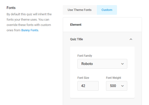
Layout
Answers
- List – Select this option to have each of your quiz answers appear stacked one on top on the other in a list format.
- Grid – Select this option to have your quiz answers appear in a grid format.
If you select the Grid option, you can specify the number of columns per row that the answers should display in. Note this only affects devices with screens greater than 782px in width; on smaller screens, the answers will stack in list format by default.
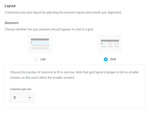
Quiz Alignment
Set the overall alignment of your quiz to left, centered or right. Note this option affects everything inside the quiz container: title, description, images, questions and answers, buttons, and social share message.
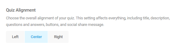
Question Item Ordering
This option enables you to change the default top-to-bottom order of the Question and optional Description & Image. Drag and drop the items into the order you prefer.
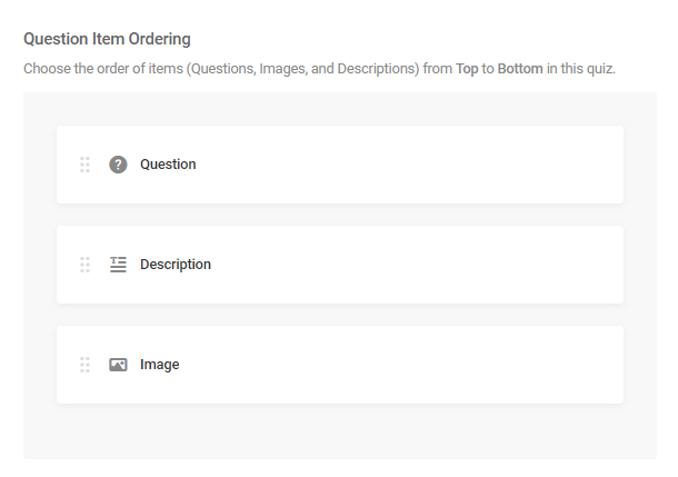
Quiz Container
Here, you can customize various aspects of the quiz container’s appearance.
- Padding – Optionally add padding to any side of the quiz container to give things a bit more breathing room if needed.
- Border – Add a border if you wish and adjust the corner radius, border thickness and style.
- Spacing – Allows to adjust the spacing between quiz questions using the default presets, or enter your own custom spacing value in pixels.
- Maximum Width – Select full-width to have your quiz fill the available width of the container it displays in, or set the maximum width you want your quiz to display at. Note that your quiz width will automatically adjust on mobile devices with screens smaller than the max-width you set here and will not bleed off the screen.
Custom CSS
Enable the Custom CSS option if you’d like to customize the appearance of your quiz beyond what is available with the built-in options above.
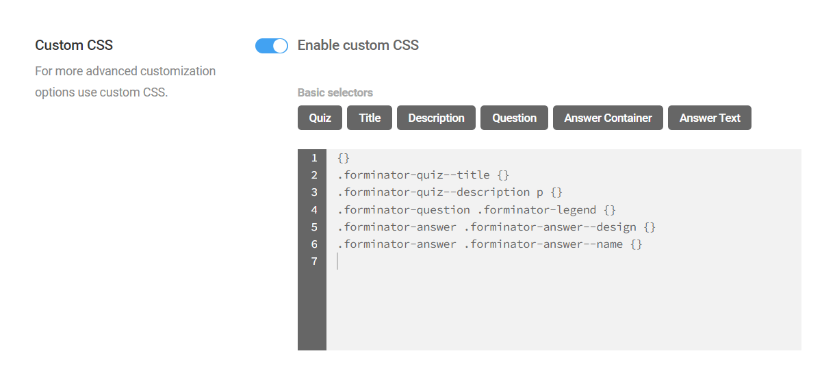
You’ll notice that there are some buttons that enable you to automatically add basic CSS selectors, simply by clicking the corresponding button. You can also manually enter the CSS you need to target any elements.
- Quiz (main container) – {}
- Title – .forminator-quiz–title {}
- Description – .forminator-quiz–description p {}
- Question – .forminator-question .forminator-legend {}
- Answer Container – .forminator-answer .forminator-answer–design {}
- Answer Text – .forminator-answer .forminator-answer–name {}
The image below illustrates which elements of the quiz would be affected by the basic selectors.
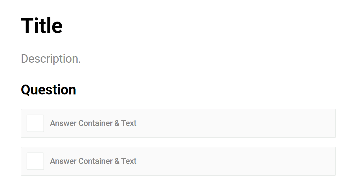
Regardless of whether you use the basic selector buttons or enter your custom CSS manually, it’s important to know that the plugin will ensure selector specificity in your published quiz by automatically prepending a class to identify the quiz itself.
For example, if you click the button to add the Title selector and add a color, this is what would appear in the Custom CSS box:
.forminator-quiz--title {color:#f00;}
However, below is what the CSS that is output on the frontend of your site for your published quiz would look like. In this example, the ID of our quiz is 3186.
.forminator-ui.forminator-quiz-3106 .forminator-quiz--title {

color: #f00 !important;

}
Be sure to keep this in mind when adding very specific selectors so you don’t create any conflicts and wind up debugging broken CSS.
4.5.7 Behavior
Link to chapter 5Options in this section are identical for both quiz types, except for Results and Messages options, which only appear in a Knowledge Quiz.
Questions
If you select to have a Paginated Quiz, you can set the following options:
- Number of questions per page – Set this to to display one or more questions per page. Users can advance to the next page only once all questions on the current page have been answered.
- Start quiz button text – Customize the text on the Start Quiz button. This displays just below your quiz Intro, before the user starts the quiz.
- Previous button text – Customize the text on the Previous Page button.
- Next button text – Customize the text on the Next Page button.
- Show page indicator – Show or hide the Page 1 of X indicator.
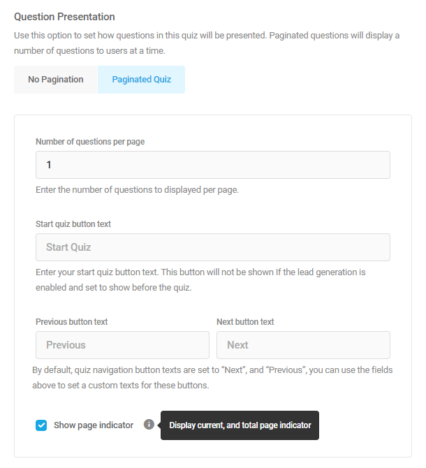
The image below is an example of what a quiz could look like with pagination set to display only one question per page:
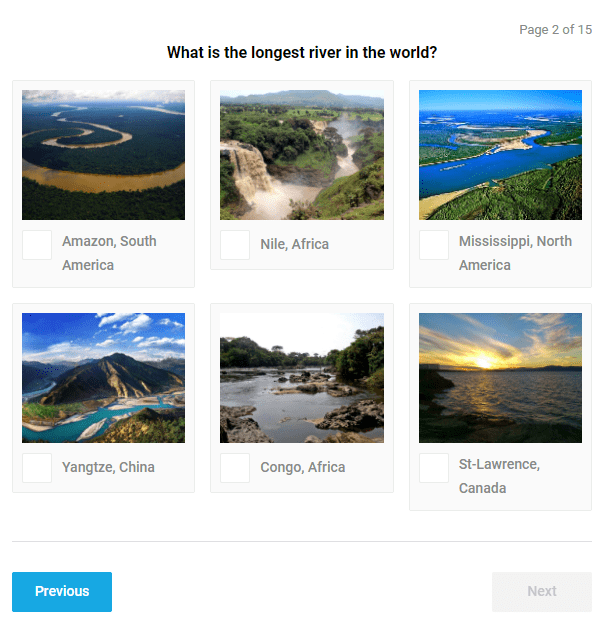
Results (Knowledge Quiz only)
If you have included a Leads form in your knowledge quiz, this option will only appear if the Leads Form Placement option under the Leads tab is set to Beginning of quiz. This is because the quiz can only be submitted after the leads form has been submitted.
Display Method
There are two ways to display results to users when they select answers in your quiz:
- Real Time – Displays the correct answer immediately when they make their selection for a question.
- On Submission – Displays the correct answers for all questions only once the quiz is submitted.
If you select the Real Time method, your users will be able to select only one answer to a quiz question, even if you have set more than one correct answer for that question.
You can also optionally choose whether to show a loading spinner when a user selects an answer. This is recommended on long quizzes as it may take a bit longer to evaluate an answer.
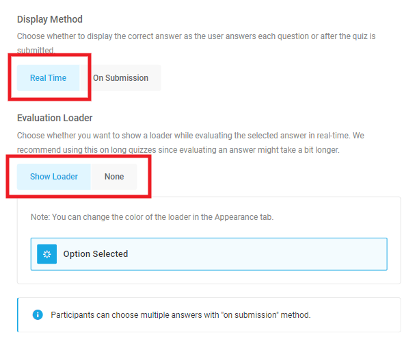
If you select the On Submission method, your users will be able to select multiple answers for each of your quiz questions.
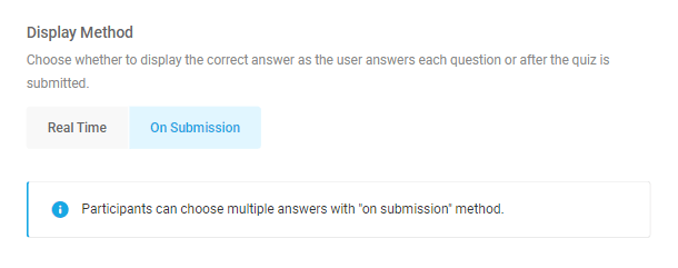
Messages (Knowledge Quiz only)
- Correct Answer Message – This message appears when the user has correctly answered a question.
- Incorrect Answer Message – This message appears when the user selects an incorrect answer.
- Final Count Message – This message appears at the end of the quiz, at the bottom, with the final count of correct answers. You can even take your quiz to the next level by adding some shortcode here. Embed WooCommerce product recommendations, a poll, or whatever else you may want.
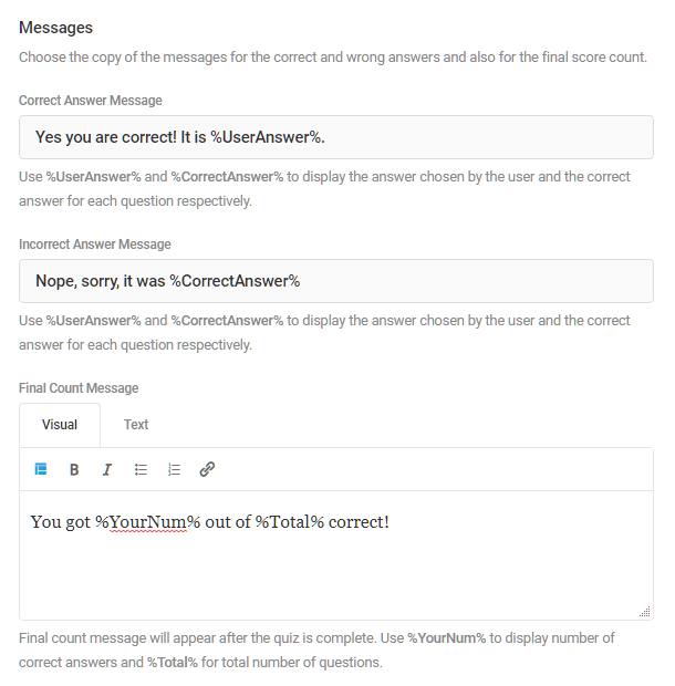
Social Sharing
Enable this option if you want to allow the quiz participants to share their results on social media. Shared results will include a link back to the user’s quiz results on your site.
You can enable any of the following social media platforms:
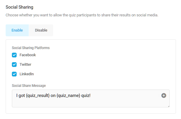
Rendering
- Load quiz using AJAX – Enabling this option will load the quiz via Ajax after the page itself has loaded, effectively speeding up the page load, and can help avoid page cache issues.
- Prevent page caching on quiz pages – Enable this option to disable page caching on any page that contains this quiz.
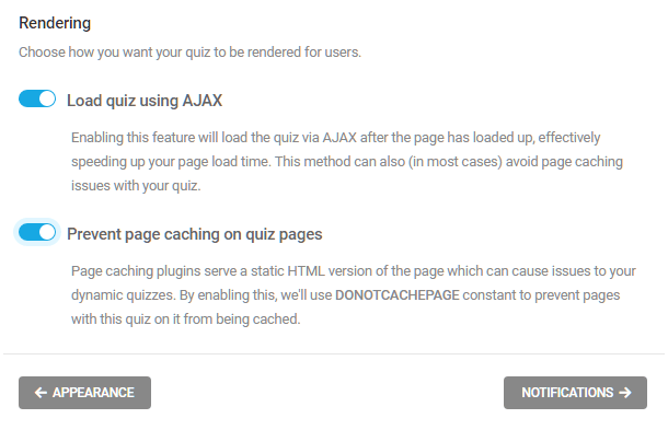
4.5.8 Email Notifications
Link to chapter 5Email notifications can be configured in the quiz’s Email Notification tab, enabling custom emails to be sent to admins or users upon quiz submission, with emails routed based on quiz data.
To add an email notification, click Add Email Notification.
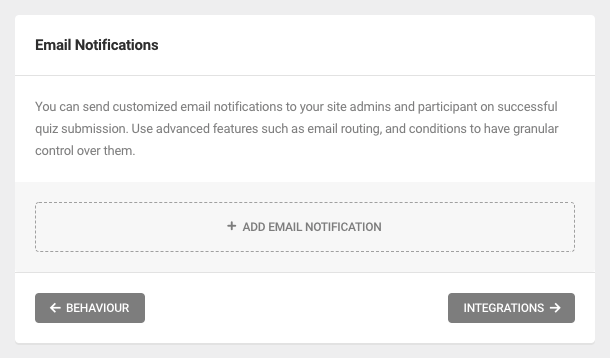
Quiz Data
Quiz data can be included in your notification email subject and body through the use of merge tags.
Merge tags can be inserted for any of the following pieces of quiz data:
- Quiz Name – Use the {quiz_name} merge tag
- Quiz Answer – {quiz_answer}
- Quiz Result – {quiz_result}
- User IP Address – {user_ip}
- Date (mm/dd/yyyy) – {date_mdy}
- Date (dd/mm/yyyy) – {date_dmy}
- Embed Post/Page ID – {embed_id}
- Embed Post/Page Title – {embed_title}
- Embed URL – {embed_url}
- HTTP User Agent – {user_agent}
- HTTP Refer URL – {refer_url}
- User ID – {user_id}
- User Display Name – {user_name}
- User Email – {user_email}
- User Login – {user_login}
- Custom Value – {custom_value}
- Query Parameter – {query} – Please ignore this tag as it serves no purpose for emails and will be removed from these options shortly.
Where supported, click any [+] icon or +Insert form fields link to select and insert available merge tags. Alternatively, you can type out the merge tag directly.
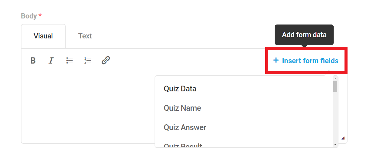
For example, the following subject line includes the merge tag {quiz_name}, representing the name of your quiz:
New Quiz Entry for {quiz_name}
Accordingly, an email notification sent upon quiz submission would read as “New Quiz Entry for My Quiz”.
You can also use standard HTML tags in the email body when editing in Text mode. However, just like when editing regular WordPress posts, some tags may be stripped out if you switch to Visual mode.
4.5.9 Integrations (Quizzes)
Link to chapter 5Options in this section are identical for both quiz types.
Third-party apps connected to Forminator will appear hear. Click the plus [+] icon next to any connected app to activate an app for the current quiz. The app will be authorized to collect data from the quiz submissions.
You can connect as many apps as you need, and as many instances of each app, to any quiz.
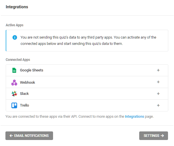
To see how to configure these integrations follow the links here:
4.5.10 Settings (Quizzes)
Link to chapter 5Options in this section are identical for both quiz types.
Data Storage
Your quiz submission data is stored in your site database, by default. Disable this storage with the toggle.
Be sure to configure alternate storage with a third-party integrated app before disabling local storage if you do need to keep this data somewhere.
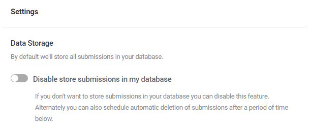
Privacy
To save your data in your database temporarily, you can specify when you would like the data to be auto deleted.
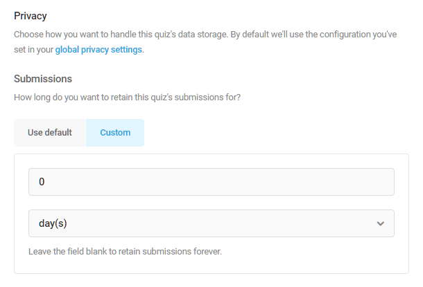
4.5.11 Embedding Quizzes
Link to chapter 5Each quiz comes with a shortcode which you can use to embed it anywhere on your site where shortcodes can be used: pages, posts, widgets, etc.
Any time you click the Publish button for a quiz in the editor, a modal will pop open to show you the shortcode for that quiz.
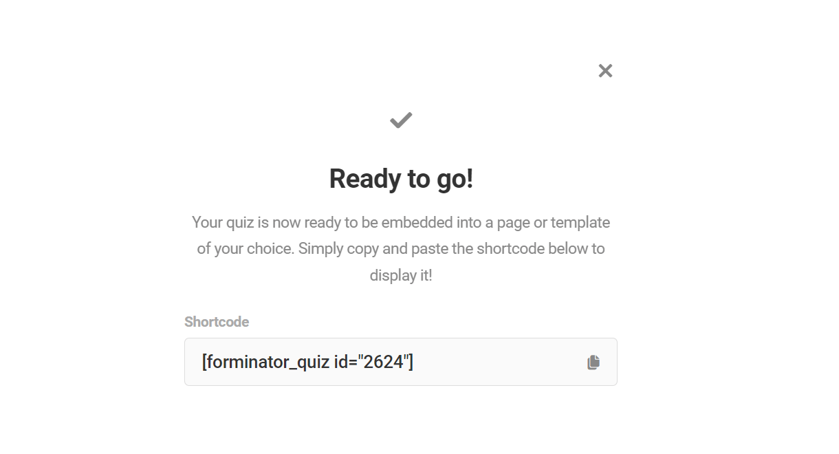
To get the shortcode for any quiz after having published it, go to the Forminator Quizzes page. Find the quiz you’d like to use and select the gear icon to open the settings dropdown for the form.
Select Copy Shortcode, which will automatically add the shortcode to your clipboard so you can paste it anywhere.
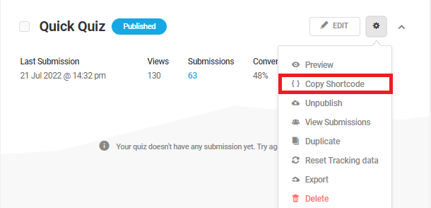
You can also add a quiz to your post while in the WordPress editor. Click the [+] icon to add a new block, and find the Quiz block.
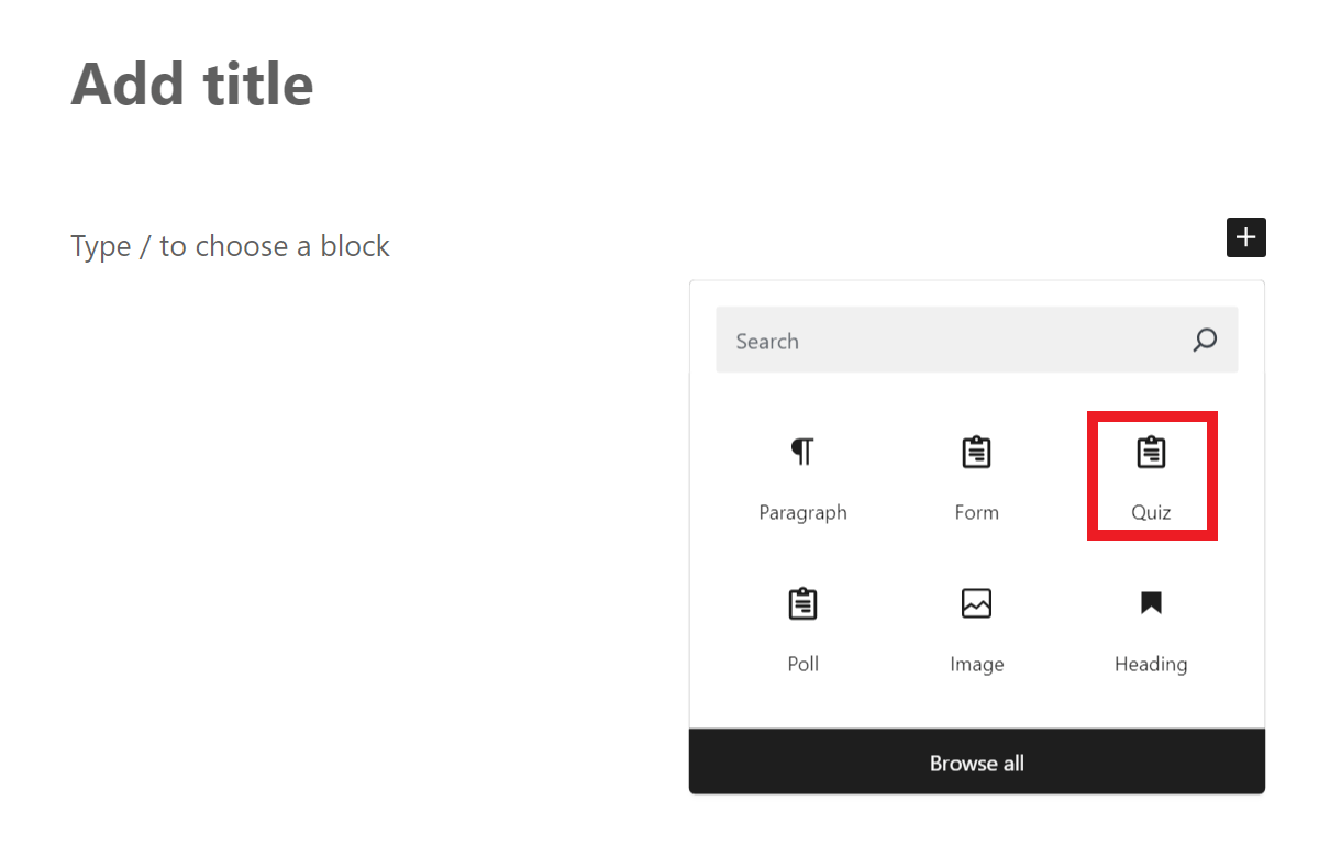
Once the block is added, select the quiz you want to embed in the post.

In case you want to present your quiz in a Widget, navigate to Appearance > Widgets. Choose the widget area you want to add your quiz into, click the [+] icon to add a new block, and find the Quiz block.
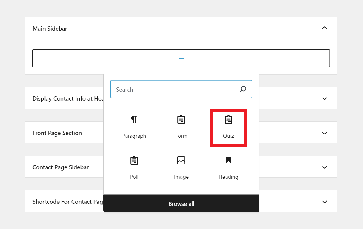
Once the block is added, select the quiz you want to embed in the widget area.
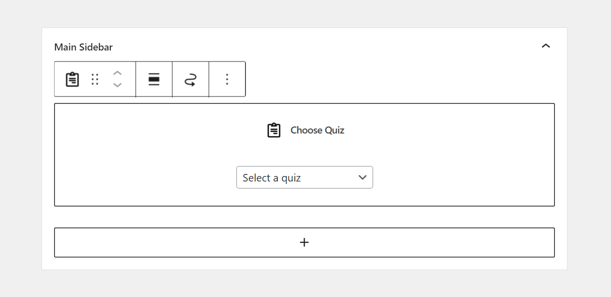
Once the quiz is embedded on the front-end, you’ll see a handy Edit link there when logged in as administrator. Clicking that link will redirect you to the edit screen for that specific quiz.
4.6 Templates
Copy chapter anchor to clipboardThe Templates section is where you can preview the Preset form templates included in Forminator, manage your own custom Cloud templates that you have created from your forms, and create new forms using any template.
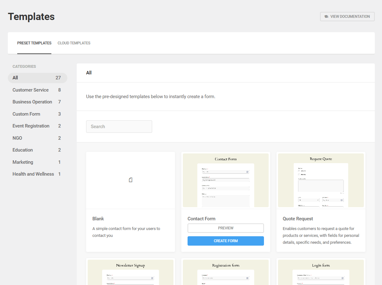
4.6.1 Preset Templates
Link to chapter 6Under the Preset Templates tab, you’ll find all the predesigned WPMU DEV templates neatly categorized for you.
Click any Category name to filter the template list by that category or browse through the entire collection. You can also search for templates using the smart Search field.
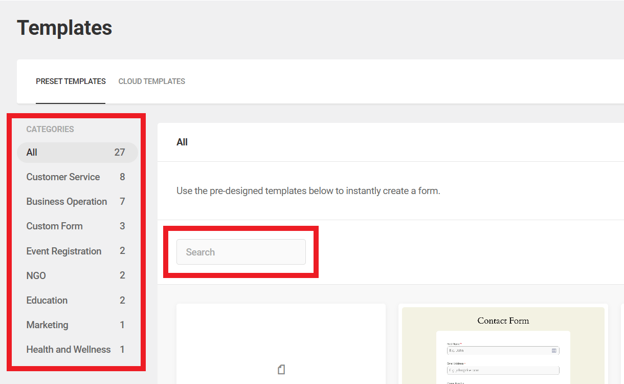
Click the Preview button for any template to pop open a modal window with a full-size screenshot of the form. Click any available Create Form button to use the selected template to create a new form.
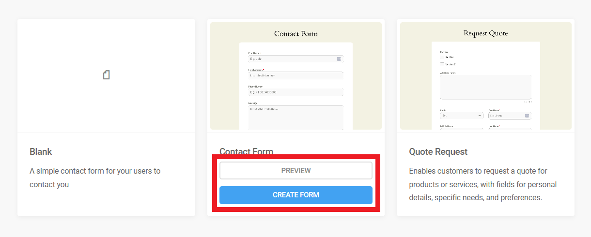
Both the free and Pro versions of Forminator include the following basic templates:
- Blank – Use this template to create a form with no default fields.
- Contact Form – A simple form designed to collect user-submitted contact information.
- Quote Request – A form with which users can submit a detailed request for feedback or more information.
- Newsletter – A basic subscription form.
- Registration Form – A powerful form designed to facilitate the creation of user profiles. See the Registration and Login Forms chapter above form more information.
- Login – A specialized form equipped with features to support a custom login screen. See the Registration and Login Forms chapter above form more information.
- Create Post – A form that already includes the Post Data field needed so your users can submit posts from a frontend form.
The Pro version also includes several additional templates:
- Event Registration Template
- Customer Feedback Form
- Appointment Booking Form
- Order Form for Small Businesses
- Job Application Form
- Volunteer Sign-up Form
- Course Enrollment Form
- Real Estate Inquiry Form
- Medical History Form
- Restaurant Reservation Form
- Donation Form
- Travel Booking Form
- Return Merchandise Authorization (RMA) Form
- Customer Complaint Form
- Course Evaluation Form
- RSVP Form
- Conference Registration Form
- Event Feedback Form
- Home Service Request Form
- Fitness Class Registration Form
4.6.2 Cloud Templates
Link to chapter 6Under the Cloud Templates tab, you’ll find all the custom templates that you have created from forms on all sites that are connected to your Hub. Cloud templates can be used to create forms on the same site or any other site connected to your Hub.
Creating a form from a custom template is an easy one-click alternative to exporting a form from one site and importing it to others using the Import / Export feature.
Click the Create Form button on any template’s row to create a new form using that template. Or click the gear icon to reveal additional management options for that template:
- Duplicate – Click to create an exact duplicate of your form template that you then edit as needed.
- Delete – Click to delete the custom template. It will no longer be available to select on any of your sites.
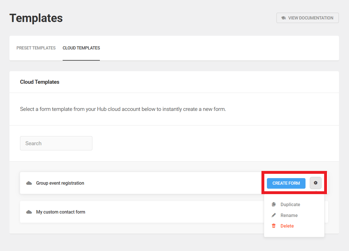
If you haven’t created any templates yet on any connected sites, this screen will of course be empty. Note that you can have a maximum of 100 cloud templates from all sites combined.
Cloud Template Filters
If you ever need to disable the Cloud Template feature on a site or network, add the following filter to the active child-theme’s functions.php or a mu-plugin:
add_filter( 'forminator_disable_cloud_templates', '__return_true' );
This could be especially useful on client sites where you don’t want them to see other clients’ forms.
4.7 Submissions
Copy chapter anchor to clipboardThe Submissions tab is where admins can manage the information contained in all submitted forms, polls, and quizzes. Use the drop-down menus to filter displayed submissions by type and title.
In the first dropdown, select to view submissions from either forms, polls or quizzes. Then select the specific one you want in the second dropdown.
Forms, polls and quizzes each display submission information differently.
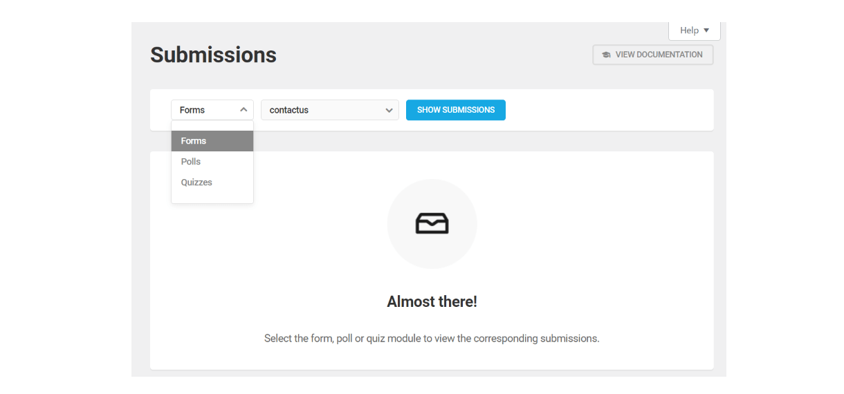
Forms
Submission results for your forms display in an expandable list.
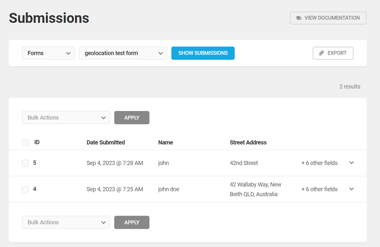
Click the row of any individual submission to see the submission details, including all form fields and 3rd-party integrations if applicable. This is also where your lead form data will show.
You can click the Resend Notification Email button to do just that. All the email notifications you have configured will be re-sent, including those sent to admins.

User Registration Form Submissions
If you have set the Activation Method for your user registration form to either Email Activation or Manual Approval, new user submissions will appear here with a yellow icon to indicate these new users are not yet active and are pending approval.
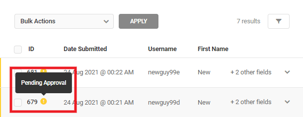
When you expand a registration submission that requires email activation, it will have a Resend Activation Link button you can click if needed.
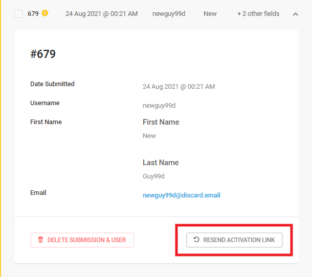
When you expand a registration submission that requires manual approval, it will have an Approve User button you can click to activate the user account. This action will also trigger an email notification to the new user with a login link.
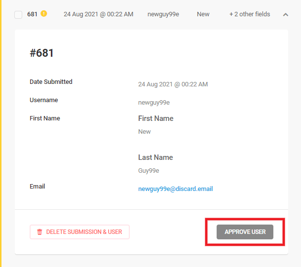
In either of the above cases, you can also click the Delete Submission & User button to delete both the pending user and the form submission.
Filters
Click the funnel icon to access additional filters that can be used to customize the submission data that appears in the Forms submission list.
- Submission Date Range – Clicking in this field will enable you to choose to only display submissions from today, yesterday, last 7 days, last 30 days, this month, last month, or a custom date range.
- From ID / To ID – You can select to show only submissions between the specified range of submission IDs.
- Keyword – Display only those submissions that contain the keyword you enter here.
- Sort By / Sort order – Sort by is preset to date only, but you can sort in ascending or descending order.
- Display Fields – Uncheck the form fields you don’t need to include in the submissions list or details view.
- User Status – This filter only appears for user registration forms and enables you to filter the list according to whether registered users are Approved or still Pending Approval.

Submission Information on Form Field Deletion
Submissions only contain information about the fields that a form currently has. If you delete any fields of a published form then the submission information of the deleted fields will get removed.
If you want to delete any fields of a published form, duplicate the existing form and delete the fields from the duplicated form, publish it and unpublish the old form. This will prevent the submission information from getting removed. Also, before deleting any form fields it is recommended to export/download both the form and its submissions.
Only submissions of a published form are listed in your site admin. So if you ever need to review those old submissions in your site admin, simply publish the original form again and they will once again be available in the Submissions section.
Polls
Polls submissions are displayed using the pie or bar graph, depending on how each respective poll was configured. Use the drop-down menus to select the poll you wish to see and click Show Submissions.

Quizzes
Quiz submissions are displayed in an expandable list. Use the drop-down menus to select the poll you wish to see and click Show Submissions. Click on any submission in the list to see the responses for that specific submission.
Exporting Submissions
To download all the entries of a specific Form/Poll/Quiz, just press on the Export button while viewing the list of entries for your selected form, poll or quiz.
From there, a popup will open where you can either choose to immediately download a CSV file with all the submitted entries or schedule an email.
- Manual Exports – Click the Download CSV button to download all submissions right away. Check the Apply Submission Filters box to apply the filters you set above.
- Scheduled Exports – Select Enable and set the Frequency and Time of Day, then enter the email address where you wish to receive the export. You can also click on the Send email only if there are new submission(s) checkbox to do just that.
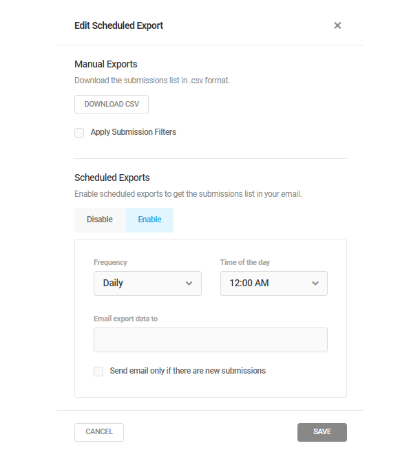
4.8 Add-ons
Copy chapter anchor to clipboardThe Add-ons page allows you to expand Forminator functionality through the installation of additional modules. Currently, the add-ons available with Forminator Pro are Stripe Subscriptions, PDF Generator, and Geolocation.
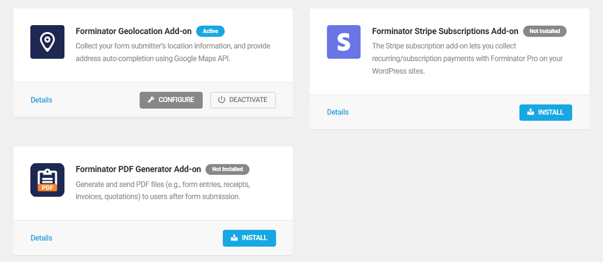
To install an available add-on, click Install. Additionally, click Details to view more information about an add-on.
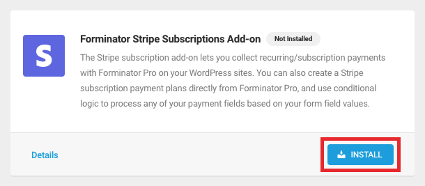
To configure or deactivate an existing add-on, click either Configure or Deactivate respectively.
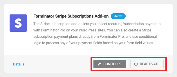
When an update is available, click Update to install the latest version.
4.8.1 Stripe Subscriptions Pro
Link to chapter 8The Stripe Subscriptions add-on expands Forminator’s Stripe fields with the added option to create subscription payment plans.
Watch the introductory video below to get a feel for how the addon works, then see the Stripe Field documentation above for details on configuring subscription payment plans.
You can learn more about the new Stripe subscriptions feature in our Stripe Subscriptions for Recurring Payments blog post.
4.8.2 PDF Generator Pro
Link to chapter 8With Forminator PDF Generation Addon you can now easily generate PDFs from Forminator forms and submissions.
To use the PDF Generator Addon feature, connect Forminator with your WPMU DEV account. You can easily create one for free if you don’t have one.
The PDF Generator Add-on requires the “mbstring” extension to be enabled on your hosting and the Forminator plugin version on your site should be 1.25 or above.
See the PDF (Forms) documentation above for details on creating and configuring PDFs from forms.
4.8.3 Geolocation Pro
Link to chapter 8The Geolocation addon allows you to collect the users’ location information when they submit forms. You can enhance the functionality of the address field with the auto-completion feature.
To use the Geolocation Addon feature, connect Forminator with your WPMU DEV account. You can easily create one for free if you don’t have one.
See the Geolocation documentation for details on how you can use the geolocation feature on your forms.
4.9 Integrations
Copy chapter anchor to clipboardForminator supports the integration of several apps into your forms, quizzes and polls, allowing you to share submission data with third-party apps. You can connect as many apps as you need, and as many instances of each app except Webhook, to any form, poll or quiz.
You can also send form data to different lists of the same app depending on user input in a form. See Sending Data Conditionally in the Integrations (Forms) chapter above.
Check out the latest updates to Forminator’s 3rd Party App Integration and After Submission Behavior on the blog.
But before an app can be integrated into a form, quiz or poll, it must first be connected to Forminator here.
Using Forminator’s Webhook integration, you can connect automation tools that support webhooks, enabling you to send the forms, quizzes, and polls submission data via a webhook URL.
Below is a list of apps Forminator currently supports. Apps that you have already connected will appear in Integrations > Connected Apps of your form, quiz or poll, with all others in an Available Apps section.

Click the link below for the app you wish to connect or integrate to view a walkthrough we’ve created for that app.
4.9.1 Webhook
Link to chapter 9Forminator enables you to integrate automation tools into your forms, quizzes, and polls using webhooks. This allows you to send submission data to automation tools such as Zapier, Integrately, Tray.io, Make, Workato, n8n.io, and other automation tools that support webhooks.
Note that at this time, it is only possible to add a single Webhook instance to a module. A future update to the plugin will allow for multiple Webhook integrations per module.
If you are an advanced user creating a custom webhook on the n8n platform, be sure to set the HTTP Method to POST. For more info, see the n8n Webhook Node documentation.
Activate Webhook by clicking on the [+] icon.
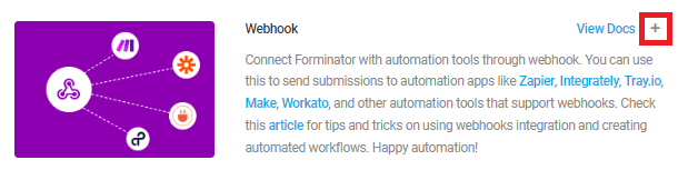
In the pop-up modal window, click the Activate button to integrate forms, polls, and quizzes with automation tools using webhooks.
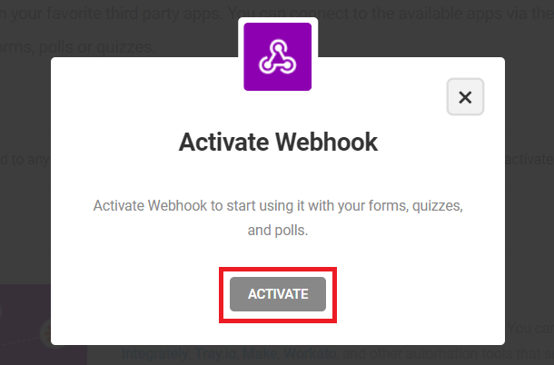
Go to the Integrations tab of the specific form where you’ll see Webhook in the Connected Apps section of the list. Click the [+] icon to open a pop-up where you need to enter your connection name and your Webhook URL:
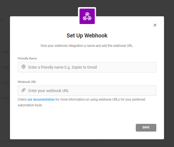
Example Setup with Zapier
As an example of using Webhook integration, we’ll walk through the process of sending submission data to Zapier using a webhook.
If you haven’t created any ZAPs before, go to your Zapier account and click on the Create Zap button.
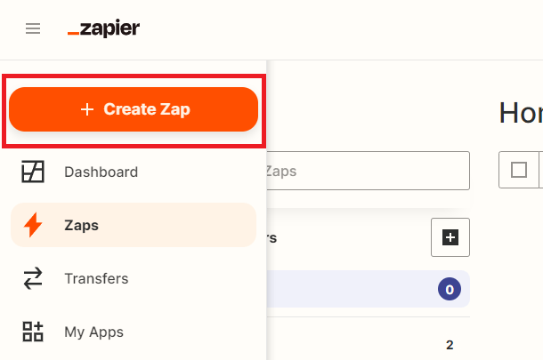
For your trigger app, choose Webhook.
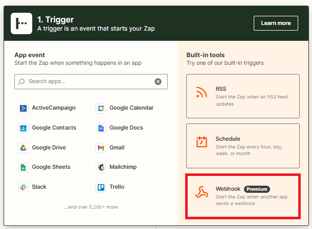
From the Trigger Event dropdown, select Catch hook, then click Continue.
Specify the keys of the fields you want to send to Zapier or leave the Pick off a Child Key field empty if you want to send all the submission data to Zapier, then click Continue.
Copy Your Webhook URL shown on that screen.
Then paste that URL into the Webhook URL field in your form’s Webhook integration, and click Save.
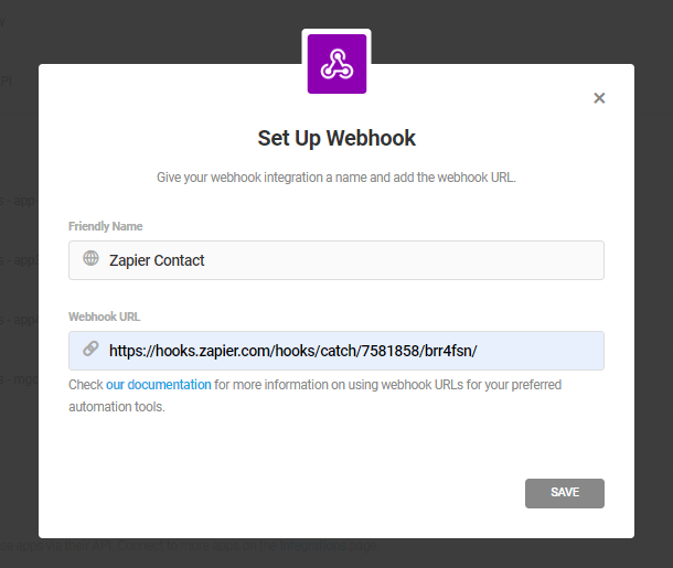
Then, back in your zap setup at Zapier, click the Continue button on the Webhook URL screen. Then click the Test Trigger button on the next screen.
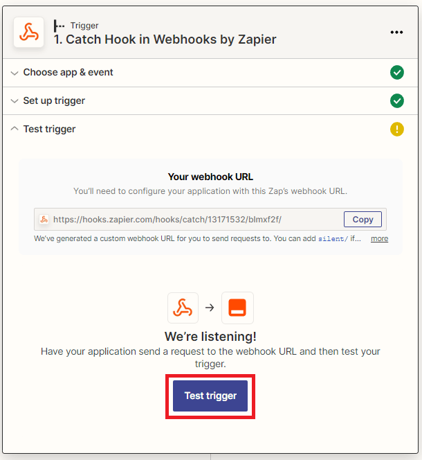
If you use Zapier to integrate your form with MailChimp instead of the built-in MailChimp integration, you’ll want to skip the Test step at Zapier. The test will fail because Zapier/MailChimp can’t recognize a dynamic value for the email field during the test. So you’d want to either rely on tests with your actual form to verify that data is sent to MailChimp, or simply use Forminator’s built-in MailChimp integration. See this article at Zapier for more info.
Once you get a Success message, click Continue.
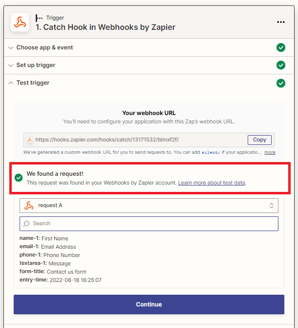
The rest is up to you and your project/needs. The steps for setting up Webhook integrations for other automation tools are similar to Zapier above.
4.9.2 Mailchimp
Link to chapter 9If you use Mailchimp for email marketing, then by integrating it with Forminator you can manage and send email campaigns to users who submit your forms.
For the purpose of this integration, we will assume that you have a Forminator form with Name and Email fields. For the integration to work you need to have these fields in the Mailchimp Audience as well, so let’s first create that.
Create a new Mailchimp account or log in to your existing account.
Expand the Audience menu item and click All Contacts.
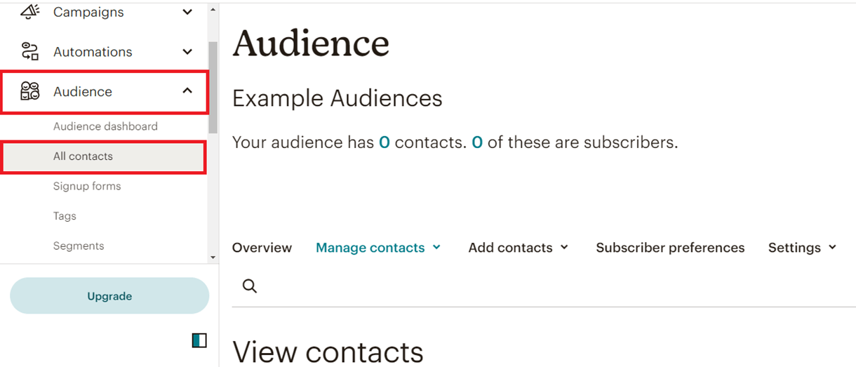
Click the Settings option and choose Audience name and defaults.
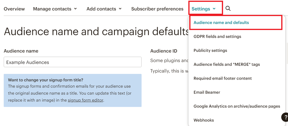
Under the Form Settings category enable the Double opt-in option if you want the users to confirm their subscription before adding them to your audience list. If this field is not enabled, then users will get auto-subscribed to your Audience list.
Click Save Audience and Campaign details to save the changes.
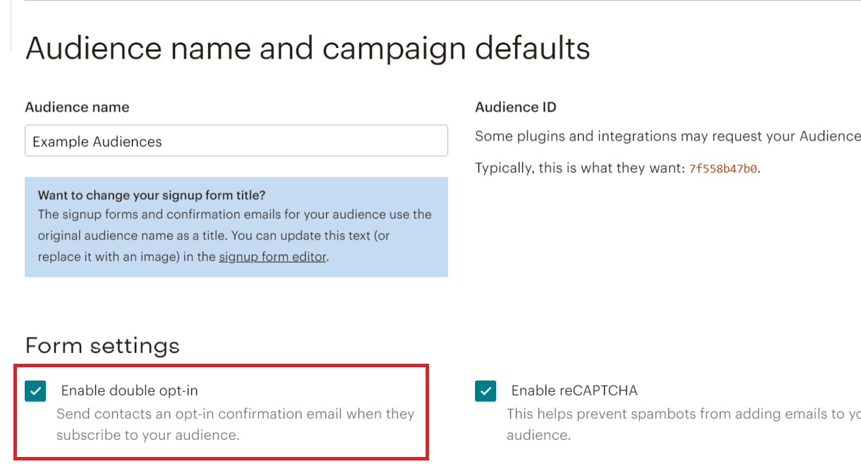
Now, under Settings click Audience fields and *|MERGE|* tags option.
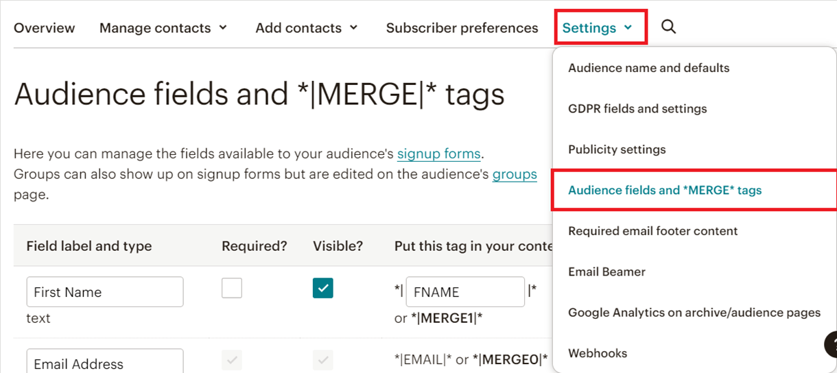
Here you can customize and manage the form fields whose data you want to send from your Forminator form to Mailchimp. Add the same fields (and types) that you have in your Forminator Form.
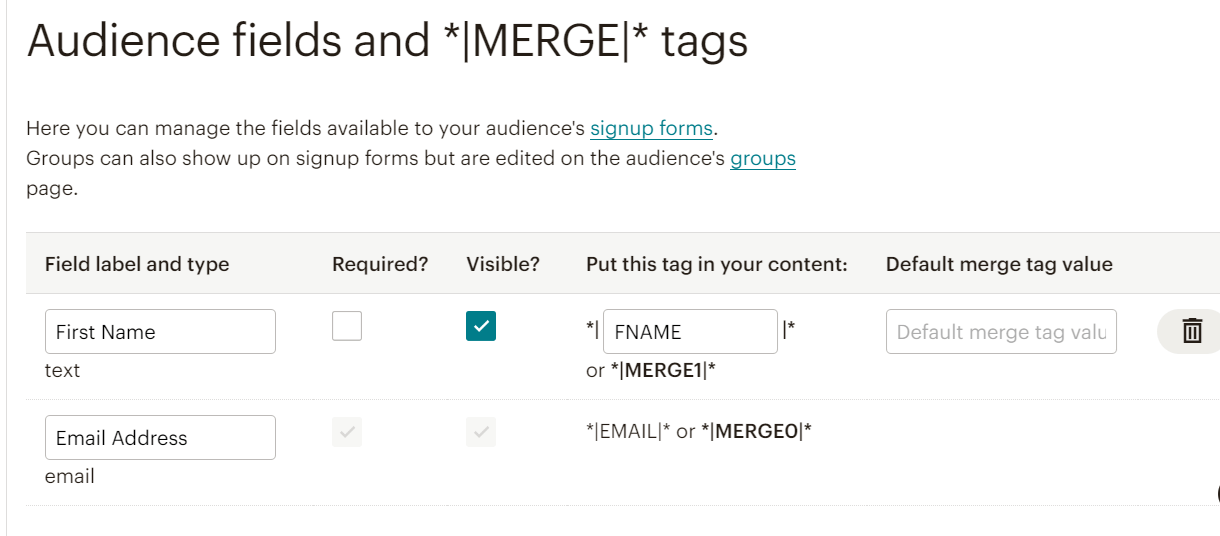
If you are mapping form fields other than the Text type at Mailchimp, like radio options, your Mailchimp option labels and Forminator option values (not labels) must be identical.
For example, if you are mapping a radio field in Forminator where the label is “15-30 Years”, but the value is “15-30-years” (note the dash and lower-case y), the corresponding radio field option in Mailchimp must be “15-30-years“.
Now to get Mailchimp integrated with Forminator, go to the main Integrations screen in Forminator and click the [+] icon for Mailchimp.
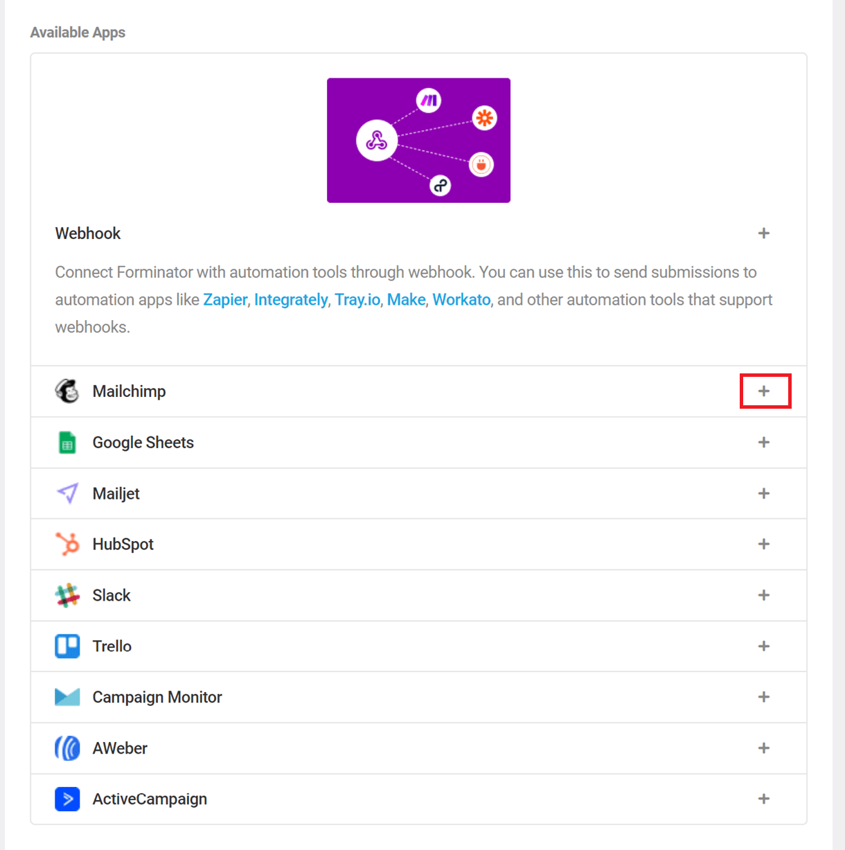
In the new pop-up window, whilst logged in to your MailChimp account, click here so you can get your API Key.
Copy the generated API Key and paste it in the API Key line of your form, and choose an identifying label for the connected account.
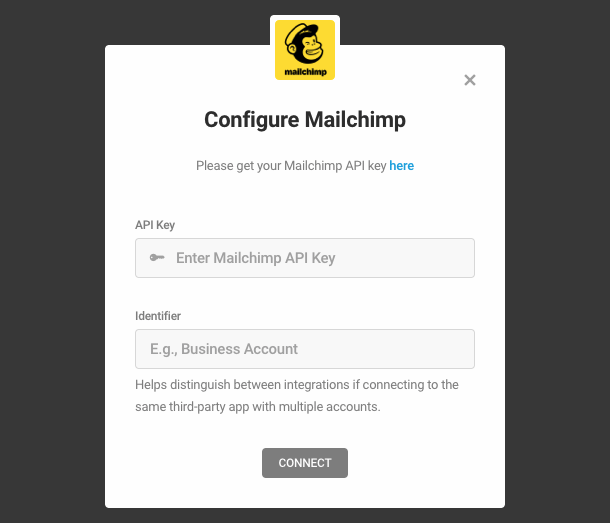
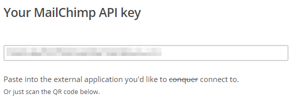
Once done, click on the Connect button. You have now created a connection to your MailChimp account.
To connect a form to your Mailchimp account, you need only go to the Integrations tab of the specific form where you’ll see Mailchimp in the Connected Apps section of the list. Click the [+] icon to open the integration options.
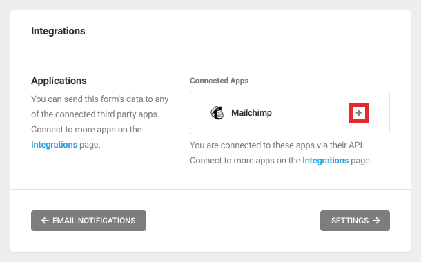
In the new pop-up, choose your desired Email Audience (List) and check if you want to use Double Opt-in (which forces your visitors to confirm their subscription, via their email, to your selected Emailing list). If Double Opt-in is not selected here, once the form is submitted the data visitor provided will be auto-added to your mailing list (basically signing them up).
Click Next to continue.
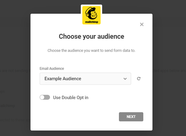
If desired, you can use your existing Mailchimp tags to help organize your audience. Enter as many tags as you’d like to the Tags text field, and then click Next to continue.
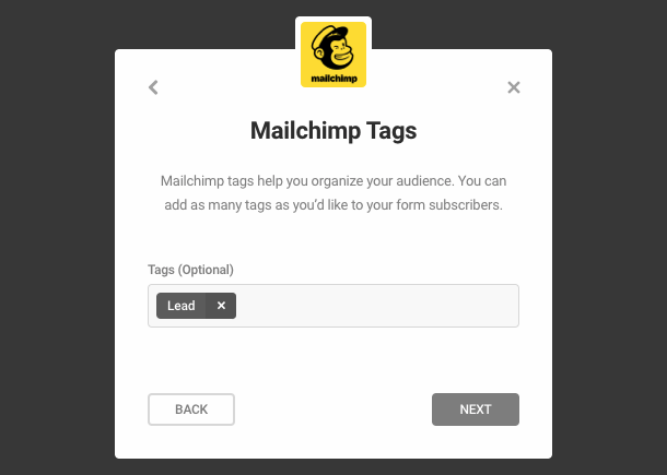
If desired, you can also use your existing Mailchimp groups to help categorize your audience based on their interests. Select an existing group category from the dropdown menu, and then select the intended interests. Click Next to continue.
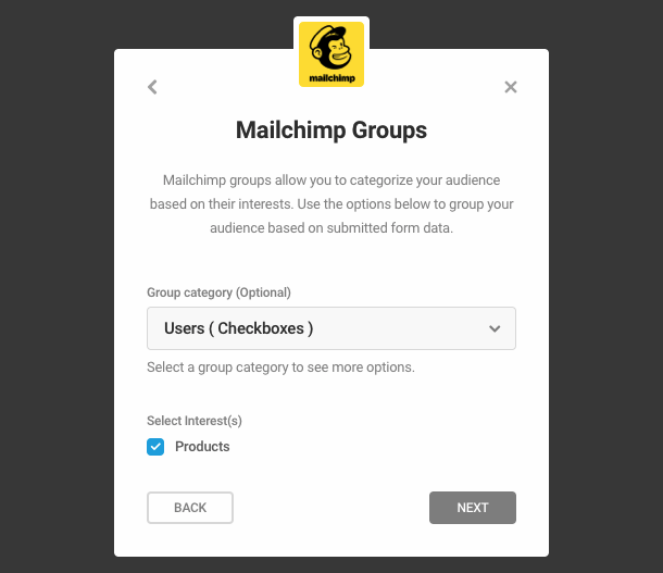
On the left side you can see the fields present in your selected Mailchimp Audience and on the right side the fields available in your current Forminator Form. Match the fields, if not already matched, so their data is sent to the right ones in Mailchimp, and then press Save.
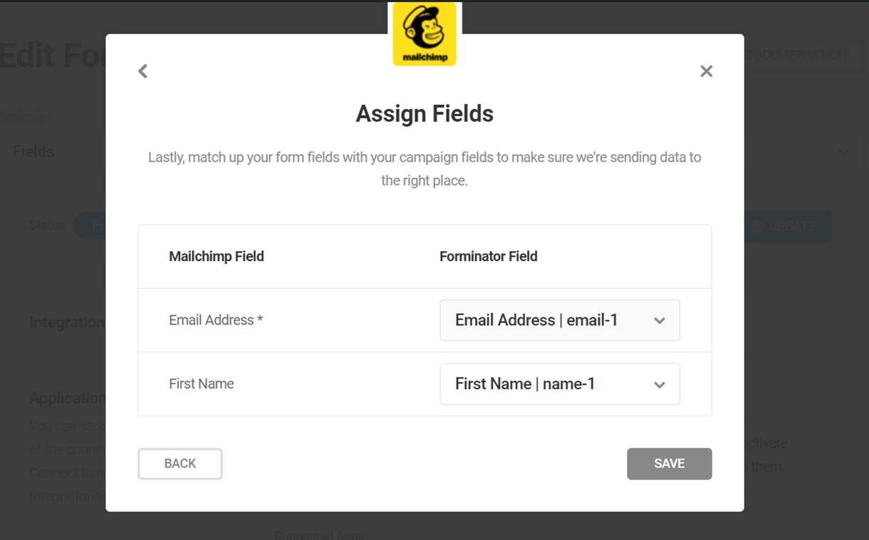
This concludes your Mailchimp integration. From now on all the data, from the forms you have chosen to set this up, will be also sent to your Mailchimp Audience :)
4.9.3 Campaign Monitor
Link to chapter 9Using Campaign Monitor as your email marketing service? Let’s quickly go through how can you connect your Form to it. Click the [+] icon for Campaign Monitor.
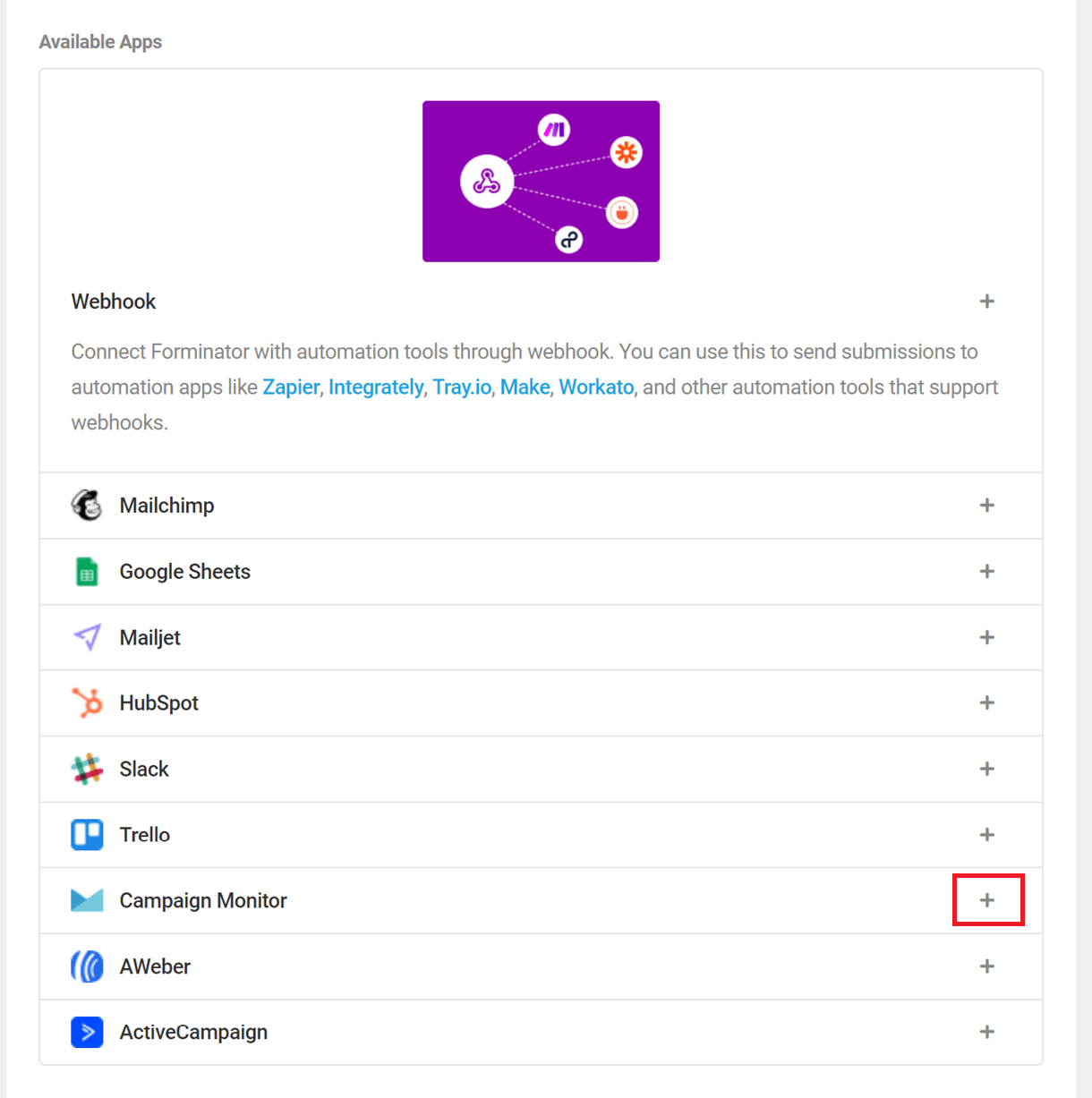
This will bring the connection pop-up where you need to enter your Campaign Monitor API Key and Client ID, as well as an identifying label for the connected account.
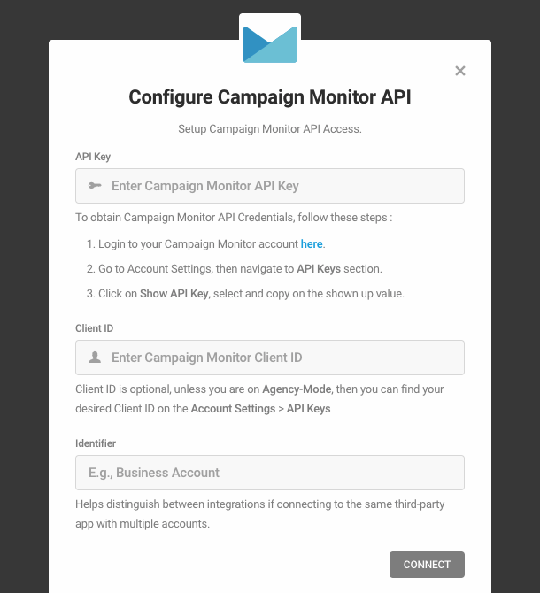
In order to get those, login to your Campaign Monitor account and then navigate to Account Settings/API keys:
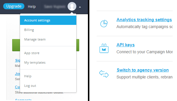
Click on Show API Key and then copy/paste both the API Key and the Client ID to the Forminator pop-up we mentioned at the start:
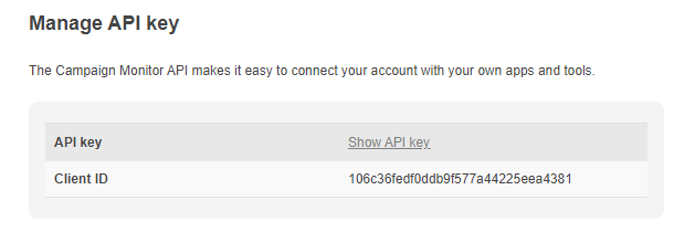
Once done, click on the Connect button. You have now created a connection to your Campaign Monitor account.
To connect a form to your Campaign Monitor account, you need only go to the Integrations tab of the specific form where you’ll see Campaign Monitor in the Connected Apps section of the list. Click the [+] icon to open the integration options.
In the popup that appears, name your connection (put any name you wish as this is just for you):
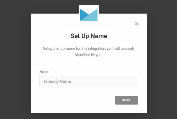
Once the connection is made, click the Next button and then choose the Campaign Monitor list where you wish the submitted data of your form to go to:

Now you need to assign fields, in order for your form data to populate your chosen Campaign Monitor list. Take note that both the email and the name fields are required by Campaign Monitor and the rest are optional:
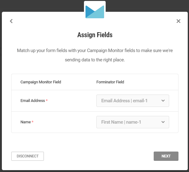
The last step allows you to additionally configure your Campaign Monitor connection, so let’s see what you can do here:
- Re-subscribe – If the subscriber is in an inactive state or has previously been unsubscribed or added to the suppression list and you enabled Re-subscribe, they will be re-added to the list. Therefore, this options should be used with caution and only where suitable. If Re-subscribe is disabled, the subscriber will not be re-added to the active list.
- Restart Subscription based Autoresponders – By default, resubscribed subscribers will not restart any automated workflows, but they will receive any remaining emails. However, if you enable the Restart Subscription based Autoresponders, any sequences will be restarted. Restart Subscription based Autoresponders only affects resubscribing subscribers.
- Consent to track – Whether or not the subscriber has consented to have their email opens and clicks tracked. This value applies to all subscribers with the same email address, within the same client. If an email address has no value stored for Consent to Track, it is assumed that the subscriber has given consent. You can find more information at Campaign Monitor.
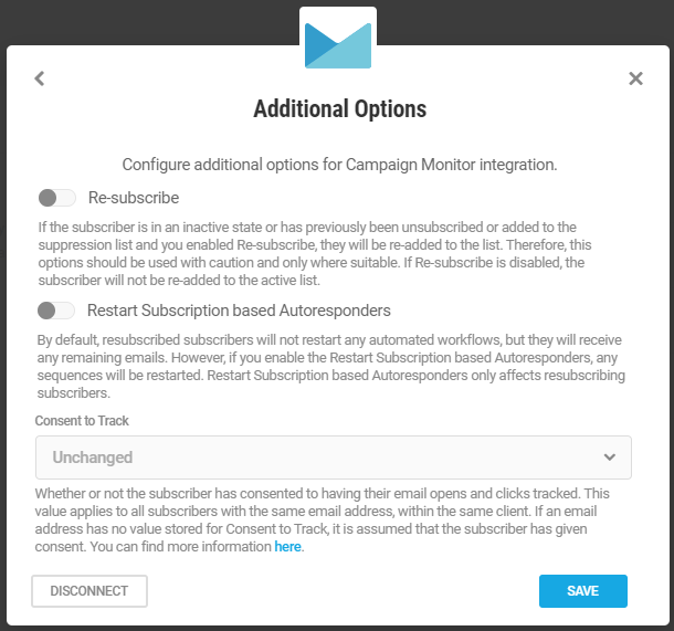
Press on the SAVE button to complete your Campaign Monitor integration.
4.9.4 ActiveCampaign
Link to chapter 9To connect your Forminator Form to ActiveCampaign, click the [+] icon for ActiveCampaign.
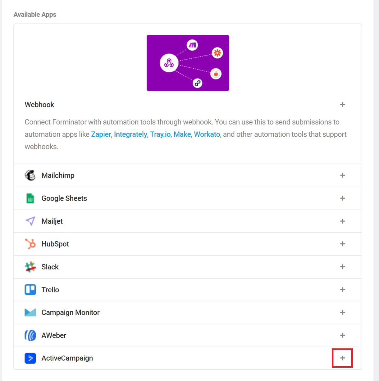
This will bring a pop-up screen where you need to add your ActiveCampaign API credentials, as well as an identifying label for the connected account.
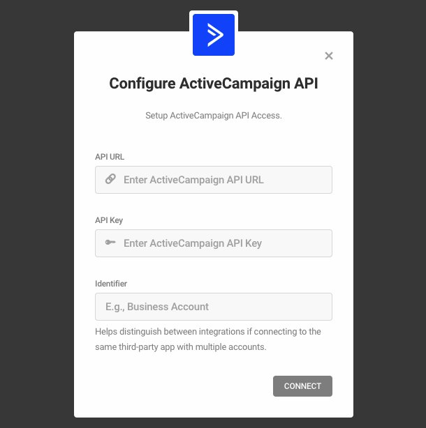
To get those credentials, log in to your ActiveCampaign account, go to Settings > Developer, and copy the required URL/KEY from the API Access module.
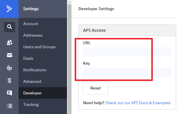
Paste those credentials into your Forminator integration window and press the Connect button. You have now created a connection to your Active Campaign account.
To connect a form to your Active Campaign account, you need only go to the Integrations tab of the specific form where you’ll see Active Campaign in the Connected Apps section of the list. Click the [+] icon to open the integration options.
In the popup that appears, you will be asked to create a name for your Integration. Enter a name and then click Next.
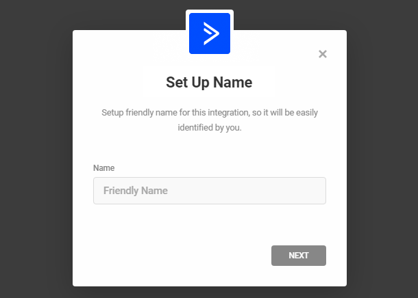
This will prompt you to choose a contact list you wish your form submits added to. Choose a list and press on the Next button:
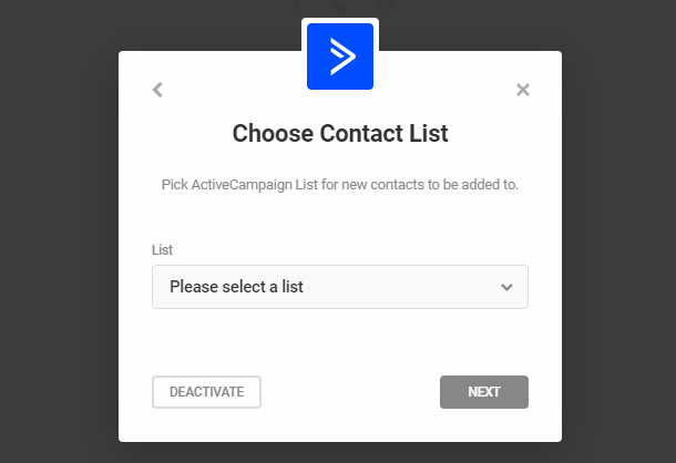
Now you need to match fields, in order for your form data to populate your chosen ActiveCampaign list. Take note that only the email address field is required by ActiveCampaign and the rest are optional. Match the fields and then click Next.
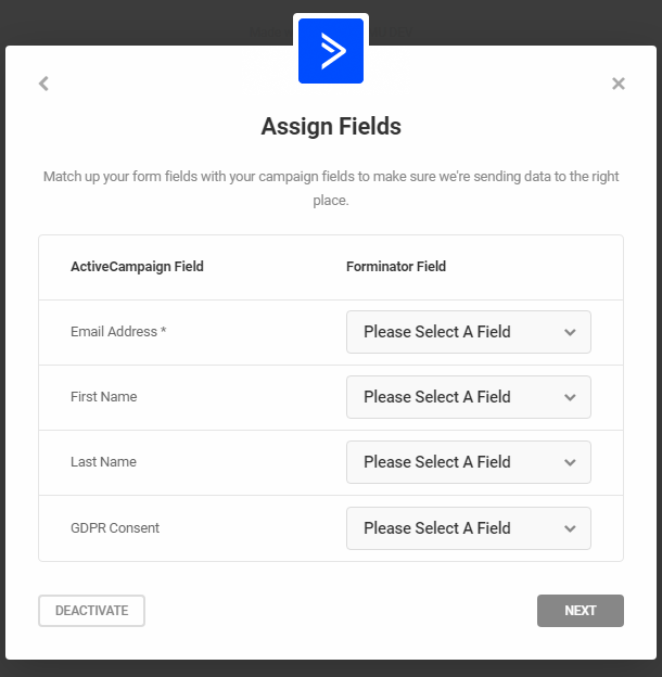
This will bring up the Additional Options pop-up where you can configure additional options for your ActiveCampaign integration. Let’s go through those options and see what they do.
- Tags – Allows you to add tags to your contacts. You can insert submitted data from your Forminator fields or you can write your own custom tags.
- Double Opt-In Form – Double opt-in Form allows you to choose which ActiveCampaign form will be used when ActiveCampaign opt-in email is sent.
- Enable Instant Responders – When the instant responders option is enabled, ActiveCampaign will send any instant responders setup when the contact is added to the list. This option is not available to users on a free trial.
- Send last broadcast campaign – When the send last broadcast campaign option is enabled, ActiveCampaign will send the last campaign sent out to the list to the contact being added. This option is not available to users on a free trial.
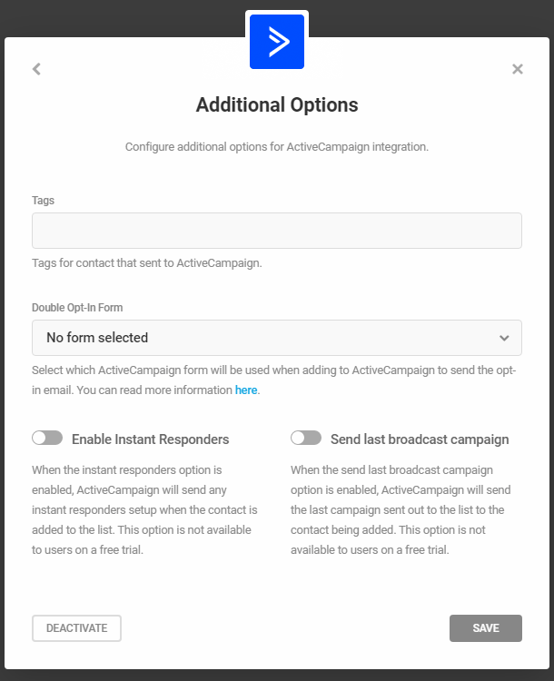
All of these fields are completely optional and don’t need to be configured. Once done, press on the Save button. This completes your ActiveCampaign integration.
4.9.5 HubSpot
Link to chapter 9See below for steps to integrate Forminator’s Consent field into a HubSpot static list.
To connect Forminator to HubSpot, first click the Connect button (+ icon) in the HubSpot row.
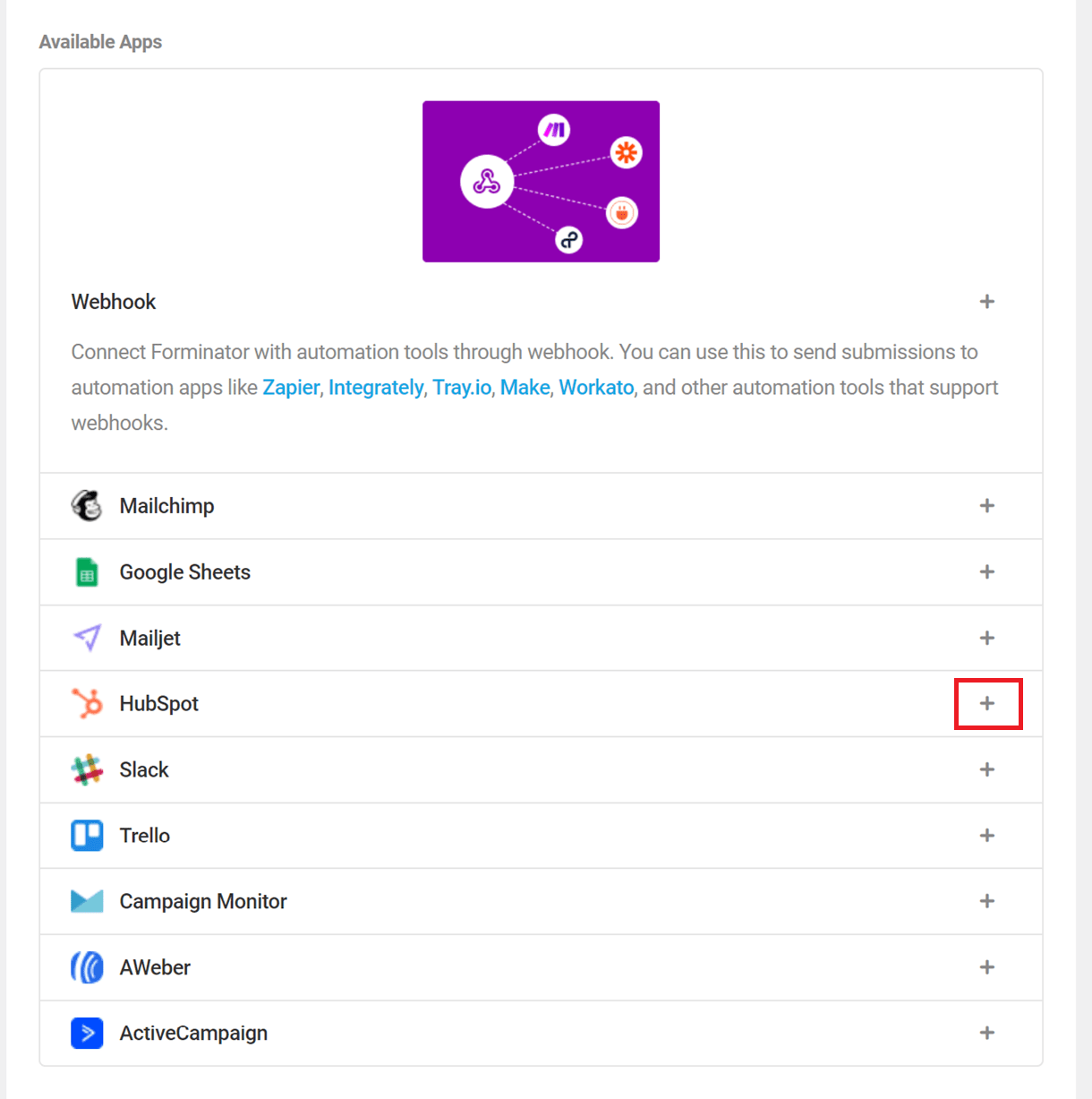
Then, choose an identifying label for the connected account, and click Authenticate to be redirected to the HubSpot authentication page.
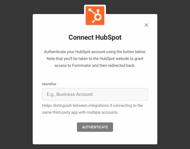
Log in (if necessary), and select your HubSpot account. Click Choose Account to proceed, and then click Connect App on the subsequent screen.
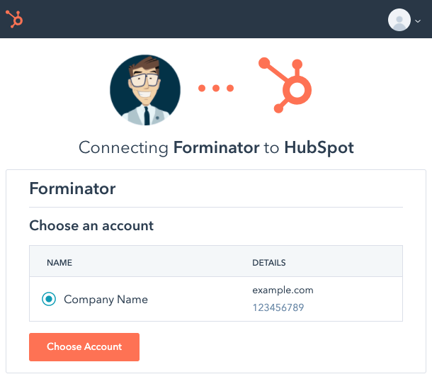
If HubSpot authentication is successful, you will be redirected to Forminator and presented with a success message.
To connect a form to HubSpot, first open the form in Forminator and switch to the Integrations tab. Then, click the Activate button (+ icon) in the HubSpot row.
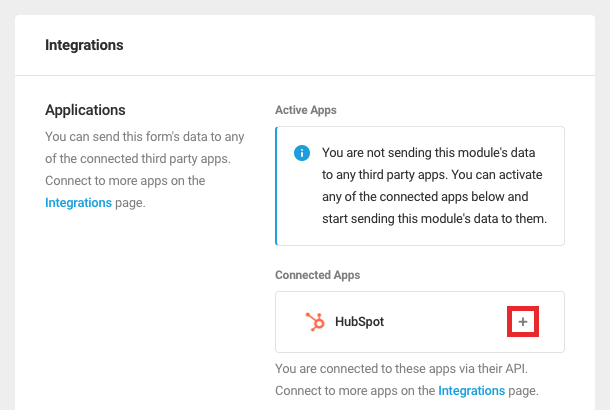
If desired, select a static HubSpot list to which contacts will be added. Otherwise, contacts will be added to HubSpot without being added to a list.
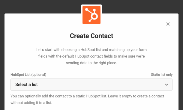
HubSpot will add contacts automatically to static lists only. If you intend to add contacts to a static list, be sure to add the list in HubSpot first before activating the integration for a specific form.
Next, map the form’s fields to fields in HubSpot by selecting from the Forminator Fields dropdown menus. Click Add Additional Field to add additional fields as needed, then click Continue.
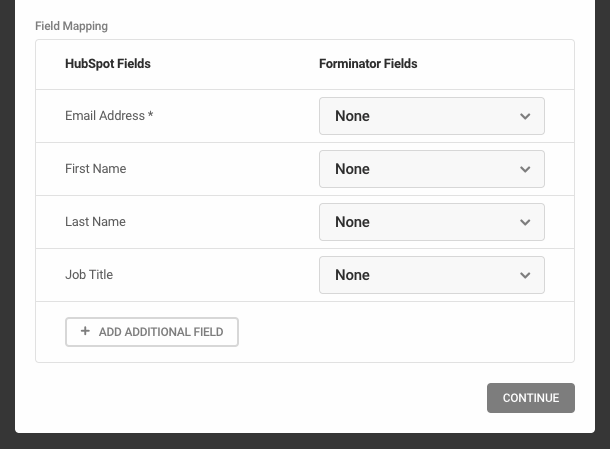
Finally, enable the creation of HubSpot tickets for each form submission, if desired. Click Activate to activate the integration.
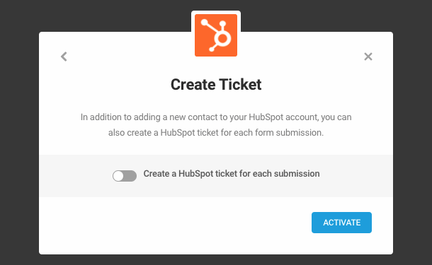
Once activated, contact information gleaned from each form submission will be added to HubSpot.
Consent/GDPR integration
If you are using a Consent field in your form, and need to have a corresponding entry for each contact in your Hubspot list, here’s how to configure that in your Hubspot account.
First, go to Settings > Properties in your Hubspot account, and search for the “Legal basis for processing contact’s data” property.
Click on that property to edit it. In the modal that pops open, click + Add an option at the bottom. Give your new custom option any recognizable name you want, but be sure the value you enter for it is: true. Then click Save.
Next, back on the Properties screen, you’ll want to ensure that property is assigned to the Contact Information group. Hover your mouse over that property and click the More button, then select Move to Group.
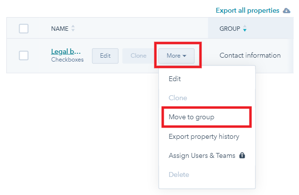
In the modal that pops open, select the Contact Information group, and click Save.
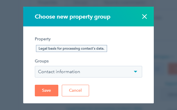
Then, to get your custom Consent/GDPR entry to show up in your list, go to Contacts > Lists and click to open the Static List you’re using for your Forminator form. Select Edit Columns from the Actions menu at top-right.
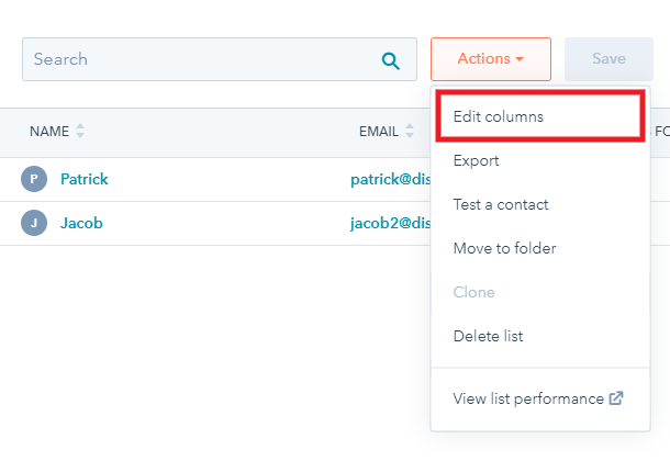
In the modal that pops open, search for the “Legal basis for processing contact’s data” property, and check the box next to it to add it to the available columns on the right. Drag & drop to move that column to your preferred position in your list and click Save at the bottom of that modal.
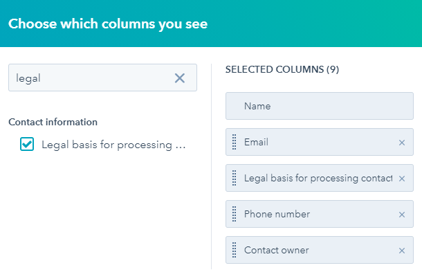
Now, whenever a user submits a Hubspot-connected form with a Consent field, you’ll see your custom entry in your contact list for that user.
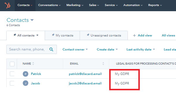
4.9.6 Google Sheets
Link to chapter 9Moving your submissions to Google Sheets, for a better preview and easier sorting is just a few clicks away, so let’s see how you can set this up. Click the [+] icon for Google Sheets.
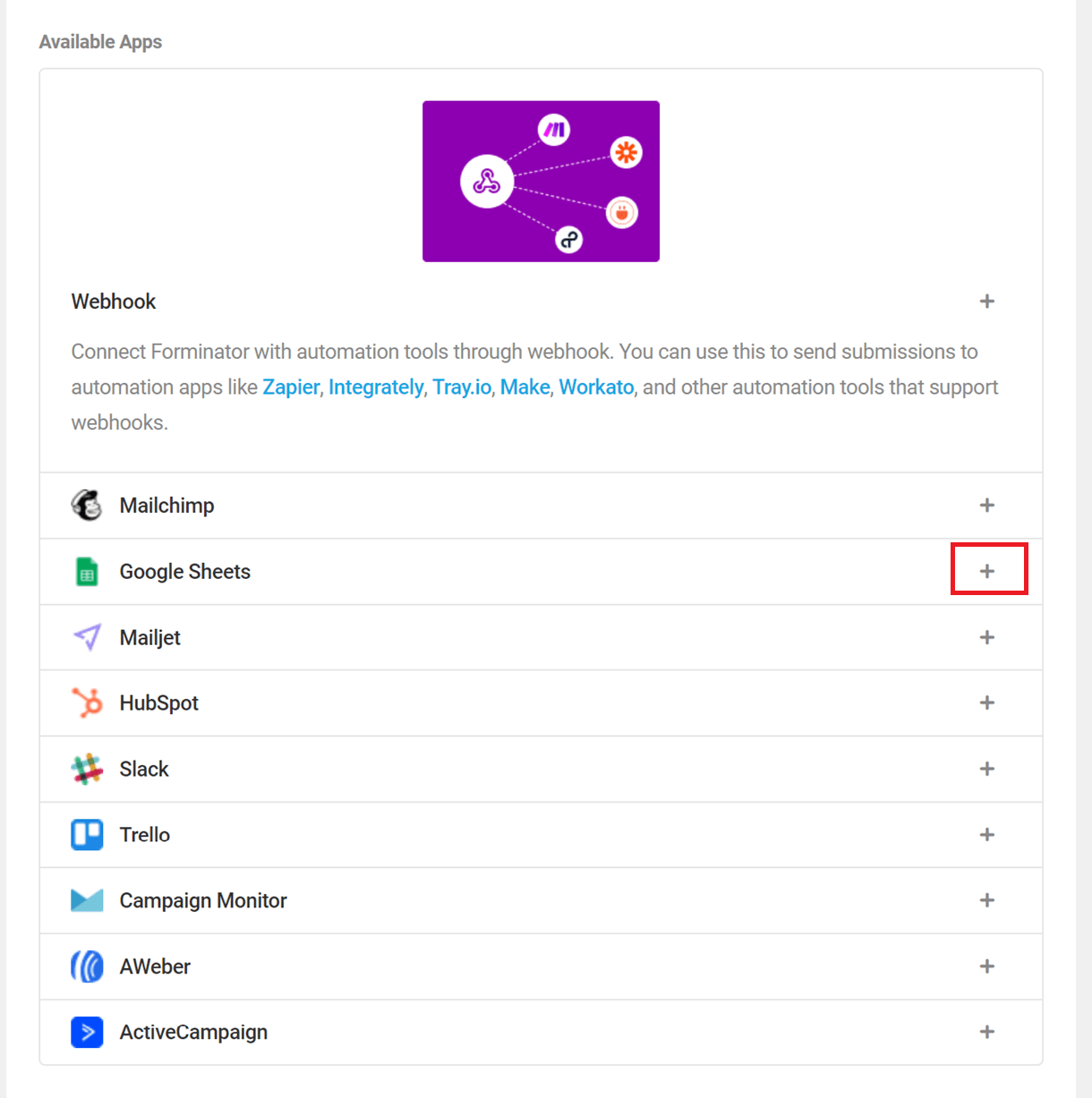
This will bring a new popup window where you need to put in your Google Client ID and your Client Secret code, as well as an identifying label for the connected account. Click the Guide to generate credentials link to jump to the technical document (this document) for a guide to creating your credentials.
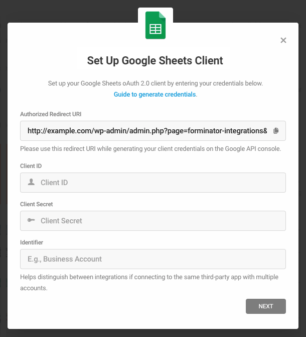
To get those, go here and create a new Project.
Name your project and then click the Create button.
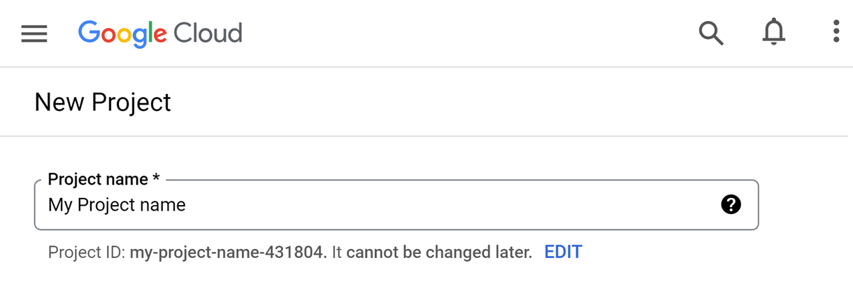
Once you’ve created your project, go to APIs & Services > Enabled APIs & services.
Click the Enable APIs and Services button.
Find and enable Google Drive API and Google Sheets API.
In the APIs & Services sidebar menu, click the OAuth consent screen. If you’re a Google Workspace user and want this app to be restricted to users within your organization, select the Internal option here. For all other cases, select External. Then click the Create button.
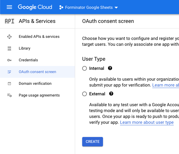
The following screen is where you’ll enter the info that appears on the consent screen when authorizing the app. As you will be the only one authorizing it for integration with Forminator, you only need to fill in the required fields.
Fill in the required fields under the App information section:
- App name – enter any name you like
- User support email – use the same address as the Google account you’re logged-in with
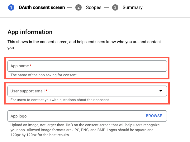
Optionally, you can fill in the information under the App domain section. Note however that as you are the only one who will see this screen, it is unnecessary.
Click +Add Domain and enter your site’s domain name in the Authorized Domains section. Note that you can only enter top-level domains here. So if your site is installed in a subdomain like sub.example.com, enter only the top-level domain: example.com
Under the Developer contact information section enter the same address as the Google account you’re logged-in with.
Click Save & Continue.
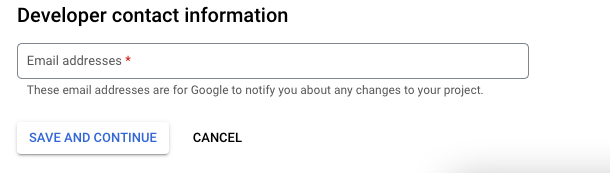
Ignore everything on the Scopes and Test Users screens, and simply click the Save & Continue button on each of those. Then, on the final Summary screen, click the Back to Dashboard button at the bottom.
On that next screen, click the Publish App button, then the Confirm button in the little modal that pops up.
Next, click on the Credentials tab and, in the +Create Credentials dropdown, select Oauth client ID.
On the new screen choose Web application. Then Name your Oauth ID and in the Authorized redirect URIs field, paste the URL given by the Forminator Google Sheets integration pop-up.
You’ll find the Forminator redirect URL you need to copy in the Authorized Redirect URI field of the Google Sheets integration pop-up in your site admin.
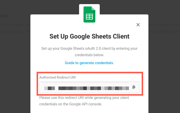
When you click the Create button, a popup will appear where you’ll see the Client ID and the Client Secret we mentioned at the beginning.
Copy those and paste them in the corresponding fields in the Google Sheets integration pop-up in your site admin.
Fill in the Identifier field with a descriptive name that would allow you to identify this integration then click the Next button.
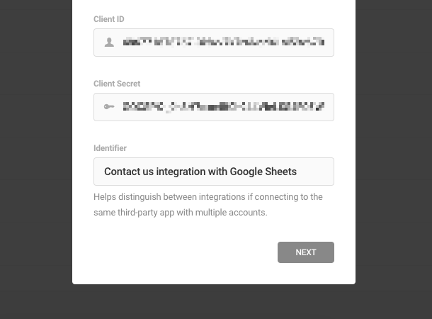
You’ll then see “Connect Google Sheets” appear in the popup; click the Authorize button there.
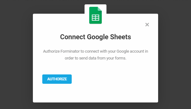
That will open a new tab where you’ll be prompted to log into your Google account (the same Google account you were logged into to create the above creds). In case you see an alert that the app isn’t verified, just click on Advanced and then on the site name you connected this to (“unsafe message”) and then Approve:
Click the Allow buttons in the next options of the authorization steps and, once that’s done, click the Close button in the popup in your Forminator Integration settings.
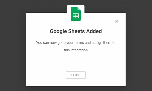
Connecting a Sheet to a Form
Now that the integration with Forminator is complete, let’s connect a sheet to a form. Go to your desired form, click Google Sheets integration and, in the new pop-up screen, enter a name for this connection and click Next.
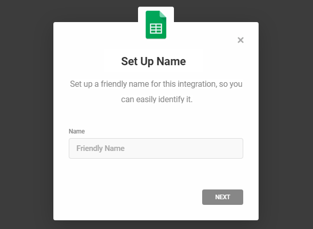
On the next screen in the popup, you can select to send submissions to a new spreadsheet or to any selected sheet in an existing one.
New Spreadsheet
Enter the Drive Folder ID where you’d like your Google sheet to be created. The folder ID would be only the part after /#folders/ in the URL.
For example, from this folder URL – https://drive.google.com/#folders/0B6GD66ctHXdCOWZKNDRIRGJJXS3 – the Folder ID would be only 0B6GD66ctHXdCOWZKNDRIRGJJXS3
If you do not specify a Drive Folder ID here, your spreadsheet will be created in the root/home directory of your Drive.
Then enter a name for the new spreadsheet you want to create in the popup and click Create.
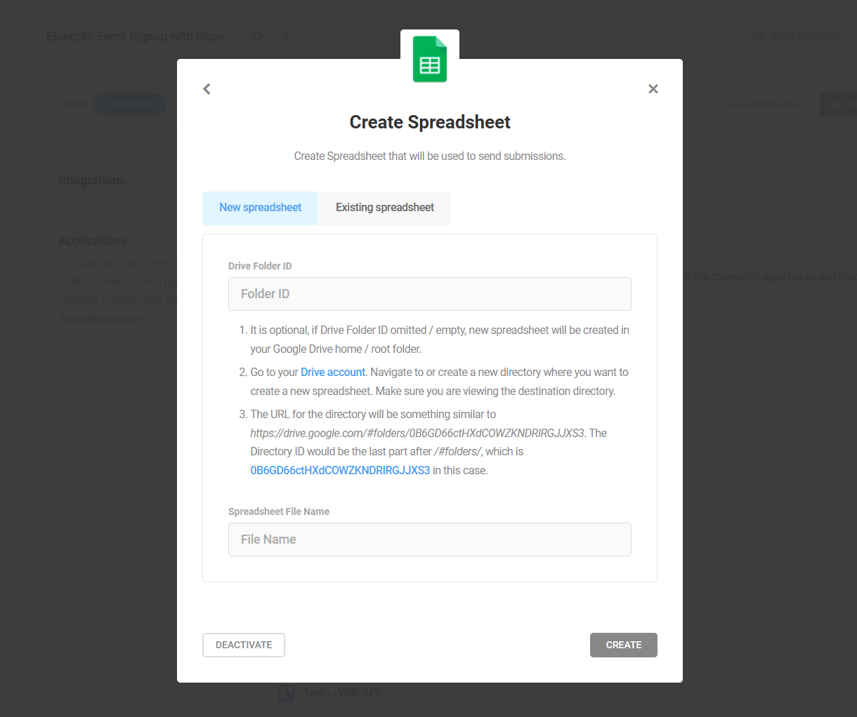
Existing Spreadsheet
Enter the ID of the spreadsheet where you want to send your form submissions. The sheet ID is the part of the URL between /spreadsheets/d/ and /edit
For example, from this spreadsheet URL – https://docs.google.com/spreadsheets/d/127I8jsYk2YsfaPqg5E3vgjhsGWW0AAmOelv1c/edit#gid=0 – the spreadsheet ID would be only 127I8jsYk2YsfaPqg5E3vgjhsGWW0AAmOelv1c
Then click Continue.
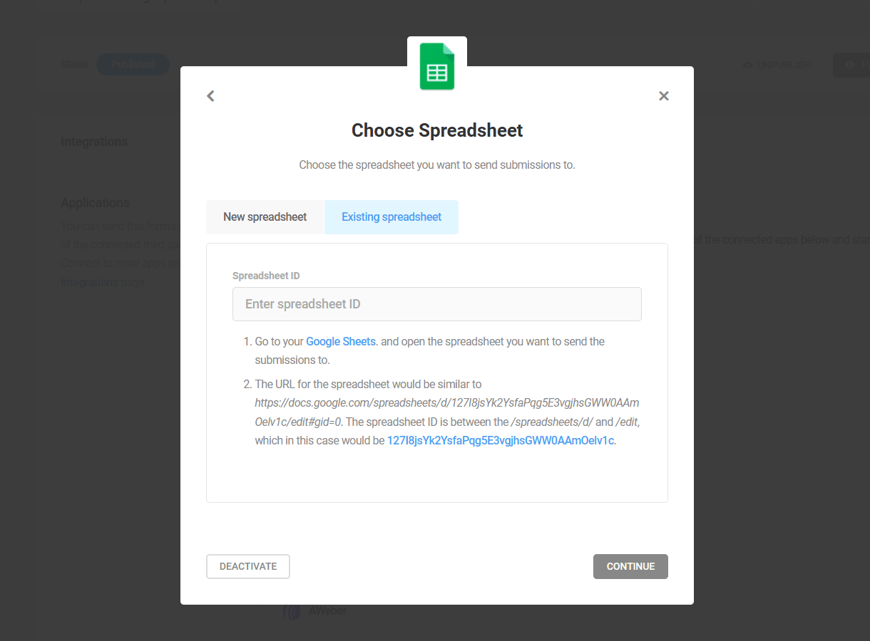
On the next screen, select the specific sheet where form submissions should be stored, and click Activate.
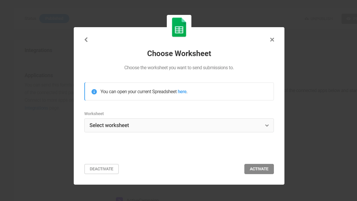
This option enables you to send submissions from multiple forms to different sheets in the same spreadsheet, or even all to the same sheet if you want to aggregate data from more than one form.
Keep in mind that if you do send data from multiple forms to the same sheet, data from fields with the same ID in all forms will appear in the same column in your sheet. For example, if one form has a {radio-1} field for the submitter’s age group, and another form also has a {radio-1} field, but for t-shirt size selection, data from both of those form fields will appear in the same column if sent to the same sheet.
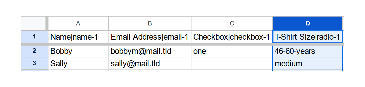
4.9.7 AWeber
Link to chapter 9To connect Forminator to AWeber first click the Connect button (+ icon) in the AWeber row.
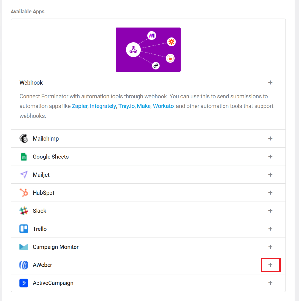
In the following pop-up, choose an identifying label for the connected account and click on Authorize.
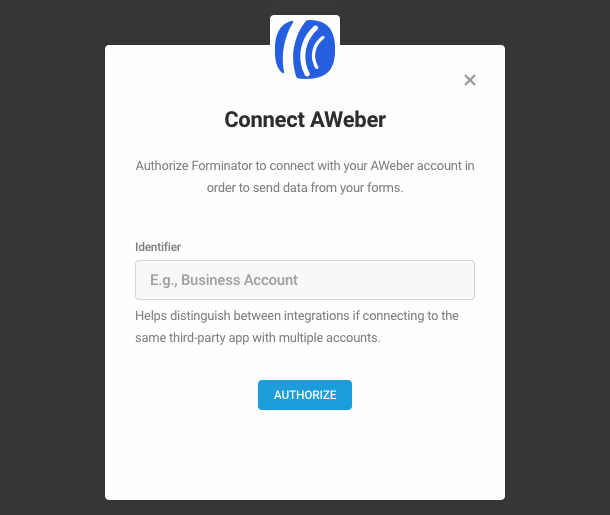
This will open a new browser tab where you need to enter your AWeber credentials in order to establish the connection between your Forminator form and your AWeber mailing list.
Note that, apparently, AWeber puts a hold on new accounts. So if you just created an account there, clicking this button may return a “404 not found” error until your new account is approved. Then just refresh the page and you should be good to go.
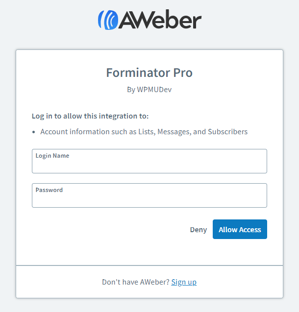
Once done, click the Allow Access button. You’ll be redirected back to your site where you’ll see confirmation that AWeber is successfully connected. Click the Close button to continue.
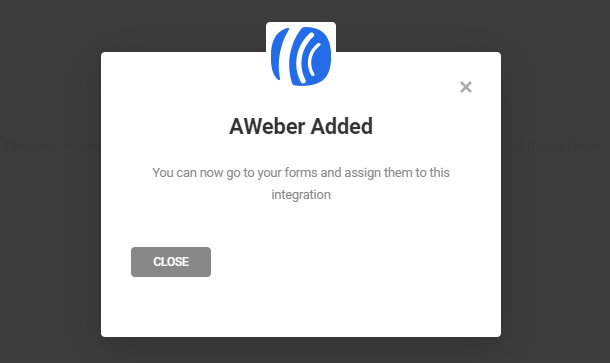
To connect a form to your AWeber account, you need only go to the Integrations tab of the specific form where you’ll see AWeber in the Connected Apps section of the list. Click the [+] icon to open the integration options.
The first step is to set up the connection name for AWeber (enter anything you like as this is only used to easily identify the connection):
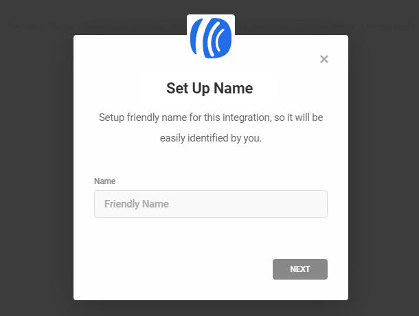
Now you need to choose an AWeber list which will get populated with your chosen Forminator form data (the drop-down menu will show all the available lists from your AWeber account):
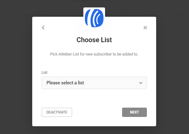
After you have chosen the list, click the Next button to match your Forminator form fields with your AWeber fields. Take note that the only required field is the Email Address and all other available fields are just optional. Once done, click Next.

The Additional Options step lets you set up your AWeber configuration to the smallest details. These are completely optional and you can just finish your integration here by pressing the Save button.
- Ad tracking – Will label subscribers based on how they signed up. You can use the pre-defined value, one of the Forminator form field data or custom values. See what is ad tracking in AWeber.
- Tags – You can also use Forminator form fields values or any custom text for your tags. In case you want to use the tag to add the subscriber to your AWeber campaign follow the guide here.
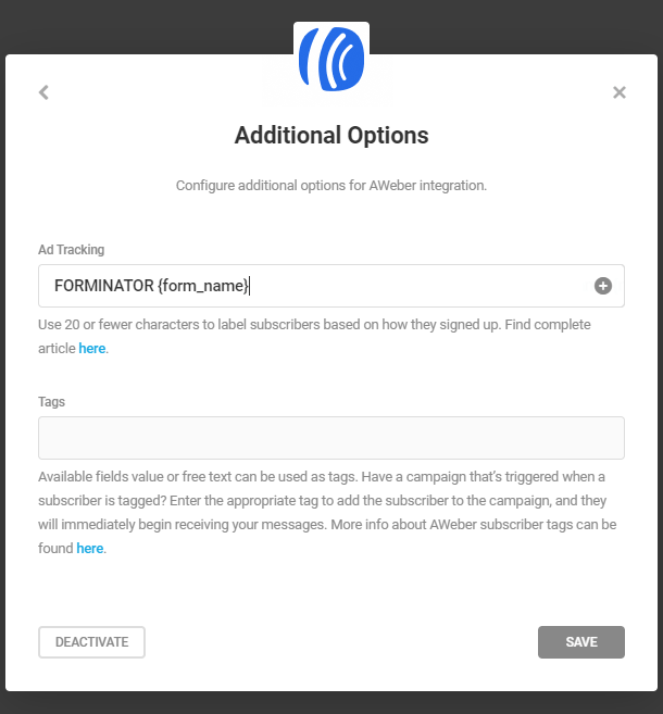
That does it! Each submitted form on your site will also trigger a confirmation email from AWeber, so your visitor can subscribe to your mailing list:
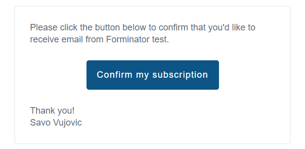
4.9.8 Slack
Link to chapter 9Slack is a team communication tool and stands for Searchable Log of All Conversation and Knowledge.
To begin, click the [+] icon in Forminator for Slack integration.
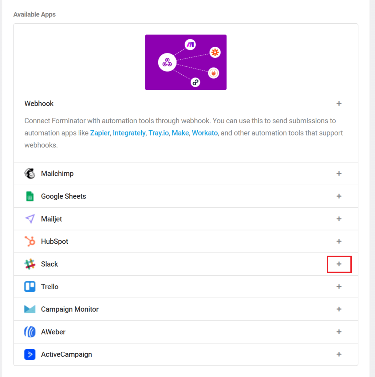
The Setup step is where you need to enter the Client ID and Client Secret for your Slack integration.
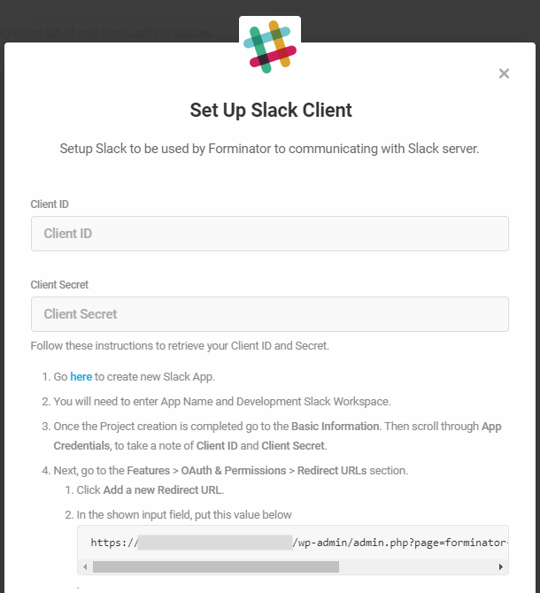
To get those needed credentials, you need to sign in to Slack in your browser. You can not complete the setup through the Slack app.

Once you’re signed in to your Slack workspace, go to Slack API to create a new Slack App. Fill out the App Name and choose your workspace from the Development Slack Workspace dropdown.
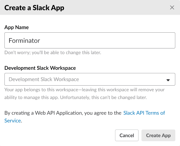
After you click the Create App button, scroll down the page to find the App Credentials section.
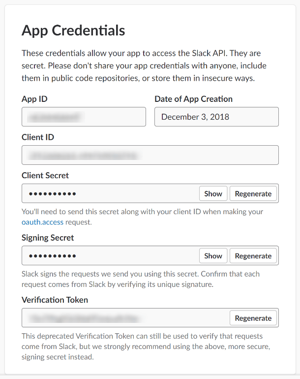
Copy and paste your Client ID and Client Secret into the corresponding fields in your Forminator Integration Setup screen.
Next copy the Redirect URL from the Forminator Setup screen. Go back to your Slack App settings and go to Features > OAuth & Permissions > Redirect URLs section.
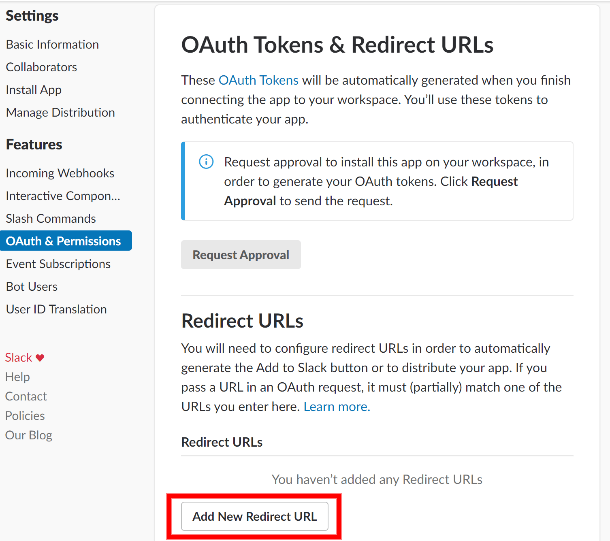
Click the Add New Redirect URL button, enter the URL you copied from the Forminator setup step and click the Add button. Then click Save URLs.
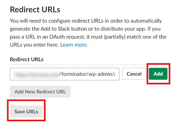
Then go back to the Forminator and click the Next button. You will need to authorize Forminator to connect with Slack.
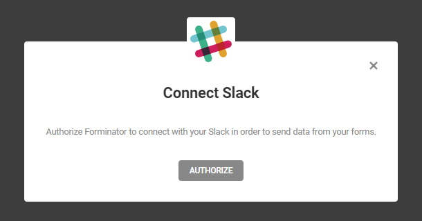
You will be redirected to Slack to allow your app (my app’s name is Forminator in the screenshot below) to access your Slack workspace.
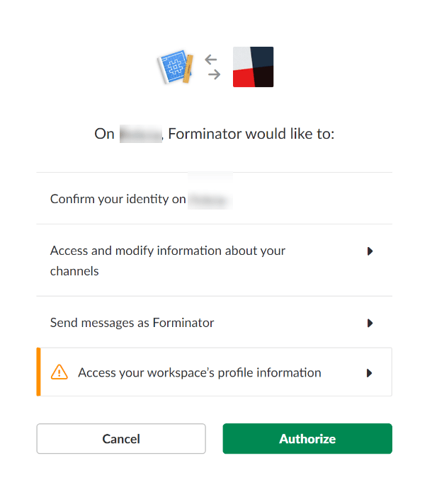
You’ll receive a success message once you press the Authorize button.
Now that we’ve connected to Slack, we need tell our form where to send a notification in Slack.
Navigate to your form and go to the Integration section. Select Slack from the Integrations list and enter a name for your integration.
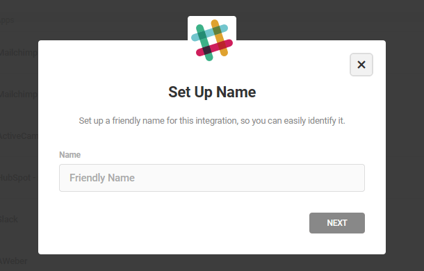
When someone fills out your form, Forminator will send a message to Slack. You need to decide where you would like to send that message; to a public channel, private group or DM channel so the right person will be notified.
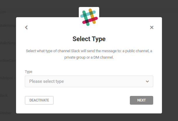
Then you need to specify which public channel, private channel or who you would like to send a direct message to.
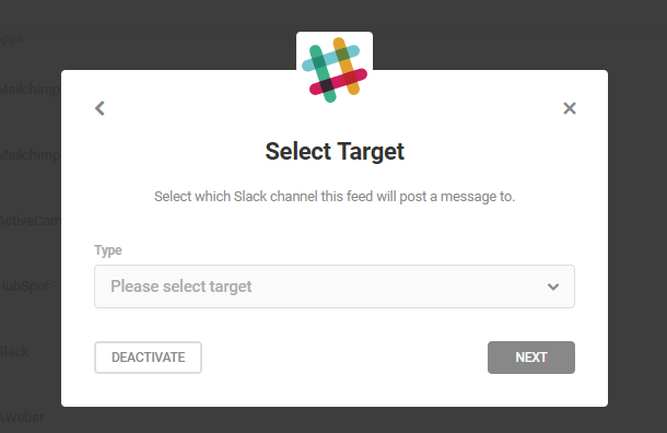
Then you’ll finish up by formatting the message. You can even insert the data your form collects in the Slack message with the plus icon.
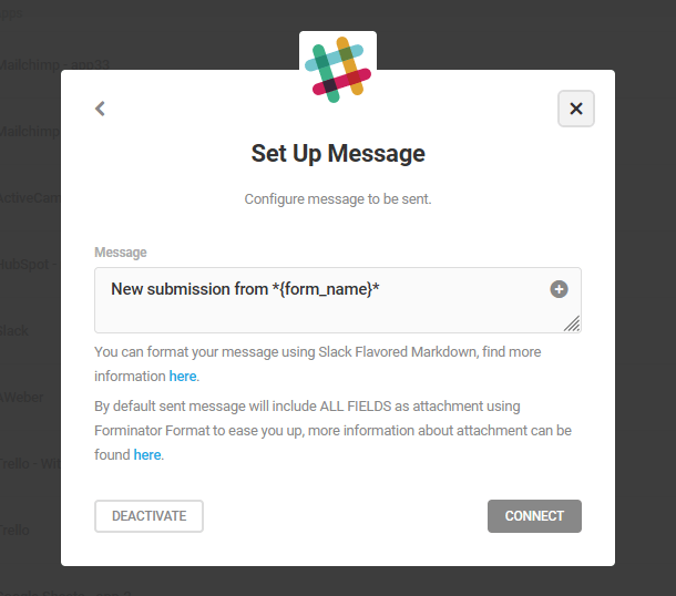
When you’re finished click on the connect button. That’s it!
4.9.9 Trello
Link to chapter 9To connect Forminator to Trello, first click the Connect button (+ icon) in the Trello row.
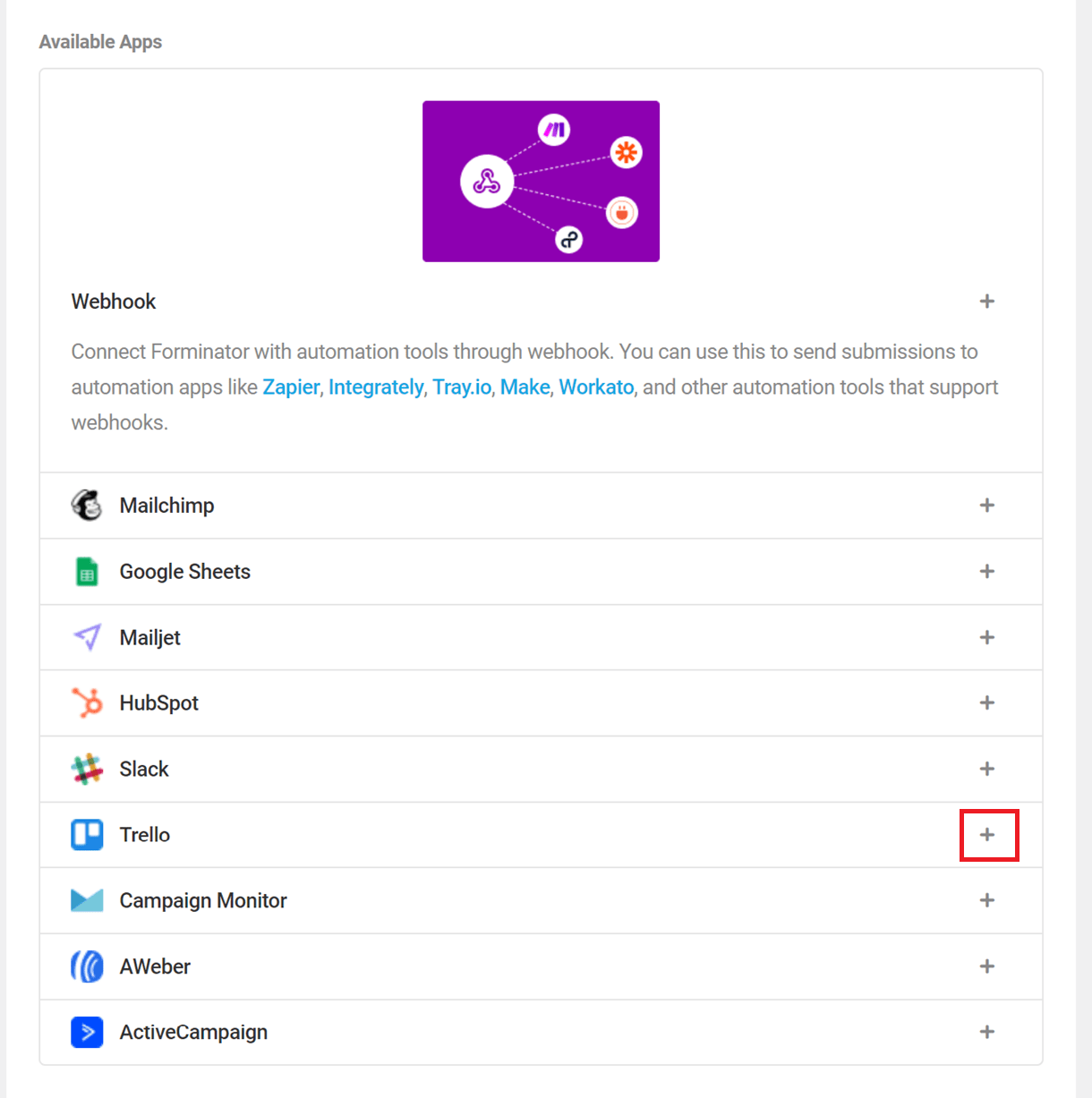
That will pop open a modal window where you’ll be prompted to enter your Trello API Key, and an optional Identifier for this integration.
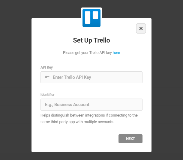
Create a new Trello account or log in to your existing account. In your account dashboard, click on the [+] icon and select create workspace option to create a new workspace. Or you can join any existing workspace.
After creating a workspace, you need to create a new power-up for your workspace. Click here to navigate to the power-up admin panel.
To create a new power-up, click New. In the modal that opens up, enter the power-up details and click Create.
In the power-up dashboard, click the API Key tab and click Generate a new API key button. In the modal that opens up, click the Generate API Key button.
While there, be sure the URL of the site you are connecting Trello to is in the list of Allowed Origins on that same page. If it is not, add it now.
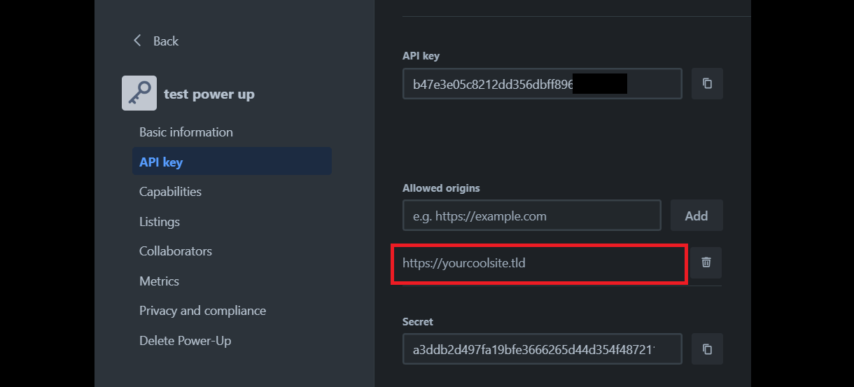
Once you’ve entered your API Key and Identifier, click Next. Then click Authorize.
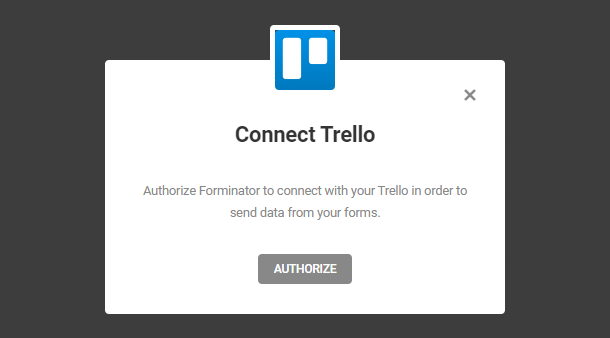
A new browser tab will open, asking for your permission to connect your site with your Trello account. If you are not yet logged into your Trello account, you’ll see the login option first. Once logged in, click Allow.
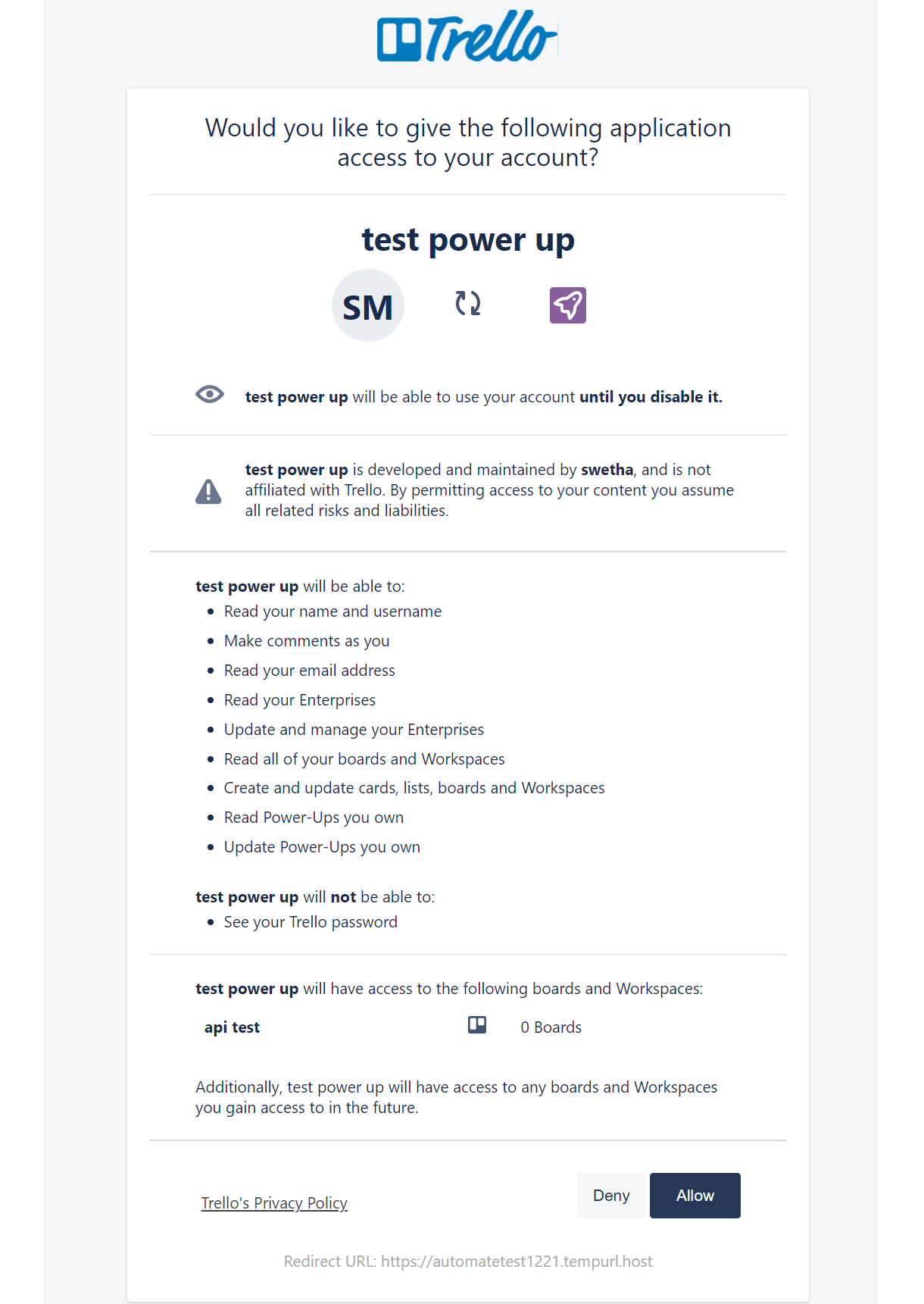
You’ll then be redirected back to your site where you’ll see confirmation that Trello is successfully integrated with Forminator. Click the Close button to continue.
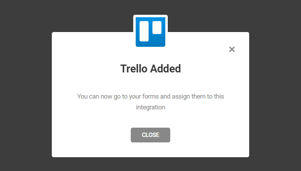
To connect a form to your Trello account, you need only go to the Integrations tab of the specific form where you’ll see Trello in the Connected Apps section of the list. Click the [+] icon to open the integration options.
Set up a connection name which only identifies the connection within a form.
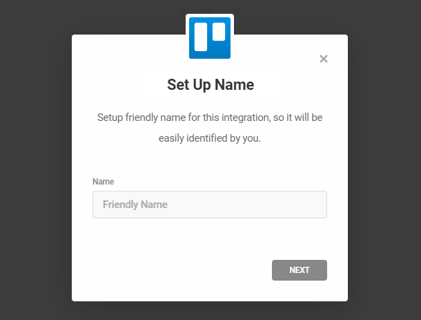
Choose which Trello board you want the cards to be added to. If no board is found, you’ll be prompted to create one first.
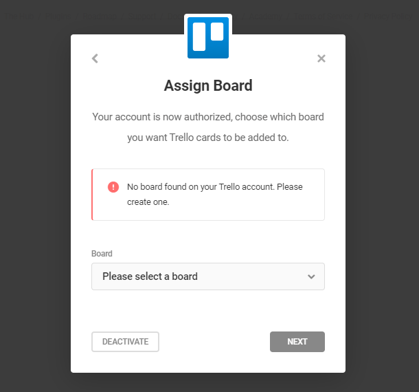
After the board is chosen, choose a list to add your generated cards to.
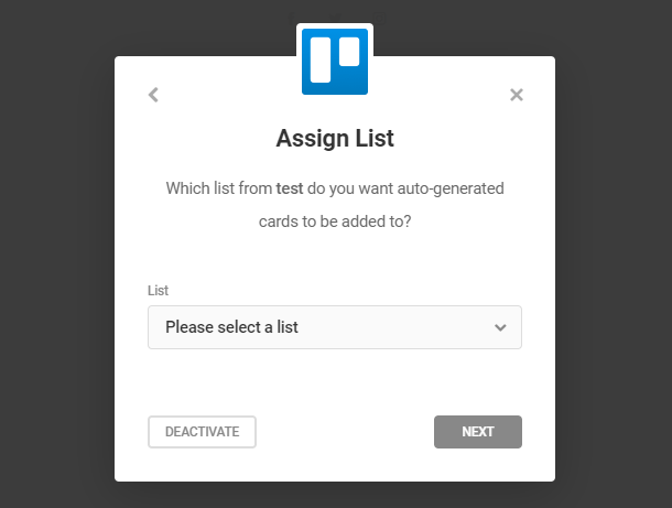
Last but not least, you will have the option to customize the Card that will be added to your Trello board. By default you don’t have to change anything here, we already provided you with the standard template that will work out of the box, so you can just click the Save button to complete the integration. In case you do want to customize your card, let’s see what each field does.
- Card name – This value will be used as the title on the created card. Other form data can also be added by clicking on the “+”
- Card description – This value will be used as a description of the created card. By default it will use a special placeholder {all_fields} which will display all the submitted data of your form. Other form data can also be added by clicking on the [+] icon. On top of that, you can add Trello flavored markdown.
- Position – The position will be used to determine the placement of a new card. By default, it will be added on the bottom of your chosen list, but you can also choose to add it on top of the previous cards.
- Due Date – Use the date-picker feature to select a due date.
- Card Position – The position will be used to determine the placement of a new card. By default, it will be added on the bottom of your chosen list, but you can also choose to add it on top of the previous cards.
- Labels – Labels can be added to the card if you specify it and you can add multiple ones.
- Members – Each card can be assigned to a specific member of your Trello board, so add as many members as you wish there.
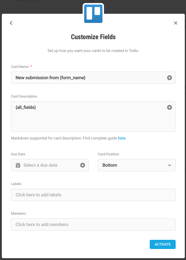
4.9.10 Mailjet
Link to chapter 9To integrate Mailjet with Forminator, go to the main Integrations screen in Forminator and click the [+] icon for Mailjet.
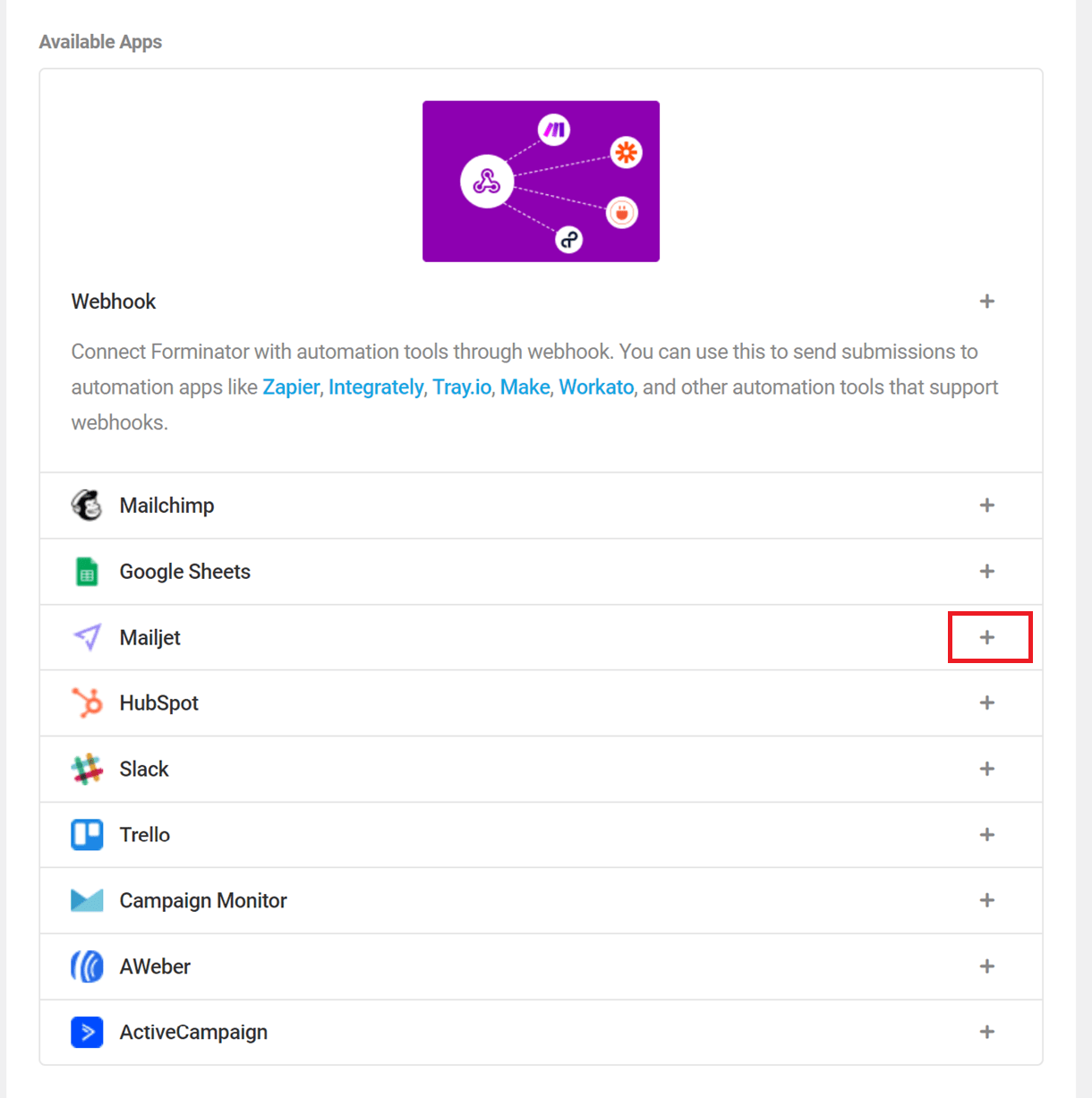
This will open up the Mailjet Configuration model, where you need to enter your Mailjet API keys and an identifier label.
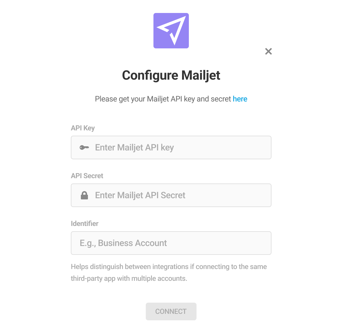
To get your Mailjet API keys, create a new Mailjet account or log in to your existing account.
Click the profile icon on the top-right corner and click Account Settings.
Select the SMTP and SEND API settings option under the Senders & Domains category.
Click on the See all API Credentials button.
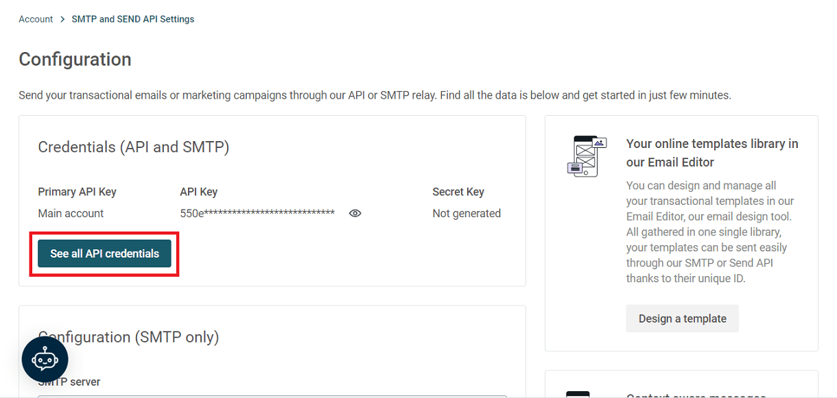
Here, you can generate the secret key. Click on the Generate Secret Key button. The secret key will be generated and displayed.
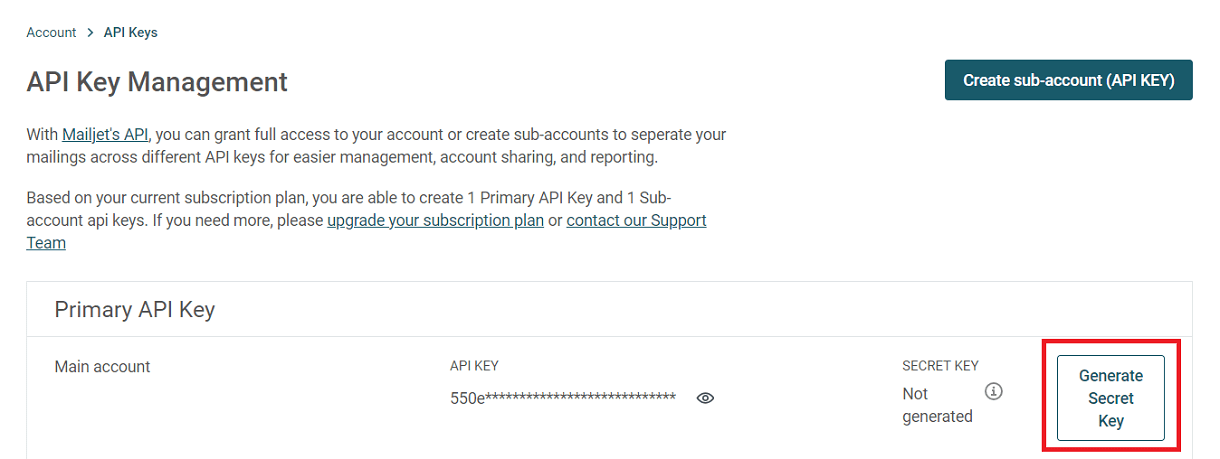
Copy the generated API and Secret Keys
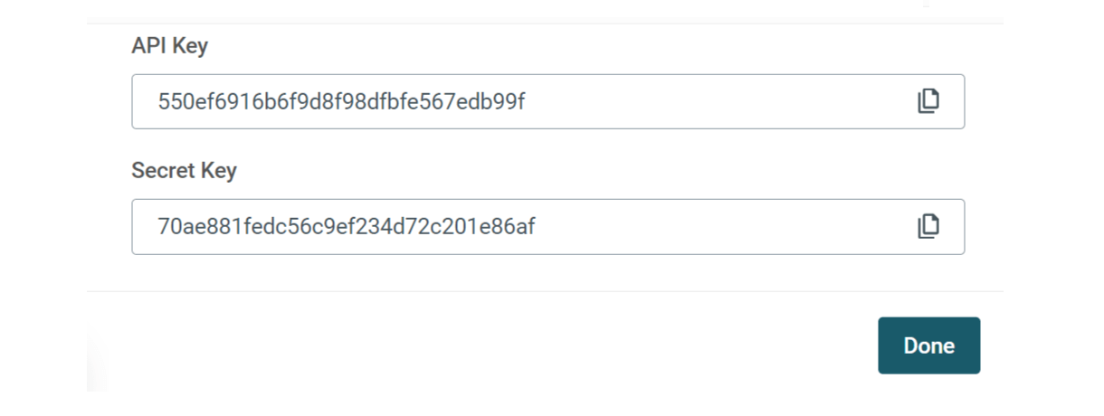
Paste the copied keys in their respective fields in the Mailjet Configuration model, provide an identifier for the connection, and click Connect. You have now established a connection between Forminator and your Mailjet account.
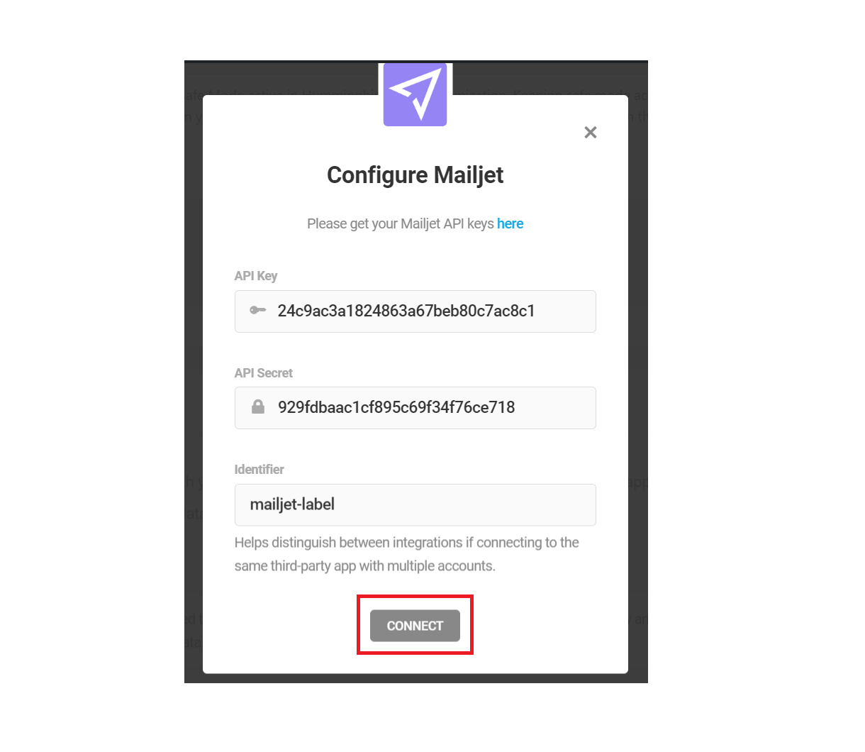
To connect a form to your Mailjet account, navigate to the Integrations tab of the specific form. You can find Mailjet under the Connected Apps section. Click the [+] icon to open the integration options.
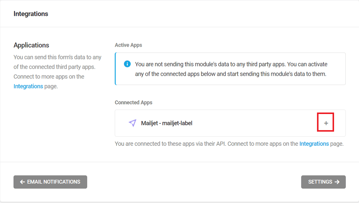
In the Choose contact list pop-up, choose your desired Email Audience (List) and check if you want to use Double Opt-in (which forces your visitors to confirm their subscription, via their email, to your selected Emailing list).
If Double Opt-in is not selected here, once the form is submitted, the data visitor provided will be auto-added to your mailing list without any additional confirmation. Click Next.
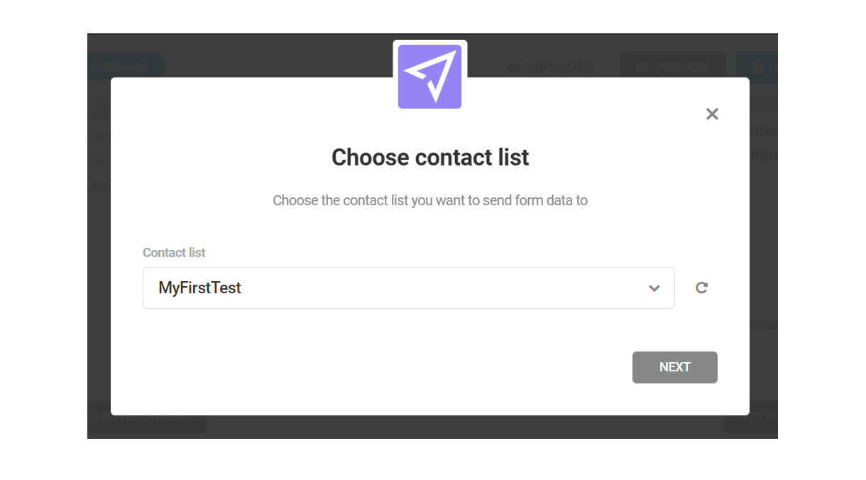
On the left side, you can see the fields present in your selected Mailjet contact list, and on the right side, the fields available in your current Forminator form.
If not already matched, match the fields so the corresponding data is sent to the right ones in Mailjet, and then press Save to complete the integration.
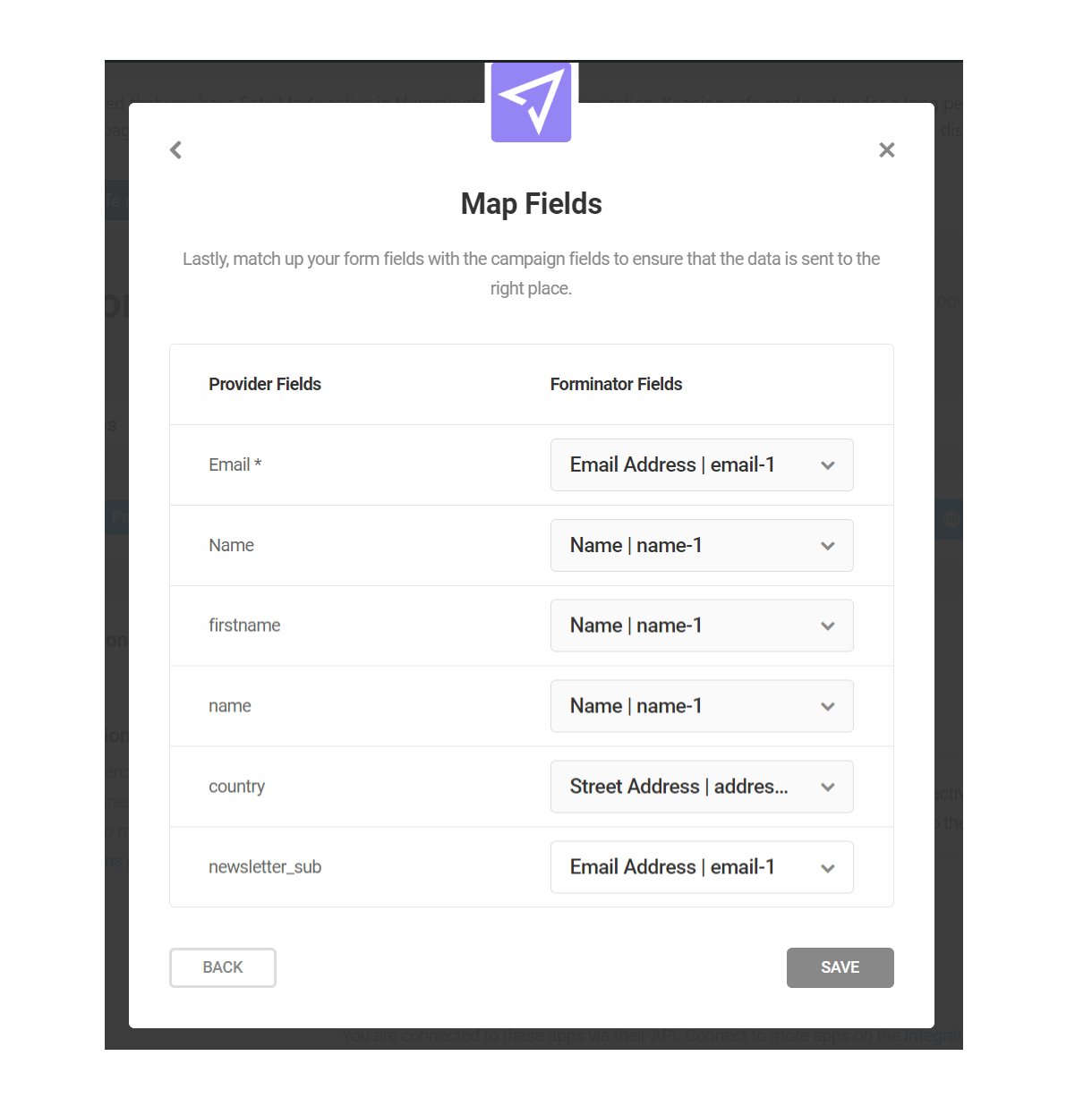
From now on, all data captured through the selected forms will be automatically added to your Mailjet Contact list.
4.9.11 MailerLite
Link to chapter 9To integrate Mailerlite with Forminator, go to the main Integrations screen in Forminator and click the [+] icon for Mailerlite.
This integration only supports the new MailerLite version released in March 2022. If you are using MailerLite Classic, you may want to consider using their migration tool to upgrade to the newer version.
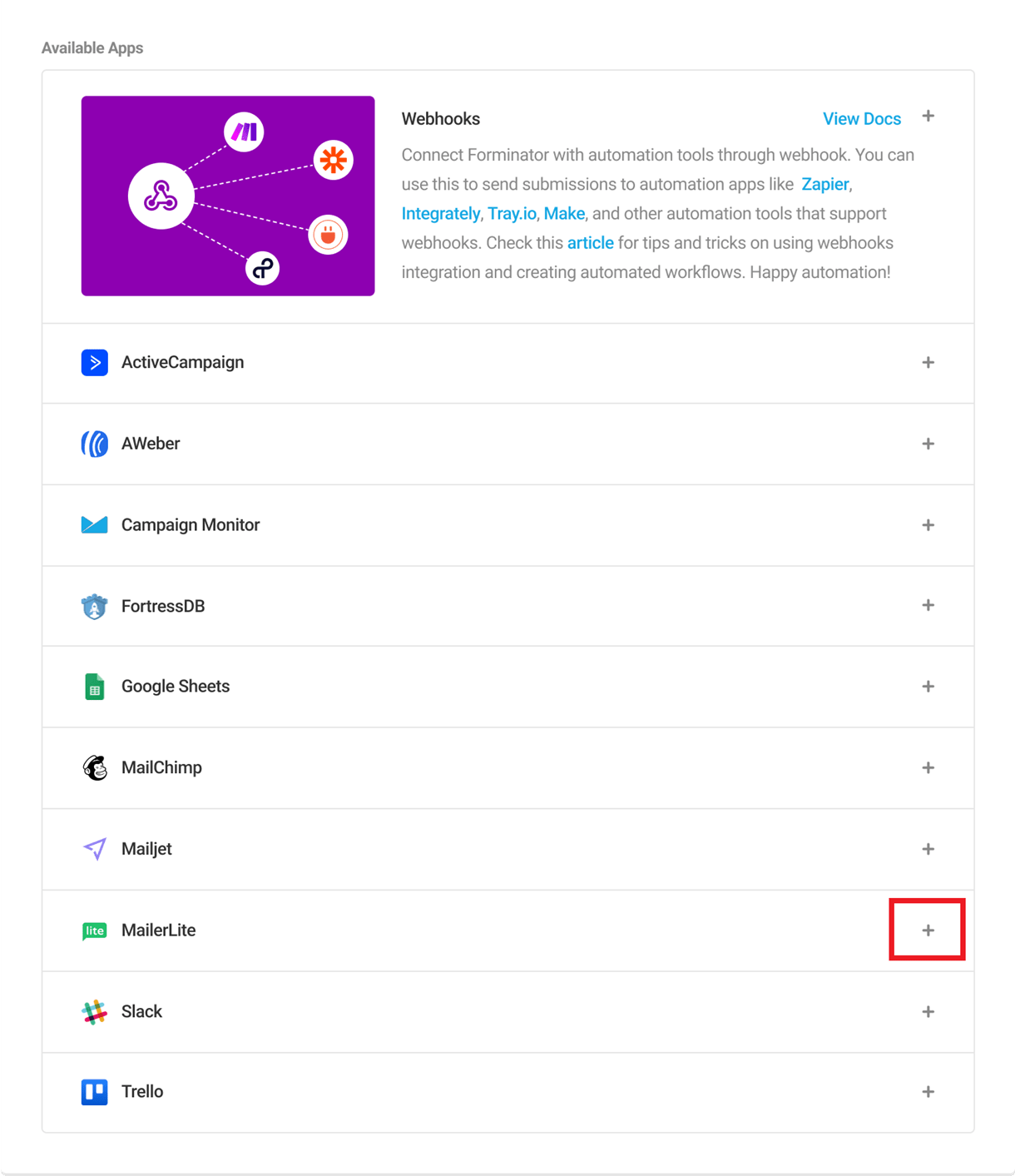
This will open up the MailerLite Configuration model, where you need to enter your Mailerlite API key and an identifier label.
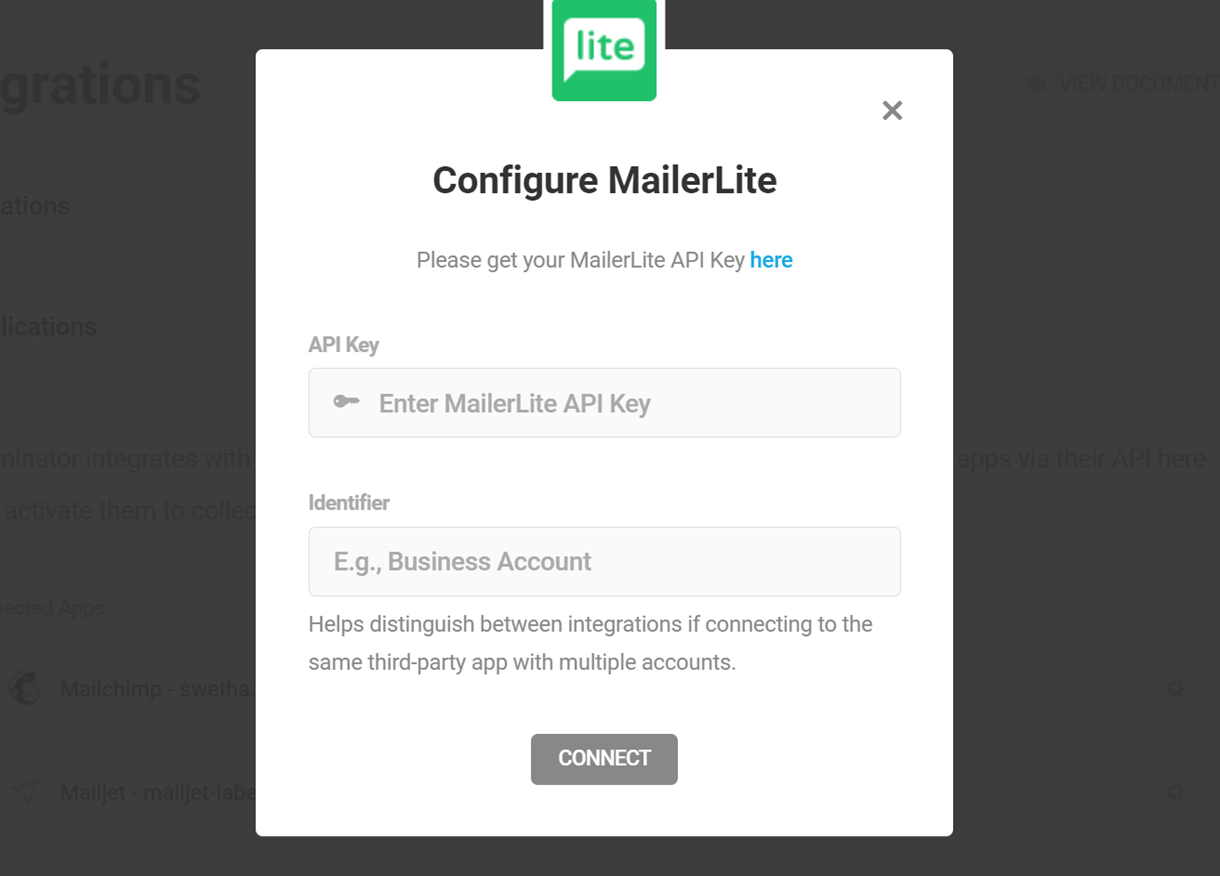
To get your Mailerlite API keys, create a new Mailerlite account or log in to your existing account.
Click the Integrations option from the menu on the left. Under the MailerLite API section, click the Use button.
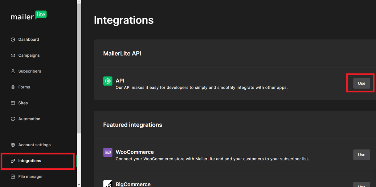
In the Developer API screen, click the Generate Token button.
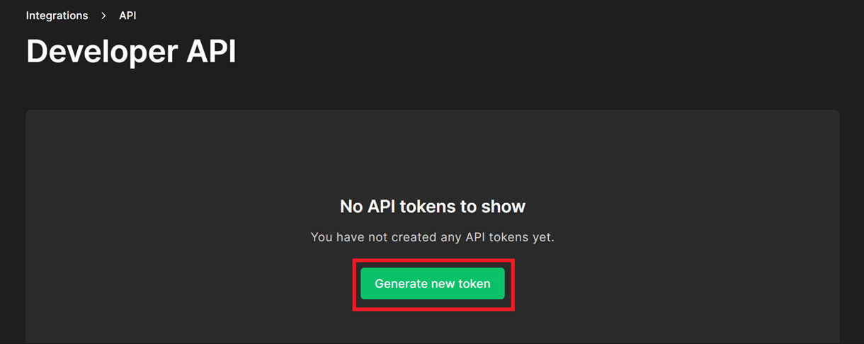
In the modal that pops up, enter an identifier for the token and click Create Token.
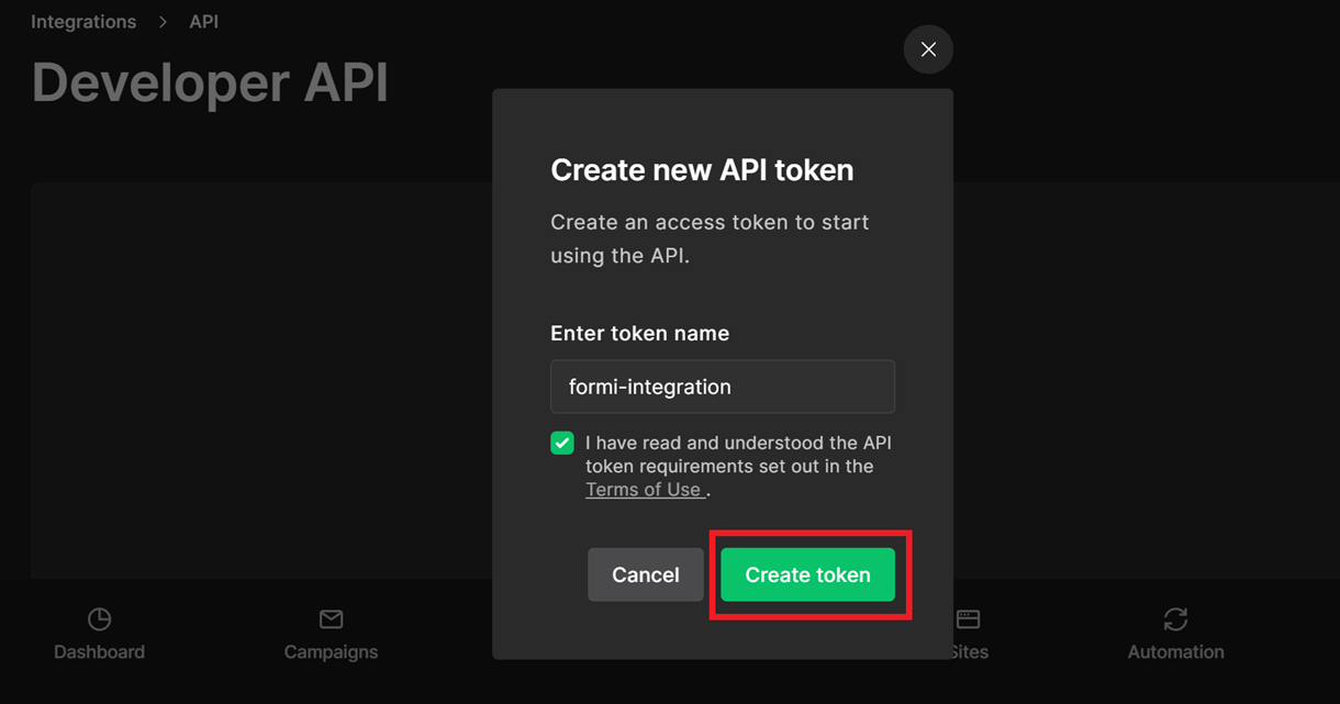
The API token will be generated. Click Copy to copy the generated token and Download to download the token in a text file.
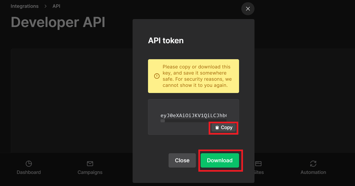
Paste the copied key in the API key field in the MailerLite Configuration model, provide an identifier for the connection, and click Connect. You have now established a connection between Forminator and your MailerLite account.
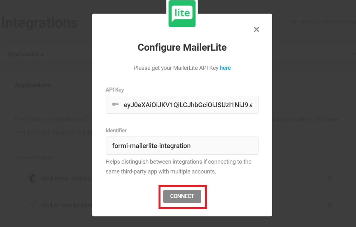
To connect a form to your MailerLite account, navigate to the Integrations tab of the specific form. You can find MailerLite under the Connected Apps section. Click the [+] icon to open the integration options.
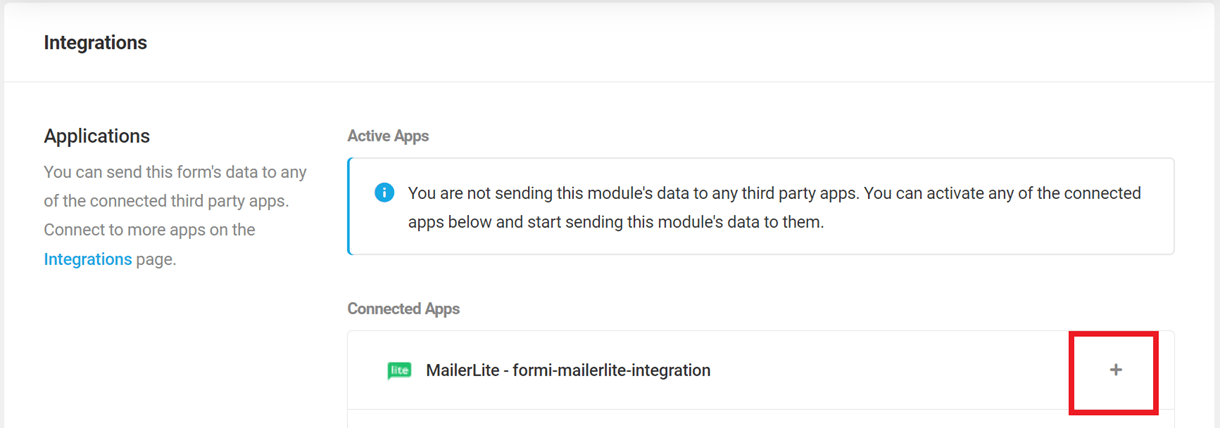
In the Choose Contact List pop-up, select your desired Email Audience (Group). Click Next.
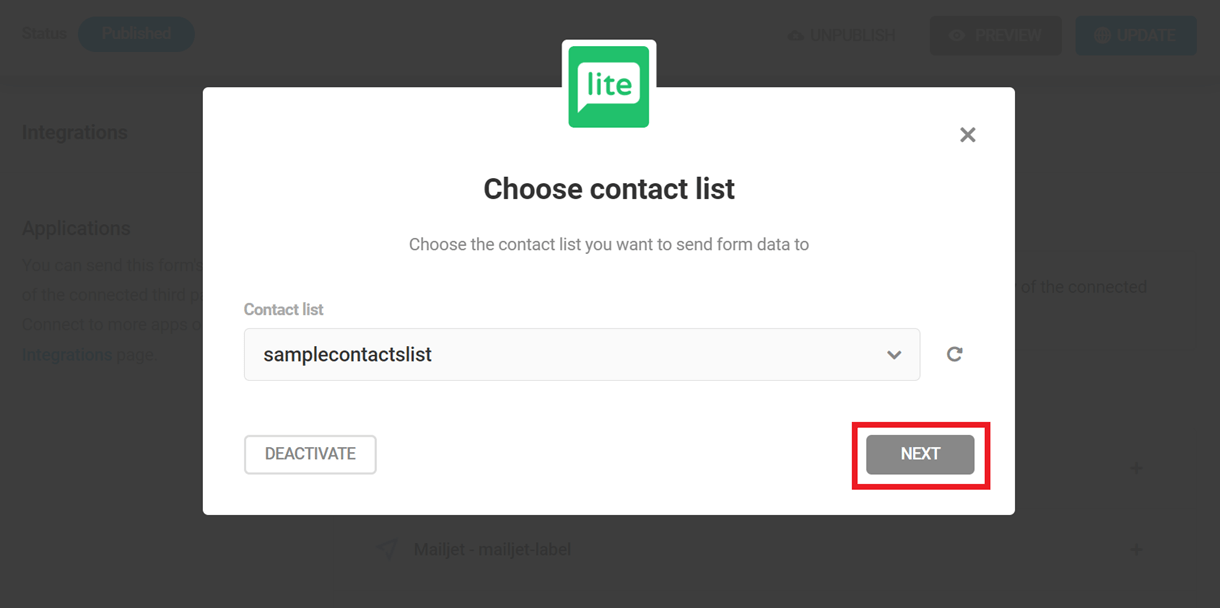
On the left side, you can see the fields present in your selected MailerLite contact list, and on the right side, the fields available in your current Forminator form.
If not already matched, match the fields so the corresponding data is sent to the right ones in MailerLite, and then press Save to complete the integration.

From now on, all data captured through the selected forms will be automatically added to your MailerLite Contact list.
4.9.12 API
Link to chapter 9Connect Forminator to your custom built apps using our full featured API.
4.10 Other Integrations
Copy chapter anchor to clipboardIn addition to the built-in integrations as detailed above, some 3rd-party plugin authors have created integrations with Forminator. This chapter will be developed as more such integrations become available.
4.10.1 CleanTalk Anti-Spam
Link to chapter 10CleanTalk has included support for Forminator forms, making it just too easy to protect your forms from spam submissions.
To get started, install CleanTalk on your site. You can install either via Plugins > Add New in your site admin, or download it from wordpress.org here.
CleanTalk is a premium SaaS plugin that protects your WordPress site from spam. The plugin offers a 7-day free trial so you can test the service for yourself to see if it’s a good fit for your project.
Once installed and activated, go to Settings > Anti-Spam by CleanTalk, and click the Get Access Key Automatically button at the top. That will create a free account for you at CleanTalk.
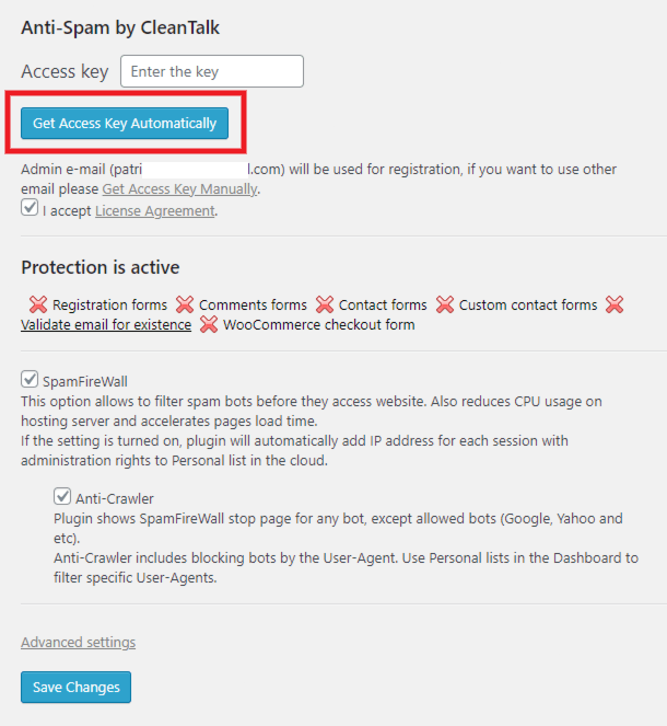
You’ll then see that the buttons at the top have changed. Click on the one that says Click here to get anti-spam statistics to go to your new account at CleanTalk where you can view and manage any form spam it catches.
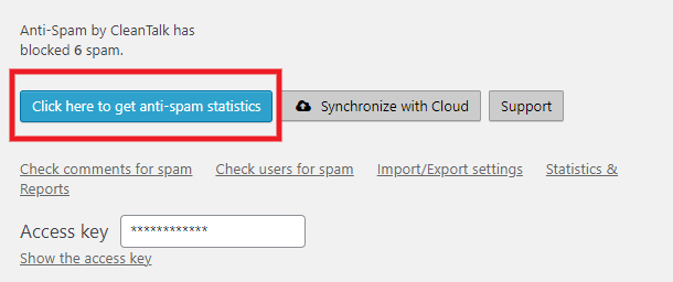
As this is a new install, you won’t see any data there yet. But you can test the integration by submitting your Forminator form with this test email address that will be automatically added to your blocklist there: [email protected]

Note that, by default, users with the Administrator role are exempted from the spam protection in this plugin. So you’d want to either test with a different role, or test in a different browser. You can also disable protection of the Administrator role if you wish by clicking on the Advanced Settings link in the plugin settings, then scroll down to Roles which bypass spam test and de-select the role.
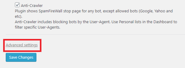
To customize or edit the list of blocked email addresses or domains in your CleanTalk account, click the Personal Lists link under your domain name.
As this is a free account automatically created for you by the plugin, you’ll be prompted to login with your username & password. That will have been sent to you automatically at the admin email address you have set in your site’s Settings. Check that email for the needed password.
Once logged in, you’ll see all the data for any blocked spam submissions. You can customize the criteria for spam blocking by adding filters to your list. Click the Add new filter button to get started.
See CleanTalk’s blacklist documentation for more information on customizing your lists.
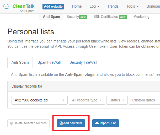
4.10.2 E2Pdf
Link to chapter 10Forminator integrates with the E2Pdf plugin which enables you to easily create PDF documents from your form submissions. Check out the video walkthrough below, or follow the written directions to set up your integration.
To get started, install either the free or pro version of E2Pdf. You can install the free version either via Plugins > Add New in your site admin, or download it from wordpress.org here.
If you’re looking for a step-by-step guide on how to quickly generate a PDF from a form, check out our blog on how to Convert Forms to PDF Using Forminator.
Once installed and activated, click on the E2Pdf menu item in your admin menu. Then go to Settings > Extensions in that plugin’s options panel, and ensure that the Forminator option is not disabled.
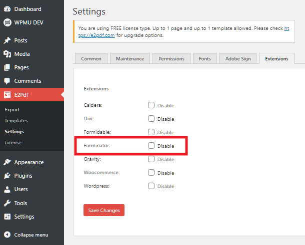
Creating your PDF
To create a PDF for submissions from a Forminator form, go to E2Pdf > Templates, and click the Add New button.
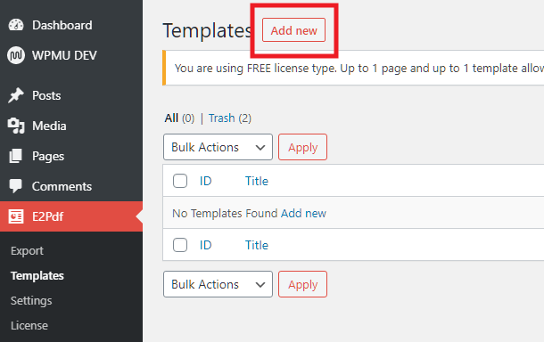
In the modal that pops up, select Forminator from the available options in the Extension dropdown. Then from the Item options, select the form you want to use to create your PDF. Adjust other formatting options however you like in that popup; you can always edit them later.
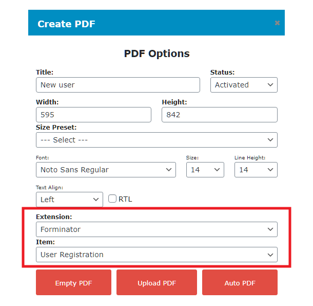
Now you want to decide whether you want to create your PDF from scratch using only selected form elements, or if you want the plugin to create one automatically for you using all available elements from your selected form.
- Empty PDF – Click that button to create a blank canvas so you can add only the form elements you want.
- Auto PDF – Click that button to automatically add all available form elements to the canvas, and you can edit as needed.
Once you click either button, the popup will close, and you’ll have your PDF canvas all set up and ready to be customized.
Note that the free version of this plugin only allows you to have one PDF template active at any time.
If you had selected the Empty PDF option, or want to add more fields to an existing template (like an e-signature field, which does not import automatically), simply drag and drop them from the PDF Builder metabox on the right.
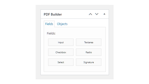
Double-click on any element in the canvas to edit its content, resize or move it. Right-click on any element to reveal additional options where you can map the PDF field to any other form field if needed. See also Things to Know When Mapping Form Fields below.
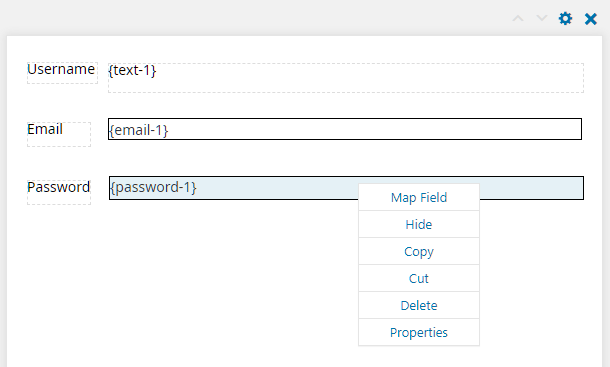
There are numerous other formatting options in this plugin which we won’t get into here. If you need more info on available options and how to use them, check out the extensive documentation & FAQs on the E2Pdf website.
Things to Know When Mapping Form Fields
e-Signature Field
If your form contains an e-signature field and you want that signature included in the PDF, you will need to add an E2PDF Signature field to your template, and map it to the e-signature field in your form, as noted above.
E2PDF Templates Are Static
The template you create in E2PDF does not automatically update if you modify things in the form that it fetches data from.
So if you make changes to your form like rearranging the field order, adding or removing fields, etc, you’ll need to manually update the existing E2PDF template or create a new one to use for your updated form.
Changing Multi-Select Fields
If your form contains checkbox, radio or select fields, there are a few additional things you should be aware of if you make changes to those particular fields in your form.
If the default Multiple Option Value in your form settings is set to use Option labels:
- An auto-created E2PDF template will use your form field labels in its fields.
- If you had manually created your template, then you need to also make sure that the E2PDF mapping properties Option uses the same string as your form field’s Label.
- You can change/edit the checkbox option values in your form’s fields at any time and your template will continue to work, but it will stop working if you change option labels. In this case, you’d need to manually edit and update your E2PDF template or create a new one.
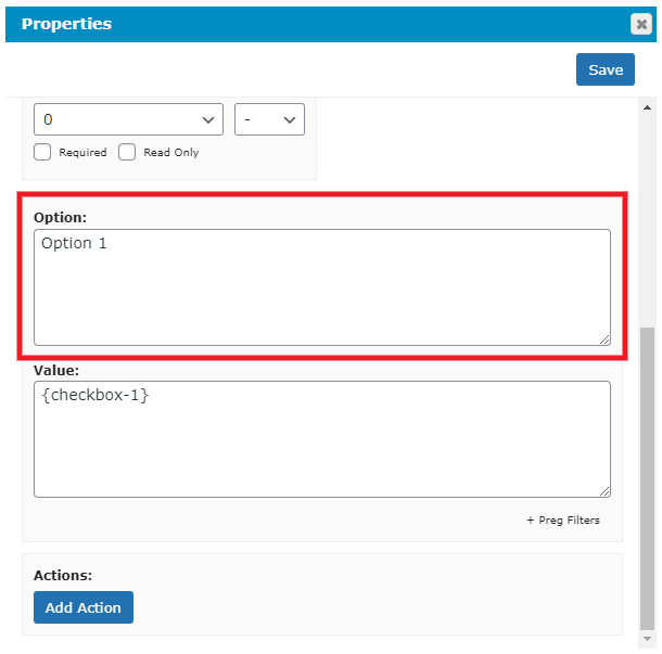
If the default Multiple Option Value in your form settings is set to use Option values:
- An auto-created E2PDF template will use your form field values in its fields.
- If you had manually created your template, then you need to also make sure that the E2PDF mapping properties Option uses the same string as your form field’s Value.
- You can change/edit the checkbox option labels in your form’s fields at any time and your template will continue to work, but it will stop working if you change option values. In this case, you’d need to manually edit and update your E2PDF template or create a new one.

Integrating the PDF with your form features
To get your new PDF integrated with your form, there are a few shortcodes you can use depending on what you need. Once you have saved your PDF template, you’ll find all the available shortcodes for it in the metabox at the top-right of the E2Pdf Templates screen.
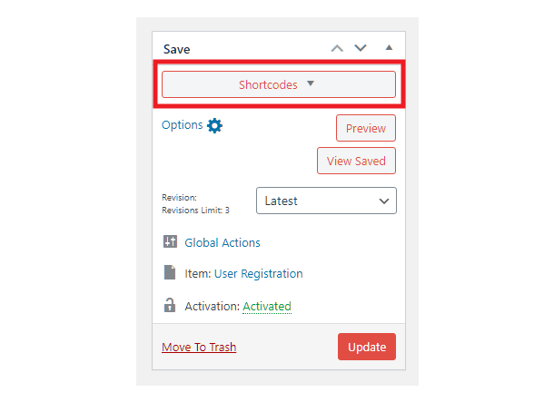
Click that Shortcodes button to reveal all shortcodes for your PDF. The ones we are most interested in for this integration are the attachment, download and view shortcodes. For example:
[e2pdf-view id="1"]– Embeds the PDF wherever you want to display it.[e2pdf-attachment id="1"]– Creates an email attachment.[e2pdf-download id="1"]– Creates a simple download link you can embed anywhere, even in emails.
View Shortcode
The “view” shortcode can be included in the After submission Inline Message that can be displayed on your form page once the user submits the form. You’d probably want to disable the Auto-close option so the message and PDF remain on-screen.
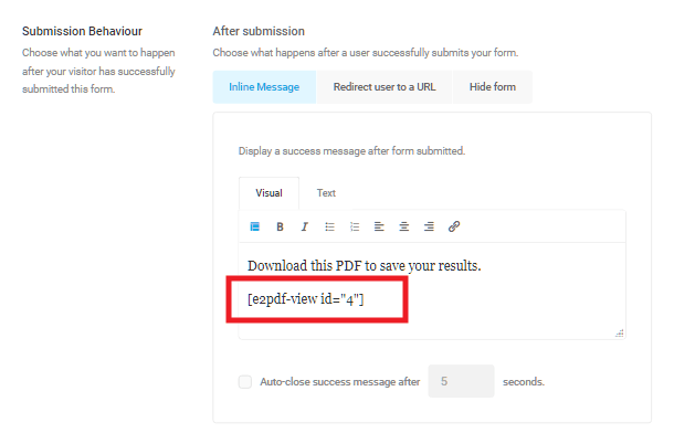
The PDF displayed in the success message could look like this example marathon calculator form:
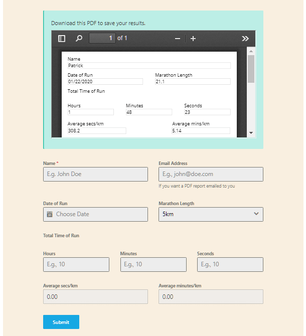
Attachment Shortcode
The “attachment” shortcode can be included in the email notification sent to the user who submits the form so they can view or download your PDF directly from the email.
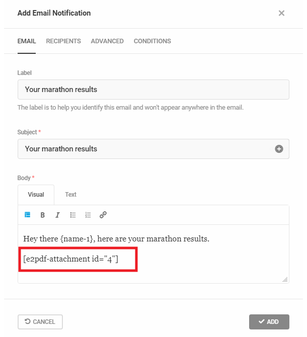
That would generate a familiar PDF attachment in the email sent to the user:
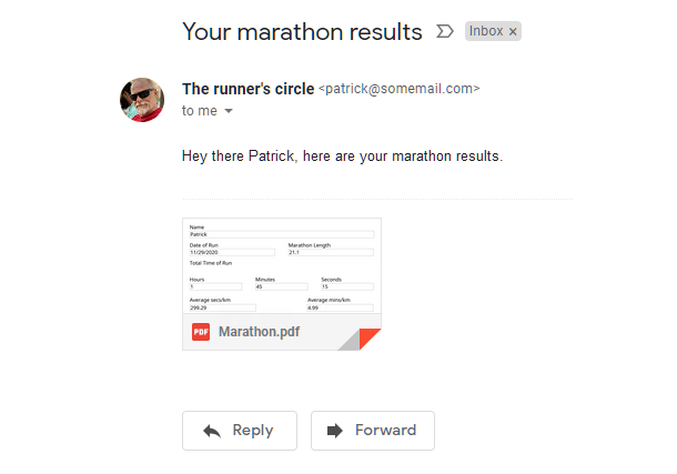
Download Shortcode
The “download” shortcode simply creates a PDF download link. It can be useful as well to include in the success message that displays after the user submits the form, or in the email notification sent to the admin or user, or anywhere else you might want to include it. The link would look like the examples below:
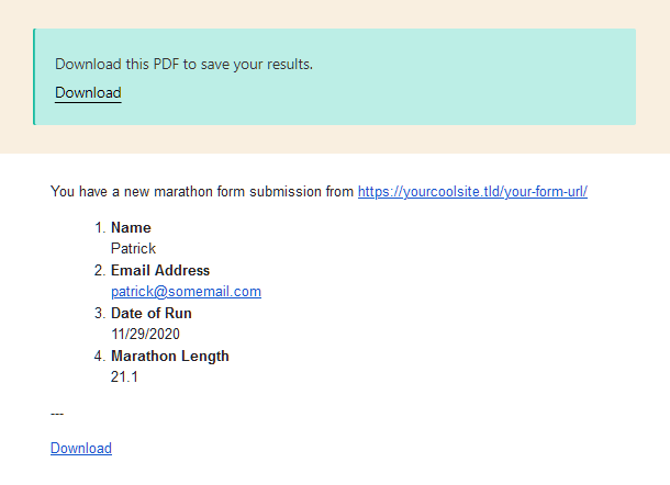
4.10.3 wpDataTables
Link to chapter 10An addon plugin is available for the excellent wpDataTables plugin that enables you to create frontend tables, graphs and charts from your Forminator form, quiz and poll submissions: wpDataTables integration for Forminator Forms.
For this integration, you must already have the wpDataTables plugin installed along with Forminator. Note that this integration works just fine with both the free and pro versions of wpDataTables and Forminator.
Check out our blog post on Creating Amazing Free Frontend Tables, Graphs, and Charts with Forminator and wpDataTablesDataTables for more information on how to make the most of your form data with insightful visualizations.
To get started, install the wpDataTables integration for Forminator Forms plugin on your site. You can install either via Plugins > Add New in your site admin, or download it from wordpress.org here.
Once installed and activated, go to wpDataTables > Create a Table, select the Create a data table linked to an existing data source option, and click Next.
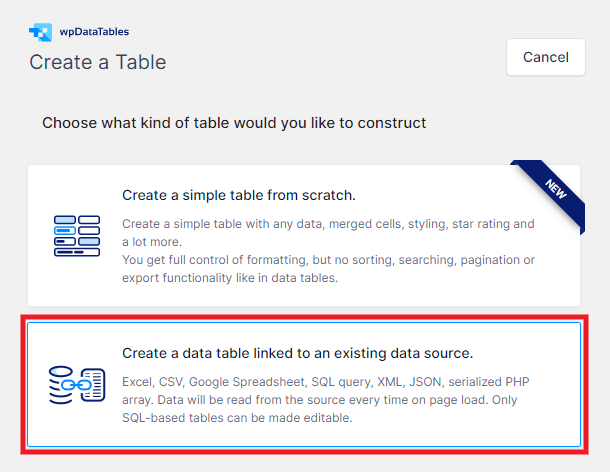
On the next screen, give your new table a Name; you can always edit this later.
Then, for the Input data source type option, select Forminator Form.
For the Choose a Forminator Form option, select the form, poll or quiz you want to use for your new table.

Note that the form, poll or quiz you want to use must have at least one submission stored in your database or you won’t be able to create a table with it, and will see an error like this if you try.
Once you’ve selected the form, poll or quiz you want, the Choose fields to show as columns option will be populated with all the fields that can be used in your table. Note that fields like CAPTCHA, HTML, Page break, Section, and Consent are not used in tables and are excluded.
Click that option to pop it open to view and select the fields you want included in your table. Click Select All or click on individual fields to highlight only the ones you want.
One you’ve selected all the fields you want to include in your table, click Save Changes at the top-right of the screen.
You’ll then see several new options & settings to explore along the top of the screen. Some of these options are only available in the Pro version of the wpDataTables plugin though.
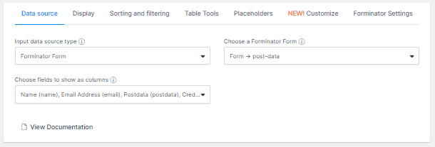
- Data source – The screen you’re currently on and where you can change the source and/or included fields if needed.
- Display – Options to fine-tune the layout of your table for the frontend display.
- Sorting and filtering – Options to allow your users to filter and sort the data in your frontend table display.
- Table Tools – Enable copy & save options in your table like print, PDF, CSV, etc.
- Placeholders – (Pro only) Options here cannot be used with tables generated from Forminator data.
- Customize – (Pro only) Table styling options.
- Forminator Settings – Options to filter the Forminator data displayed in your table by ID or date range.
Once you’re happy with how you have your table set up, copy the shortcode from the top of the screen and add it to a page on your site to see how it looks and works.
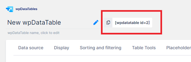
You’ll likely want to come back to the settings to adjust things. There are way too many options in the wpDataTables plugin to go over here, which is outside the scope of this usage document.
For help with configuration of its many features, click a View Documentation link anywhere in that plugin to consult the extensive wpDataTables documentation.
Here are a few examples of the types of frontend tables & charts you can create from your form, poll & quiz data.
Data from a t-shirt order form:
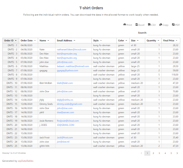
Data from a frontend post form:
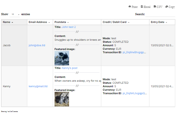
Graph of cumulative sales data:
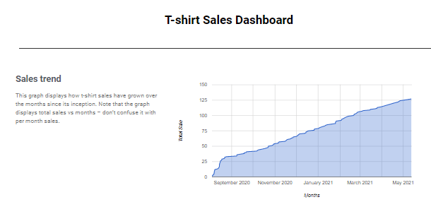
Chart of data from a closed poll:
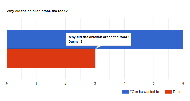
4.10.4 Clearout Email Validation
Link to chapter 10Clearout enables you to automatically filter out undesirable and invalid email addresses from your form submissions, and consequently from your email lists, ensuring only high-quality leads.
They provide 2 methods that you can use to integrate with your Forminator forms:
- A plugin method to apply the validation to all your forms
- A javascript method that you can apply to specific forms only
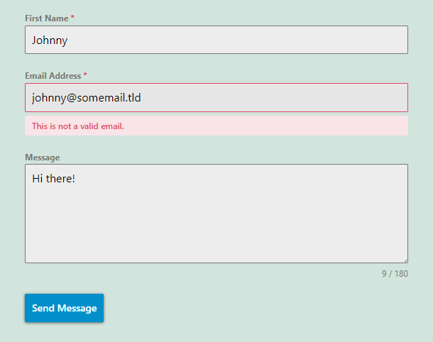
You can customize the message that appears when an email address does not validate under the Email Settings tab of your Email field.
Plugin Method
To get started using the plugin method for all your forms, first install the Clearout Email Validation plugin on your site. You can install either via Plugins > Add New in your site admin, or download it from wordpress.org here.
Next, log into your Clearout account, or create one now if you haven’t already.
Once logged-in, go to the Apps tab and click the + Create App button.
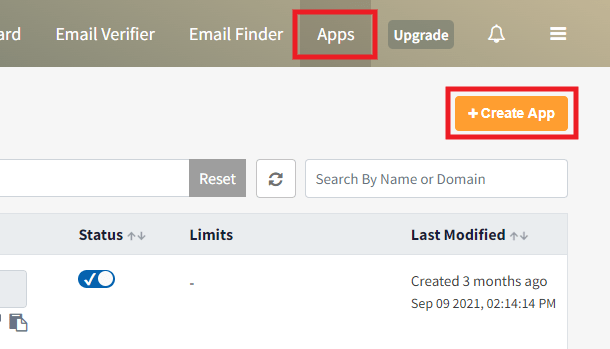
In the modal window that pops open, select the Server option. Then give your app a Name and an optional Description, and click Create.
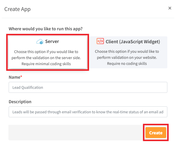
Finally, click the copy icon next to your new app to copy your app API Token.
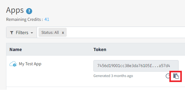
Now go back to your site, navigate to Settings > Clearout Email Validator in your site admin, and paste the Clearout API token in the field provided.
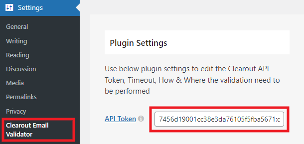
Then scroll down to the Apply Validation section of the plugin settings where you’ll see a list of compatible plugins. Clearout now integrates natively with Forminator. Enable the Forminator Form checkbox in the Select Forms option. Then, click on Apply to complete the integration.
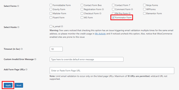
This integration will now affect all Forminator forms on your site.
Javascript Method
To use the javascript method for specific forms, first log into your Clearout account, or create one now if you haven’t already.
Once logged-in, go to the Apps tab and click the + Create App button.
In the modal window that pops open, select the Client (JavaScript Widget) option. Then give your app a Name and an optional Description. Customize any of the other options if you wish, then click Create.
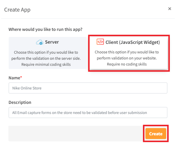
Finally, click the copy icon next to your new app to copy your app’s JS code.
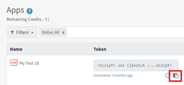
Now go back to your site and, on the page where you have embedded your Forminator form, add a code block in the Gutenberg editor. Paste your Clearout app’s JS code in the block, then click the Update button for your page.
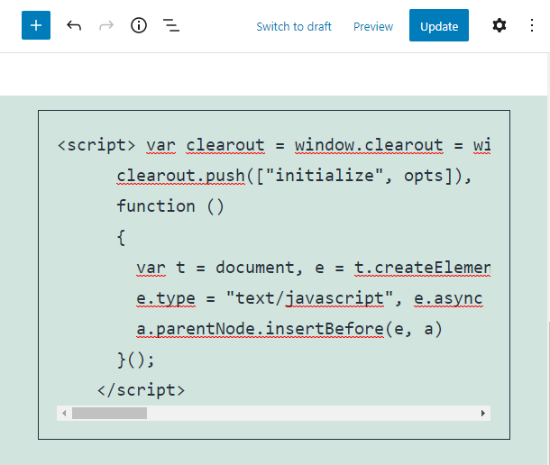
This integration will now affect only this particular form on your site.
If you’re using the Classic Editor or a page builder to create & edit your pages, you may not be able to add a code block as above. So an easy alternative is to use a free plugin like Shortcoder where you can add the Clearout JS code and generate a shortcode that you can add to your page instead.
Possible Issues
If your form is embedded in a Hustle module and the email validation is not working on your site, try setting the form’s submission Method to Ajax instead of Page Reload.
4.10.5 Complianz
Link to chapter 10Complianz integrates with Forminator out of the box when configuring that plugin.
The Complianz Cookie Consent plugin does not have any settings specific to Forminator. However, when configuring that plugin, you may come across some options that may impact your Forminator forms.
For example, Complianz has a setting to hide Google reCAPTCHA if the corresponding cookie option is not accepted by a site visitor. So if you’re using reCAPTCHA in your forms, you’ll want to be aware of that.
4.10.6 Groundhogg
Link to chapter 10Groundhogg Marketing Automation & CRM has created an integration plugin that enables you to add any contact info submitted through a Forminator form to your marketing funnels.
To get started with this integration, we’ll assume you already have the Groundhogg plugin installed and configured on your site.
Whether you have a paid Groundhogg plan or have purchased just the Forminator Integration plugin, you’ll find it in the All Access Downloads area in your Groundhogg account.
Download the integration plugin, then upload the zip file to your site via Plugins > Add New > Upload.
Once the integration plugin is installed and activated, go to Groundhogg > Funnels in your site’s wp-admin.
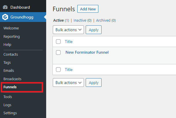
Once there, you can either create a new funnel or edit an existing one to include integration with any Forminator form. For the purposes of this document, we’ll create a simple new funnel.
Click the Add New button, then click the Start Building button in the Start From Scratch option.
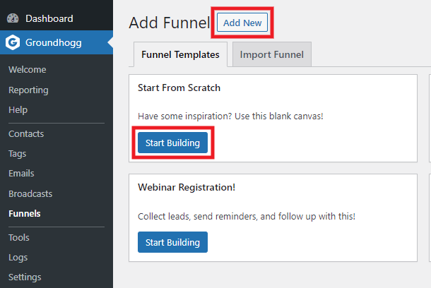
On the next screen, click the + Add Step button and, in the modal window that pops open, select Forminator under the Benchmarks tab.
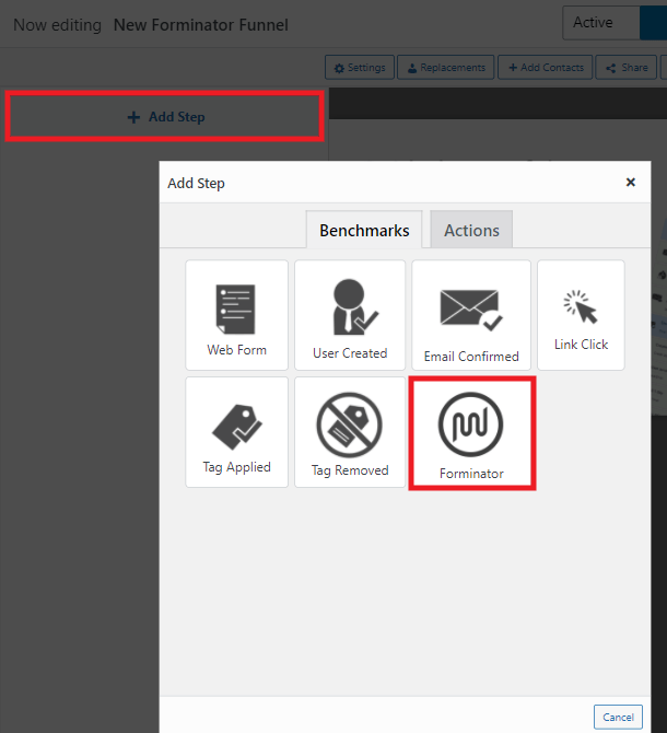
Next, select the form you wish to use for this integration, and click the Map Fields button.
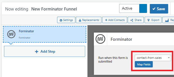
In the modal window that pops open, you’ll see all the fields from your Forminator form listed in the 2 columns on the left, which you can map to any Groundhogg field you need by selecting it in the corresponding dropdown on the right.
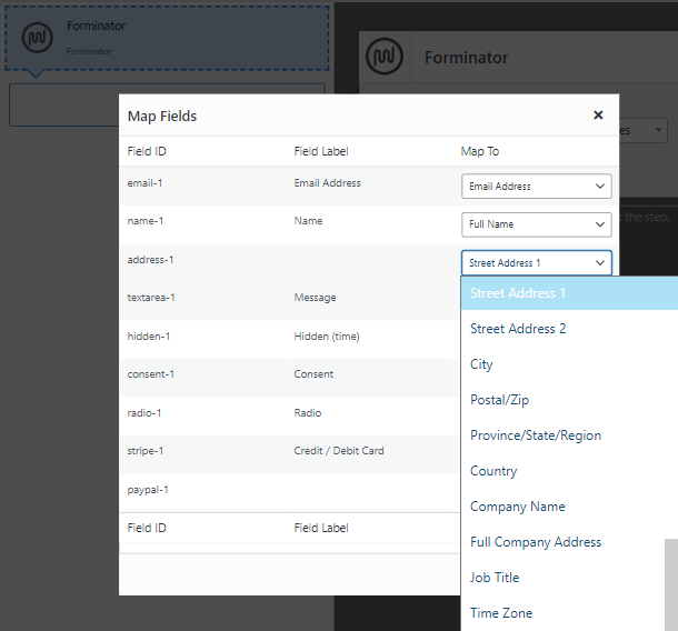
Once you have mapped all your form fields, click the Save Changes button at the bottom of the modal.

Finally, set your funnel to Active and click the Save button.
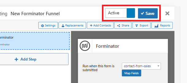
You’ll then see the form field information you mapped appear in the Groundhogg Contacts section whenever a user fills in your selected Forminator form.
Any other steps you wish to add to your Groundhogg funnel are beyond the scope of this document. For help with that and any other issues with Groundhogg configuration, please see their support documentation.
4.10.7 WP E-Signature
Link to chapter 10ApproveME WP E-signature has created an integration plugin that enables you to collect legally binding digital signatures on contracts after a form submission.
To get started, you need to install and activate the WP E-Signature, WP E-Signature add-ons, and the Forminator Signature add-on plugins.
Download the plugins, then upload the zip files to your site via Plugins > Add New > Upload. These plugins are included in the ApproveMe Elite and Lifetime plans.
For this integration to work, you must add name and email fields to your Forminator form, as they are required to create the contract document.
Navigate to E-Signature > Add New Document, and choose the Stand Alone option.
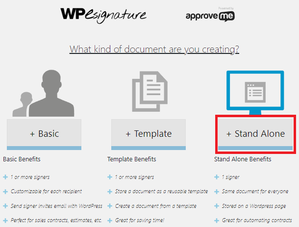
Enter the contract title and content. Then, click the pencil icon and choose Forminator Data.
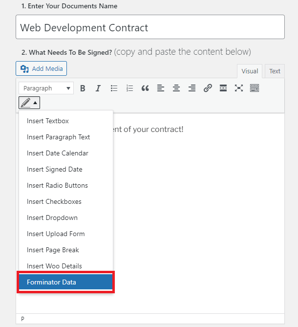
In the modal window that pops open, choose the form that you want to connect the contract document to then, click the Next Step button.
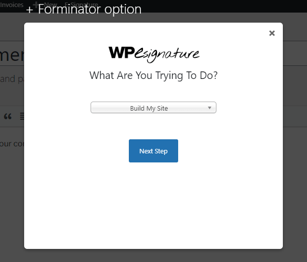
In the first dropdown menu, choose Insert all fields. For the Select a display type drop-down menu, you get to choose to display the values of the fields only, values and labels, or labels only.
We recommend choosing the Display label + value option, so it is clear when the user views the contract document which value corresponds to which field. Then, click the Add to document button.
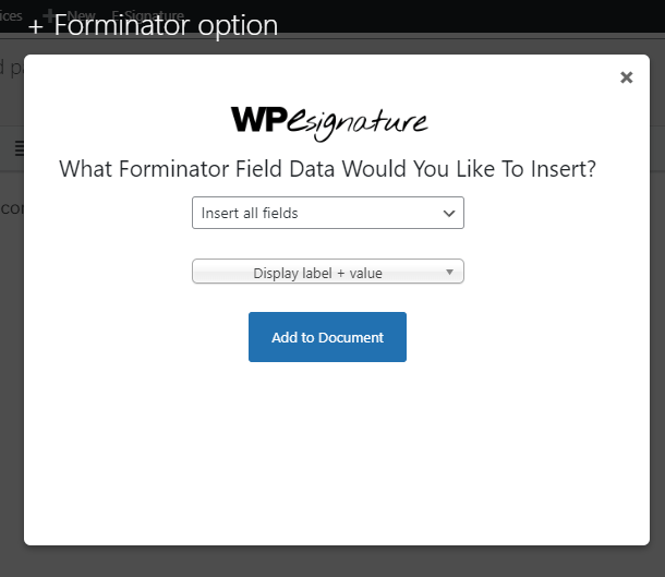
This adds a shortcode for each field in your Forminator form. Feel free to remove field shortcodes that you don’t want to include in your contract document. Make sure that you don’t remove the name and email shortcodes as they are required to create the document.
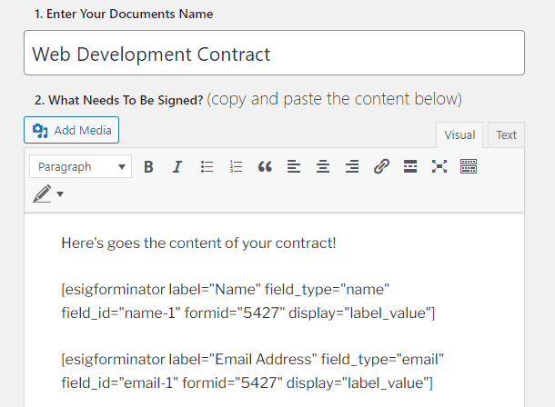
In the Document Options section, tick the Create a new WordPress page for this document checkbox and choose any additional configuration setting you’d like to apply to your document. Then, click the Publish Document button.
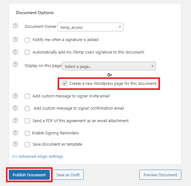
A modal window pops up to let you know that you need to complete the configuration on the form’s editing screen. Click Let’s go now! to navigate to the form editing screen.
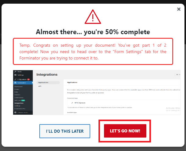
Navigate to the Integrations tab where you will find WP E-Signature under the Connected Apps. Click the plus icon.
In the E-Signature Settings pop-up modal, choose the name field for the Signer Name and the email field for the Signer Email.
For the Signing logic, you can choose between Redirect user to the E-Signature document after submission or Send user an email requesting their signature after submission options. And for the Display Type, you can choose whether or not you want to underline the data that was submitted in the form.
In the Select Document dropdown, choose the contract document you want your user to sign.
You can also tick the Enable Signing Reminder Email checkbox to do just that then, click the Update button.
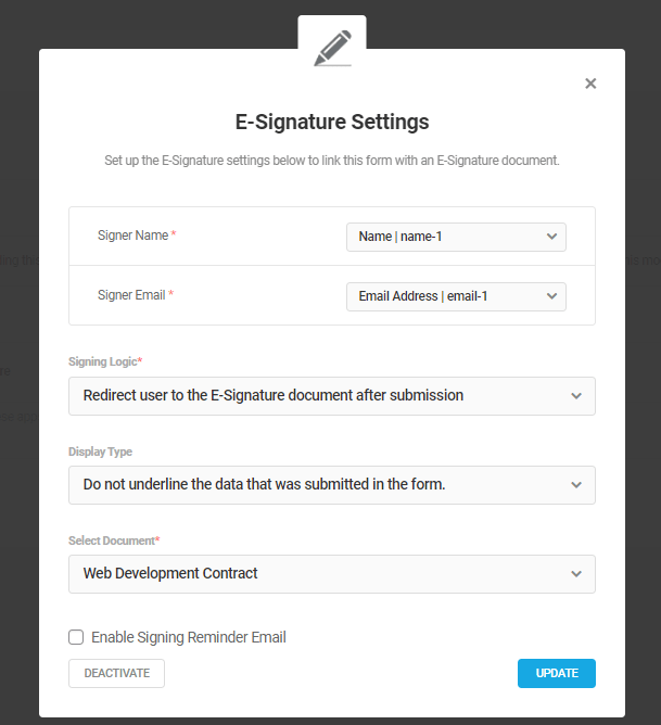
Finally, navigate to the form’s Settings tab and ensure that you have enabled the Store submissions in database option to ensure triggering the E-Signature document when the form is submitted.
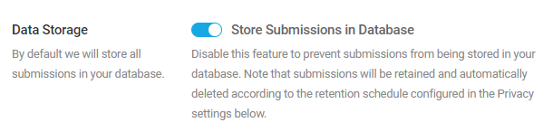
Depending on how you configured your document, once users submit the form, they will be redirected to the page where they can sign the document or receive an email that includes a link to the document they need to sign. This is how the document looks on the front end:
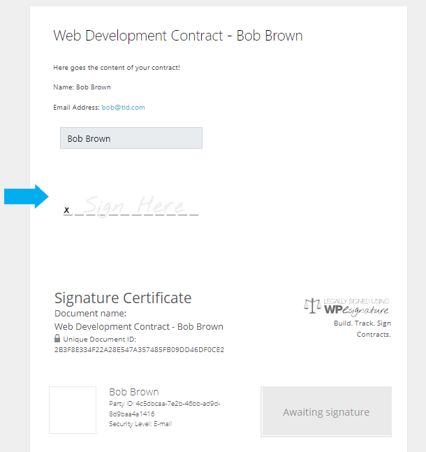
Any other configuration settings you wish to apply to your WP E-Signature document are beyond the scope of this document. For help with that and any other issues with WP E-Signature configuration, please see their support documentation.
4.10.8 Friendly Captcha
Link to chapter 10Friendly Captcha has included support for Forminator forms, making it so your users don’t have to do anything to solve a captcha. With this integration, the captcha is solved automatically as soon as a user begins filling out a form.
To get started, install the Friendly Captcha plugin on your site. You can install it either via Plugins > Add New in your site admin, or download it from wordpress.org here.
Friendly Captcha is a premium SaaS plugin starting at €9/month for commercial use. The service comes with a 30-day free trial so you can try it out and see if it’s a good fit for your project. Note that for personal or hobby sites, it is free to use for up to 1000 requests (captcha solves) per month.
Once installed and activated, go to Settings > Friendly Captcha, and click the link to create a Friendly Captcha account if you don’t already have one.
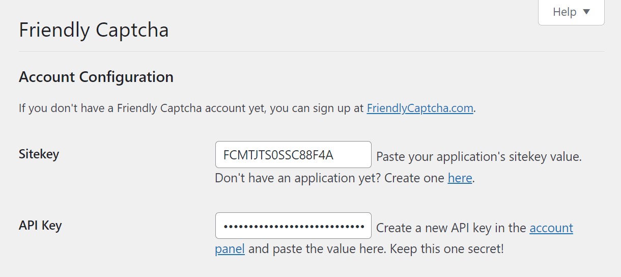
Follow the steps to create your account and set up your organization. Then go to Applications and click Create new application.
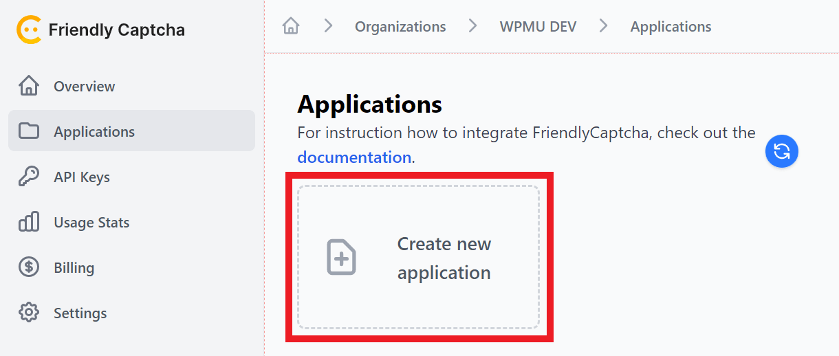
Fill in the form to create a key for your site. Then copy the generated Application key and paste it in the Sitekey field in the Friendly Captcha settings in your site’s wp-admin.
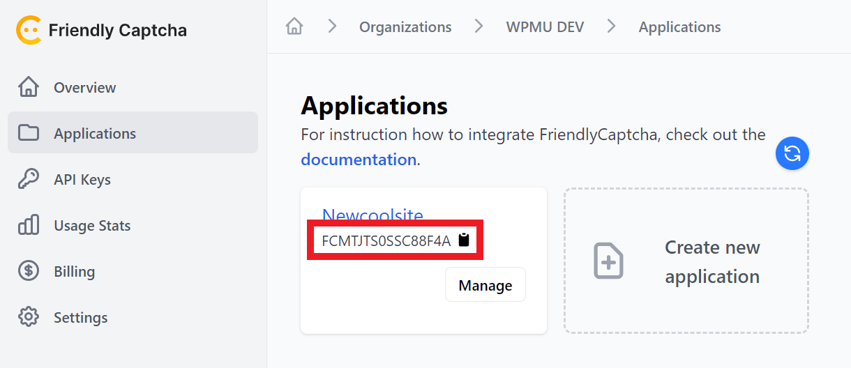
Next, go to API Keys in your Friendly Captcha account. Enter any recognizable name you want for your API key, and click Create API Key.
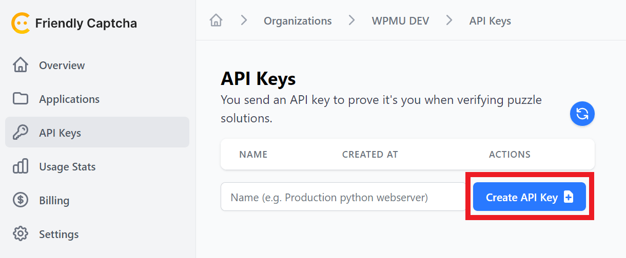
Copy the generated API Key and paste it in the API Key field in the Friendly Captcha settings in your site’s wp-admin.
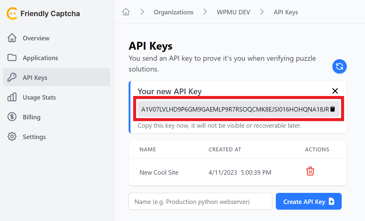
Then scroll down to the Integrations section in the Friendly Captcha settings in your site’s wp-admin, and check the box next to Forminator to enable the integration.
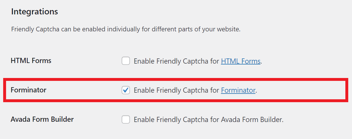
Click Save Changes at the bottom of the Friendly Captcha settings screen and you’re done.
There are no additional settings to configure in Forminator, and no need to add a captcha field in your forms.
Now, when you load any form on the frontend of your site, you’ll see the Friendly Captcha widget just above the Submit button.
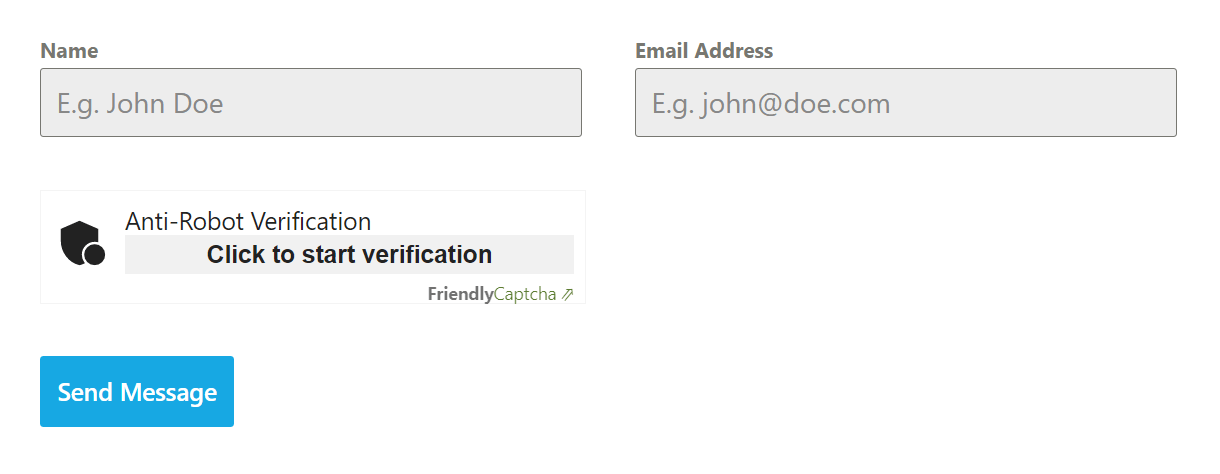
As the user begins filling out the form, the captcha will begin to solve itself automatically.
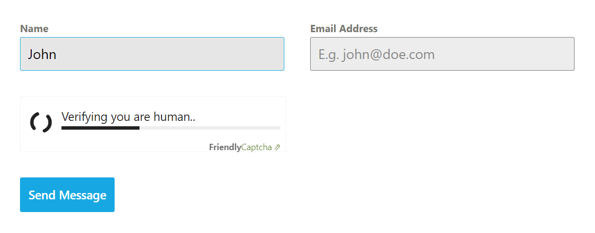
By the time the user is ready to hit the submit button, the captcha will already be solved.
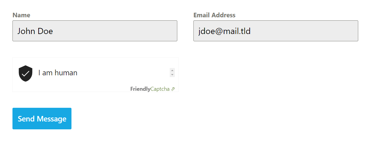
4.10.9 Simple Cloudflare Turnstile
Link to chapter 10Simple Cloudflare Turnstile plugin enables you to add a Cloudflare captcha to your Forminator forms to protect spam entries.
To get started with this integration, we’ll assume you already have the Simple Cloudflare Turnstile plugin installed and configured on your site.
Once the integration plugin is installed and activated, go to Settings > Cloudflare Turnstile in your site’s wp-admin.
To get started you need to enter your Cloudflare site and secret keys. First, log in to your Cloudflare account and navigate to this URL https://dash.cloudflare.com/?to=/:account/turnstile
On the Turnstile Sites page, click on the Add Site button.
To add a new Turnstile site, enter your site name, select your domain, choose your preferred widget mode, and click Create.
Note: To add a domain to Cloudflare, refer to this Cloudflare documentation on how to add domains to Cloudflare.
Copy the generated Site and Secret keys
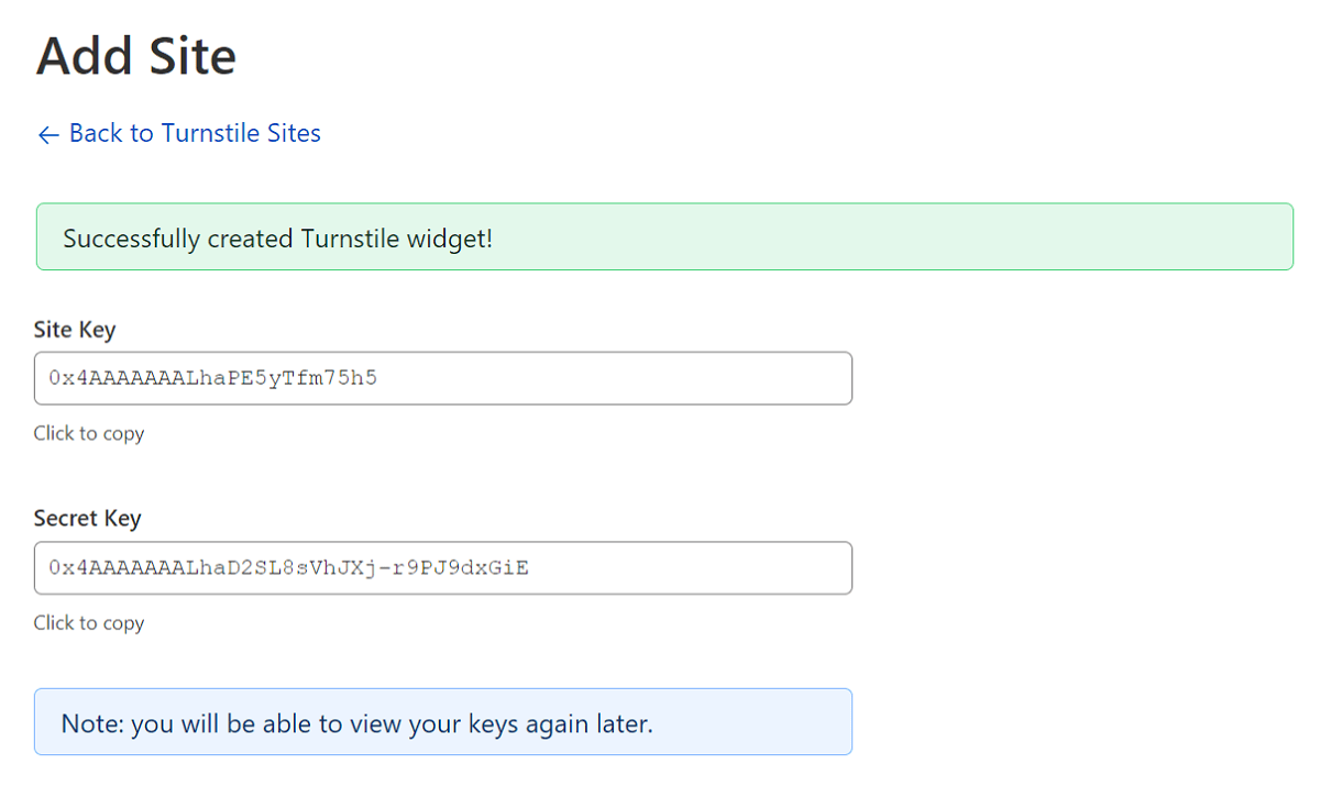
In your wordpress dashboard, paste the copied keys in their respective fields and check the enable on all forminator forms field to display cloudflare captcha on all forminator forms by default. You can also exclude forms by mentioning their IDs in the Disabled Forms ID field.
From the Widget Location drop-down select where you want the captcha to be displayed and Save the changes.
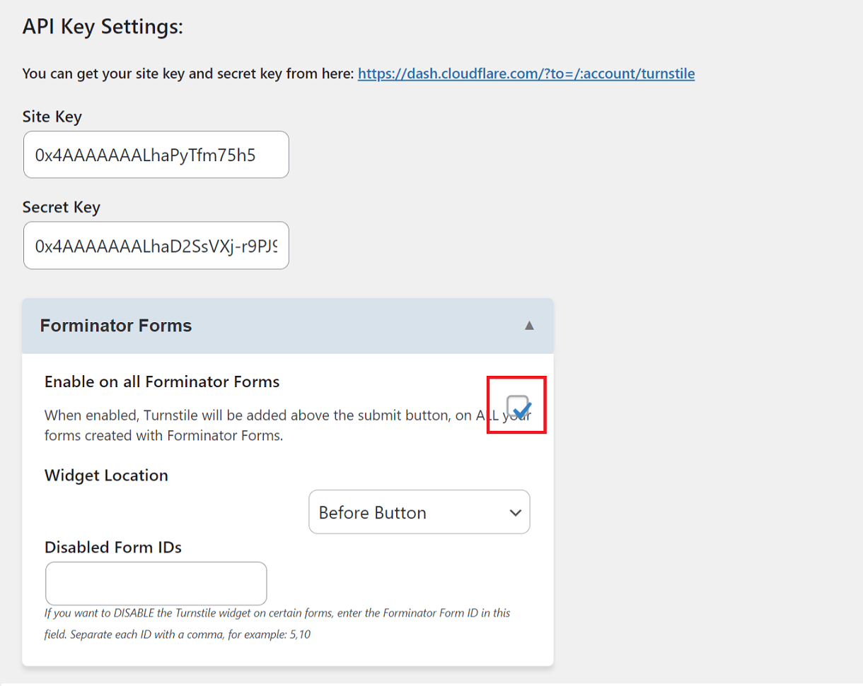
The final step is to test if the integration is successful. Click on the Test Response button to initiate a sample request/response test.
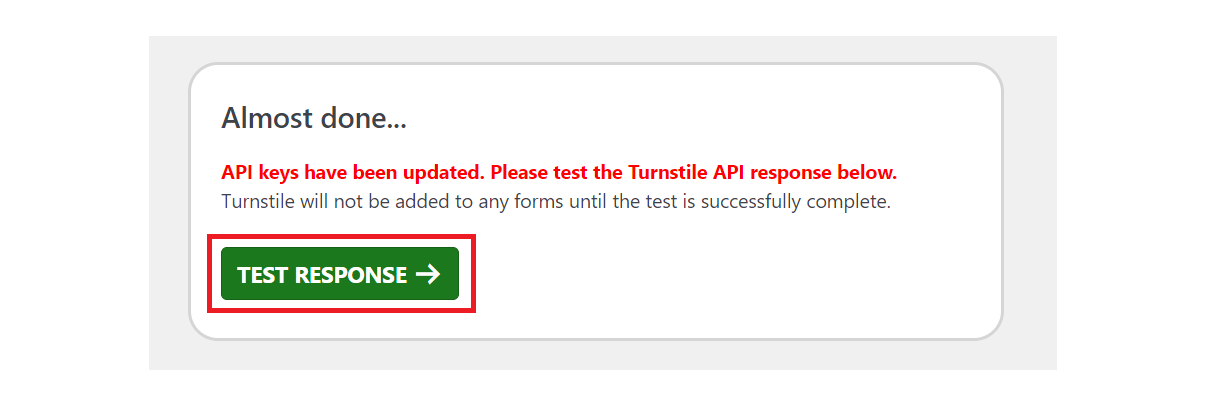
If the integration is successful, the cloudflare captcha will be displayed on the enabled forminator forms.
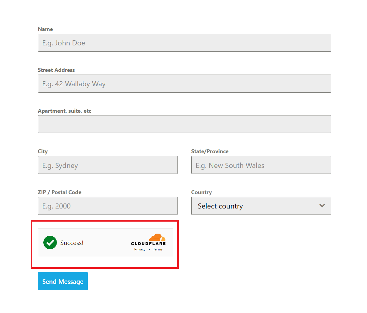
4.10.10 Zoho Flow
Link to chapter 10In their own words, Zoho Flow is a low-code integration platform that extends integration capabilities for Forminator users, not only with other WordPress plugins but also with the Zoho Ecosystem, various cloud applications, and on-premises applications, including databases.
While you can integrate Zoho with Forminator using webhooks, they have created an integration plugin that makes it just too easy to get things done.
Zoho Flow is a premium service that offers a range of features to help you automate and streamline your workflows. You can sign up for a 15-day free trial to test the service and determine if it’s a good fit for your project.
To get started, install the Zoho Flow plugin on your site. You can install either via Plugins > Add New in your site admin, or download it from wordpress.org here.
Once installed and activated, go to Zoho Flow > Integrations and select Forminator from among the available integrations.
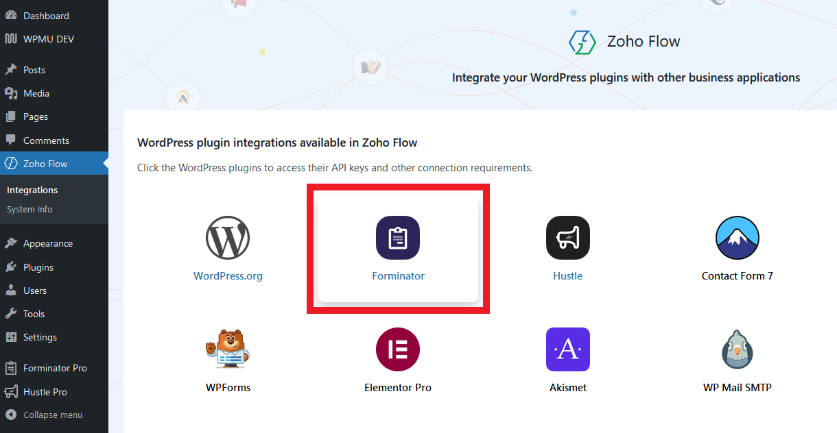
Click the + New API Key button.
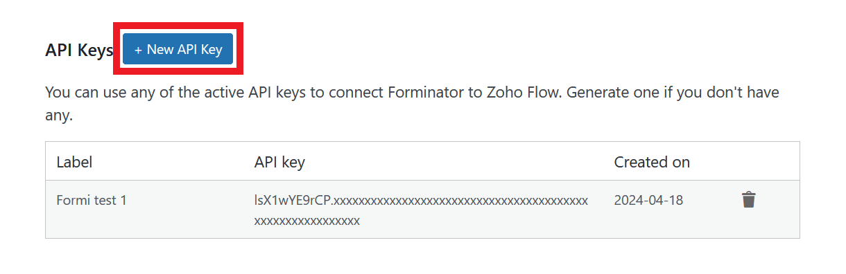
In the modal window that pops open, enter a recognizable label for your new API key, and click Generate.

Copy the generated API Key and the Base URL and paste them into a text file for the next steps.
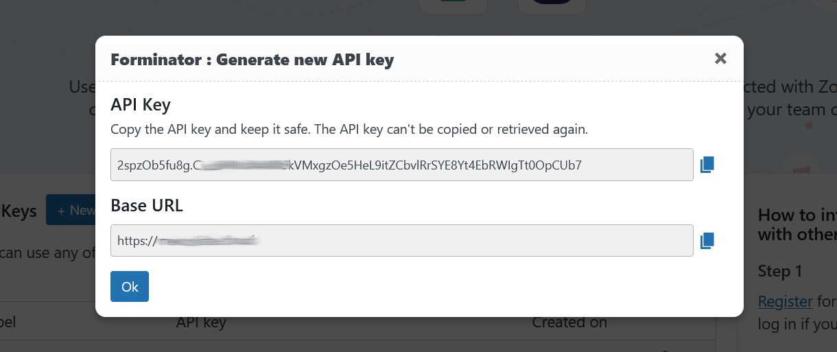
Note that you will not be able to retrieve the API key once the modal window is closed. The Base URL is simply your site address, without the trailing slash at the end.
Next, create your Zoho Flow account at https://flow.zoho.com if you haven’t already, and login. Then go to My Flows and click the Create Flow button.
Enter a name for your new flow, select or create a new folder where you want to store it in your account, give it a description, and click Create.

On the Builder screen, click Configure in the App trigger section.
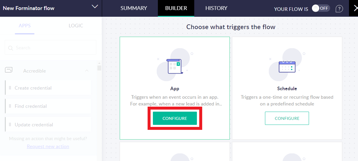
Scroll through the available apps until you find Forminator. Select it and click Next.
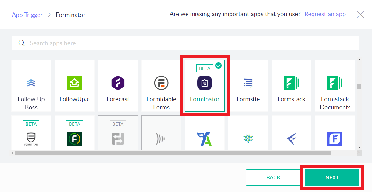
Select whether you want your flow to be triggered when a Forminator form, poll or quiz is submitted, and click Next.
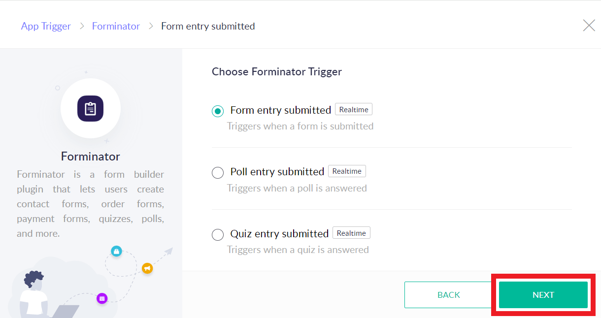
Click the Connect button to create the API connection needed for Zoho to communicate with your site and fetch data from Forminator.
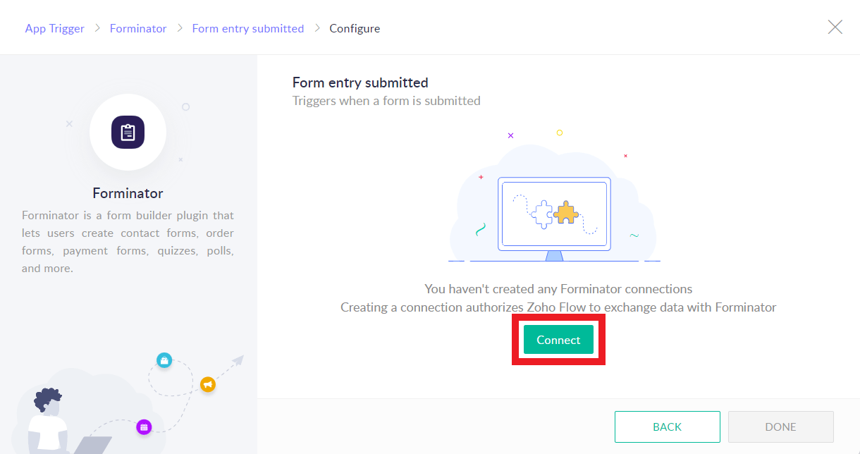
Give your API connection a name, then enter the API Key and Base URL you copied earlier from your site admin, and click Authorize.
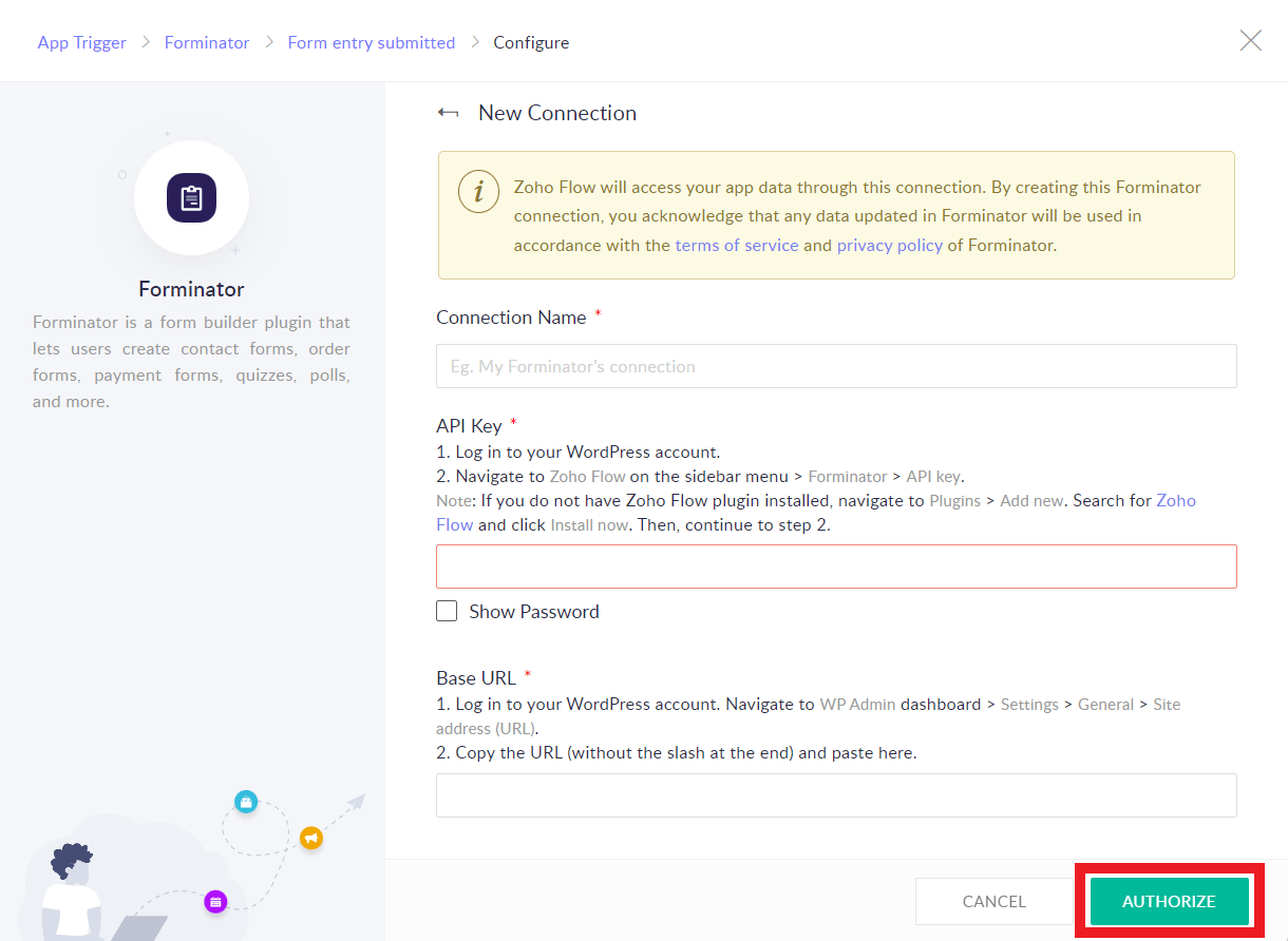
Note that once you have authorized an API connection with your site for your first flow, you will not need to authorize it again for new flows from that site unless you delete the API key from your site.
Select the specific form, poll or quiz you want to use for this flow.
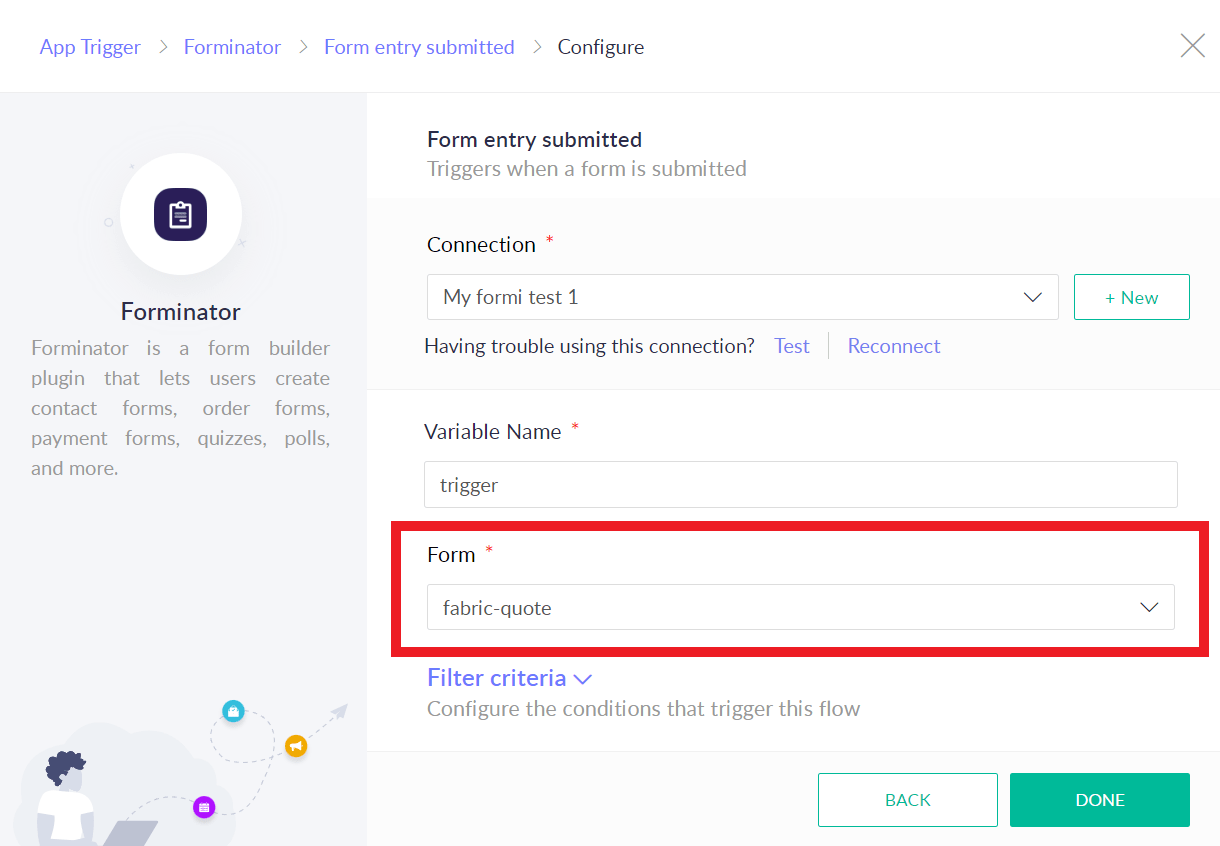
Optionally click on Filter criteria and fine-tune the flow to only trigger when certain Forminator field values or conditions are met. Click Done when you’re finished.
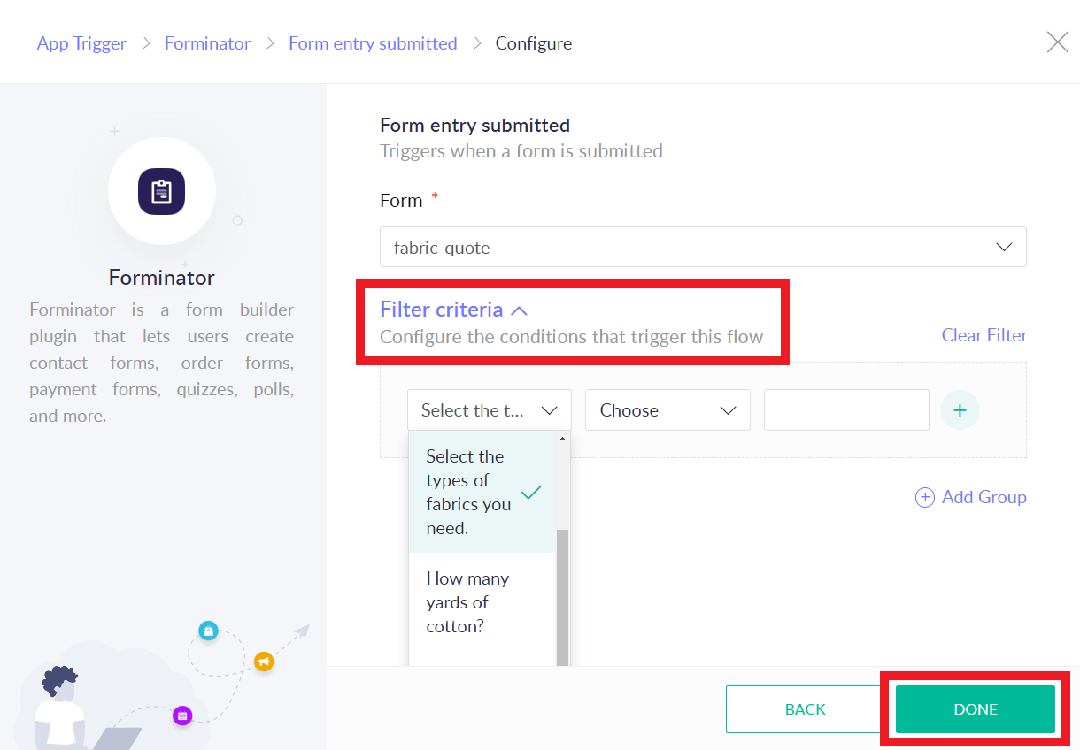
You have now successfully created a Zoho flow that triggers when a Forminator form, poll or quiz that optionally meets your filter criteria has been submitted on your site.
The next steps of what you do with that data are entirely up to you, and are beyond the scope of this guide. If you need help continuing with your setup, Zoho has extensive documentation and tutorials in their knowledge base.
4.10.11 Uncanny Automator
Link to chapter 10Uncanny Automator allows you to easily automate specific workflows on your WordPress site using triggers and actions. You can create customized workflows, known as recipes, which enable you to establish connections between different WordPress plugins, sites, and third-party services or apps.
To get started, install and activate the plugin from WordPress.org.
You have the option to create a free Uncanny account. If you choose not to create an account, you can still create automation for any available built-in integrations.
However, to utilize app integrations such as Facebook, Slack, Google Sheets, MailChimp, and more, you will need to connect your site with a free Uncanny Automator account.
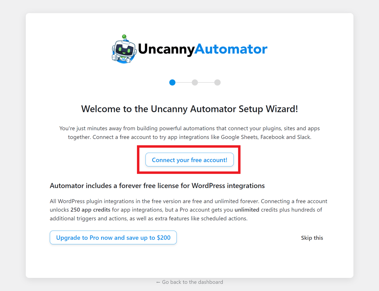
To begin setting up a new automation with Forminator, click on Add New. In the modal that pops up, select the type of automation you want to create.

You can specify whether the automation should be triggered only by logged-in WordPress users or by all users. Note that once the automation type is set, it cannot be modified later.
You can view the supported triggers and actions for each automation type for Forminator at https://automatorplugin.com/integration/forminator/.
Enter a suitable title for your automation. Under the Trigger section, choose Forminator.
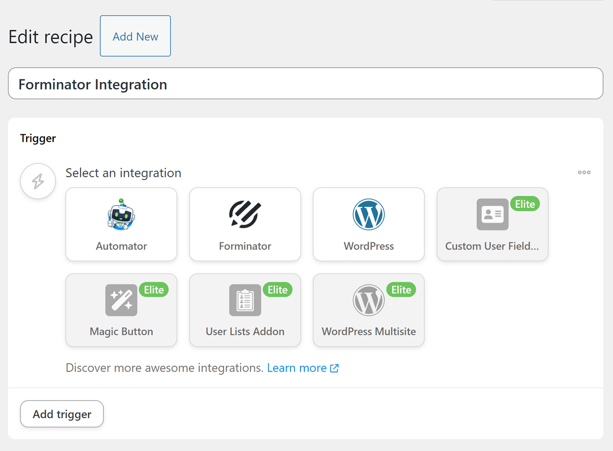
Now, select the trigger for the automation. In the below example, form submission is chosen as the trigger.
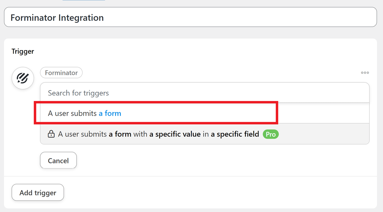
After selecting the trigger, choose the form that should trigger the automation, and click Save.
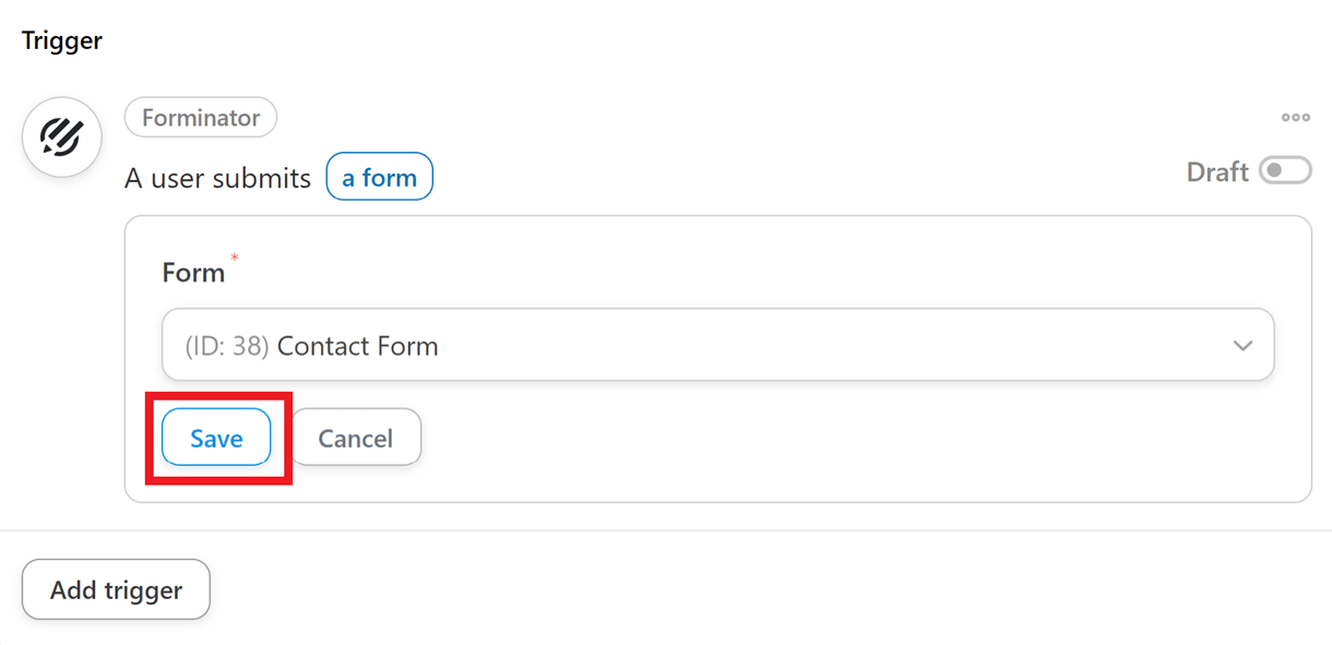
Under the Actions section, add the action(s) you want to be performed when the trigger is activated.
Click Add action and select from the available apps/integrations.
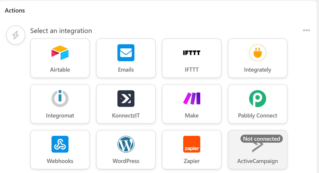
In the below example, Emails is chosen as the integration, and Send an email is chosen as the action to be performed when the trigger is activated. So, whenever the selected form is submitted (Trigger), an email will be sent (Action).
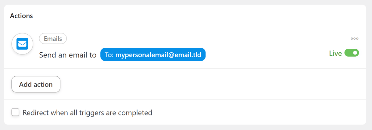
Note that you can add multiple actions to a trigger.
Once the trigger and actions are saved, set the status of the automation to Live
Now, whenever the automation is triggered, the saved actions will be executed.
4.10.12 SureTriggers
Link to chapter 10SureTriggers enables you to connect Forminator with hundreds of 3rd-party apps right in your site admin. Note that this integration only works with forms, not polls or quizzes.
To get started, install the SureTriggers plugin on your site. You can install either via Plugins > Add New in your site admin, or download it from wordpress.org here.
Once installed and activated, go to SureTriggers in your site admin. Follow the prompts to create and authorize a free account at SureTriggers if you haven’t already done so.
Once back on the SureTriggers page in your site admin, click + Create Workflow.
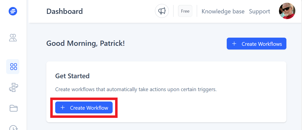
Enter a name for your new workflow and click Start Building.
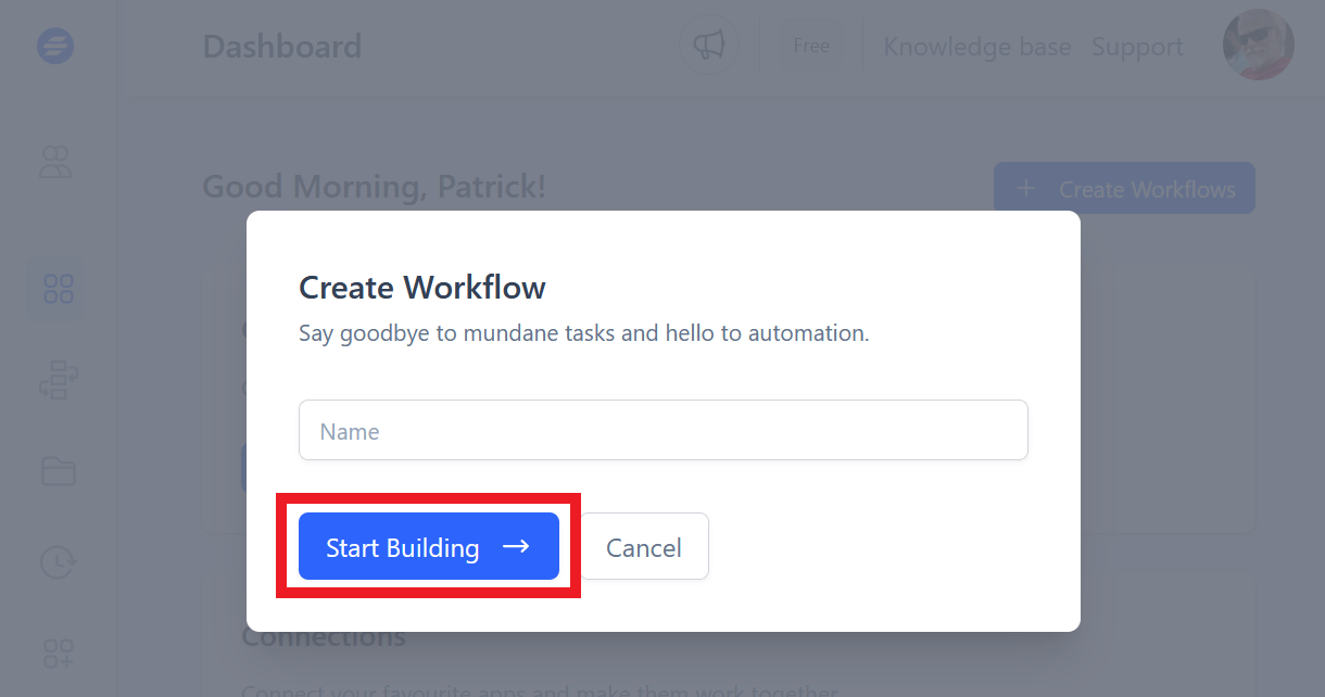
The modal window will close and the builder screen will appear. Click + Add Trigger.
In the Add Trigger window that slides open, search for or scroll through the list to locate and select Forminator as your trigger.
The only trigger event available for this integration is when a form is submitted, so that will be selected by default. In the Select Connection field, select your current site that displays there.
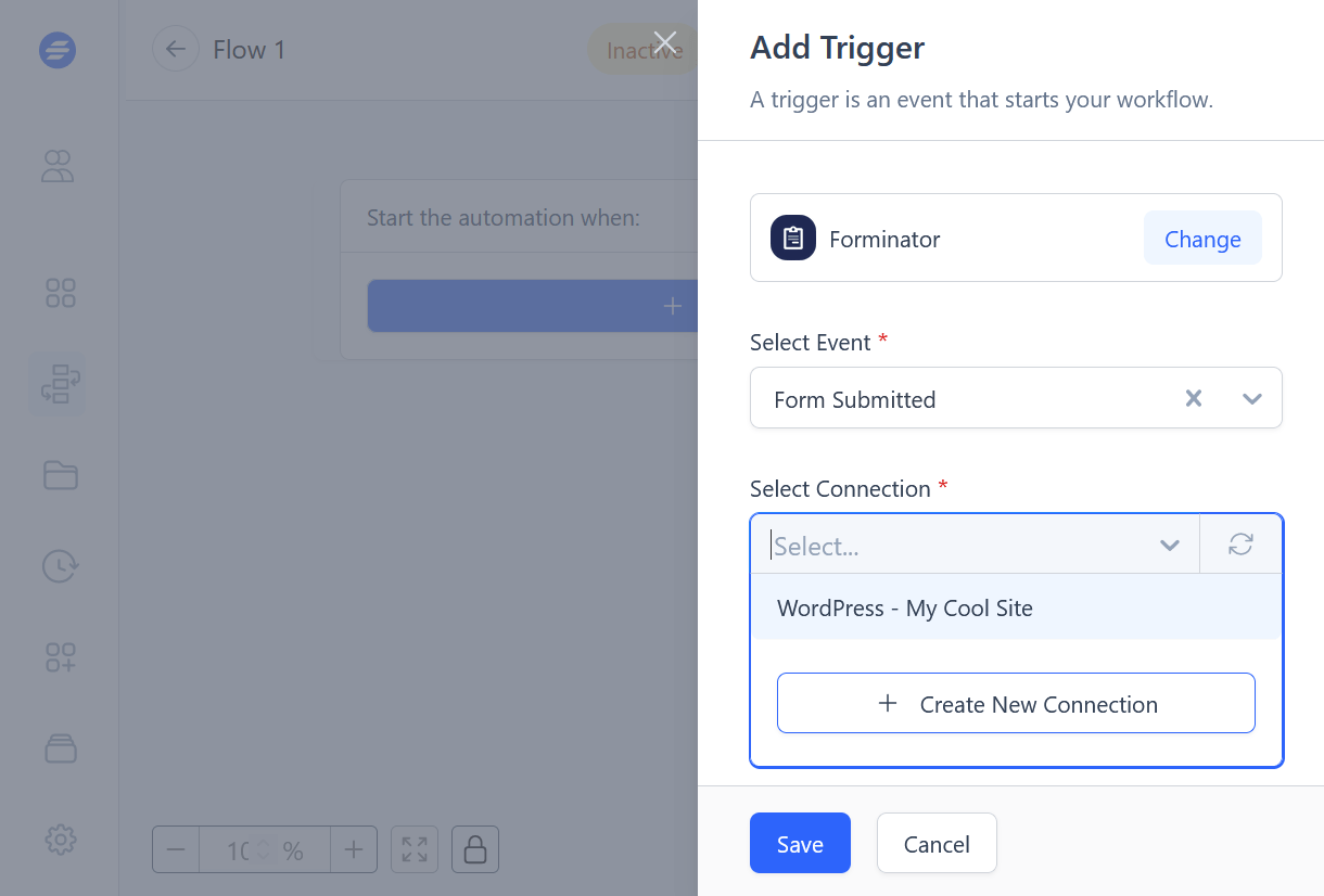
Next, scroll down in the Add Trigger window and select the form you wish to use for this workflow.
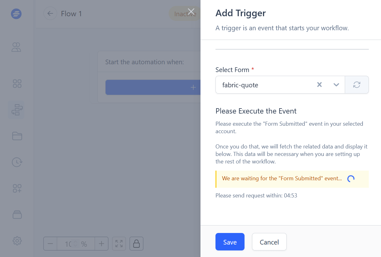
You’ll get a prompt to Execute the Event within the next 5 minutes. That means SureTriggers needs you to fill in your selected form on a page on your site and submit it so the form data can be fetched.
As soon as you create a submission using your selected form, that window will refresh and display the data it found to confirm that the connection is working as it should. Click the Save button to complete the trigger step.
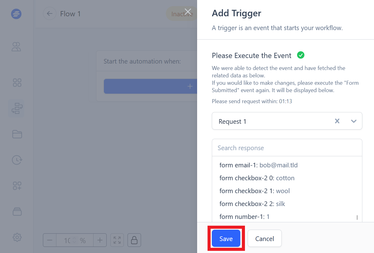
You have now successfully created a SureTriggers workflow that triggers when a Forminator form has been submitted on your site. Click the (+) button to start adding Actions to your workflow.
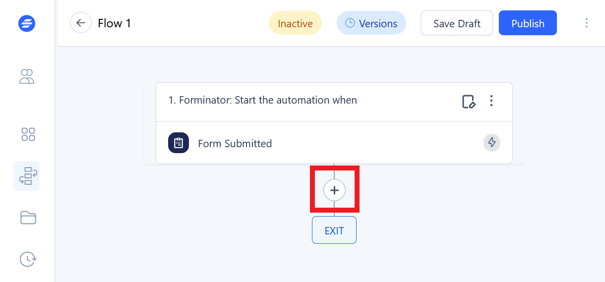
The next steps of what you do with that data are entirely up to you, and are beyond the scope of this guide. If you need help continuing with your setup, SureTriggers has extensive documentation and tutorials in their knowledge base.
4.11 Reports
Copy chapter anchor to clipboardThe Reports Dashboard is where you can find detailed reports for the forms, polls, and quizzes on your site.
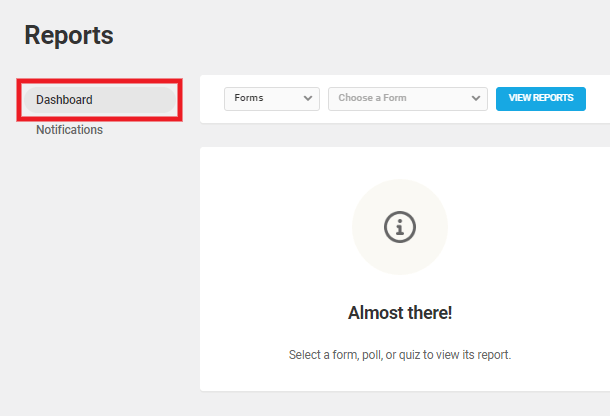
See how to Do More With Your Forms with New Forminator Reports and Webhooks Integration on the blog.
In the first dropdown, select to view reports for either forms, polls, or quizzes. Then select the specific one you want in the second dropdown.
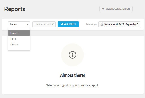
Click the Date range field to select the date range for your report. You can manually select the start and end dates on the calendar or choose from the pre-defined ranges. Finally, click the View Report button.
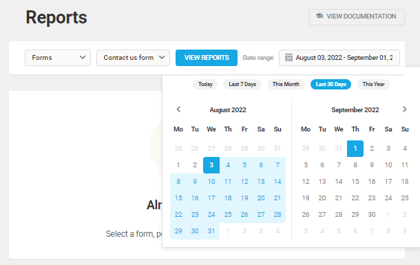
The Reports tab includes the following panels:
- Overview
- Views
- Submissions
- Conversion Rate
- Payments (Forms only)
- Apps
- Leads (Quizzes only)
- Location (Forms only)
Overview
The Overview panel displays the date/time of the last submission. It also shows the number of views, submissions, and conversion rate for the selected period. In addition, it includes an interactive line graph illustrating submissions during the period chosen.
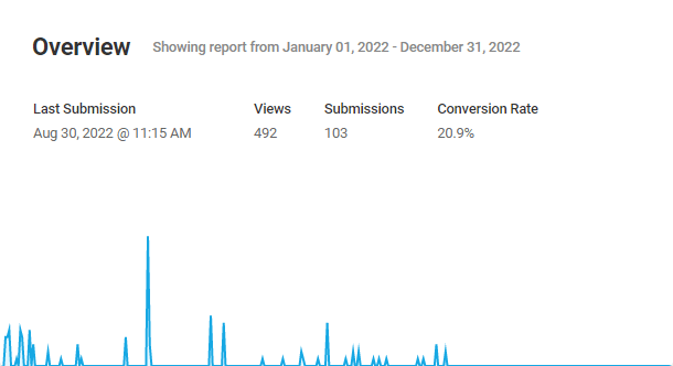
Views
The views panel displays the number of visitors who viewed the form, poll, or quiz for the selected period and the views for the same previous period. It also shows the percentage of increase/decrease in views compared to the same previous period. And you can also see the average monthly views in this panel.
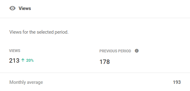
Submissions
The submissions panel displays the number of times users have completed and submitted a specific form, poll, or quiz for the selected period and the submissions for the same previous period. It also displays the percentage of increase/decrease in submissions compared to the same previous period. You can also see the average monthly submissions in this panel.
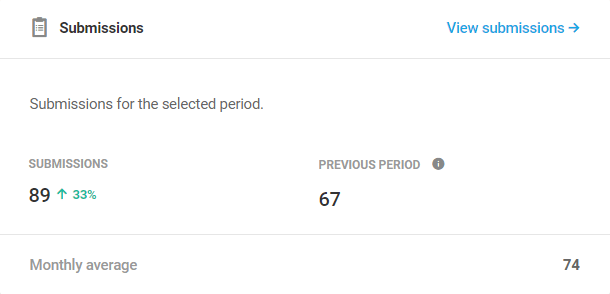
Conversion Rate
The conversion rate panel displays the percentage of users who submitted a form, poll, or quiz relative to the total number who viewed it. It also shows the conversion rate for the same previous period, along with the monthly average conversion rate.
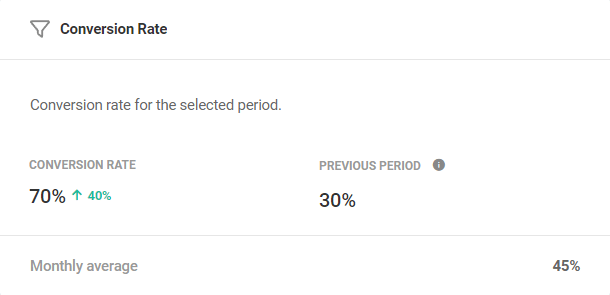
Payments (Forms Only)
The payments panel displays the payments collected via a form over the selected period. It also shows the amounts paid via Stripe and Paypal.
The payments panel won’t display any data if your form doesn’t include any payment fields.
Apps
The apps panel displays the number of data points sent to a specific application you have connected under the Integrations tab and the data points sent for the same previous period. It also shows the percentage of increase/decrease in data points sent to these applications compared to the same previous period.
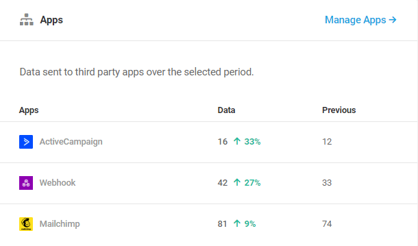
The apps panel won’t display any data if you haven’t connected any applications to your form, poll, or quiz
Leads (Quizzes Only)
The leads panel displays the number of leads you have collected via a quiz over the selected period. It also shows the number of leads collected for the same previous period, and the monthly average leads collected.
Locations (Forms Only)
The location panel displays a summary of the location of the users who submitted the form. It gives an overview of the locations of the users where the majority of the form submissions are from along with the submission count. It also displays the split up of the submission count for specific states/provinces within the country.
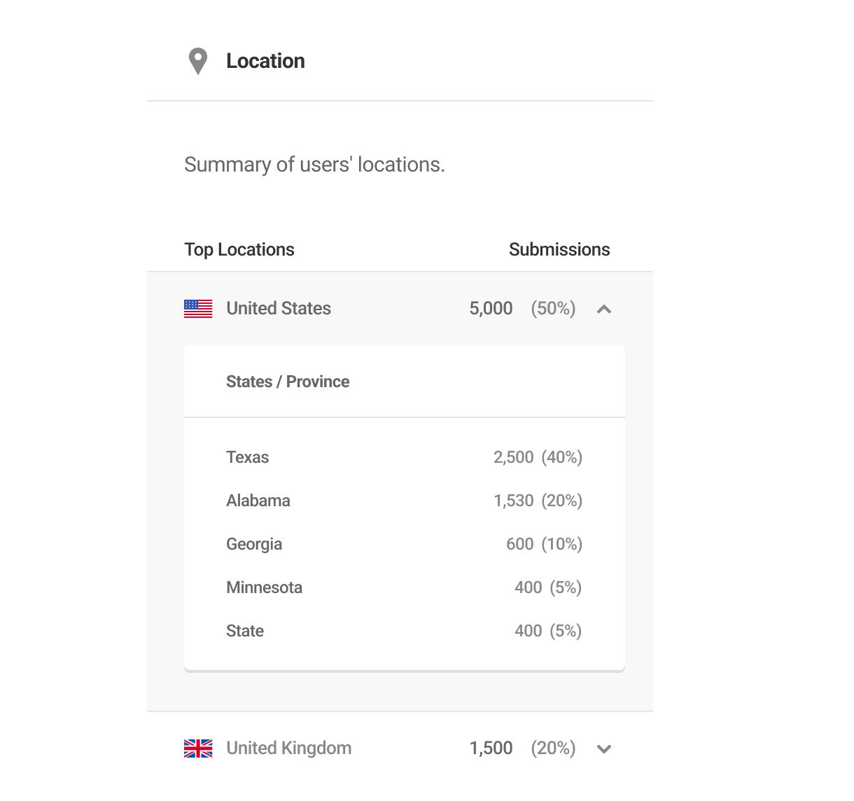
4.11.1 Reports Notifications
Link to chapter 11This is where you can create and manage regularly scheduled report notifications for any or all of your forms, polls and quizzes.
The first time you access this screen, you’ll see a notification has already been created by default for all of your forms. You can activate, edit or delete this default notification as needed.

Each report in the list displays the following summary information in its row:
- Report – The name you have given to the report, as well as the number of forms/quizzes/polls included in it.
- Module – This indicates whether the report is for Forms, Quizzes or Polls.
- Recipients – The avatar(s) of the recipient(s) you have included for the report will appear here. Hover over any avatar to see the email address associated with that recipient.
- Schedule – The report frequency you have set.
- Activate/Deactivate – Click the toggle at the far-right of a report’s row to activate or deactivate that report.
- Gear icon – Click the gear icon in any report’s row to reveal options to Configure or to Delete the report.
The Bulk Actions menu at the top of the screen enables you to apply the following actions to any number of selected reports:
- Activate
- Deactivate
- Delete
Add New Report
To create a new report, click the Add New Report button to pop open the configuration modal.
Settings
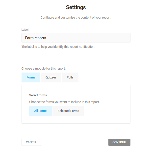
- Label – Enter the name you’d like for this report.
- Choose a module for this report – Choose whether your report should include data from Forms, Quizzes or Polls. Note that you can only include one module type per report. If you need data from multiple module types, you’ll need to create multiple reports.
- Select forms (or quizzes, or polls) – Choose to include data from All Forms/Quizzes/Polls, or only from Selected Forms/Quizzes/Polls.
If you choose to include only selected forms/quizzes/polls in your report, click in the search field that appears and select the ones you need.
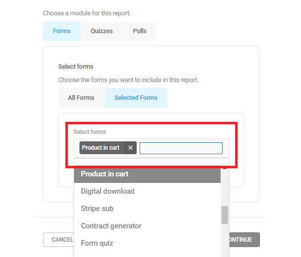
Click Continue to move to the next step.
Schedule
Set the frequency at which you’d like this report to be sent.
Note that, regardless of the frequency you select here, your report notifications will contain all-time data for the selected forms, polls or quizzes.
- Daily – For a daily report, simply select the time of day the report should be sent.
- Weekly – Select the day of the week and the time of day the report should be sent.
- Monthly – Select the day of the month and the time of day the report should be sent.
Click Continue to move to the next step.
Recipients
Under the Add Users tab, you can select which of your site’s registered users should receive the report. If the list of users is long, start typing the username in the Search users field instead of having to scroll through the list. Click the + icon next to the user’s username to add them.
You can also add recipients who are not registered users of your site under the Add By Email tab.
Simply enter their First name and Email address, then click the Add Recipient button.
Once you’re done with the configuration of your report, click the Save Changes button. You can also optionally toggle the Activate report option on or off before saving.
4.12 Settings
Copy chapter anchor to clipboardThe Settings module allow admins to customize some functionality and appearance and to establish data security protocols.
4.12.1 General
Link to chapter 12Here you can adjust the number of forms, quizzes, and polls that display on the dashboard, configure your default email header and address, and choose how many items appear on the modules and submissions pages.
Dashboard
In the field provided, enter the number of forms, quizzes, and polls you wish to see on the dashboard, and select whether to display only published forms, only drafts, or both.
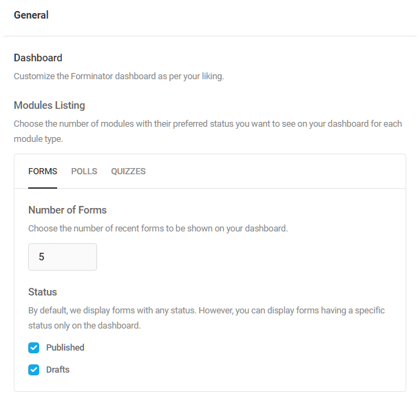
From Headers
In the Sender email address field, enter the default email address from which emails will be sent, and below that, the name you want to appear as the sender.
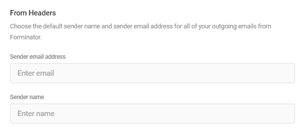
Pagination
Enter the number of forms, quizzes and polls to display on the main page for each, and do the same for the submissions listing page as well.
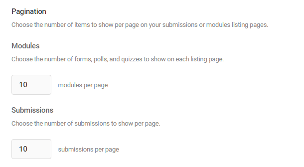
Form editor
Choose whether you want the settings modal to open automatically whenever you insert a field. This only applies when you insert one field at a time.
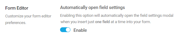
Usage Tracking
Usage tracking is incredibly useful for our designers and enables us to learn more about what features you use and don’t use. It is a completely anonymous feature and helps us deliver more relevant features in the future. See our Privacy documentation for more information about the data we collect.
To enable usage tracking, toggle on Allow usage tracking and click Save Changes.
WPMU DEV’s usage tracking never collects your personal data or that of your site users. If you enable this option, we will only collect anonymous data about how Forminator is used, what errors occur, and under what circumstances, and we use this data to improve the plugin. Leave the usage tracking option enabled if you want to help out or disable it if you’d prefer to opt out.
When White Label is activated in the WPMU DEV Dashboard, only users with permission to access the WPMU DEV Dashboard will be able to see the usage tracking option.
4.12.2 Accessibility
Link to chapter 12Click Enable High Contrast Mode to increase the visibility and accessibility of Forminator elements and components to meet WCAG AAA requirements. When enabled, High Contrast Mode only affects elements within the Forminator UI.
4.12.3 Appearance Presets
Link to chapter 12This section enables you to create and edit your own custom styles that can then be applied to any form with a single click.
Check out our blog post on styling forms using appearance presets.
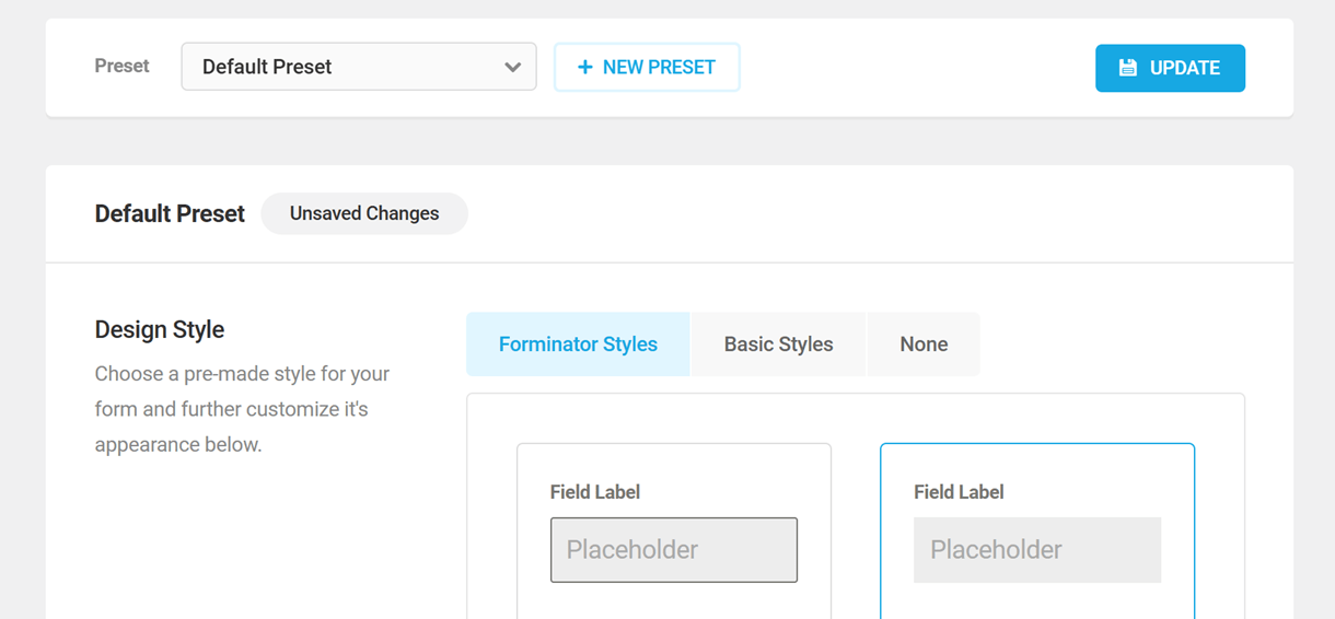
Note that these preset options are available for forms only at this time; a future update will include appearance presets for polls & quizzes as well.
The first time you access this section, you’ll see only the Default Preset style, which is the style that is applied to all your new forms by default. You can edit this default style, or create your own custom styles.
Creating a New Preset
To create a new custom preset, click the + New Preset button.
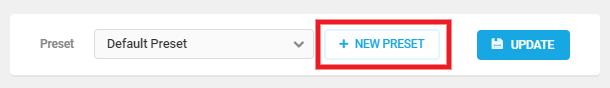
In the modal window that pops open, give your new custom preset a Name.
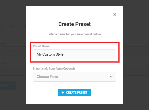
If you already have a form styled the way you want, and would like to use that style for your new custom preset, you can optionally import its appearance settings. Simply select the form you want to use from the Import dropdown.
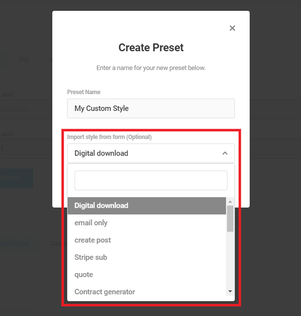
Then click the Create Preset button and your custom preset will load on the page so you can customize everything you need.
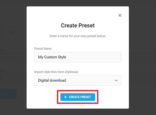
Editing a Preset
To edit an existing preset style, either the default or one of your own custom presets, select it from the Preset dropdown.
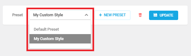
When you edit any preset style here, your changes will not be automatically applied to forms where that preset is used. You will need to apply the preset to those forms again for the changes to take effect. Use the Bulk Actions if you have multiple forms using the same preset. A future version will improve upon this process.
Customizing the Preset Appearance
The specific styling options for your presets are identical to those available in each form as seen in the Appearance (Forms) chapter above, so please review that chapter for details on their use.
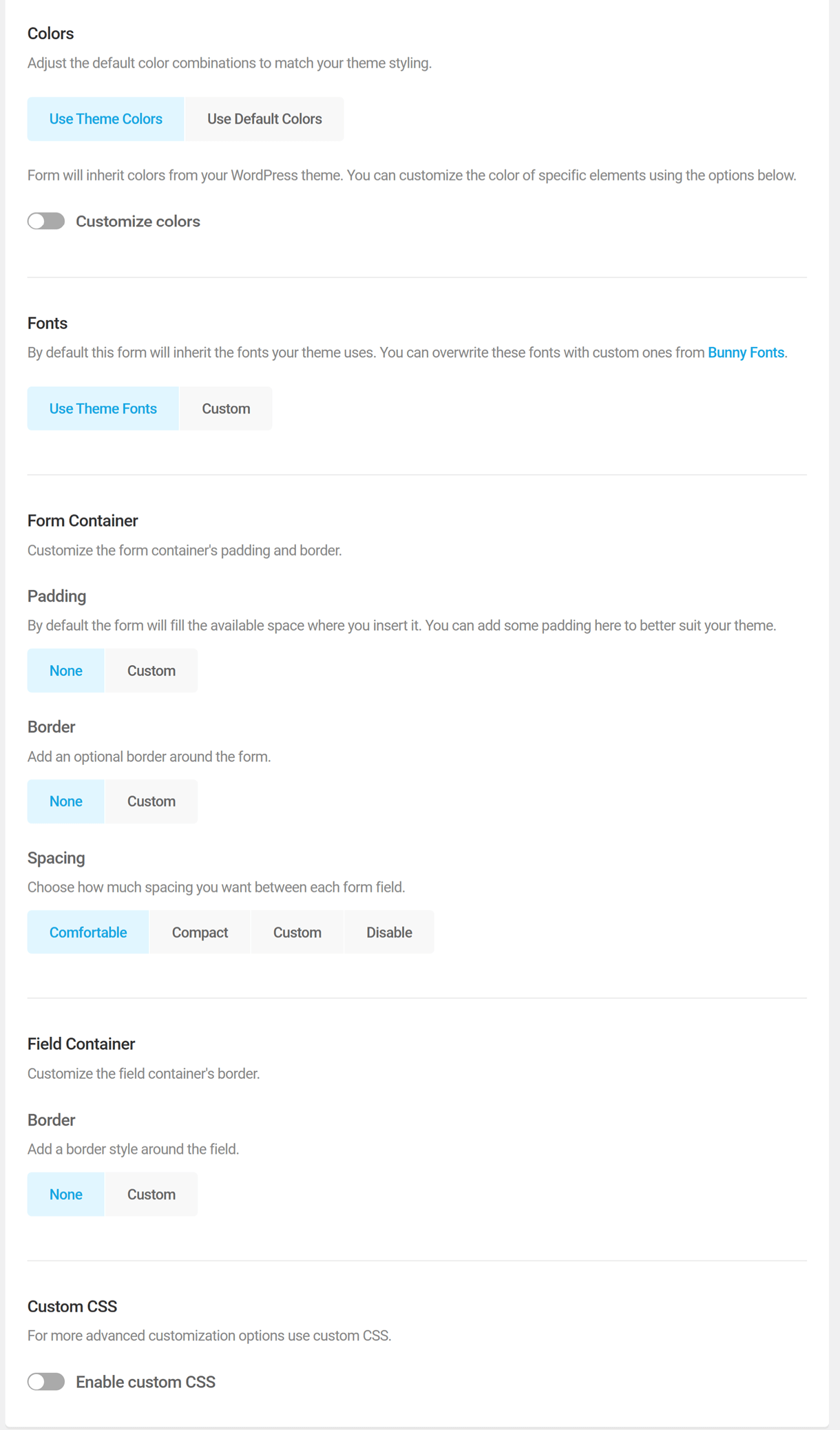
Note that there is no preview option for appearance presets. So if you do want to preview your styling as you go, we suggest styling the appearance of an existing form, and using the Preview option there. Then save your form, come back here and import that form’s appearance settings when creating a new custom preset.
4.12.4 Data
Link to chapter 12Uninstallation
Select whether to Preserve or Reset settings and data when the plugin is uninstalled.
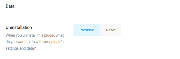
File Upload Storage
By default, all files uploaded via File Upload fields in your forms are stored with random names in designated subdirectories of the /wp-content/uploads/forminator/ directory.
But you can specify a custom uploads directory here if needed. Select Custom and enter your custom directory name. Note that this directory will be relative to /wp-content/uploads/ and cannot include a subdirectory.
As an example, if you enter my-custom-folder, the directory would be located at:
/wp-content/uploads/my-custom-folder/
If the custom directory you specify here does not yet exist, it will be created automatically.
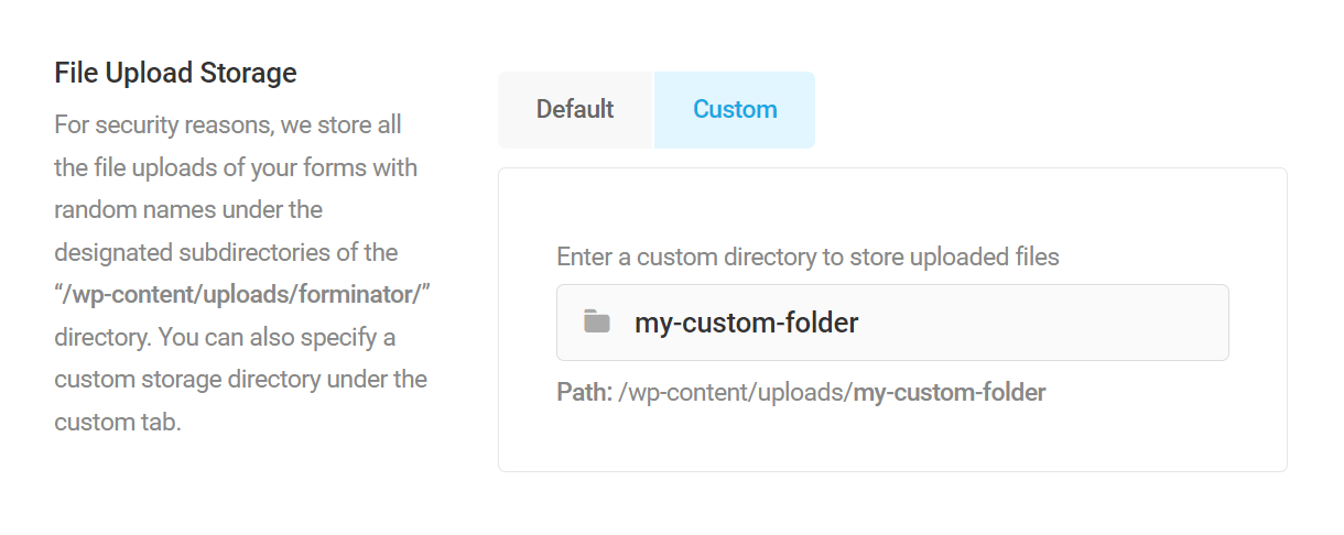
Custom File Uploads Filter
You can further customize the file uploads path by using the forminator_custom_upload_subfolder filter added to your active child-theme’s functions.php file or a mu-plugin.
Using the filter as shown in the above example would append the form ID plus the uploads or signatures subdirectory to the custom file path you set, like so:
https://domain.com/wp-content/uploads/my-custom-folder/[form_ID]/[uploads/signatures]/path-to-image.jpg
Here are a few additional examples to help you get started with this filter:
Append the following to the Custom File Uploads path:
[sub-folder]/[user-id]/[uploads/signatures]/path-to-image.jpg
Append the following to the Custom File Uploads path:
[sub-folder]/[username]/[uploads/signatures]/path-to-image.jpg
Append the following to the Custom File Uploads path (stores both uploads and signatures in the same subdirectory):
[form_ID]/path-to-image.jpg
Reset Plugin
Need to start over with a fresh install? Click the Reset button to return Forminator to its default state.
Remember to click Save Changes after adjusting Forminator data settings.
4.12.5 CAPTCHA
Link to chapter 12Add an additional layer of protection to your forms with a CAPTCHA field. Forminator includes support for the following captcha types:
The language for each captcha type will display in your site’s language by default. But you can specify the language that should be used in the captcha at the bottom of this screen if you prefer to change it.

Google reCAPTCHA
Forminator supports Google reCAPTCHA v2 Checkbox, v2 Invisible, reCAPTCHA v3, and reCAPTCHA Enterprise. You must enter correct credentials for the version(s) you intend to use in your forms or you will get an error when you try to save settings in the captcha field added to your forms.
We recommend setting up all the reCAPTCHA versions so you can easily use any of them in any form without errors.
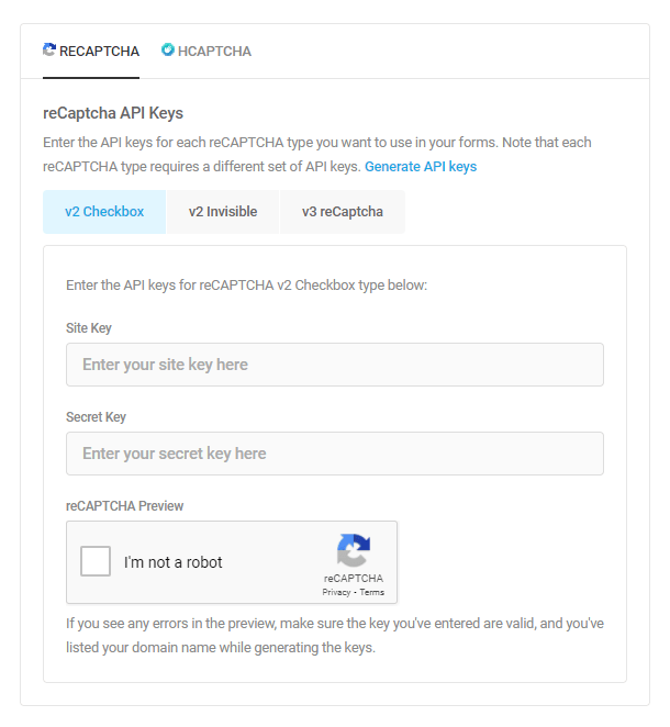
To get Google reCAPTCHA set up, go here and follow the steps below for each version you want to set up:
- Add a Label, such as Forminator Form.
- For reCAPTCHA type, select the version you wish to use.
- For Domains, enter your site domain where the form is located.
- Accept the Terms of Service.
- Click the Submit button.

In the next step, copy your Site Key and your Secret Key and paste them into the corresponding fields on your site for the version you set up.
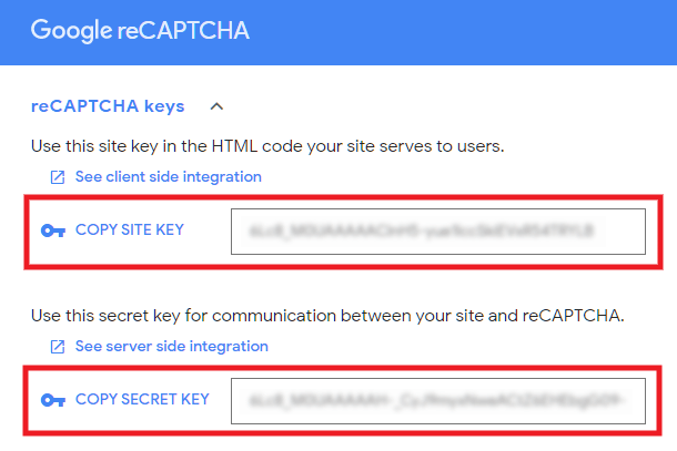
Once you’ve added your keys , click the Save Settings button, and you’re done. You can now add a reCAPTCHA field to any of your forms.
Note that if you set up the reCAPTCHA incorrectly here, you’ll see an error message in the preview section informing you what went wrong so you can fix the setup.
Enterprise reCAPTCHA
To set up Google reCAPTCHA Enterprise keys, follow the steps below
Read Google’s official documentation on how to create enterprise reCAPTCHA keys to understand the process in detail.
Log in to Google Cloud Console and create a new project or select an existing project
Read Google’s official documentation on how to create a new project in Google Cloud Console.
Enable the Enterprise reCAPTCHA API
Click the Create Key button under the Keys tab of the reCAPTCHA enterprise page to create a new key.
Enter a display name to identify the keys and choose the platform type as Website
Enter your domain name in the New domain field and click Done to add it to the list.
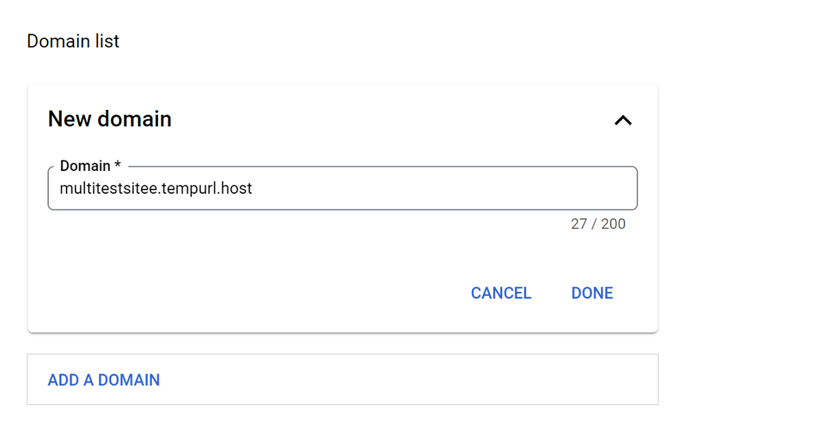
Expand the ‘WAF, Domain Verification, AMP pages, and challenge’ option to configure firewall, domain verification, checkbox challenge, amp pages, and testing key options.
Keep the ‘Use checkbox challenge’ toggle disabled to create API keys for V3 reCAPTCHA type
Or, enable the ‘Use checkbox challenge’ toggle to create API keys for the V2 checkbox reCAPTCHA type. Set the difficulty level for the checkbox challenge to easy, medium, or hard.

Click Create Key button to create the API key.
Copy the generated API key and paste the same key in both the Site Key and Secret Key fields on your site.
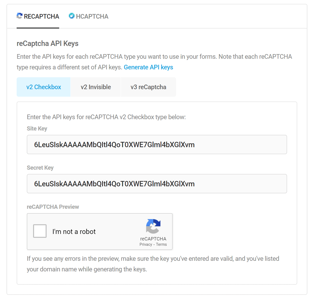
Once you’ve added your keys, click Save and preview to ensure the keys are valid and configured correctly.
hCaptcha
Forminator supports hCaptcha as an easy alternative. You only need to enter one set of keys here and can then select either the standard or invisible captcha when adding the field to your form. See Captcha Field for details.

To get hCaptcha set up, go here and click the New Site button.
Enter your site domain where the form is located in the Hostnames field, and click the Save button at the top.
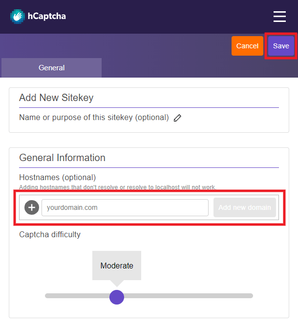
In the next step, click the Settings button next to the site you just saved.
Copy your Site Key and paste it into the corresponding field in Forminator on your site.
Then, under the Settings tab, copy your Secret Key and paste it into the corresponding field in Forminator.
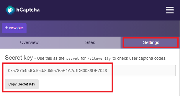
Once done adding your keys , click the Save Settings button, and you’re done. You can now add a hCaptcha field to any of your forms.
Note that if you set up the hCaptcha incorrectly here, you’ll see an error message in the preview section informing you what went wrong so you can fix the setup.
4.12.6 Import
Link to chapter 12Forms created using the Contact From 7 plugin can be imported to Forminator, as long as the form files exist on the same site.
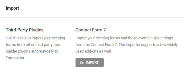
Click All to import all Contact Form 7 forms, or click Specific Forms to see a list of available forms from which to choose.Then, click Begin Import to proceed.
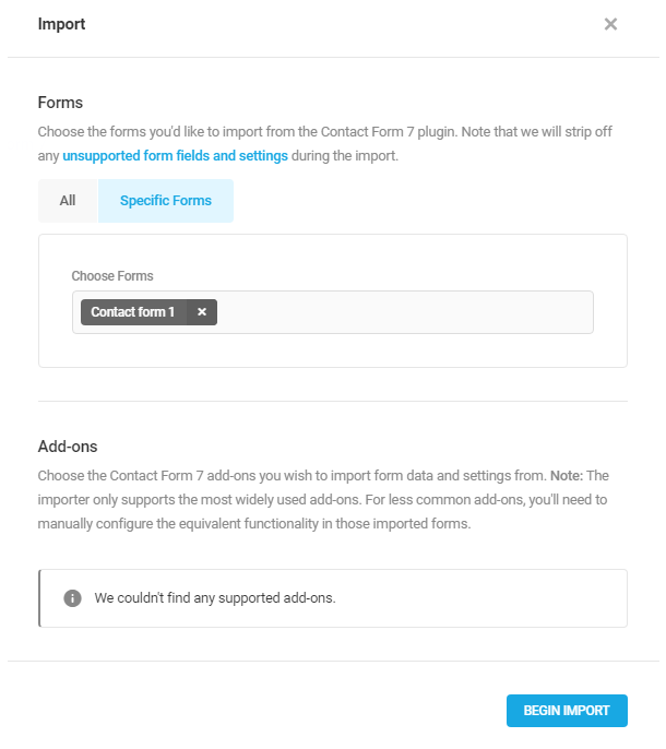
Most field Contact Form 7 field types will work just fine in Forminator, but a small number will not. These include:
- Quiz Field – Forminator doesn’t have a built-in quiz field, however, you can enable Google’s reCAPTCHA v3 and Honeypot protection on your imported forms.
- ConstantContact – Forminator doesn’t integrate directly with ConstantContact. However, you can use Webhook integration with Zapier to send your leads to ConstantContact.
- reCaptcha v3 – At this stage, Forminator can’t import your existing reCAPTCHA integration. You can set this up manually on your imported forms once they are transferred.
- Additional Settings – Forminator doesn’t support CF7’s additional form settings.
- Custom field IDs – Forminator creates a unique ID for each field, and the conditional logic relies on them. However, you can provide a custom CSS class for each field.
4.12.7 Submissions (Settings)
Link to chapter 12If you enable the “Custom” option for any of the features in this section but leave the value at “0”, that is the same as enabling the “Forever” option.
Forms Privacy
Submissions Retention
By default, all submissions will be kept forever but you can auto erase all submissions after a certain period in case you need to set that up.
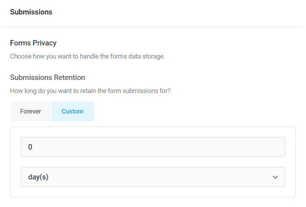
IP Retention
Forminator will save IP addresses in your database. If you need to release this data (due to GDPR or any local law) you can customize the IP retention policy here.
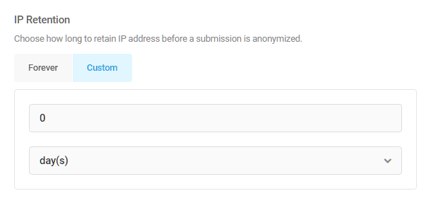
Account Erasure Requests
Here you can choose what will happen to the submissions of a user you are deleting from your site (by using Tools/Erase personal data) if those submissions contain an email address. Retain Submission will leave all submissions of that user intact and Remove Submission will remove all submission from the user you deleted from your site.
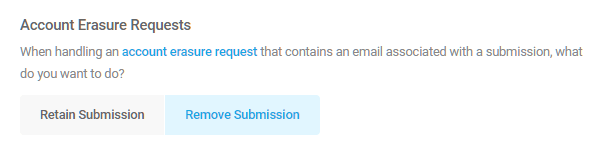
Poll Privacy
Submissions Retention
Much like with forms above, you can choose to auto erase all poll submissions after a certain period.
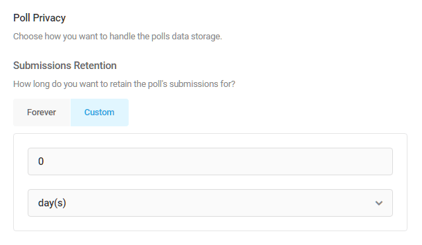
IP Retention
Each time your visitors vote, Forminator will save their IP in your database (this is used to prevent multiple votes by one visitor on the poll they already voted in and to modify vote limitations). In case you need to release this data (due to GDPR or any local law) you can enable the IP Retention here.

Quiz Privacy
Submissions Retention
Here again, just like with forms and polls above, you can choose to auto erase all quiz submissions after a certain period.

4.12.8 Payments
Link to chapter 12Forminator supports both Stripe and PayPal online payment processing platforms.
You must have access to an account with one or both of these services and one or both of those accounts must be connected to Forminator in order to use the payments feature.
Add Forminator Encryption Key to Config File
When using the Stripe or PayPal fields, Forminator encrypts and securely stores their secret keys.
This encryption by default is done using a WordPress salt. If you update your WordPress salts, the Stripe and PayPal integrations will stop working, as the secret keys can no longer be properly decrypted.
To avoid this issue, add the encryption key to your wp-config.php file.
To add the key automatically, click the Add Key button in the notice that appears at the top of the Forminator plugin screen if you have not yet added it.
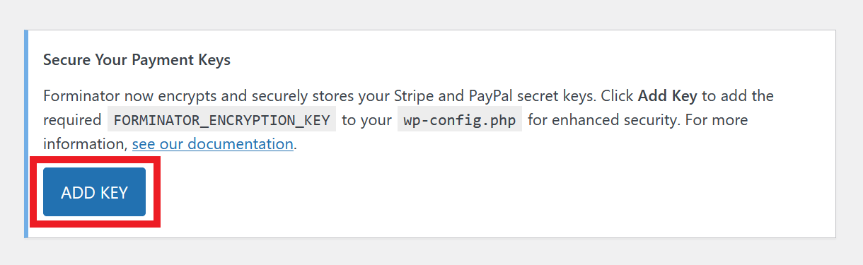
To add the key manually, add the following to your wp-config.php file, before the line that says “That’s all, stop editing”, and set a value for the FORMINATOR_ENCRYPTION_KEY constant.
define('FORMINATOR_ENCRYPTION_KEY', 'random_encryption_key');
For example, define('FORMINATOR_ENCRYPTION_KEY', 'vVF|EgWZgj(HU|8.hY)}u(LW *_-stW3L~pJ2k]3~5/fw<YytLKu4;a:yqt(CX-a');
The random encryption key value you set will be used for encrypting the secret keys. You can set it to any random string, but it’s highly recommended to use a complex and unique value for better security. You can use any online password generator to create them.
Avoid using simple or easily guessable values like “1234”. Be sure to set a strong and secure value for better security.
Connect to Stripe
Stripe recommends the use of restricted API keys (RAKs) to improve security and efficiency in third-party integrations, in compliance with the latest standards. RAKs offer precise control over permissions, allowing third-party services to access only necessary data and actions.
As a result, we encourage all our users and members to use RAKs and integrate with Stripe using the Forminator Stripe App. See Stripe’s documentation to learn more about it.
To connect your Stripe account to Forminator, click the Connect to Stripe button.
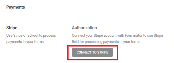
You’ll be prompted to enter your Test and Live API keys in the modal that pops open.
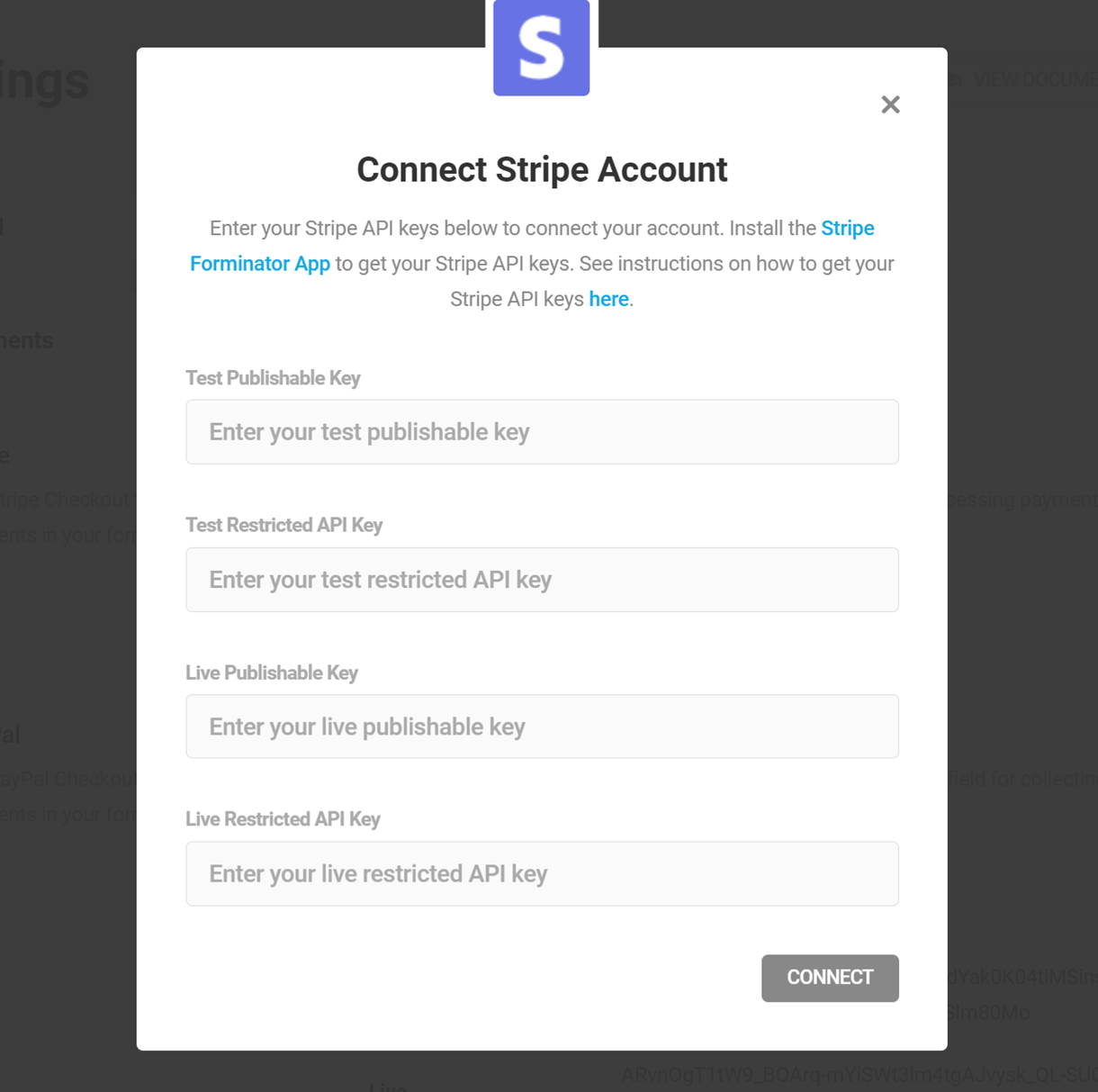
To get the needed keys, click the Forminator Stripe App link in the feature description at the top. The link will redirect you to the app installation page, where you can install the app.
Alternatively, you can navigate to the Stripe marketplace, search for the Forminator Stripe App, and install it.
We highly recommend creating the API keys via the app. However, if you wish to create the API keys manually, navigate to the Manual API Key Creation section.
In the installation modal, click Continue.
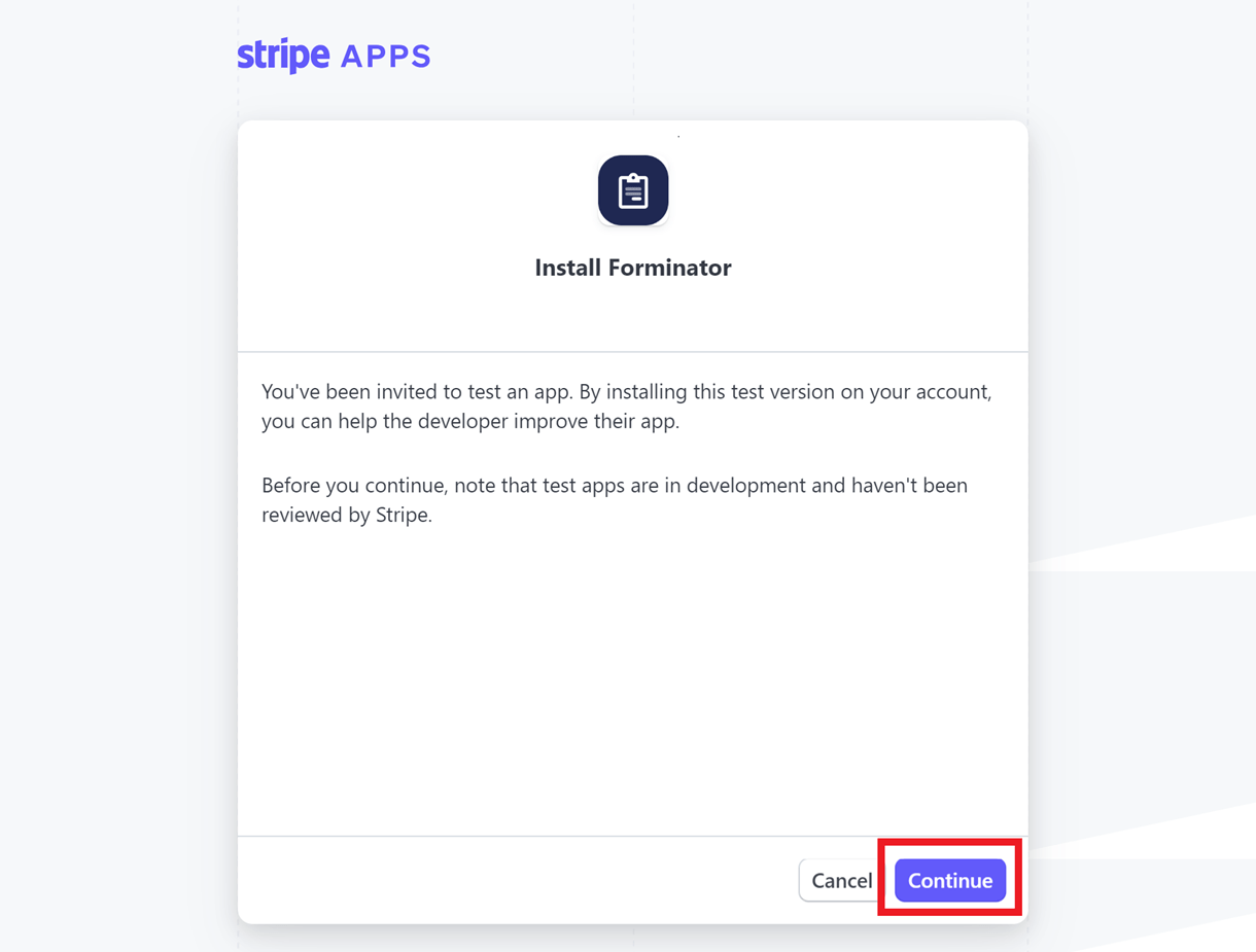
Now, select the Stripe account to which you want to install the app. From the Install In drop-down in the bottom left corner of the modal, select if you want to install the app in Live or Test Mode.
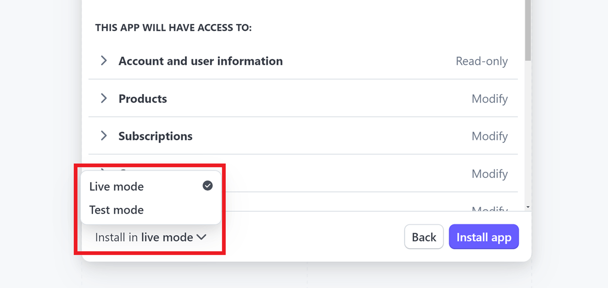
Note that if the app is installed in live mode, it will not be accessible in test mode (or vice versa), and it will need to be separately reinstalled in test mode by following the installation steps.
Click the Install App button to complete the installation process. After successful installation, you will be able to find the app under the Installed Apps tab on the Team and Security page.
To generate the API keys, click on the app.

In the app dashboard, click the View API Keys button to pop open a modal where you can find your Publishable and Restricted keys. If you are in Live mode, click the Generate new key button and enter the verification code sent to the phone number associated with your Stripe account to reveal the restricted key.
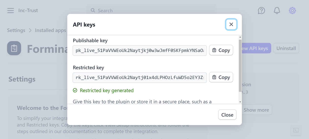
Copy the keys and paste them into the corresponding fields in the Forminator Stripe integration modal. Note that the restricted key can be viewed only once. It’s important to make a copy of the key, as a new key needs to be generated in case it gets lost.
Note that you’ll need to get the Test Publishable and Restricted keys as well; Forminator requires both sets.
To get the Test keys, enable Test Mode in your Stripe account, install the app, and during installation, select Test Mode from the Install In drop-down. Then create the keys by repeating the above-mentioned steps.
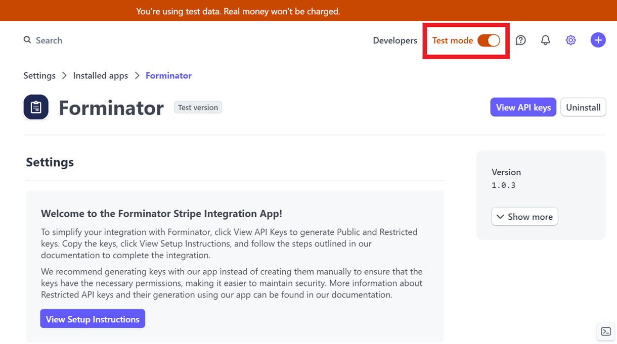
Be sure to paste the Live keys in the Live fields and the Test keys in the Test fields, then click the Connect button.
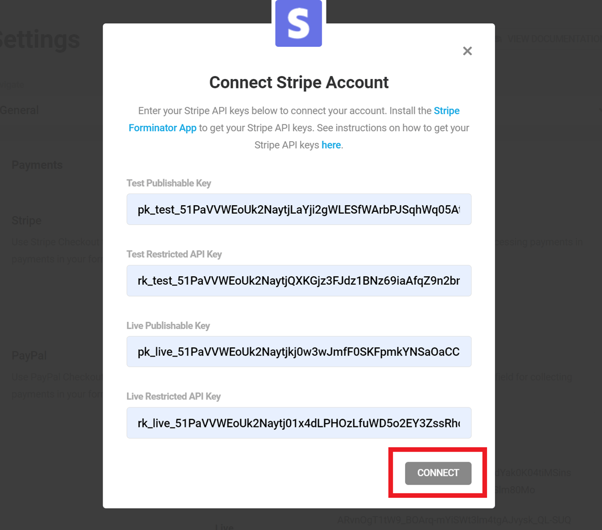
Once connected, you’ll see your Stripe connection info appear to confirm, and you can set your Default Currency for Stripe payments.
If you generate a new live key, the old key will still remain valid for about 1 hour to avoid any unexpected transactional issues. If the app is uninstalled, the keys will become invalid instantly. It is important to ensure that you generate new keys and re-connect with Forminator if the app is accidentally uninstalled.
Once this setup is completed, you can add the Stripe payment field to any of your forms.
Manual API Key Creation
It is highly recommended that you use the Forminator Stripe App to generate the API keys, as the required key permissions are pre-defined to ensure a smooth key creation process.
However, if you wish to manually create the API keys, navigate to your Stripe dashboard, and on the Developers page, under the API keys tab, you can find the Standard and Restricted keys sections. Under the Standard Keys section, click on the publishable key value to copy the key.
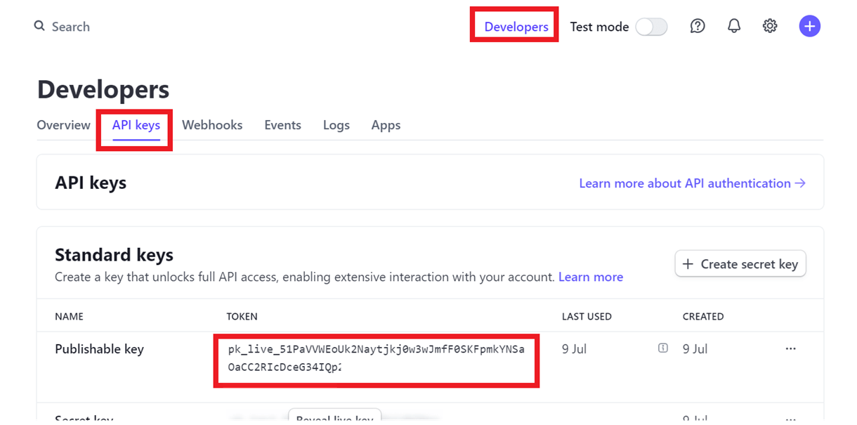
To generate a new Restricted API key, click the Create Restricted Key button.
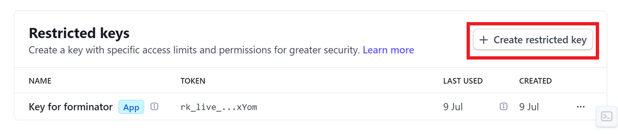
The following screen appears only in newly created Stripe accounts and may not appear in older ones during manual key creation. In such a case, you can directly configure the permissions.
In the modal that opens up, select the Building your own integration option and click Continue. Selecting this option ensures that permissions are not automatically configured.
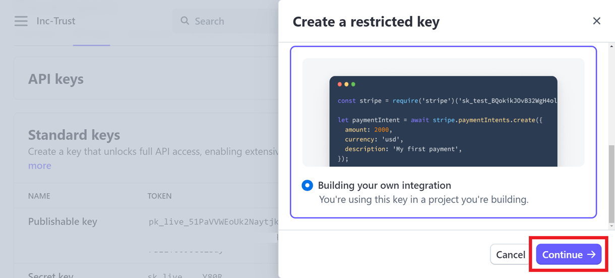
In the Key name field enter an identifier for your key and configure the following permissions for the resource types
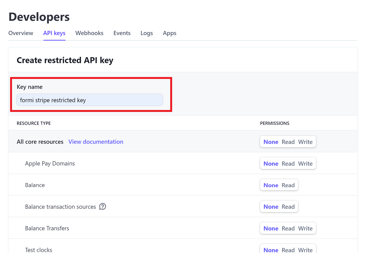
All core resources
Charges: Write
Customers: Write
PaymentIntents: Write
Products: Write
Tokens: Write
All Checkout resources
Checkout Sessions: Write
All Billing resources
Credit Notes: Read
Subscriptions: Write
All Connect resources: Read
All webhook resources
Webhook Endpoints: Read
All Terminal resources
Locations: Read
Readers: Write
The permissions for the rest of the resource types can be set to None. After setting up the above permissions, click Create Key. The new restricted API key will be created.
Remember to repeat the same steps in the Test mode to create the Test Publishable and Restricted API keys. Now, paste the copied keys into the corresponding fields in the integration modal.
Connect to PayPal
The setup for PayPal payments is very similar to Stripe above. Start by clicking the Connect to PayPal button.
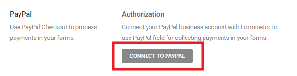
You’ll be prompted to enter your Sandbox and Live keys in the modal that pops open.
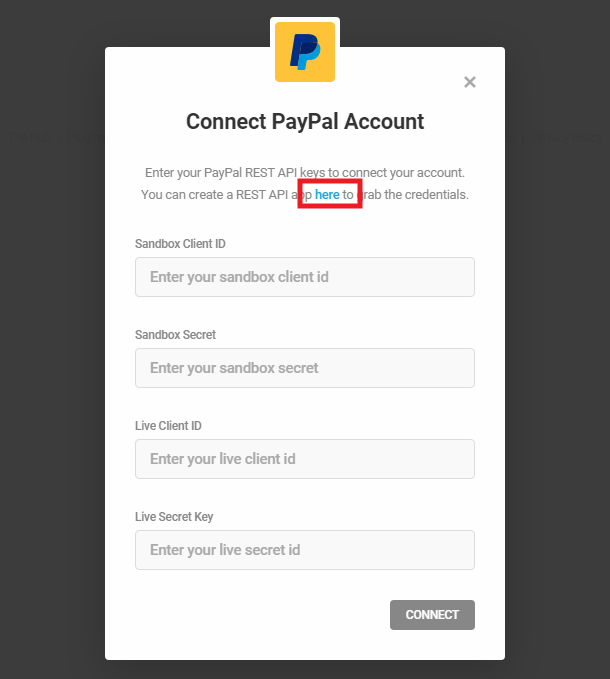
To get the needed keys, click the here link in the feature description at the top. That link will redirect you to the My apps & credentials page in your PayPal developers account. If you are not already logged in there, you’ll be prompted to do so; just log in with your regular PayPal credentials. You should then see one or two default Sandbox accounts provided by PayPal.
Click on the name of a Sandbox account to open the credentials page, then copy the Sandbox Client ID and Secret from your PayPal account, and paste them in the corresponding fields in the Forminator popup.
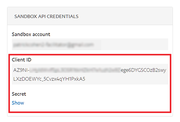
You’ll then need to get the Live Client ID and Secret as well; Forminator requires both sets. To get the Live keys, navigate to the My apps & credentials page in your PayPal developers account. Then click the Live toggle at the top, and click the Create app button to create a live REST API app if you haven’t already.
Get the live Client ID and Secret keys the same way as the sandbox ones: click the name of your app and copy them from the next page. Then paste those keys in the corresponding fields in the Forminator popup.
Once again, be sure to paste the Live keys in the Live fields, and the Sandbox keys in the Sandbox fields, then click the Connect button. Once connected, you’ll see your PayPal connection info appear to confirm, and you can set your Default Currency for PayPal payments.

Once this setup is completed, you can add the PayPal payment field to any of your forms.
Payments Filters
If you ever need to disable all payments features on a site or network, add the following filter to the active child-theme’s functions.php or a mu-plugin:
add_filter( 'forminator_payments_disabled', '__return_true' );
This could be especially useful on client sites if you or they do not need or want any payment features in forms.
4.12.9 Permissions
Link to chapter 12You can configure and manage permissions to the features of Forminator for various user roles or users. By default, all administrators have complete access to all the features of Forminator.
If you had previously added the manage_forminator capability to certain user roles using the User Role Editor plugin or similar, you can now remove that capability from those roles and grant users more fine-grained access rights with this new feature.
Click Add Permission to add new permission.
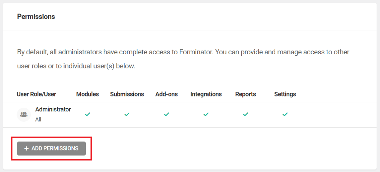
User role
Select this option if you want to add permission to all the users of a specific user role. From the drop-down select the user role to which you want the permissions to be applied.
Exclude users – If there are any specific user(s) of the chosen user role that you would like to exclude from the permission you can specify in this field by specifying their user name or email.
Specific User
If you want to add permissions to any specific user(s) you can select this option. Search the user you want to add permission to in the search bar.
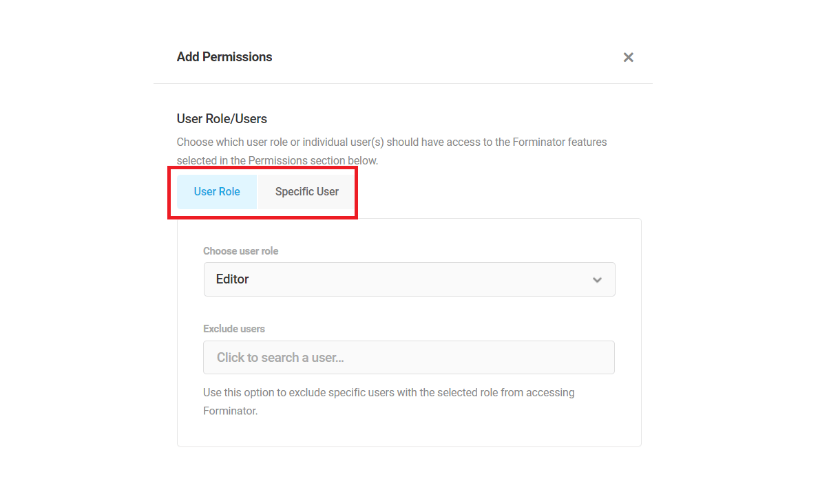
Permissions
Here you can select the feature(s) that the chosen users or user role can access. Click Add Permissions to add the permission.
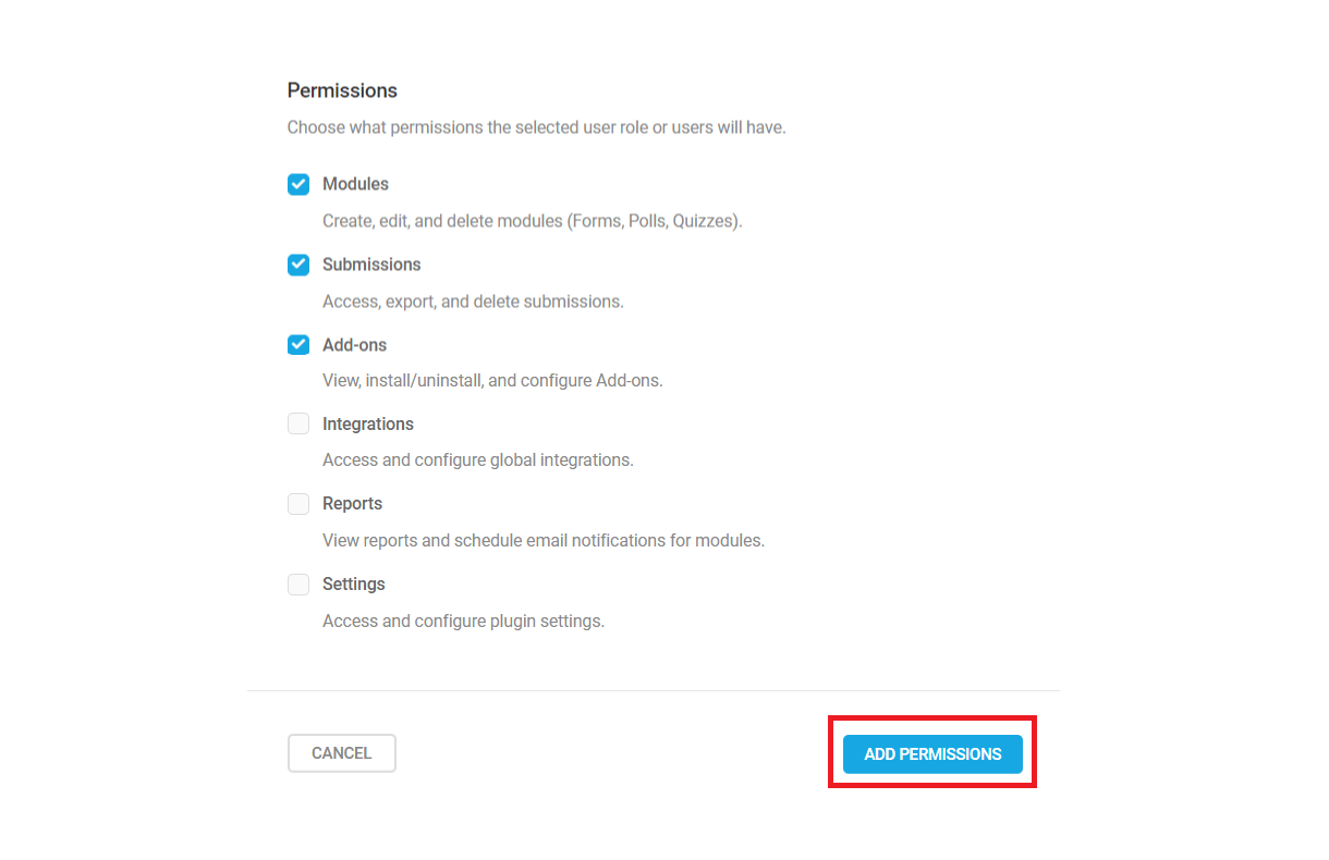
A list of all the added users or user roles will be displayed along with their permissions. The features that the user role/users can access are indicated by a green check mark and the ones that can’t be accessed are indicated by a lock icon.
Click the gear icon next to every added permission to view the options to edit or delete the added permission.
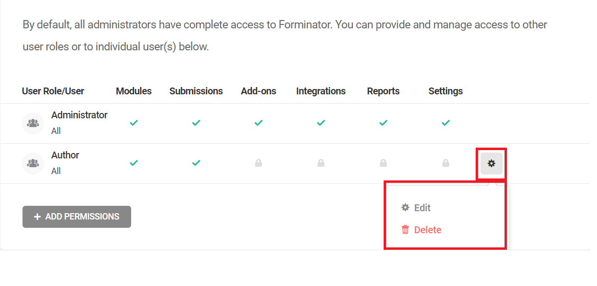
If any user or user role tries to access a feature that they don’t have the necessary permissions for, the following screen will be displayed.
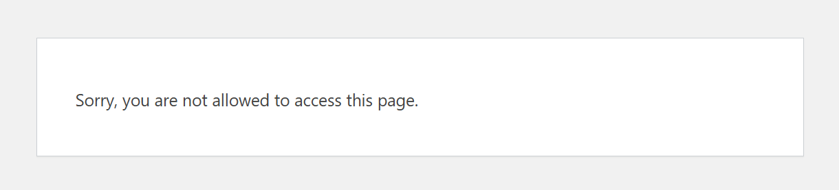
4.12.10 Geolocation
Link to chapter 12Here you can enter the Google Maps API key to use the Geolocation feature in the address field of your forms.
Enable the “Default form settings” option if you want to enable Geolocation by default on all address fields across all the forms on your site.
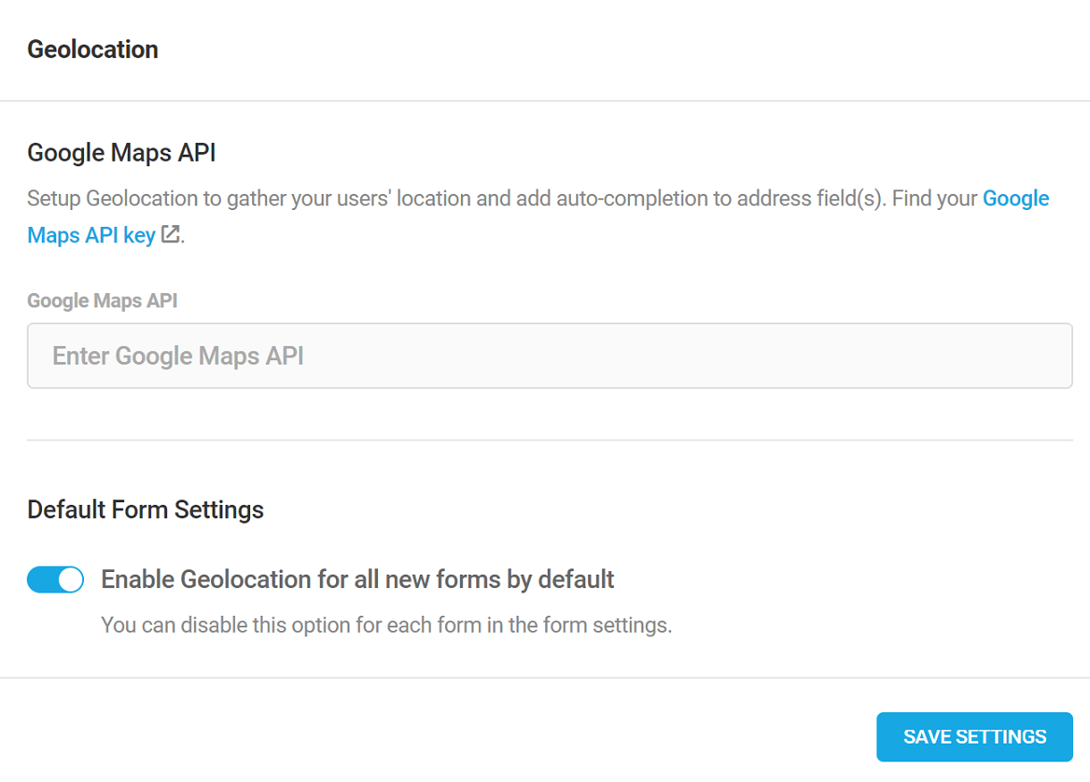
Find your Google Maps API Keys
Login to Google Maps Platform. Click on the “Keys & Credentials” tab
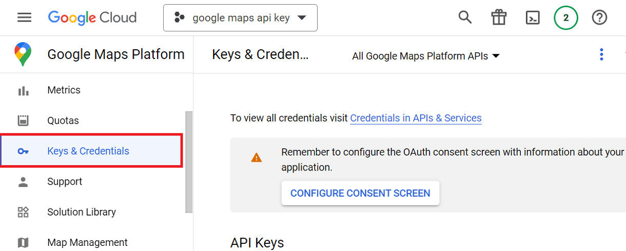
Create a new project or select an existing project
Note: If you haven’t previously set up your billing account, provide your bank account details or add your credit/debit card details to set up a billing account. You won’t be charged until you exceed your free usage limitations.
Click on Create Credentials > API Key
The API key will be generated.
Copy and paste the generated key in the “Google Maps API” field under Geolocation settings
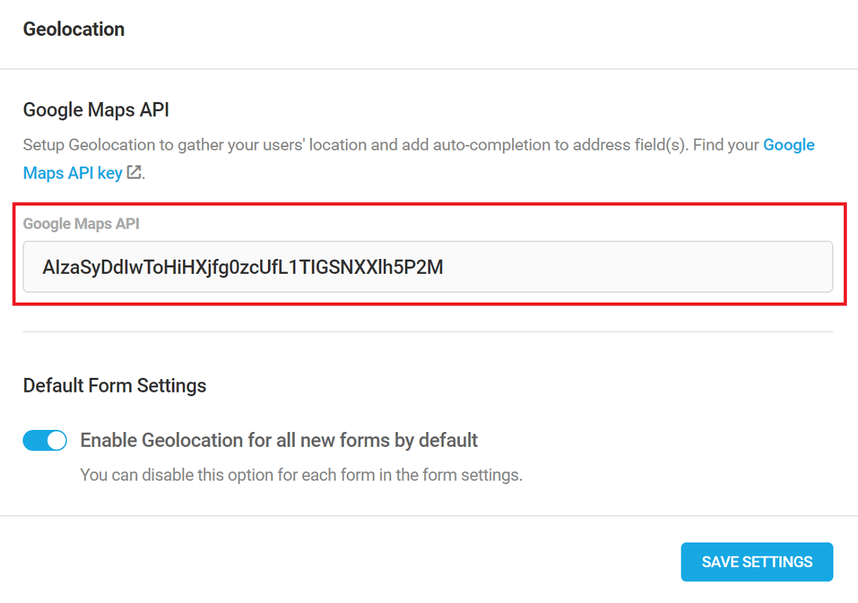
4.13 Import / Export
Copy chapter anchor to clipboardYou can export any form, poll or quiz from one site to another for easy duplication and to keep your branding consistent across multiple sites. If your form includes one or more PDFs, they will be included in the export.
Click the gear icon for any form, poll or quiz, and select the Export option.
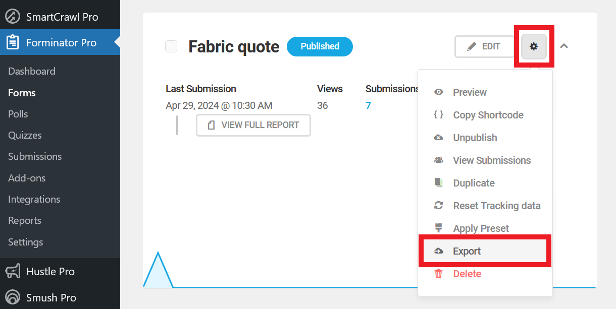
Copy all the text from the field in the modal that pops open. You can also click the Download button to download that code as a plain text file for safekeeping if you like.
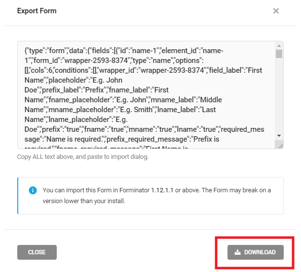
Then go to the appropriate Forminator page on your other site (Forms, Polls or Quizzes depending on which one you want to import there). Click the Import button at top-left.
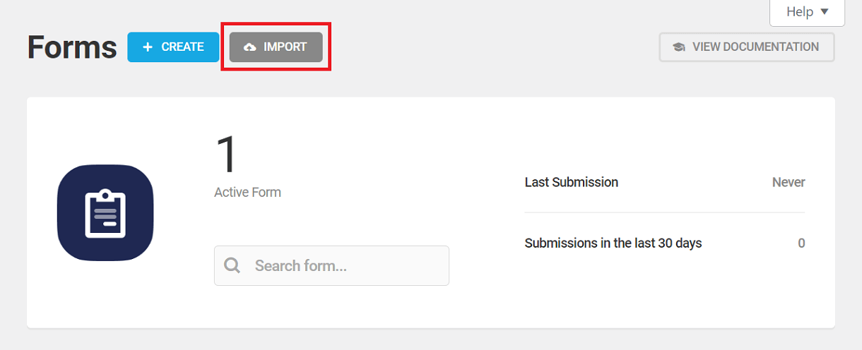
In the modal that pops open, paste the code you copied from the other site into the textarea. Select the Replace all email notification recipients with your current user email checkbox to do just that. Finally, click the Import button. You’ll then see your imported module appear in the list with any others that may already be there.
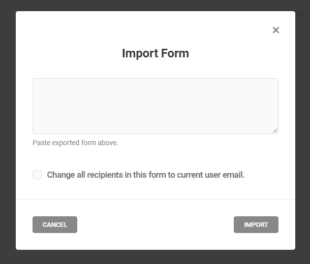
4.14 Troubleshooting
Copy chapter anchor to clipboardOur awesome support team is always on call, should you need any help. However, sometimes it is helpful to troubleshoot issues yourself first. Below are some issues that you might encounter and appropriate troubleshooting measures to help you along.
If you require any assistance, or if the issue you’re having is not covered here, don’t hesitate to contact our 24/7 live support.
Regardless of the issue you may be having, here are some of the most common causes:
Cache Interfering
Cache is often the cause of any of the issues outlined in the chapters below..
If your form or form fields (like e-Signature) are not appearing or functioning as expected, ensure all caches have been cleared from any cache plugins, from your theme, from your server, and from Cloudflare (if applicable).
Try enabling the Load form using Ajax and Prevent page caching on form pages options under Behavior > Rendering.
Plugin, Theme or Code Conflicting
The cause of any issue could also be your active theme, or some other active plugin or custom code conflicting with Forminator.
You’ll want to perform a conflict test to try to pinpoint the source of the conflict.
Browser Errors or Conflicts
Check for any errors in your browser’s developer tools, and disable any browser addons/extensions that may be conflicting.
Quite often, error messages will clearly indicate the issue. Contact support if you need help interpreting the results.
4.14.1 Form not Appearing
Link to chapter 14Form Not Appearing for Logged-Out Visitors
If the form is showing for logged-in users but not logged-out users, and you want it to show for all, ensure the Enable logged in submission only is disabled in Behavior > Security
Custom CSS Interfering
Added CSS may be hiding the form or conflicting with Forminator’s CSS. Check if any relevant custom CSS has been added to the form’s Custom CSS area, in the theme’s settings or stylesheet, the Customizer, or any other custom CSS plugin.
Optimization Plugin Incorrectly Configured
If you are using Hummingbird, you can test the page where your form should appear with no cache or asset optimization by adding the parameter ?nocache=1&avoid-minify=true to the URL (e.g. https://yoursite.com/form-page/?nocache=1&avoid-minify=true). If the form loads with the parameter, you’ll know the issue is related to some asset being optimized when it shouldn’t be.
If you are using the Manual option in Hummingbird’s Asset Optimization module, some required assets may have been inadvertently deferred or moved to the footer. Check your browser’s console to ensure that jQuery/JS assets are loading correctly, and there are no errors related to jQuery not loading.
If you are not using Hummingbird, check relevant options in whichever optimizer plugin you are using, and any relevant custom functions as well.
Incomplete Loading of the Form
In your browser’s developer tools, check if you see display: none; set for the main form container. If you do see that, do not try to force the form to display using CSS to override that.
The reason is that Forminator will keep the form hidden until all the javascript needed for the form has loaded, then will automatically remove that CSS rule so your form displays as it should. So if you do see display: none; in there, it means your theme or some other plugin or code is interfering and preventing Forminator JS from loading properly.
In this case, you’ll want to perform a conflict test to try to pinpoint the source of the conflict.
4.14.2 Form Data not Sent to GTM
Link to chapter 14By default, form submissions don’t trigger a submit event when the Ajax submission method is used.
When the submission method is set to Page reload, a submit event is triggered. But this may not send the required field information, and may even send some irrelevant form HTML data.
To accurately track form submissions in Google Tag Manager when using either submission method, we recommend enabling the relevant Forminator Integrations in our Beehive plugin. See the Settings (Tag Manager) chapter in the Beehive documentation for details.
However, if you are using the Ajax submission method and don’t want another plugin just to track submissions in GTM, you can use the following custom code instead.
Use it as a mu-plugin or add it to your child theme’s functions.php file. Note that you should already have the tag manager scripts installed on your site to use this option.
If you are using a page builder and the above code doesn’t work for you, try replacing this line in the code:
if ( is_a( $post, 'WP_Post' ) && !has_shortcode($post->post_content, 'forminator_form') ) {
with this instead:
if ( ! is_page( 'your_page_slug' ) ) {
Be sure to replace your_page_slug with the actual slug of your form page.
4.14.3 Fields not Appearing
Link to chapter 14Incorrect or Conflicting Visibility Conditions
A frequent cause of fields not appearing as expected in your form is incorrect or conflicting Visibility conditions. So you’ll want to first double-check that any condition(s) you have set for your field are correct and not conflicting.
Custom CSS Interfering
Check if any custom CSS has been added to the form’s Custom CSS area, in the theme’s settings or stylesheet, the Customizer, or any other custom CSS plugin. Added CSS may be hiding the field or conflicting with Forminator’s CSS.
4.14.4 Form Submission Fails
Link to chapter 14Error Message – Something went wrong
“Something went wrong” is the default message that appears when the Akismet plugin detects a spam submission.
If form submission fails and you see that message appear instead of the expected success message, check if you have enabled the Akismet spam protection option under Behavior > Security in your form’s settings.
If that is enabled, try changing the default message to something else and test the form submission again. If you then see your custom message, you’ll know the cause is Akismet.
Unfortunately, Akismet only provides Forminator with a simple pass or fail flag, and there are no options to adjust the level of spam detection.
So if Akismet is flagging legitimate form submissions as spam, the recommended solution is to disable the Akismet Spam Protection option & instead use either a CAPTCHA field and/or enable Honeypot Protection.
4.14.5 Add-ons not Working
Link to chapter 14Geolocation
If you are getting errors when trying to activate the Geolocation Add-on, please log into your Google Maps Platform and ensure that the following APIs are enabled.
- Places API – Required for auto-suggesting 5 address options based on what is entered in the relevant field.
- Maps JavaScript API – Required to display maps & markers.
- Geocoding API – Required to convert latitude and longitude to an address.
4.14.6 Integrations not Working
Link to chapter 14If an Integration is not sending data to the corresponding app, first check for error messages in the Submissions for the corresponding form. Opening a submission will show you if the upload to an app failed, and a possible cause.
Double-check that your Integration is correctly configured, and that any mapping of form fields to app fields is also correctly set up and that data meets the app’s fields requirements (e.g. length, date format, type).
If needed, you can get additional information in your debug.log file by adding the following defines to wp-config.php (be sure that WP_DEBUG is set to true):
define('FORMINATOR_DEBUG', true);
define('FORMINATOR_ADDON_DEBUG', true);
4.14.7 PayPal not Working
Link to chapter 14Enable the Debug Mode option in PayPal field > Advanced settings and check the browser console for any PayPal-specific errors.
Most often, the error message will clearly indicate the issue. Contact support if you need help interpreting the results.
4.14.8 reCAPTCHA not Working
Link to chapter 14This is usually due to a conflict with the theme and/or some other active plugin also calling Google reCAPTCHA assets. In this case, you’ll want to perform a conflict test to try to pinpoint the source of the conflict.
You may want to try hCaptcha as an alternative to reCAPTCHA.
4.14.9 Form Emails not Sending
Link to chapter 14Are Default Emails Sending?
You’ll first want to determine if default WordPress email is working correctly. To do that, enable the Email Logs module in Branda Pro, or use any other similar plugin that logs emails sent from your site. Then double-check that default WordPress emails are sending as they should.
An easy way to check that would be to click the Lost password link on the login form for a test user. Check the email logs in the plugin you’re using to ensure the password-reset email has been sent, and see if you get that email in your test user’s inbox.
If default emails are being received in your inbox (not the spam folder), proceed with additional checks below. If default emails are not being sent at all, then the issue is not specifically with Forminator, and you may want to contact support for more in-depth troubleshooting.
SMTP Not Configured
If SMTP is not yet configured on your site, we highly recommend doing so. SMTP resolves most deliverability issues out of the box.
In the meantime, you can enable WP_DEBUG in your site’s wp-config.php file, and check the debug.log file for any clues.
SMTP Configured
If SMTP is already configured on your site and default emails are sending as expected, check the email logs in Branda (or any other similar logging plugin you may be using).
If the logs indicate that Forminator is not sending emails, there is likely a conflict with your active theme, plugins or some custom code. You’ll want to perform a conflict test to try to pinpoint the source of the conflict.
If the logs indicate that Forminator is sending emails, check the error messages to see why they are not sending correctly.
4.14.10 Custom “From Email” Setting Not Working
Link to chapter 14Forminator allows you to change the From Email address for any email notification under the Advanced tab of the notification.
However, if you have configured SMTP on your site, this setting cannot override the from email address set there and may cause errors. Also, some hosts and email services force a from email address that cannot be overridden by any means. Still others do not allow non-verified email addresses to be used in the From Email field.
The recommended method in situations like this is to leave the From Email address field empty in the Advanced settings because the address configured in the SMTP settings (or by the /host/email service) will be used regardless.
Instead, add the relevant email field tag (like {email-1}) to the Reply-to Email field in the notification’s Advanced settings.
In this way, when you reply to an email notification, the reply will be addressed to the Reply-to Email address provided in the submission.
4.15 Get Support
Copy chapter anchor to clipboardIf you still have questions or need assistance after reading this document, please don’t hesitate to contact our support superheroes using the available options under the Support tab in your Hub or via the Support tab in your WPMU DEV Dashboard.
