A Guide to Designing Better Buttons and CTAs for WordPress
A step-by-step guide to creating beautiful call-to-action buttons in WordPress.
Buttons and calls-to-action fill up relatively little real estate but they’re some of the most important design elements of any website. Considering their importance, getting buttons and calls-to-action right is sort of a big deal.
However, designing buttons can be tricky. There are many design factors to consider when designing buttons – size, color, icons, shape, placement, and text — and call-to-action buttons are even more critical to get right.
In this post, we’ll cover the basics of designing buttons for your WordPress website. We’ll also consider the factors to take into account when your buttons will be used as part of a call-to-action. Finally, we’ll leave you with code you can use to create buttons and show you how to use that code with WordPress.
Three Principles for Designing Effective Website Buttons
Let’s start with the basics. If you want to create buttons that are effective, you need to follow a few best practices.
These best practices may seem like common sense and that’s because they really are. However, if you’ve never thought about button design before you may find that you’ve been violating some of these principles.
Principle #1: Buttons Should Look Like, Well, Buttons!
In order for a website design to work as intended, buttons need to be easy to pick out. Let’s take a look at how Google does this on their landing page for their analytics product.

While not everyone loves Google’s material design, the buttons in the image above are unmistakable. Buttons should stand out. Buttons that aren’t clearly buttons may experience a markedly lower click-through rate.
Principle #2: Button Actions Should be Clear
When designing buttons, the action associated with each button must be clear. Look back at the image above. The action associated with each button is clear. Use the text or icons on buttons to clearly and succinctly describe the actions each button is designed to perform.
You don’t have to do this with text. Sometimes icons can be just as effective. For example, looking at the same example, we see this icon style button on the right:
The icon on this button communicates something along these lines: “Hey! There’s more stuff over here!” It lets us know that there are additional options available which can be seen by clicking on the button.
Principle #3: Button Design Should be Consistent
Third, when designing buttons make sure that all buttons that perform a similar action have a similar design. Let’s look back at Google once again.

In the image, there are three different button designs. Each button design does something different. The green buttons are a call-to-action — they let you sign up for a service and are the most prominent. The blue arrows let you learn more about each service. The icon button displays more options available on the same webpage.
Throughout this web page this pattern is consistent:
- Round icon buttons perform on-page actions.
- “Learn more” buttons are blue and include an arrow (and sometimes some text).
- Call-to-action buttons are square and green.
As you design buttons for your site, develop a system in which different button designs have different purposes and be consistent in the application of these designs.
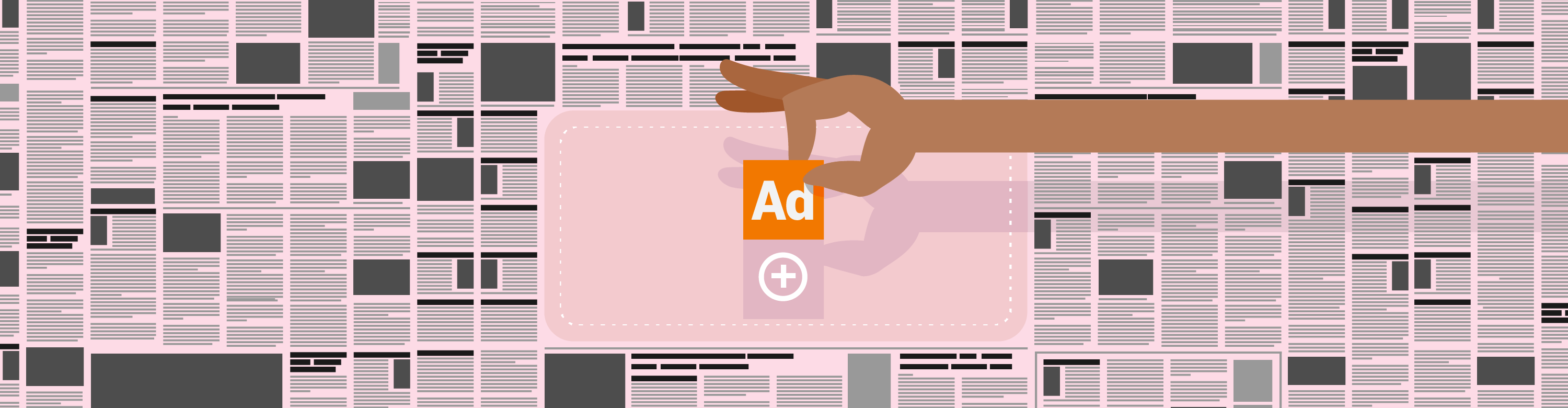
How to Make Call-to-Action Buttons Stand Out
Buttons included in call-to-action (CTA) elements are a bit different from the rest of the buttons on your website. That’s because CTA buttons should be designed to encourage a specific action rather than simply serve as a functional UI element. In order to make CTA buttons as effective as possible keep these guidelines in mind:
Use colors that are in high contrast to the background color and stand out from the other UI-type buttons on your site.

Make CTA buttons easy to see and find by sizing them generously and leaving plenty of whitespace around CTA buttons.

Use urgent language when writing the copy for your CTA buttons, especially if you’re making a limited time offer.

Creating Buttons with Code
You could always use a plugin to create buttons, but by coding them yourself you have complete control over the appearance and behavior of your buttons. So, with basic button design principles in mind, let’s take a look at how you can create three common button designs with code: rectangular text buttons, circle icon buttons, and buttons that combine text and icons.
How to Create Rectangular Text Buttons with Code

Text buttons are very easy to create and if you write the code yourself you can fine tune them to look just the way you like.
Let’s start with the HTML markup for a simple text button.
To link this button to a page, add the URL to the anchor element by deleting the pound sign and replacing it with your URL, like this: href="http://example.com/page-to-link-to".
The button text can be changed by replacing Buy Now in the button markup with your preferred copy. Below that, a span contains smaller detail text. Simply delete all of the text out of the span if you do you not wish to display detail text.
Next, we need to add some CSS to style the button:
To change the appearance of each button, just edit the CSS at the points indicated by the comments. The CSS above will create a green button with a gray border and rounded corners as shown in the image above.
How to Create Circle Icon Buttons with Code
These buttons are inspired by the icon buttons at Google Analytics. Thankfully, they’re pretty easy to create.
First, we need to add an icon font to our website. We can do so in a few different ways. If you’re building buttons in a plain HTML document, then just drop this link in the document head to import Font Awesome.
On the other hand, if you’re adding the buttons straight to WordPress, and your theme doesn’t include Font Awesome icons, then you can enqueue them by installing Enqueue Font Awesome CDN, a free WordPress plugin.
Now, we can write the markup that we’ll use for our icon buttons. To create the four icons in the image above, we’d use this code:
The class fa fa-angle-left applied to the first i element is what loads the icon. This is how icons are loaded with Font Awesome and you can see a full list of icons at the Font Awesome website.
This code could be used to generate buttons incorporating any of the Font Awesome icons. For example, to create a Facebook icon, you would use the following code:
Finally, we apply some CSS to turn our markup into buttons:
If you want to use this code on your own site, the comments in the CSS above will help you fine-tune the appearance of your buttons. Note that you may want to tweak icon alignment a bit from one icon to the next. To do that, you’ll need to add the appropriate class to the icon as shown in the HTML markup and adjust the padding applied to the icon using the last section of CSS.
To center the icon don’t add any of the classes prefixed with move-.
How to Create Square Buttons with Text and Icons
With the CSS already in place from the icon and text buttons, creating buttons that combine both text and icons is simple. All we have to do is add an icon the markup of our text button, like this:
As you can see, we’ve used a new icon and reused a class from the icon button styling, move-left, to create some space between the icon and nearby text.
Adding Buttons to WordPress
There are two steps to take to add buttons to a WordPress website. First, you need to load the CSS. Second, you add the markup on the post or page where you want the button to appear.
You have a couple of options for adding the CSS to your website.
- You could use a child theme and add the CSS to the child theme’s style.css file.
- Now that WordPress 4.7 has rolled out, you could add the CSS to the Additional CSS section of the WordPress customizer.
- You could use a custom CSS plugin.
Conclusion
Coding buttons for your WordPress site is pretty simple and give you the opportunity to try out different colors, button copy, icons, and designs to maximize the effectiveness of UI elements and calls-to-action.
Share article
All the good WordPress stuff, once every two weeks
Subscribe
Create your free account to post your comment
Login to post your comment